|
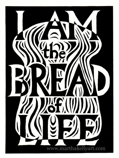
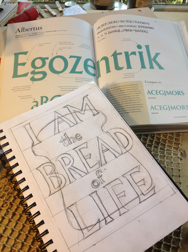
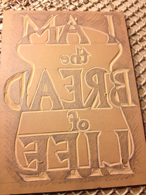
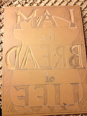
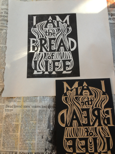
First Presbyterian Church in Holley, NY, is commissioning me to do another series of liturgical prints. I'm going to do a series of "I am" statements from John for their spring bulletins. I started drawing the first one free hand, but using one of my type books as a guide for the lettering. Then I got it transferred onto the block, outlined the letters with an exacto knife (to try to keep the edges sharp and keep me from cutting on through a line), and started carving. Things were going along great on the left, but then I started listening too hard to the Sunday morning puzzle on NPR and got distracted. The A in BREAD was supposed to be dark, to show up in the white of the bread, and I cut right into the letter. These positive/negative ones are especially tricky brainteasers for me. And that was in spite of the shading I did to try to keep myself straight. Fortunately I wasn't too far along, so I started over, kept it straight, and managed to finish the print. Below is the first proof. I cleaned up the letters and edges a bit before pulling the final version at the top of the post.
0 Comments
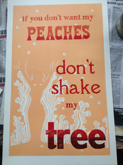
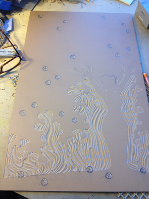
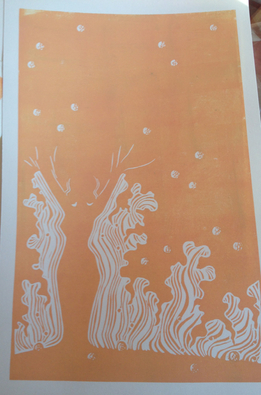
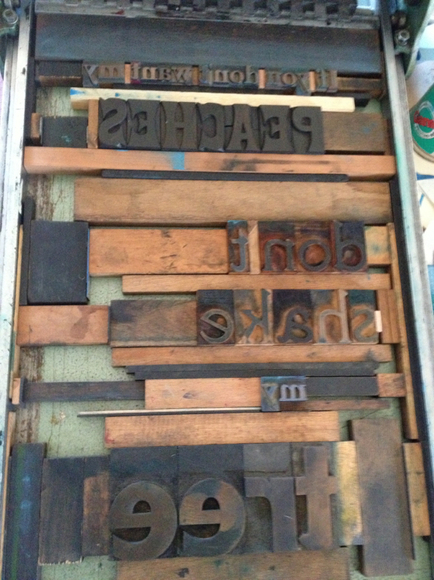
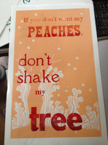
I'm continuing both my January freedom to play with different kinds of projects and also my run of feminist letterpress posters with this offering. It's another bluegrass one, to go with my Little Maggie poster. The quote is a quite old verse that has floated around into a lot of songs, but I know it from "Sitting on Top of the World", a standard in both blues and bluegrass. Above is the finished product. I did an edition of 20, about as many as I want to hand ink at one sitting, especially since I'm still playing around with grading the ink through several colors. I've been having fun with my wood type lately, and I wanted to try combining it with a carved image. My first step was to carve the block and print it. The next day I typeset the words I wanted. Then I printed them and realized I had the words on the left by mistake instead of on the right. I was looking at a proof of the print as I laid things out. Next time I'll use the actual block instead, since it's also in the mirror image state. But I was a little sleep deprived that day, and this is all still a learning process for me. I had done a couple of proofs to play with instead of using the good paper right off, so after printing the one below and realizing it was wrong, I moved things around and printed the actual prints. If I'm not careful I'll end up with a wood type letterpress show somewhere. I'm really having fun with these.
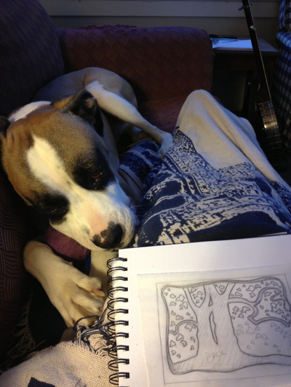
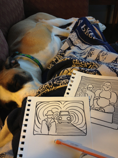
I turned in my second set of illustrations for Chalk Line Books at the new year. They're reprinting vintage crime fiction and have asked me to be their illustrator, assuming these become popular. The second book I did for them was Night Squad by David Goodis. It's fun to just be handed a text and allowed to choose the texts I want to draw from and create a whole vision of the book. And it was a perfect snuggle on the couch with my dog project as I was recovering from the bustle of the holidays. You can preview (or buy) the first book I illustrated for Chalk Line here on the Amazon kindle store. If you click "look inside" and scroll down, you'll see my first illustration. I'm even mentioned in the Book Description; "The Chalk Line Books version of “Sharecropper Hell” also features the evocative illustrations of artist Martha Kelly."
Woohoo! Opera Memphis has been inviting our Memphis Urban Sketchers group to sketch at their dress rehearsals. I love how they are so inclusive of a broad variety of arts in the community. I couldn't make the dress rehearsal this time, but my family went on Tuesday night, and I sketched then instead. I started with the pre-opera sideboard, and then did a watercolor of the set before the performance started. It was dark to draw, and I was thoroughly enjoying the performance, so I only did a quick one actually during the opera. My figures are challenged enough when I have good light to see by. But I love that the modern setting they gave this show and the fact that the prince, disguised as a wandering minstrel, is dressed as an Elvis impersonator. Perfect.
I recently re-watched "Much Ado About Nothing" with Emma Thompson and Kenneth Branagh (directed by him as well). It's one of my all time favorite movies, and my favorite part may be the very beginning with a dark screen where Emma just speaks the words of this song. Breathtakingly beautiful. Being in a flux period of dating at the moment, the song also seemed good to have in my arsenal at the moment. I find it helps to have a few songs that see me through those occasional "Boys are stupid" moments in life, even though I generally enjoy the company of men just fine.
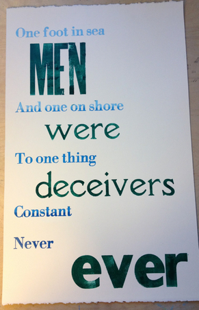
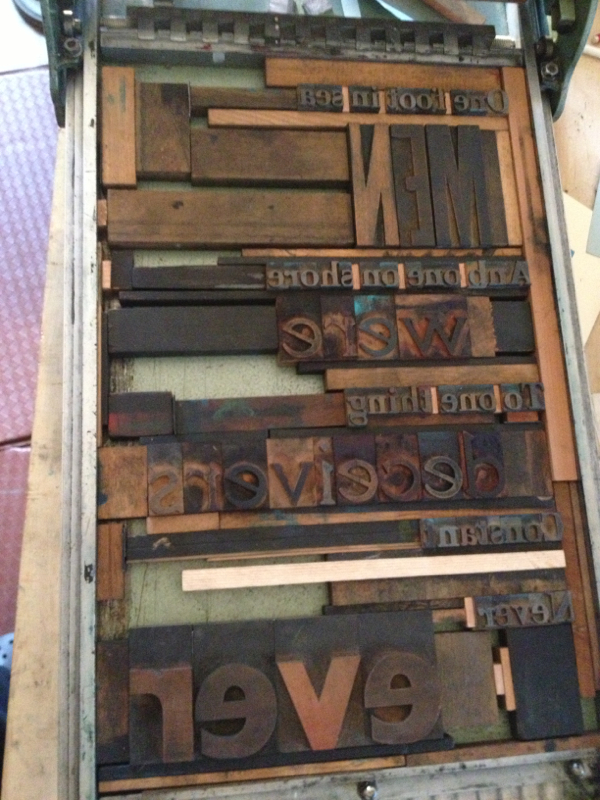
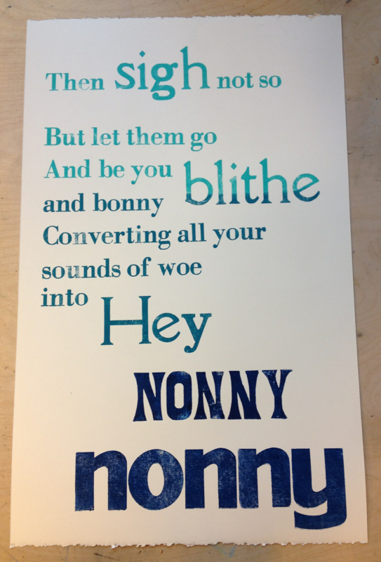
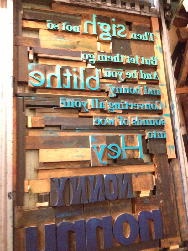
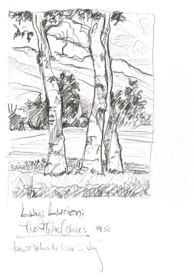
I'm also playing with inking on these posters. I've been mixing gently gradated colors and using several different rollers to gradually fade the colors from top to bottom. You can see the ink on the letters in the above right picture of the type set into the bed of the proof press. You can also see the jigsaw puzzle nature of typesetting. It's fun to fill in the holes and make everything snug. My other experiment was interweaving the two different phrases in the poster on the left, seeing whether different sizes and colors would leave the phrases legible and discreet. I'd be happy to hear how it strikes those of you who aren't as familiar with the poem. It's hard for me to come at it with fresh eyes since I know what I was trying to accomplish. I did an edition of 10 for the "Men were deceivers ever" and 20 for the "Hey Nonny Nonny" (I thought there might be a little more call for the happier one). The posters are $30 each or $50 for the pair, since I really made them to go together. My fountain pen was out of ink, and I was rushed getting out of the house, so I ended up doing pencil sketches today and really enjoyed that. It was a family day -- lunch at the Brushmark, the restaurant inside the Brooks museum here in Memphis. I ended up being early after all, so I sketched this 1950 etching by Luigi Lucioni. Of course I was drawn to the one with the trees. They had a show up of his etchings, and they are gorgeous. Delicate and detailed, and many views of the same scenes, which always appeals to me. I like artists working in the same area over a period of time.
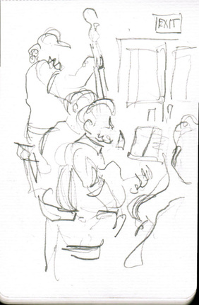
Later I ended up at Huey's, my semi-regular Sunday hangout. I've been going for many years now to hear music on periodic Sunday afternoons. If a band I like is playing, it's my favorite part of the week -- hearing great music, seeing friends, having a glass of wine, just relaxing in a happy place. Today was a new band to me, Le Tumulte Noir. It was only their second gig. But with familiar musicians like my friend Jim Spake of the Boyfriends and Lucero on sax and clarinet, and THREE (count 'em) gypsy guitars plus a fine bass player. Really great stuff. I was mostly hanging with friends and then my brother, but I did do one quick music sketch. Mr. Darcy and I have spent a lot of time like this this past week. I managed to sprain my ankle on Christmas Eve, so sitting up with it down on the floor at my work table is less comfortable than being on the couch just now. Mr. Darcy likes this new approach to working. He's been keeping me company very happily.
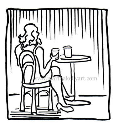
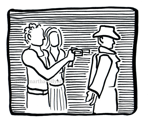
Above is a new letterpress block, and below are illustrations for the new e-book I'm working on called the Night Squad by David Goodis. This is my second project for the new publishing imprint called Chalk Line Press. |
online store Martha Kelly is an artist and illustrator who lives and works in Memphis, Tennessee. Get occasional studio email updates. Categories
All
Archives
June 2024
|
