 I stopped in St. Louis on my way home and spent a couple of days seeing friends, resting up, and doing a little sketching. I started the morning in Tower Grove Park with a field of small sunflowers, painted daisies and a strawberry rhubarb tart, and (of course) Ted Drewes. My favorite stop and such a funky, old time place to draw. 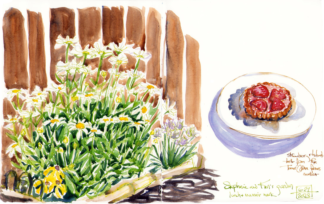 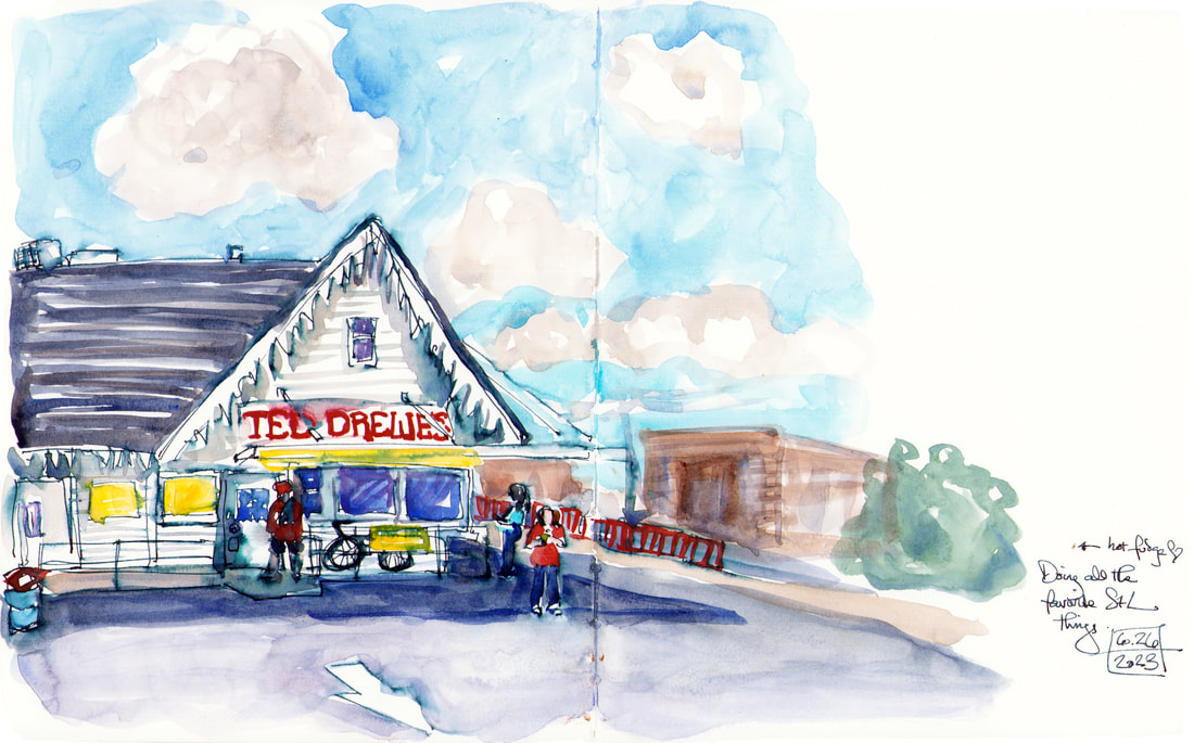
0 Comments
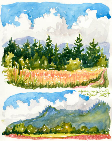 I've been working on two different book projects during my time out west and barely even sketching. Today I went for a walk in my favorite state park out here and took my sketchbook along and enjoyed doing a couple of quirkish sketches. Dip pen with a light green ink and watercolor on top. The line almost disappeared in the paint, but I'm reasonably pleased with both of them, and they were fun to do on a gorgeous day. It's been raining and freezing for a week, so the book projects were perfect for that stretch. Today called for sketching.
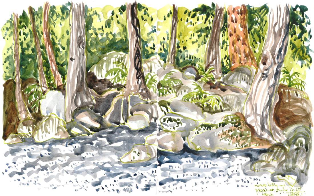
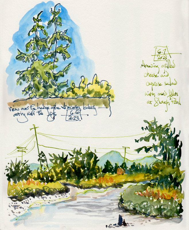
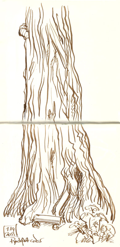
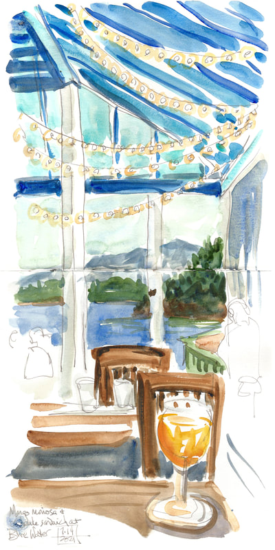
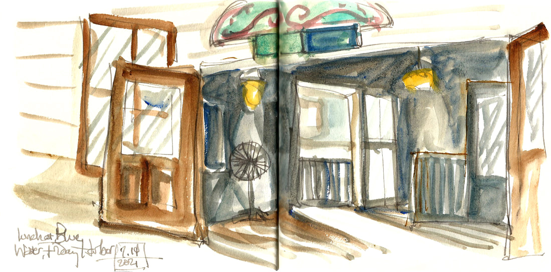
The second page is two restaurant patio sketches. The top is in one of my new favorite inks. It's a waterproof fog grey from DeAtramentis. I've had the best time using it for simple sketches with a watercolor marker for some fast tone. I've found that it's dark line that doesn't move at all, though, makes me feel like I'm using a coloring book when I put full paint on top of it. A ton of sketchers do waterproof ink and paint, but I find that I still like an ink that will melt a little and swirl with the paint. The second sketch (as well as the top one) is Diamine's warm, springlike green (either Leaf green or Spring green, I can't remember which), and I'm much happier with that effect. Vacation is definitely for trying new things, though, so mission accomplished on all fronts! Heres a small video of that beach and river confluence, just to share the beauty.   I've been working flat out on several corporate commissions this week, so I haven't had time to make any art for public consumption here (though that's a lovely problem to have). Here instead are a couple of small oils from the show at Eclectic Eye that's up in Memphis through January. These two are both 9x12" and $275. I have several small, Christmas present (for someone you really like) sized pieces in the show as well as some of the largest oils I've done in years. It felt good to stretch out to that size again (36x48"), but I've also deeply enjoyed doing the tiny, fast ones either from my sketchbook pages or from my recent morning walks while the memory is fresh. These two are from my summer out west. 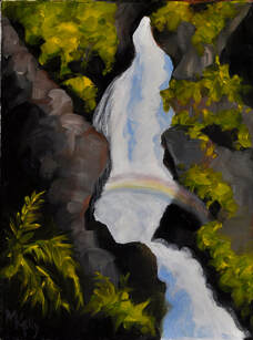 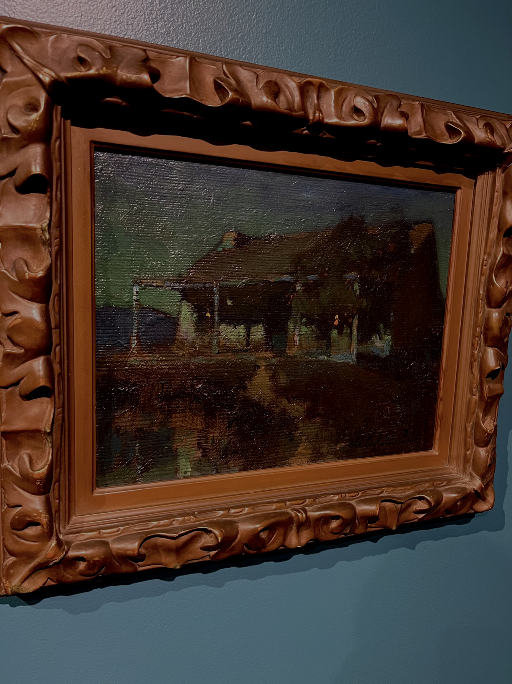 I’ve done a lot of carving over the last year, and I’ve done some printing too, but I haven’t at all kept up with the volume of blocks. So now is the time. I’m settling into printing at least the first batch of each edition for the WAMA show next year. Nicely I still have some months, so I can do it in stages and keep going on some more creative work as well. Friday, after my Thursday sabbath (see my last post), I printed the first 10 of this Skagit river print. It’s really detailed and delicate, and my regular, somewhat heavy paper was moving too much on the block as the press went across it, so I was getting blurry prints. I ended up choosing a lighter paper that will stick better to the wet ink and not smudge. I got 10 of 30, and that was plenty of work by the time I had puzzled through the earlier issues. Now I know, though, and the next batch will go faster. Then yesterday I cut a blank block the same size as my show poster, a carved poster print to celebrate the fact of a museum show. I did one for Dixon and am now doing one for Walter Anderson. When you get to put your name and a museum name together, it’s worth doing a print to celebrate. As I did with Dixon, I’m doing a bunch of different color tests. It’s fun to have some rainbow options. So yesterday I cut the background block, figured out the paper size, cut a stack of paper, and then made a diagram to keep the block carefully centered on the paper so I can layer two blocks and not have them weirdly offset. Then I stopped and played with my new dog a while. Today I did a whole series of different colored backgrounds (each one requiring multiple color mixing and blending the colors on the block itself with rollers). They’ll dry for a day or two, and then I’ll print the intricate block with all the lettering on top. I’m finding myself still in slow motion as I try to get back into my work groove. I think it’s been hard for everyone to stay sharp and focused through this whole pandemic period. So I’m giving myself some grace, taking more time off than usual, but getting one good printing session done each work day. I’ve got time, and that feels like a manageable approach for now, and I’m grateful to be able to do this. Last year felt very slow as well, but I ended up with a stack of museum prints and also a book I wasn’t expecting to do, so sometimes I’m doing better than I think I am on the productivity front. Anyway, for now printing, plus dog time and some pleasure reading breaks plus extra trips to Dixon during the Thiebaud show (which feeds my work in a roundabout way). Solidarity to everyone doing a little slogging at this point in the world. And gratitude to everyone managing to make a little beauty along the way. 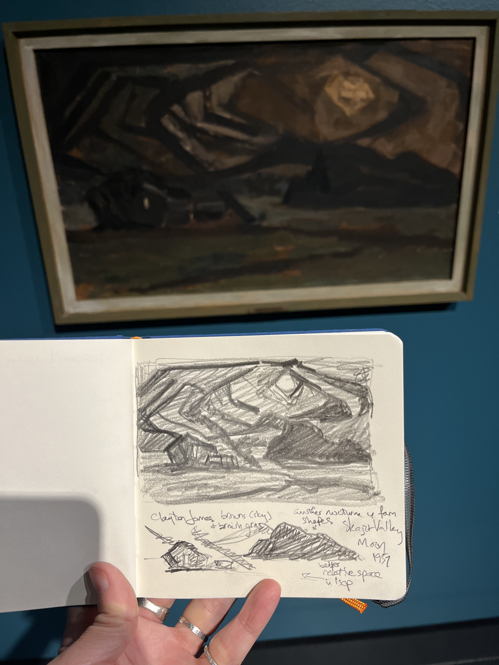 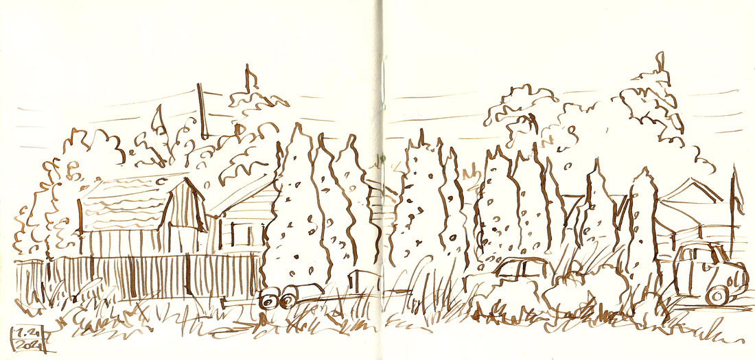 When I am feeling a little lost, I often buy new art supplies to play with. So I've done a lot of that this last year and a half. One of those has been a bottle of walnut ink from the Art Center in Memphis. I love having a really good, locally owned art store that will not only stock my specific needs for me (18x24" linoleum blocks instead of just 12x12" ones) but that also has a wide array of alluring things to browse and try and play with. If you are lucky enough to have such a store, please support it. Online ordering just isn't the same. So I came on this summer trip with a bottle of walnut ink and a very old dip pen that had been handed down to be and that has been sitting in a cup ever since, lonely and untried. I'm having a ball. The walnut ink nicely has a tight fitting top, and it rides around safely in the daypack with my art things, so I've been using it on site a lot lately. 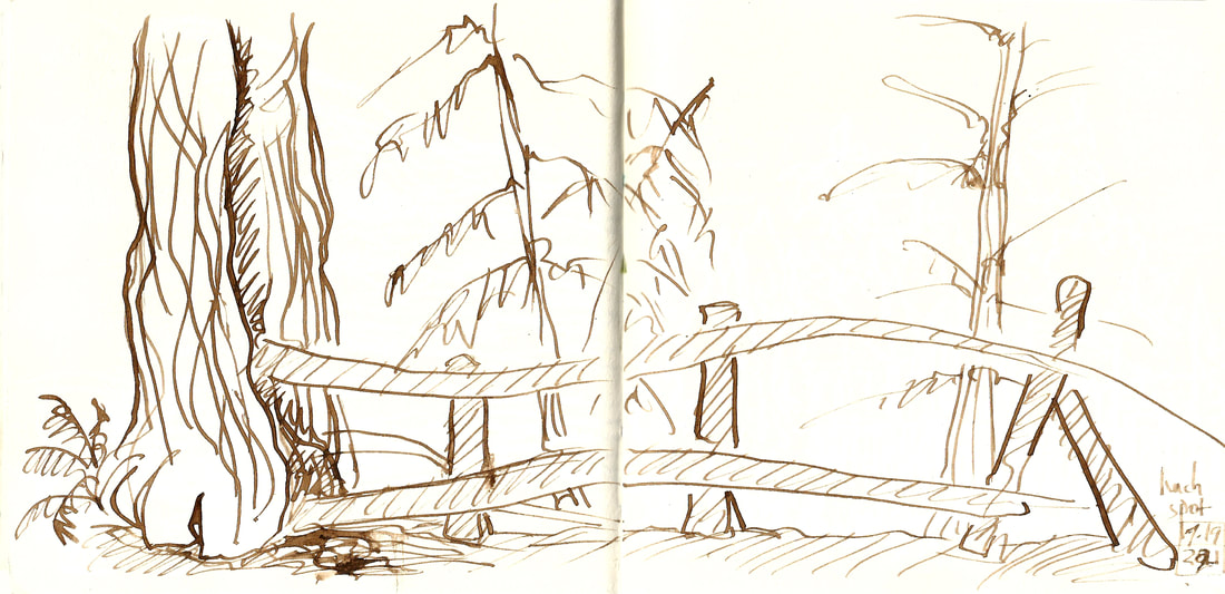
 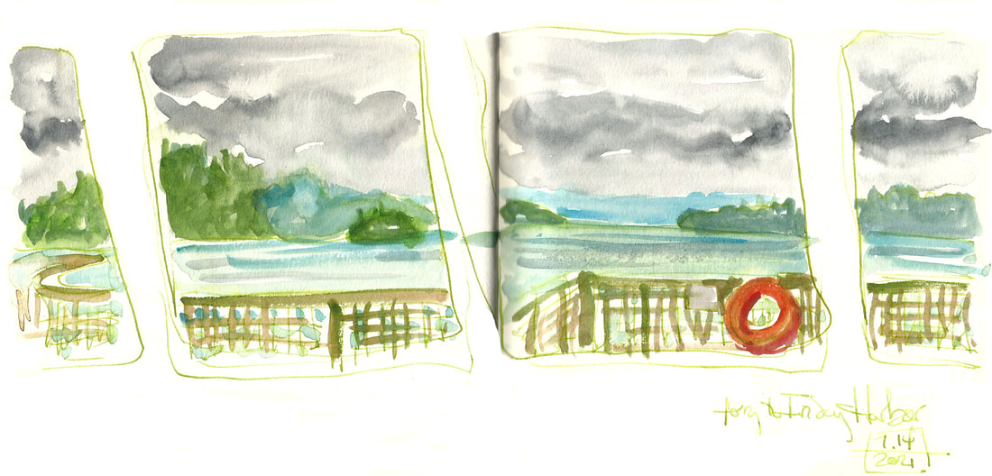  I'm slow getting these scanned in (it's been a somewhat eventful summer), so here is a report on one lovely day taking the ferry out to Friday Harbor in the San Juan islands back in the middle of July. Jude's cousin Liz, an artist and photographer and all around delightful person, was visiting, so it was the three of us. I sketched on the ferry the way I did several years ago. I've been doing passenger seat sketches this summer, and the ferry is about the best version of that -- not as fast flashing past everything, but a kaleidoscope of a changing view. Such fun. There were many more people in the way of the view in July than there had been in September, but it was still fun. I think my favorite ferry sketch was this simple one done only with green ink in a brush pen. 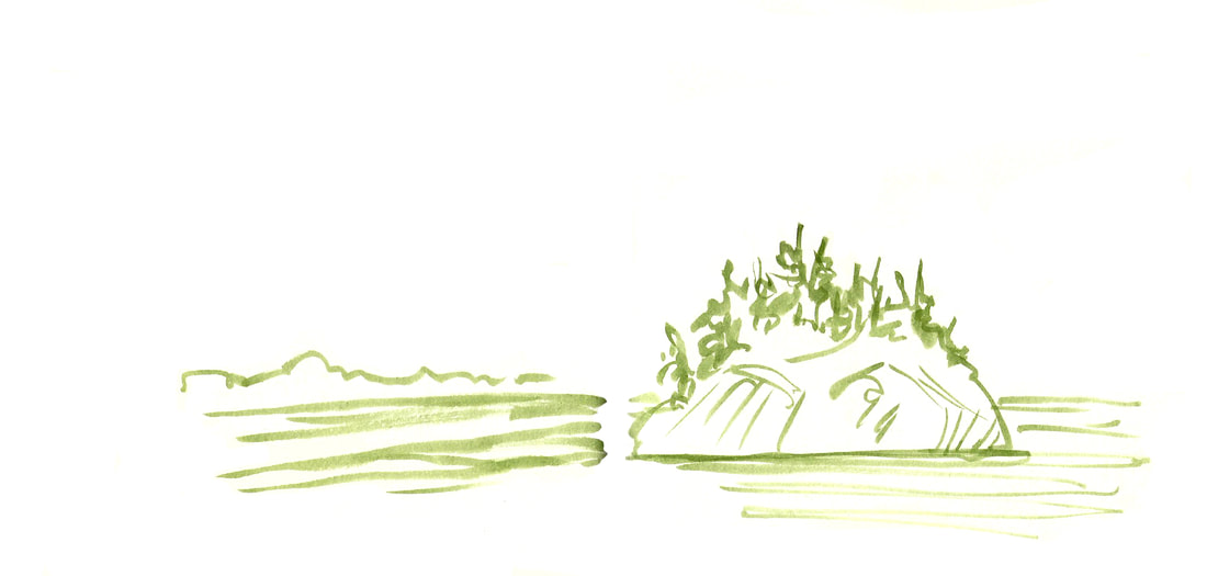
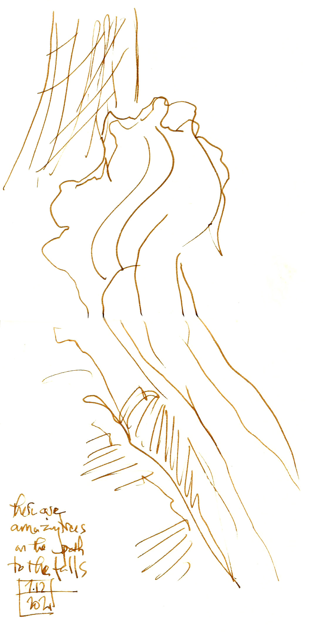
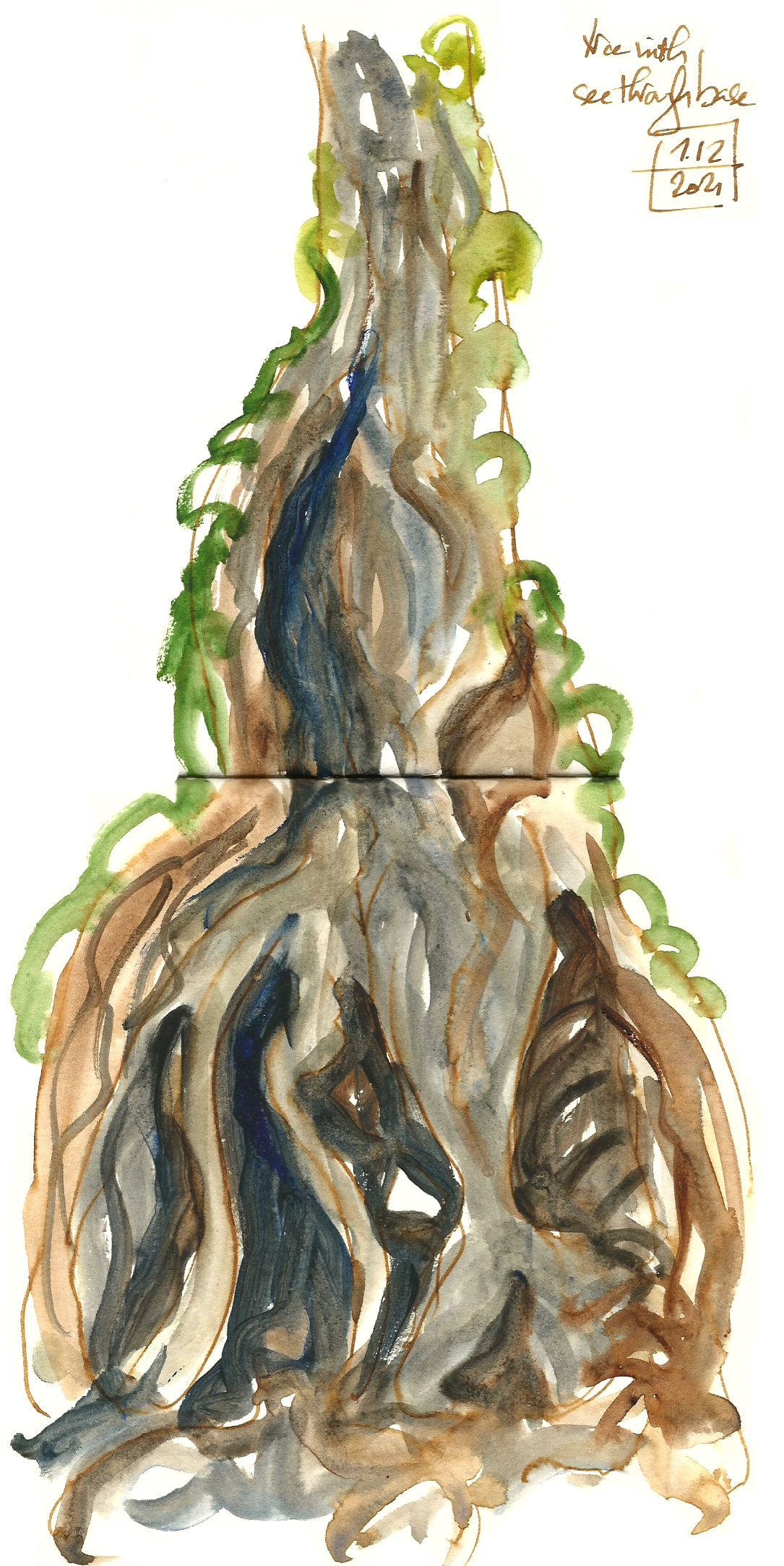
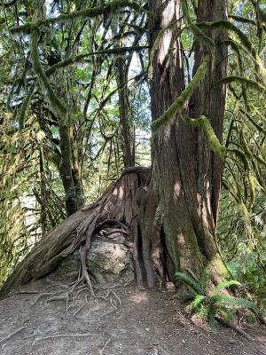
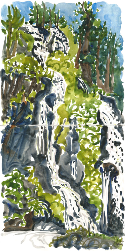
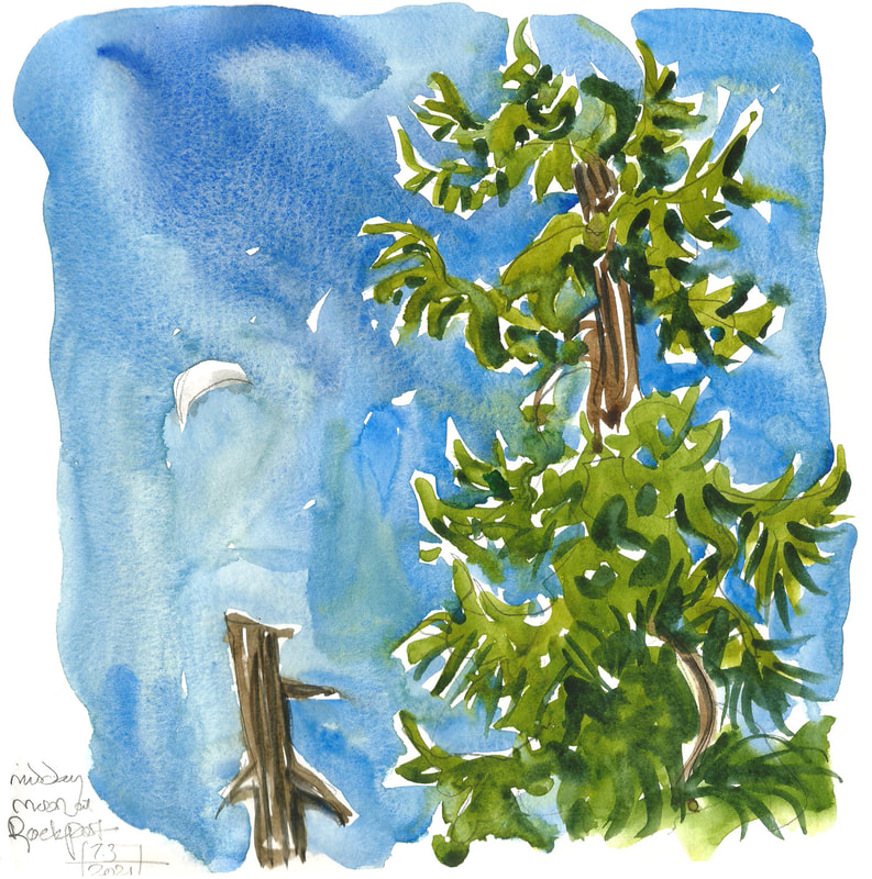
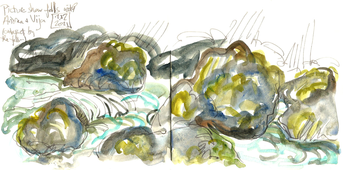
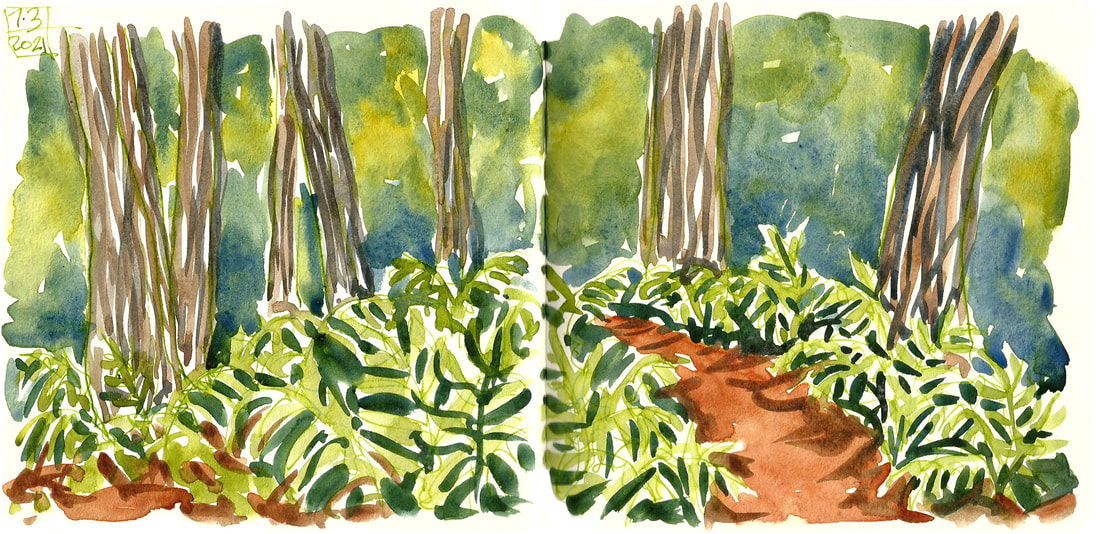
 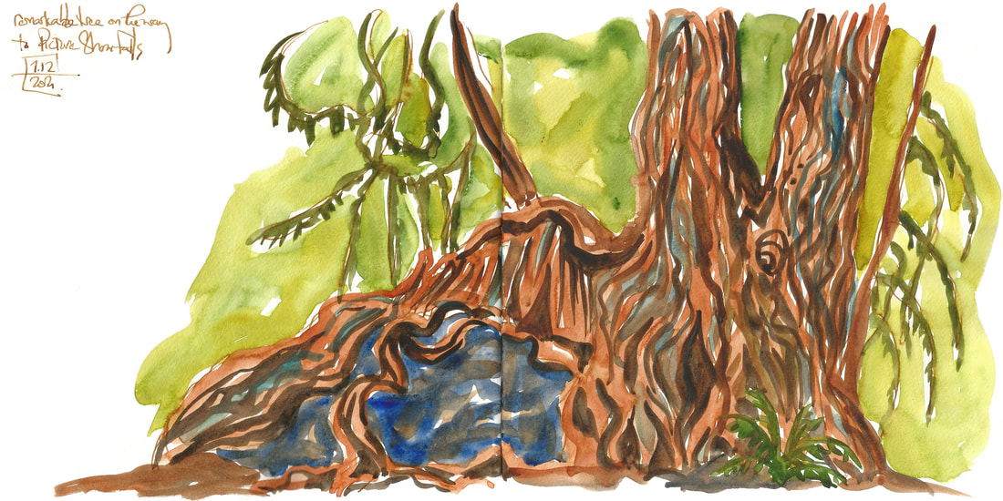 My last post was about Feature Show Falls, which was indeed a stunning feature (even if the name vaulted me back in time to my Rocky Horror Picture Show days). Almost as stunning, though, were the trees on the trail to get there. Especially this one, growing over a rock. After lunch at the falls, I left the others to explore a little further and came back early to sketch this one. Along the way I did a few other, much quicker sketches, of other gorgeous trees. Sometimes it's fun to just do line gestures and leave the paints in the box. 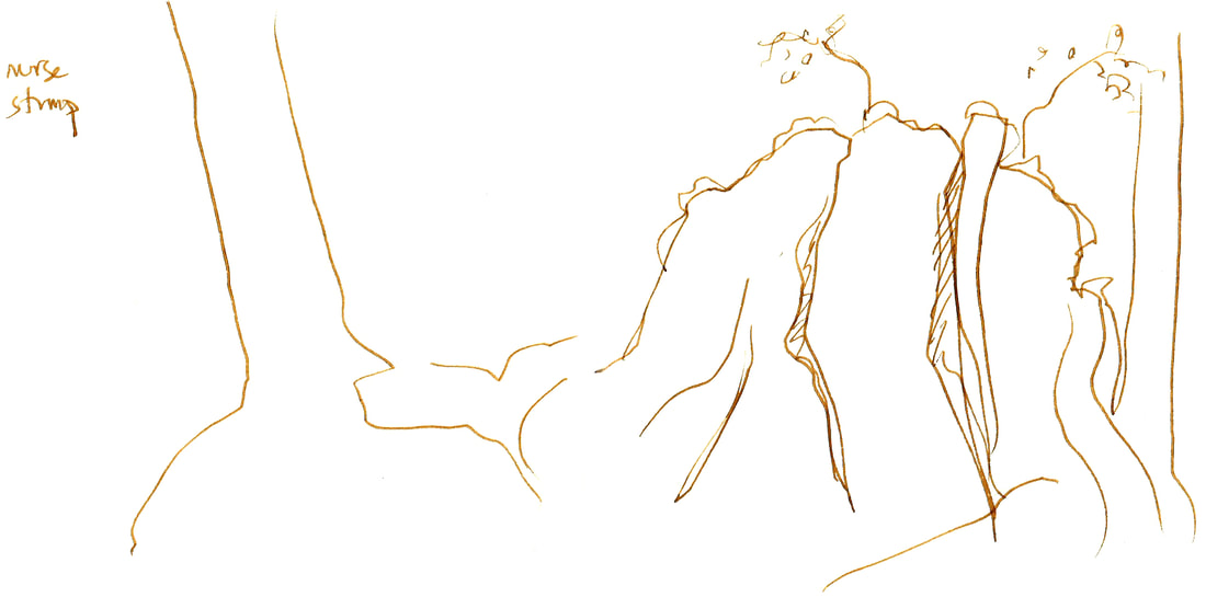
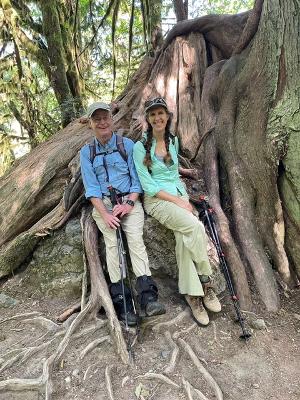
That original tree was so stunning, and my sketch of it so inadequate to convey its magnificence, that I'm adding a couple of photos from that day as well. The second one is for scale. It was just remarkable.
 |

online store Martha Kelly is an artist and illustrator who lives and works in Memphis, Tennessee. Get occasional studio email updates. Categories
All
Archives
June 2024
|