 It took me getting to Washington to get to a scanner and clean up my St. Louis sketches. I love to draw there and did some smaller, faster sketches as well as full watercolors. This first one is walnut ink with a dip pen of an Osage Orange tree. They always grow in such fascinating shapes. I also got a fantastic blueberry/lemon curd crepe from a food truck creperie that flashed me back to Paris. I loved both the food and the fun little bus, so I did a sketch to remember. 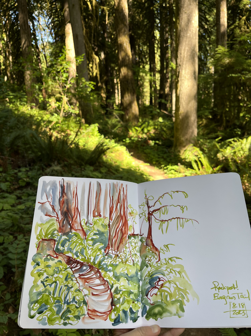 There was also a great book signing at the graphic bookstore Betty’s Books. Beautifully they got in an art hero of mine Lucy Knisley. I found her first graphic memoir An Age of License some years ago, and it (plus my first Ben Hatke book found at the same time) made me want to include more storytelling in my work, which had been purely landscape up until that point. She had a huge influence on my work, and I trace a direct line back from her book to doing several of my own, even if they’re quite different in feel. It was fantastic to hear her talk, meet her in person, and see her delightful hand painted cat dress. 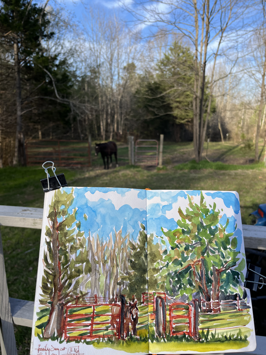 One more lovely day in town was revisiting the St. Louis Art Museum, another favorite place. They had a Vuillard I don’t remember from before on view this time, which makes sense because it’s on cardboard and probably needs to rest for preservation purposes in between times out in the light. I love his patterned interiors and interlocking shapes and had fun doing a sketch while standing in front of it. 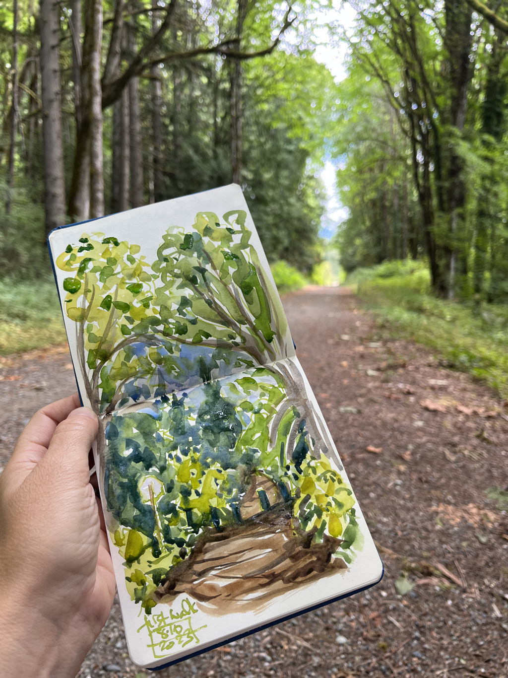
0 Comments
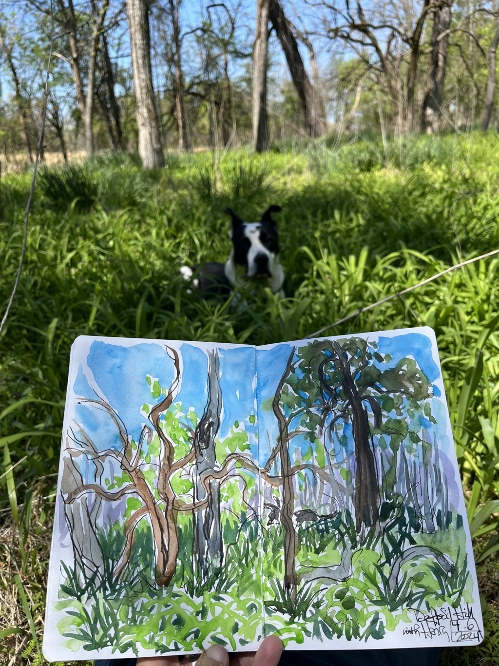
 I have always loved those golden age British mysteries with a map at the front. Probably because my dad collects maps and often hand drew ones for us to follow along with from the back seat on family vacations. Since all the trees in the exhibition at Rowan Oak are actually on the grounds of Faulkner’s home, I thought it would be fun to give people the opportunity for a self guided scavenger hunt to compare the prints with the originals. There are no prizes, but if there were, there would definitely be extra credit for Portrait III, which is by far the trickiest to spot.  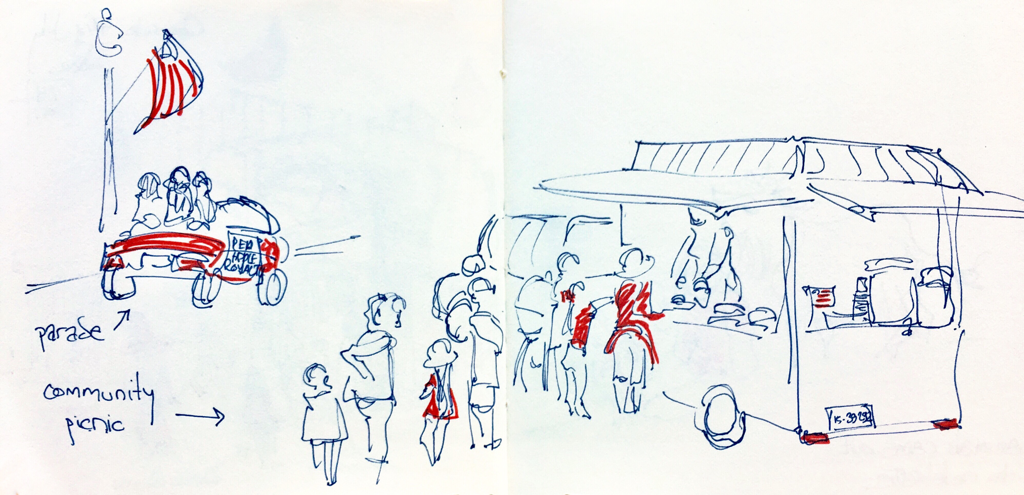 I’m doing some sketching in Tower Grove Park in St. Louis. My favorite park away from home, and it’s such a pleasure to walk and sketch here.  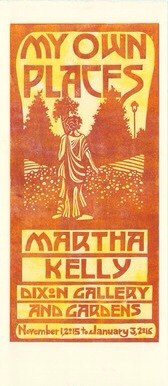   I've been working hard on the show the last few weeks, but I have taken the time to meet some friends for sketching several times recently. It's good to get back to the immediacy of watercolor after prolonged time doing prints. These sketches are from Crosstown (above) and the shady back deck of Memphis Pizza Cafe.   WKNO fm kindly hosted me again today (thanks, Darel!) on their daily Checking on the Arts show to talk about the Faulkner's Trees exhibition at Rowan Oak and a little bit about my newest book, a small paperback called Portal. You can click below to listen. It's always fun to get out and talk to Darel about my mostly solitary work.

I will get it in a frame and have it ready to hang with the rest of the show on Monday. I've also carved and printed a small gallery card for folks coming through the museum to pick up and have my information available. This is one of the handful that print two tone when I add a second color once the first is established. I love the variegated effect. I usually get three or four of these before the inks blend to a solid color again, so most of the cards will be a little less wild, but I always love these the best.
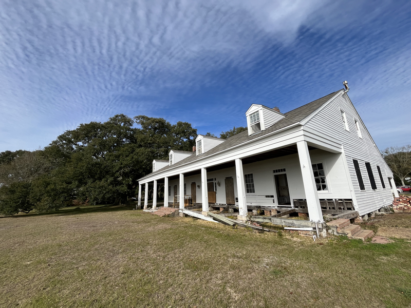
 I had SUCH a good time staying at this tiny cabin right by a small river. I sketched and read and sketched some more. It was perfect. Here's the second half of the sketches from my two night retreat.    I've given myself two small vacations/exhales in the past month instead of the longer trip I had hoped to be taking by now. I've mostly been nose to the grindstone on the Rowan Oak show that hangs this month, but I did take two smaller trips recently to relax and exhale. The first trip was to a cabin just outside Mountain View on the site of the Herpel P.O., right along a small bayou with large stones sitting right down by the water. I sat out there with my sketchbook, journal, and book. I had every meal sitting by the water and watching the birds. And I walked up the quiet road with my sketchbook to visit more wonderful trees. It was heaven. This is the first batch of those sketches. I was there two nights and part of a third day, and I sketched a lot after doing so much print work and missing my sketchbook.     I am late with everything right now, so here are the sketches I finally got scanned in from Hamlet a few weeks ago. It was utterly remarkable. Eliza Pagelle played Hamlet, and she was not only the finest Hamlet I've seen, but she also went to Juillard and played sections of Chopin at the grand piano on the stage throughout, which perfectly fitted Hamlet's self examination. Stephanie Shine directed with such warmth and humanity, bringing Ophelia in silently early on to establish the relationship before we see it distentegrate. The Ophelia/Laertes/Polonius family was deeper than I've ever seen, as was the Hamlet and Horatio bond. The early 20th Century costumes by Austin Blake Conlee were remarkable. I loved Nic Picou paired as Claudius and the Ghost, back and forth between his self important military outfit and a ghostly gas-masked Great War apparition, and his wonderful queen could have stepped out of a Fred and Ginger movie. Truly the whole cast was marvelous. I can't say enough about what this wonderful company is doing in Memphis.      My main work lately has been my upcoming Faulkner's Trees exhibition. I'm trying to get final prints of everything, get started on the framing, and finish carving the last two prints. I'm working slowly with my fatigue making an unwelcome return, but I'm chipping steadily away at it. We haven't set a hang date yet, and I'm grateful for Rowan Oak being flexible. It will go up some Monday in June so it's in time for the Faulkner scholarly conference that meets there in July. I'm so grateful to them for wanting my work for that. So carving and printing every morning while I'm fresh. There has been lots of tea involved.  I've got the first couple in frames already. It's nice not to leave all of that till last, since it's my least favorite part of the process.  This is the last piece I'm working on. It's three colors, and I'm carving on the last block now.  |

online store Martha Kelly is an artist and illustrator who lives and works in Memphis, Tennessee. Get occasional studio email updates. Categories
All
Archives
June 2024
|
