|
I’ve been slowly working on proofs of this piece, since you have to leave the first layer to dry overnight before adding the second one. It’s from a sketch I did a bit over a year ago in Ocean Springs, the trip where I got on their calendar for an exhibition. I want to have a number of my own home places in the show, since that’s what Anderson did, but I always love sketching down there and would like to have a few pieces where I interpret the landscape his work sprang from in my own voice. I hung out on the pier sketching a good bit, bundled up against the wind since it was January, but land-locked folks need to take advantage of the coastline when they manage to get there. I’d actually hoped to be able to be down there a good bit more while preparing for the show, but none of us saw COVID coming, so I’m still working on early 2020 sketches.
You can see the top print set against the first one I did, which was too dark, and the second one, which was too light. It’s been a bit of a Goldilocks situation working my way toward “just right.” I want to try this level of blue with just gray clouds. I’m of a divided mind about the pink. It’s fun to be able to try different versions before printing the final edition. I’m always impressed with the printmakers who do reduction prints, which means they lay down one color (usually the lightest), carve away more of the block, lay down the next one, keep carving, and repeat. I’d have had the blue layer too dark, and the whole print would have been wrong. I just can’t imagine it before seeing it on paper, so I tend to do a separate block for each color, and that gives me a lot of options. And sometimes it’s fun to play later with a completely different color scheme.
0 Comments
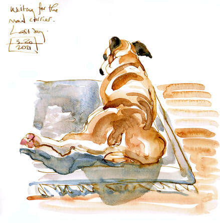
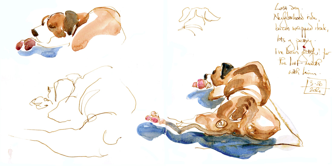
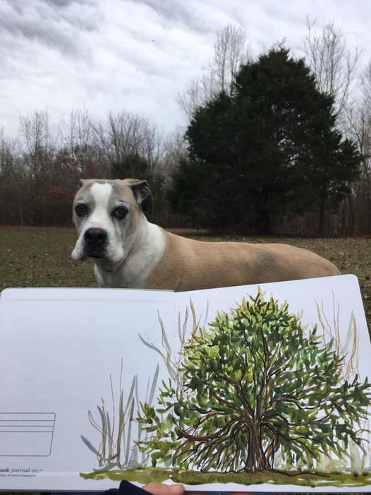
We had a couple more farm visits before Mr. Darcy hit the point where he was dragging too much and not wanting to eat the things he had formerly loved. It was apparent it was time, but I was so grateful for one more day to ride around with his head out the window, have a little steak, see a couple of loved people and sit in the sunshine with lots of pets and kisses. It was a good last day, and I'm so grateful for how peaceful and sweet it was. I miss my studio helper and muse, but it's the deal you make getting a dog. The timeline is uncompromising, but the rewards are enormous. I'm so grateful to have had him as a companion as long as I did.
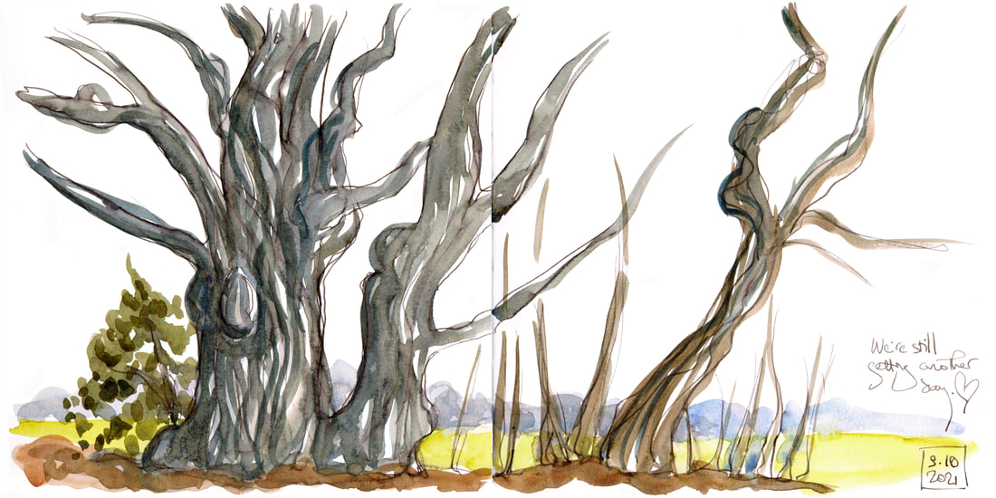
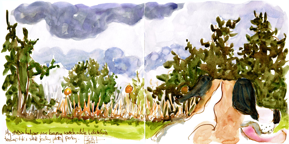
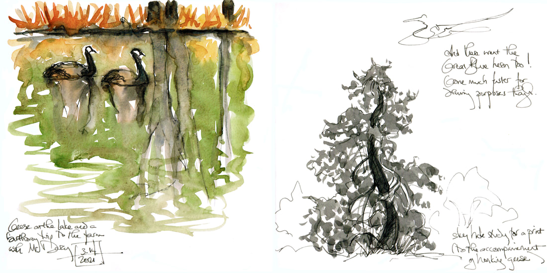
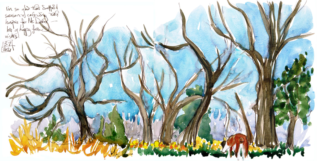
Hospice for Mr. Darcy continues with almost daily farm visits. It's his favorite place, and he enjoys the ride with the windows down, sniffing out the window, as well as the actual walking time. It's also the best place for me to be able to evaluate how he's feeling. Plus I'm doing a good bit of sketching while we're there and getting some good print ideas going. It's definitely some time away from my main work, but I'm grateful to be able to be this flexible and really enjoy this last time with my boy and main muse.
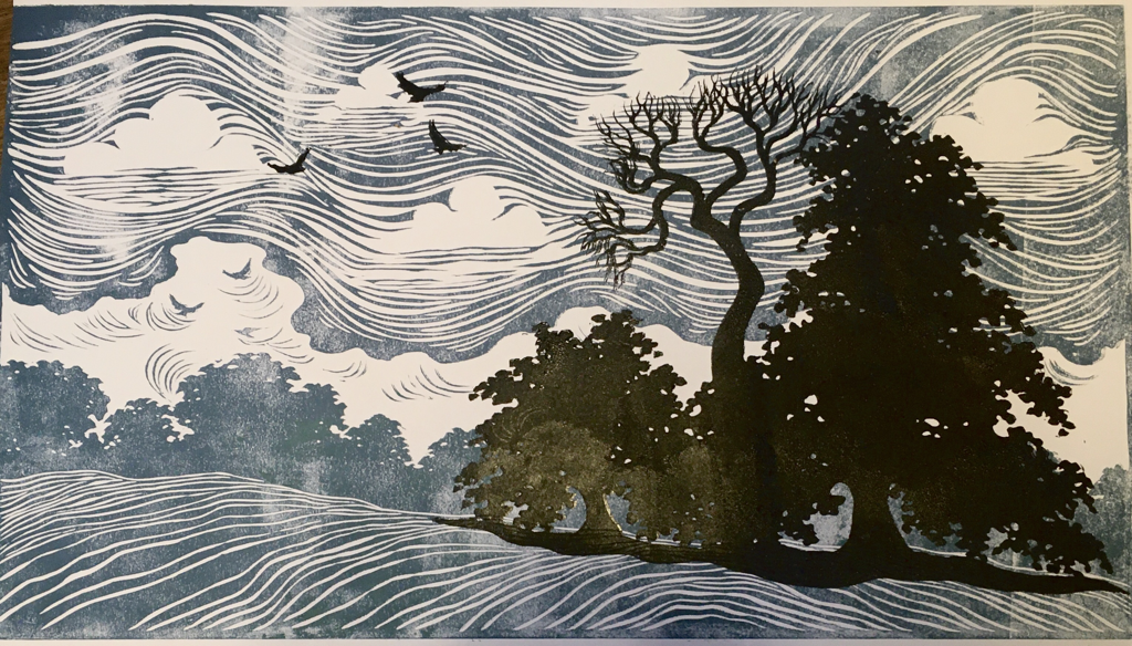
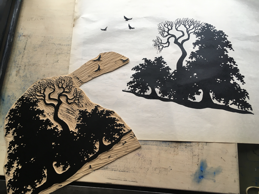
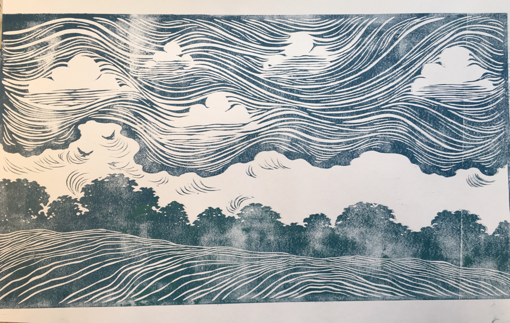
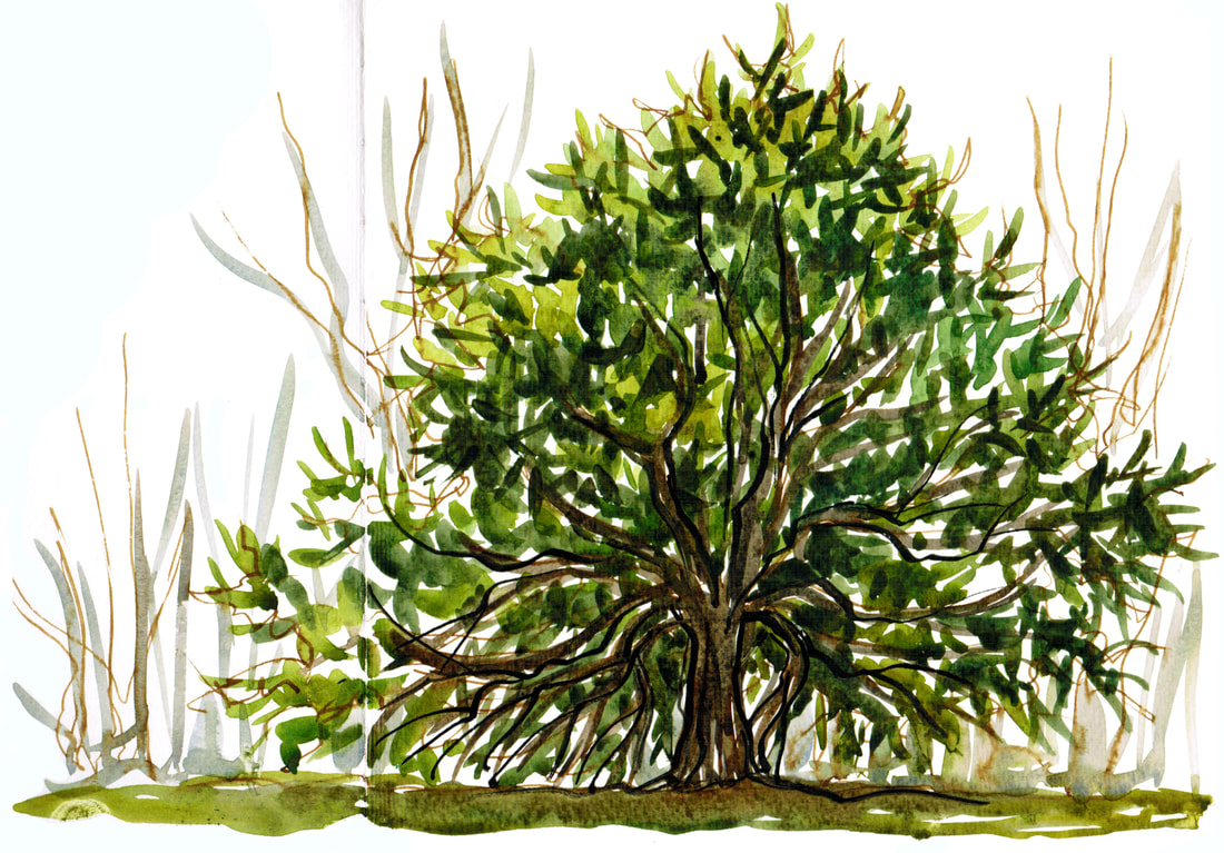
I've been trying something different with my current print. I usually do a square frame for the key block (the usually black one on top) as well as for any colored blocks underneath. Lately I've been doing some trees that are cut out around their forms in a vertical arch background, and I thought it might be fun to see what such an image might look like in a landscape setting. I did the background in a blue/green and then printed the trees on top. I'm quite happy with the results overall. I'll get a better (less rough) version of the blue green block and clean up a bit of the sky, but I like the depth the foreground versus background have, and I'm going to play with this idea again. You can see the layers separately below, along with the tree block trimmed for printing. This is planned to be part of my WAMA show, Feb. 28 to Sept. 4 next year.
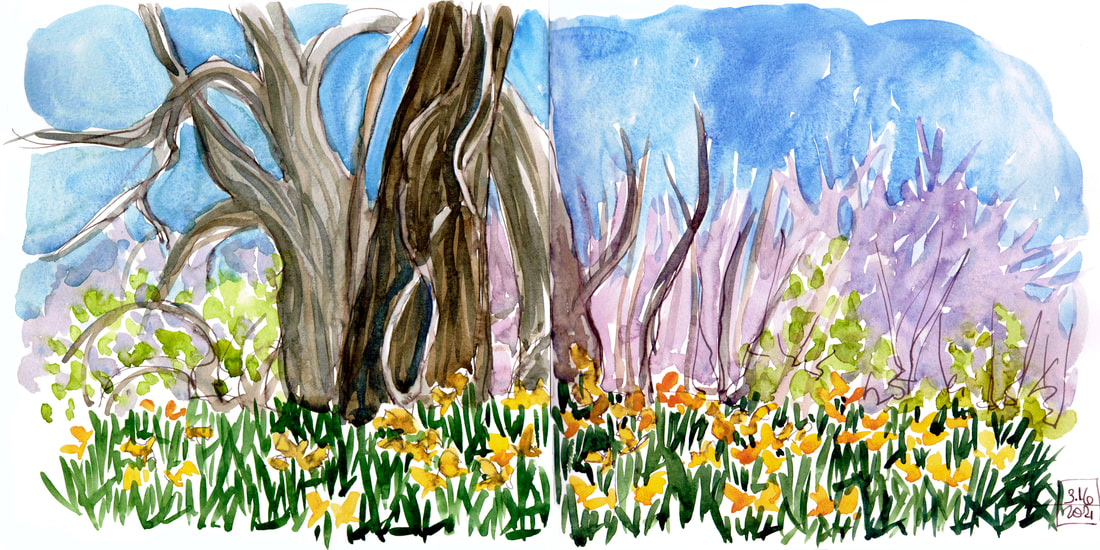
We're trying to go to the farm every other day for joy. I'm so glad the daffodils are blooming during this period. It's been lovely to bring home a fistful of sunshine from these trips. I've been sketching around the farm, and today I decided to draw the daffodil hill itself. With a really quick, sketchy Mr. Darcy. I refilled a couple of fountain pens with favorite ink, so it was fun to use this cacao de Brazil ink that I haven't used lately. I've never been able to get a sketch of the daffodils that does them justice, but it's fun to try.
|
online store Martha Kelly is an artist and illustrator who lives and works in Memphis, Tennessee. Get occasional studio email updates. Categories
All
Archives
June 2024
|
