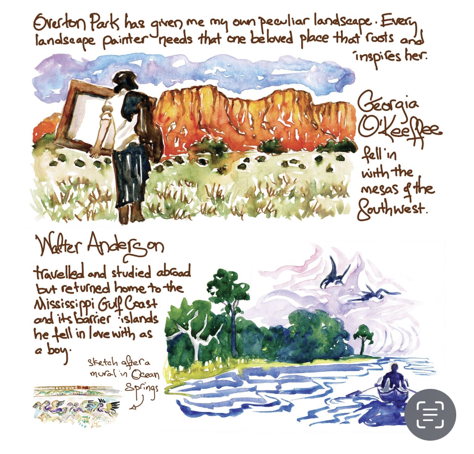
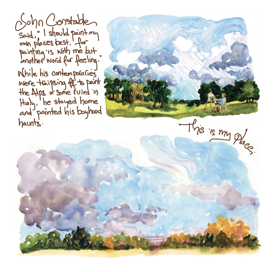
I’ve been doing a bunch of book work this week since getting the Apple pencil. It’s taken a bit of getting used to, but is so much better than scanning in and cleaning up huge blocks of text. I can also play with it and change sizes, wrap it around images, etc. It feels much more immediate, and while I’m working to keep my handwriting legible, I hope that energy will translate into the book. I see that the pencil somehow migrated in color a bit, but overall I’m getting the hang of things and am grateful for this new tool. This is a double page spread. Georgia and Walter were in the Oxford American essay, but no one who knows me will be surprised to see that I added Constable now that I have a bit more room. He’s my number one influence on work habits and art philosophy, but OA is about Southern culture, so I leaned into American artists for it. I’ve got a few more watercolors and a back cover to do, but I’m getting close. I forget how very much longer all this takes than I think it will, but it’s always worth it to have a book in my hands.
0 Comments
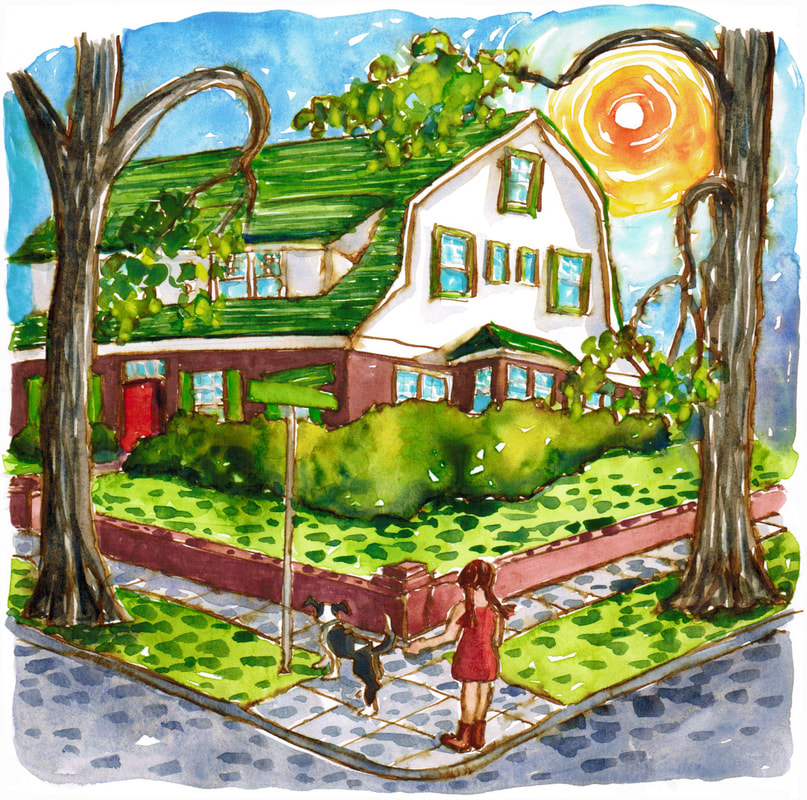
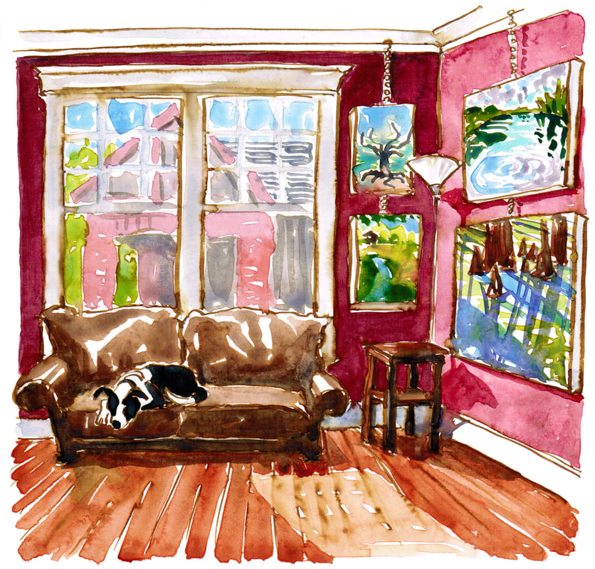
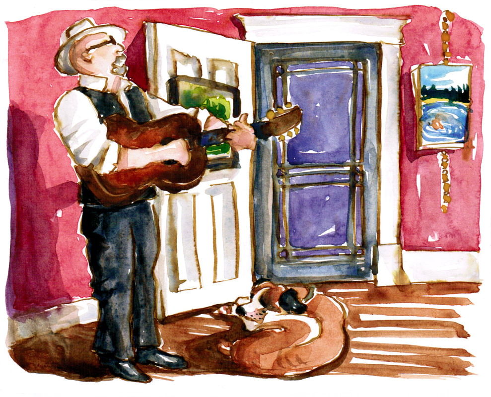 One of my big projects this year was the Oxford American graphic essay Memoir of a House. It's still on the new stands in the Summer issue, but once the Fall issue comes out, I'll be free to publish it as well. I'm expanding it just a little and making it into a book, which I plan to have out before Christmas. I'm adding in maybe a dozen more watercolors to go with the 30 that were in OA, with a few more tidbits about the history. One bit I'm adding is more of how I use my front room. It's always a gallery, but it has been known to double as a dance hall or a space for house concerts. The inimitable Joe Newberry played his songs and told his stories with Mr. Darcy lying at his feet, and I wanted a sketch of that moment for the book. I've also been known to have swing parties with a live band, as part of the local contra dance weekend we used to put on in town. It's been fun to revisit and expand this project a bit. 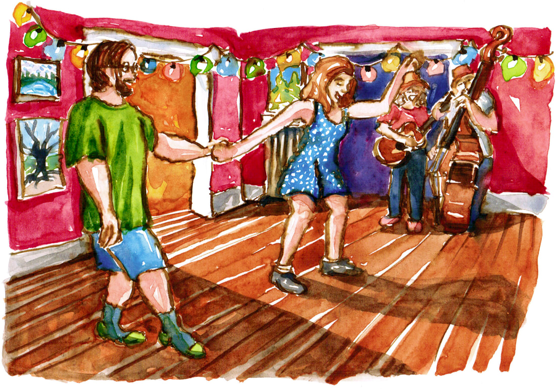
Oxford American is on newsstands and in bookstores (Burke's and Novel locally), and my essay is also up on their website. I'm so delighted to see it out in the world! It was a great pleasure to have a physically small winter project to do through the worst of my long covid. I could be on the sofa, under a fuzzy blanket, with Henry on my feet, and work on the 30 small watercolors while watching British mysteries. It meant so much to have a hopeful, exciting project that was also manageable for me. I'm still not standing up to do oil paintings, but I'm back to doing a bit more print work again. This essay saved me through the worst of being able to do none of my regular, much loved activities. WKNOfm hosted me to talk about the essay (and to announce my next big project), and that interview is here. They do such a great job supporting a whole range of arts in Memphis. Here is one more painting from the essay. I had such fun doing a small portrait of Georgia O'Keeffe in her adopted landscape. 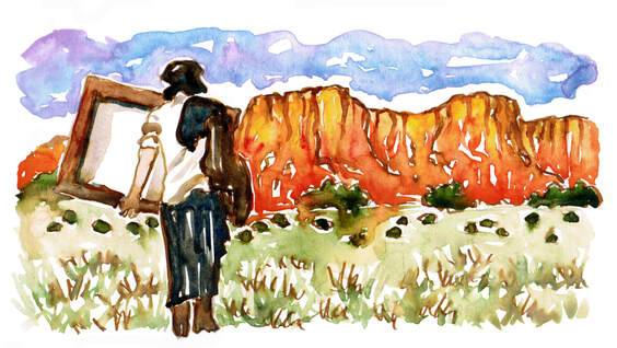 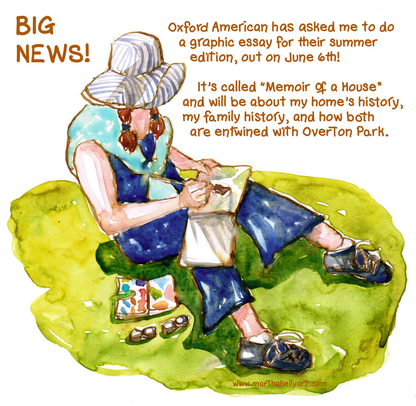 Y'all, I'm so excited. I've been head down working on this for six weeks or so. And it was amazing to be asked to do this. I had sent them my Greensward essay a couple of years ago, which found a quick home at Memphis Magazine, bless them. Then in late January, one of their newer editors was going back through old submissions, said she loved my style, and asked if I had any more stories to tell.
I've done over 30 sketches since we got a general direction in mid-February, and it's just about to go off to the copy editor and layout folks for approval. The last step will be for me to hand letter all the text to fit into the correct spaces, but I'm ahead of a pretty tight deadline. It's so good to know I can work this quickly when I need to. I'm still struggling with long Covid fatigue, and this has been the just the right project for this spring. It's all small enough to do sitting down and even in my lap on the sofa, but it's new and exciting and something to look forward to. So perfect. 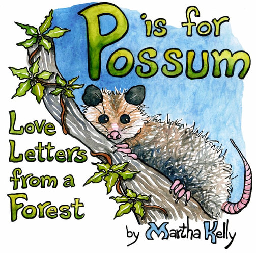 Darel Snodgrass kindly had me on his Checking on the Arts show again this week. I'm so grateful to WKNO fm for promoting artists daily on the radio, everyone from dancers to musicians to actors to visual artists like me. I always get great ideas about what's happening in the community and new shows I want to see (in normal times). And he always pays attention, knows your work, and asks good questions. It's such a fun time to be invited to talk about something you love. So check out the interview if you live outside Memphis and didn't get a chance to hear it. I talk about making art during the pandemic, sketching in the Old Forest, the general awesomeness of local bookstores, and my upcoming show next year at WAMA. Burkes Books and Novel both made sure they had a stack of books ready for when this went on the air, and you can also order copies from my online store. All of these copies will have an individual drawing in the front as well as a signature. I've celebrated by making each one special, since having a book to sign is such a delight. 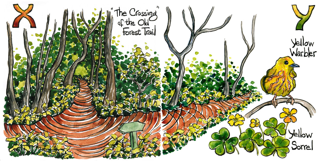 One of the crazy fun things about having artwork at Dixon Gallery and Gardens is being able to go out and do a tour on various afternoons. For me, as an artist who works mostly at home in solitude, it’s great fun to get to dress up, go out in public, and talk about art, ideas, and where my work comes from. I love getting to answer questions and see folks interacting with my work. This year, of course, things are different, but Linley Schmidt taped me (outdoors in the cold, bless her, because I didn’t want to take off my mask indoors, and I’m terribly muffled talking with it on) in the gardens and shared this video for a virtual “tour.” It’s a little harder to just wind up and go without questions or feedback, but fortunately talking is one of my comfortable places. And I do really love the chance to have to put into words the less formed ideas floating around in my brain while I’m working. It pushes me and clarifies my own thinking. Being in this show is a huge honor, and I enjoyed getting to draw the through lines from the St. John’s gospel back through the history of marrying art and text.
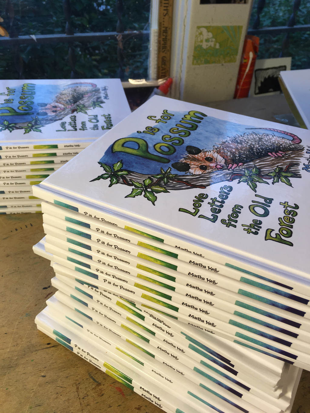
There was a huge stack of boxes as I stepped out to get my paper this morning. No warning, no email, but I’ll totally take it! I’m signing this morning and getting a batch of them off to Burkes. I’m also selling them on my website at https://martha-kelly-art.square.site/ The signing includes me doing a small sketch in the front of each book. I’m celebrating the fact that I have a book to sign, and I want to make it special for everyone. If you’re local, you can pick them up from me as well. Just holler. And thanks to everyone for their excitement and support about this. It’s been a great journey. 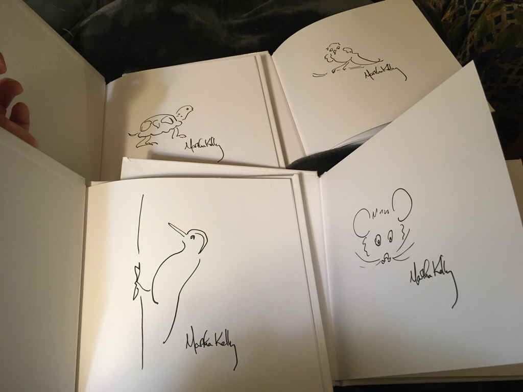 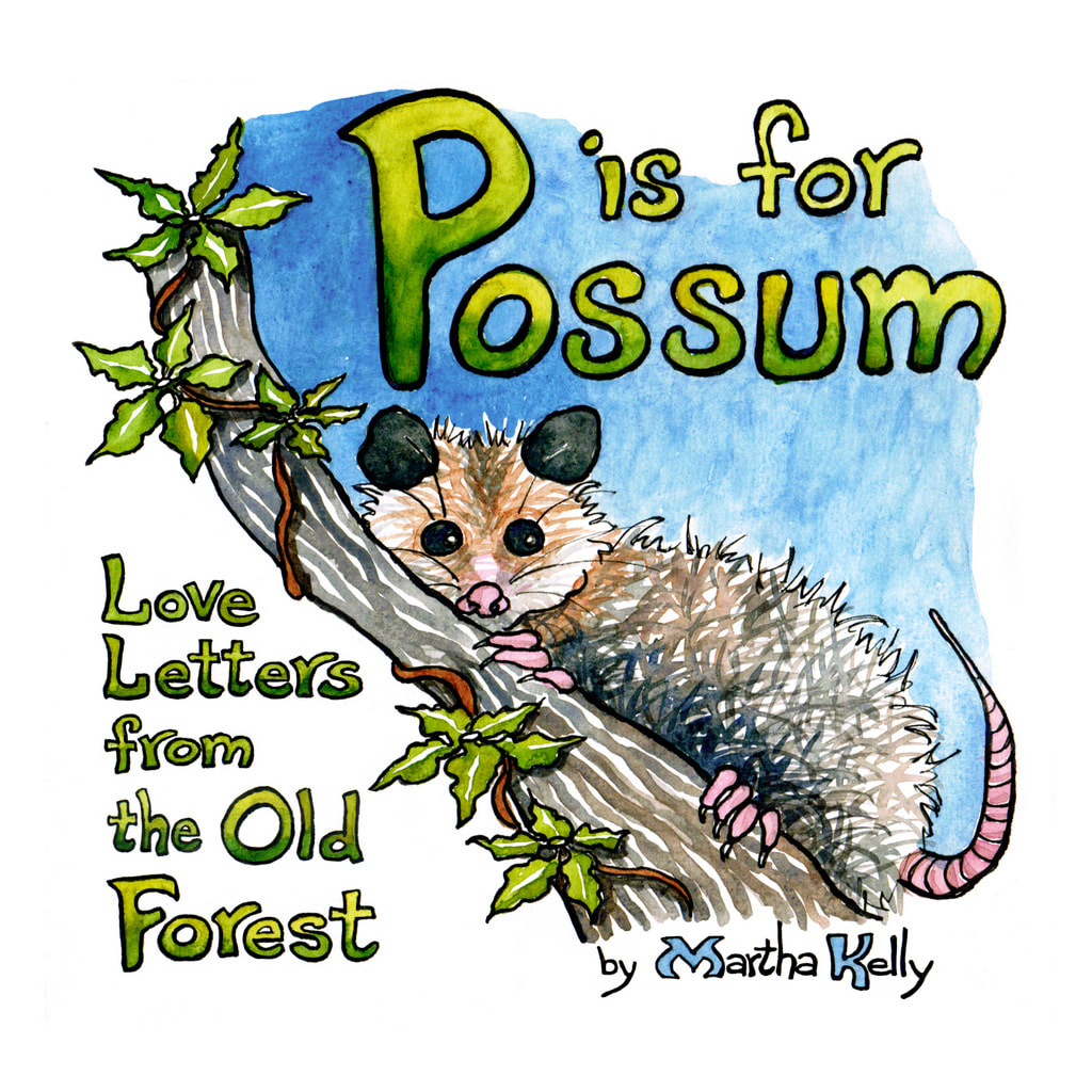 I've been working on P is for Possum non stop this week. My brain hurts from learning about Library of Congress numbers (mine came today!), ISBNs, bar codes, and hardest of all, the formatting needed to actually publish it. Yesterday I reworked every page to the specs at Ingram (margins, space left in the gutter, different color system, etc.) and reworked the cover.
Today I assembled the interior of the book into one file, lettered and did decorations for the spine, if it's big enough to take something (fingers crossed), and ordered the cover template. I've got to letter the LOC number and add it to my publishing info page, but I'm going to wait till tomorrow to assemble the cover (inside and out) into the template. Then hopefully I'll be able to upload it and order a hard copy to make sure all the margins and whatnot are right. When I get that in hand, I'll finalize pricing. I'm reluctant to do that before I see what it actually looks like, though I know I should be taking pre-orders by now. Next time around I'll know a lot more what I'm doing and what I'm getting. I'm a total newbie. My brain hurts, but it's also really exciting. Burke's Books, Memphis's 145 year old bookstore, is going to carry P is for Possum, and I'm so excited. I know them well enough to ask in advance, and Cheryl, the co-owner, has been really helpful as I finalize the details. Once I have a hard copy in hand, I'll be asking around a at other places too. Burke's has carried my calendars, given me a signing/print sale night for them, and even got in my Book of Common Worship despite it's not being available through their regular suppliers. They are fantastic, and I'm delighted that my first original book will have a home with them. I'm hoping other places that feature Memphis made things will also want to carry it, but Burke's has my heart. I've been cycling down there all year for curbside pick up of books to tide me through this crazy year. 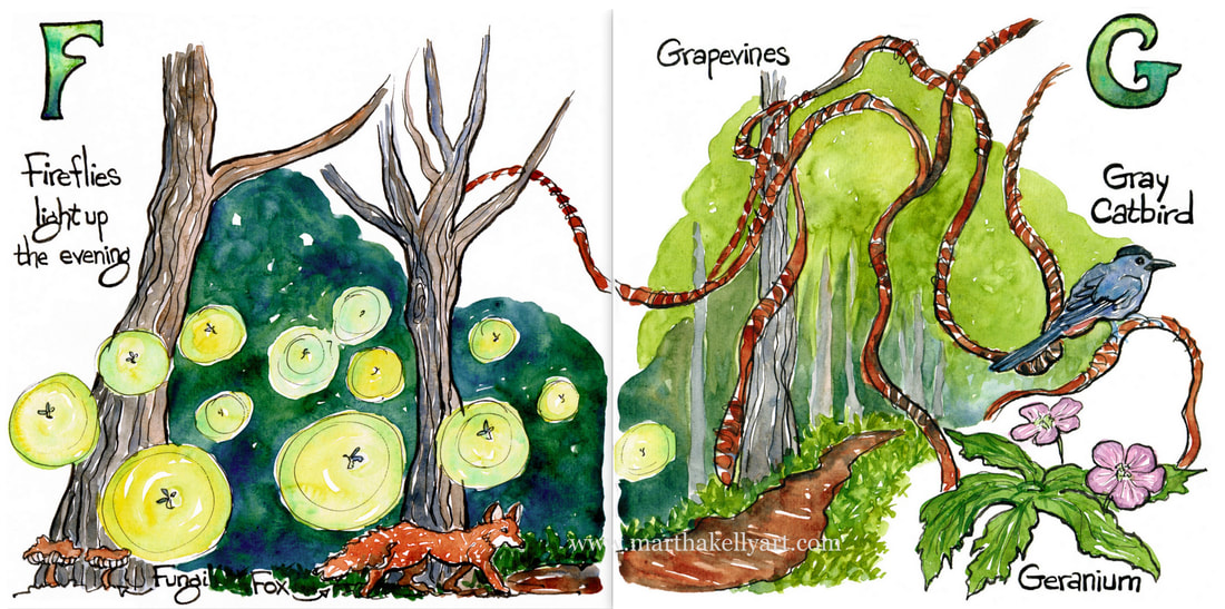 The book work has slowed down (and the journal work almost disappeared) as I've been trying to get the final layout/extra pages/last few letters done, and as I've started scanning in and cleaning up (mostly letters that got out of hand in thick fountain pen on bumpy watercolor paper). I'll have to do yet more digital work to put each on on exactly the right size file and make sure there's enough border and also make sure than ones like this with a little overlap will meet up in the right places. Definitely the less fun part to come. But I'm really excited and have drawn out all the pages now, with only three plus covers to color. It's coming. My printer is getting me proofs on the paper he intends to use, and then I'll just have to dive into the scanning more intensely.
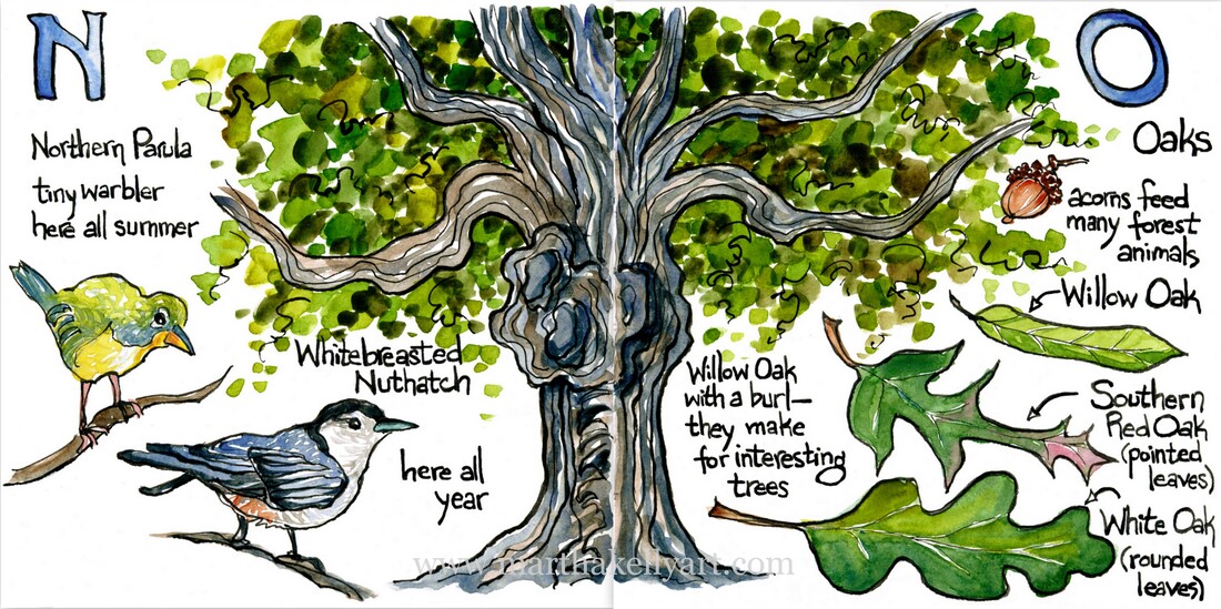 I'm feeling a bit back to my workaholic, immersive self for the first time since March. I've been getting work done, but it hasn't been that really deep dive that I'm used to. Then I got this idea, which grew from a combination of my Quarantine Journal and walking almost every day with my sketchpad in the forest. I've really been enjoying working on a new book project, even if I'm not sure where to take it when I'm done.
Plus this is much more portable than my printing press work. The weather has been flat out gorgeous this week, so I've been carrying out a whole stack of sketchbooks with years' worth of forest sketches to the table on my back porch. I've been sitting out there enjoying the breeze and the birdsong and doing this project. It's been a joy. |

online store Martha Kelly is an artist and illustrator who lives and works in Memphis, Tennessee. Get occasional studio email updates. Categories
All
Archives
June 2024
|