|
Cape Resorts is putting together its annual magazine that they hand out to their guests. They needed a surf board scene, and I'm in Florida dancing and visiting with sister and friends, so I got to so this one sitting at an outdoor table. I'll fly home later today, but its been a lovely long weekend away. 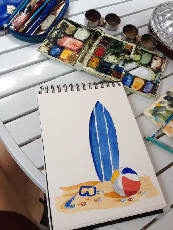
0 Comments
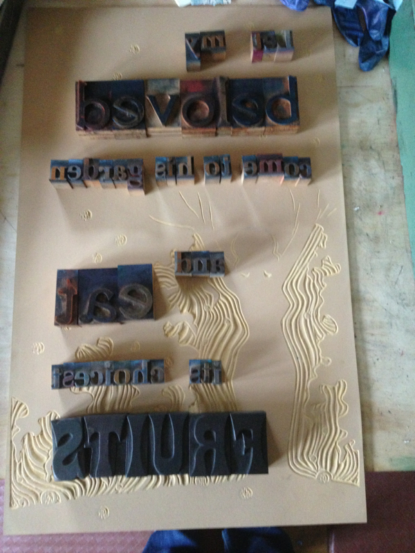
I used this block for a previous letterpress poster print, "If you don't want my peaches, don't shake my tree." But the original image several years ago was born out of the Song of Solomon quote, "Let my beloved come to his garden and eat its choicest fruit." I thought it would be fun to do that text with the wood type as well. First I laid it out on the block to get a sense of the placement. 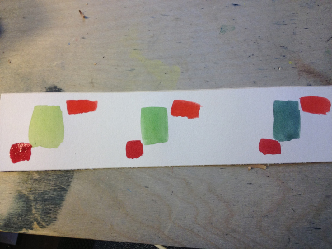
Then I did some color tests in watercolor. And once I settled on a green, I printed the backgrounds. Then I went dancing for the weekend and left them to dry.... 
Finally I set the type and locked it down into the press and printed on top of the background image. Here's the final product. 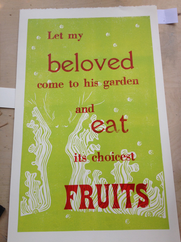
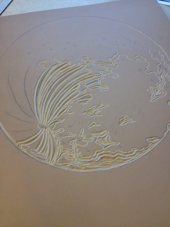
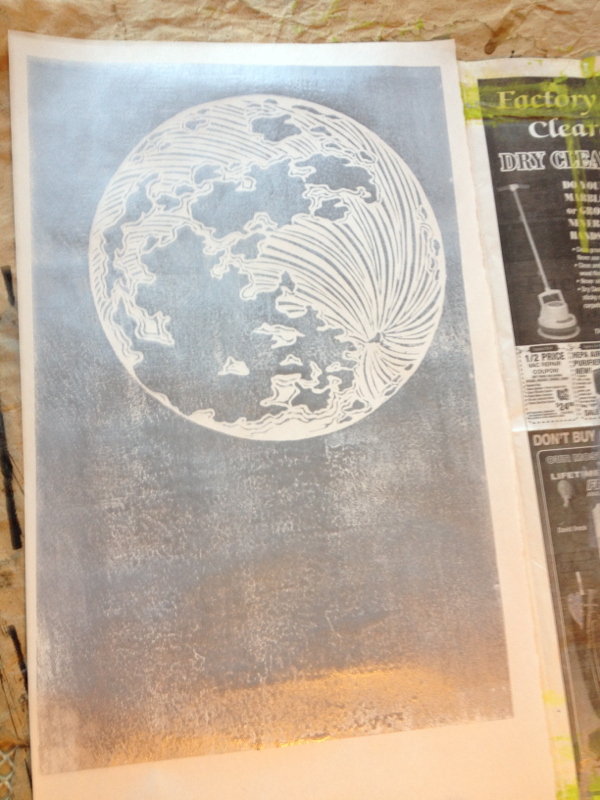
I've been slow working lately and am likely to continue to be so for a bit. I've been out of town a little, had a cold, and been stymied in my carving by a very dull gouge, the one I most rely on. I'm way overdue for my yearly tune up with all my gouges done by my toolmaking friend in North Carolina, and my most used one just got away from my ability to sharpen it. I'm still trying to learn to be better at that. So I took a break from carving the moon (above) for my next letterpress poster. I finally got back to it today and got to proof it (on the right). I'll thin out those lines a bit more, and then it will be ready to be a background for some more wood type text. I did some book-keeping, emails, packaging, and other uninspiring work during my break. I also went ahead and started a different letterpress poster (below). I had the block already carved, but I want to try it with a different color scheme and with different text. I've got the backgrounds printed now and just need to set the type, hopefully when I get back in town next week. 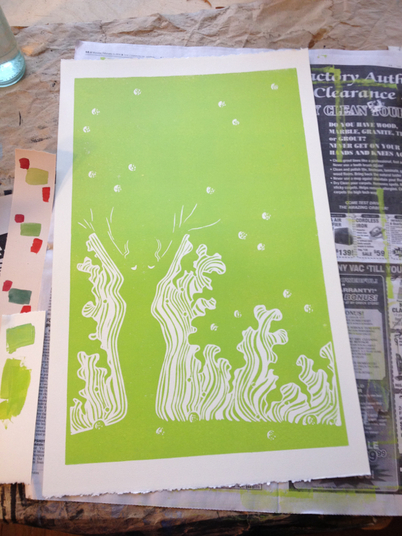
First, though, I'm going dancing this weekend with my sisters and assorted old and marvelous friends!
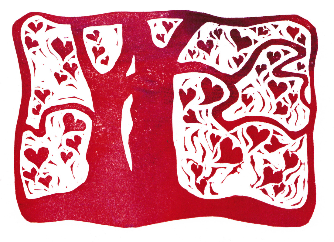
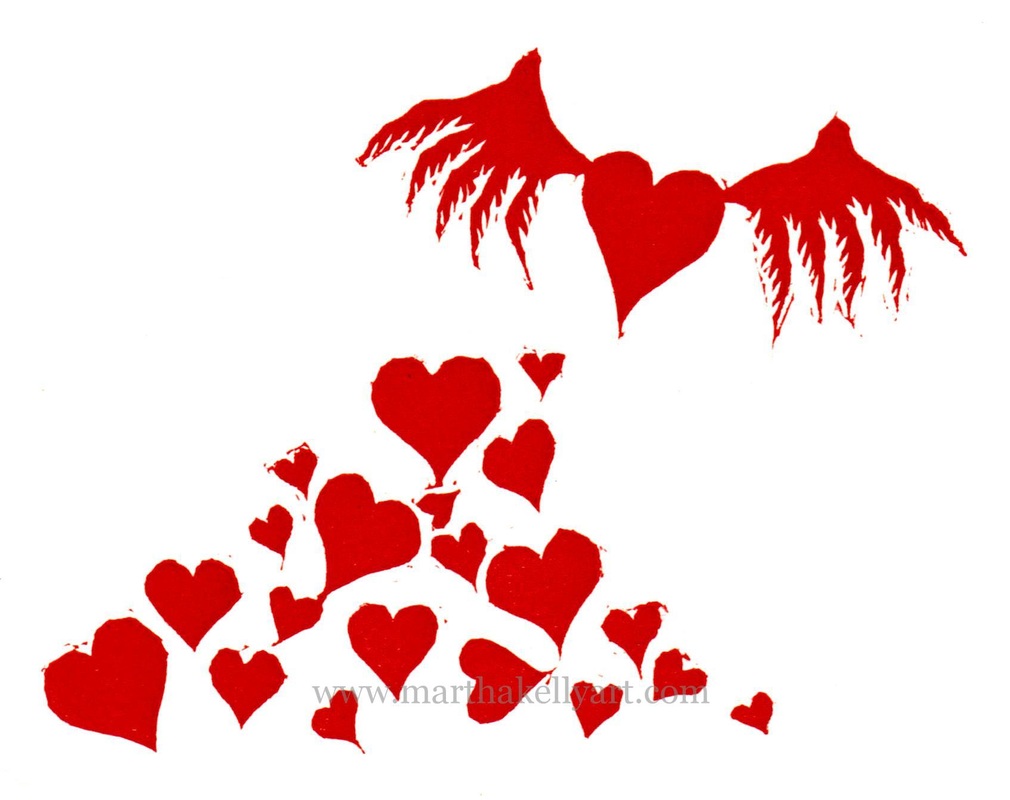
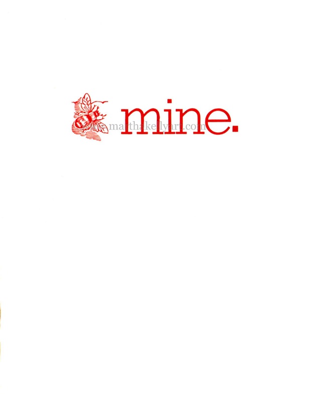
I got my beloved Chandler and Price press just on four years ago, and the very first block I carved was a valentine. Really it was a valentine for the press itself. The next year I created a letterpress valentine from old metal type and and a vintage bee ornament. Last year I was in a bit of turmoil and more or less skipped that holiday, but this year I'm celebrating printmaking and life in general, so here is the new one. I'm still playing around with inking two different colors. This time I used warm red and a warm purple. It worked for a little while, but the colors were similar enough that pretty soon they flattened out into one solid for most of the run. Mixing yellow and blue to make green is a more lasting contrasting effect. These two colors were just a little too close, I think. I got some nice mixed ones like the one on top, but mostly they looked like this: 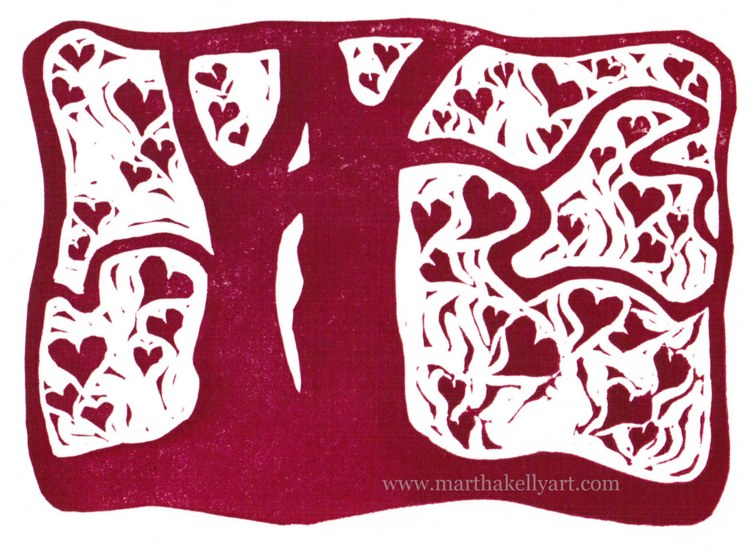
Here are the previous years' valentines.
And here I am with my valentine press. And my beloved dog Merlin. Thanks to Kelly Cox for the photo, from back in 2011. 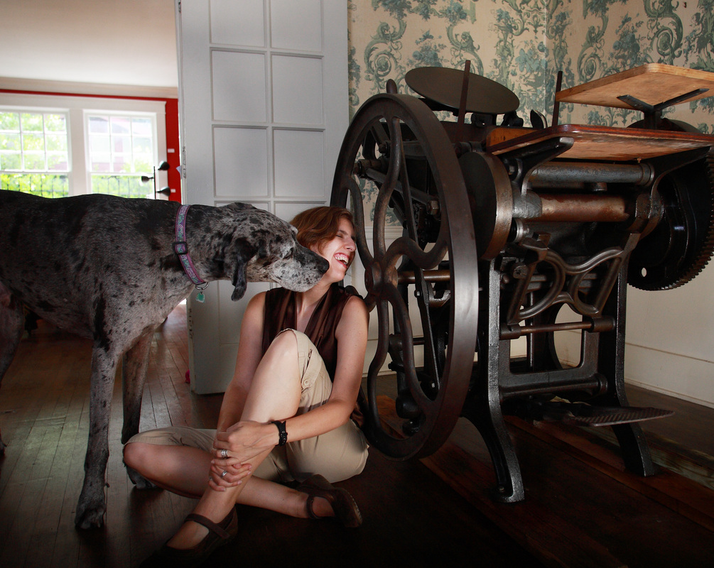
|

online store Martha Kelly is an artist and illustrator who lives and works in Memphis, Tennessee. Get occasional studio email updates. Categories
All
Archives
June 2024
|