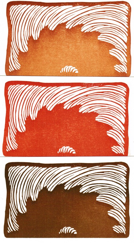
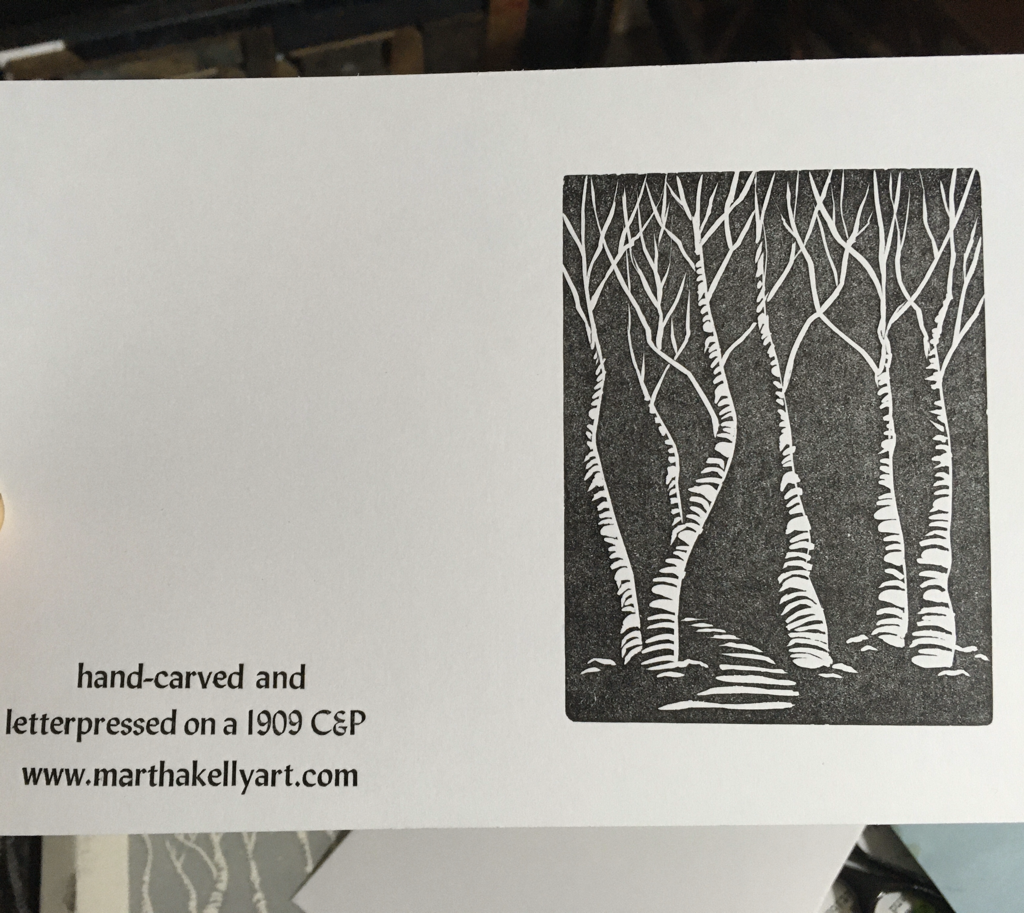
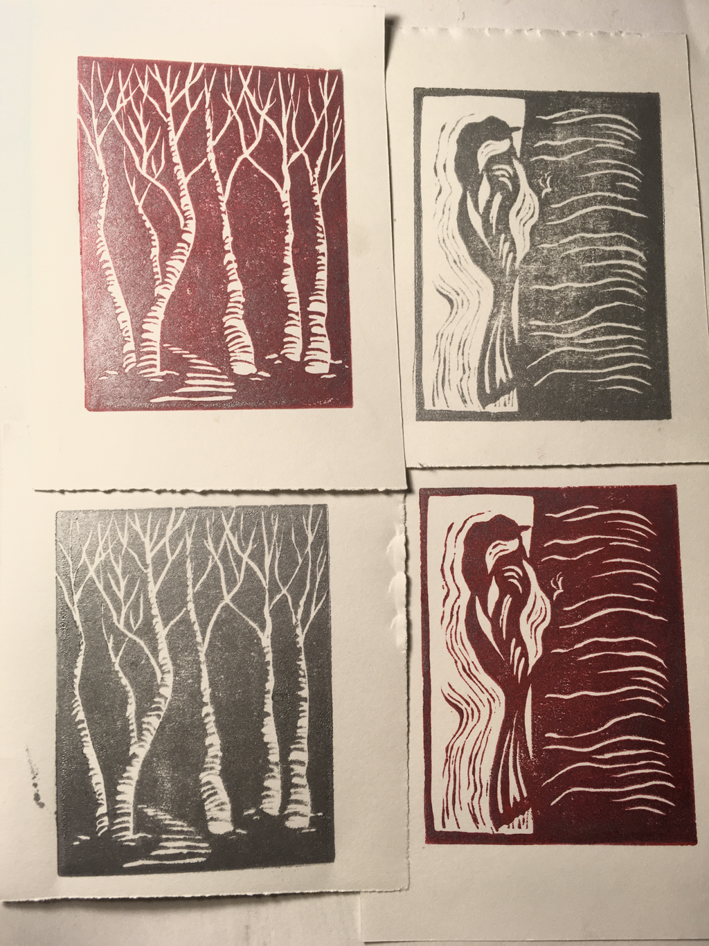
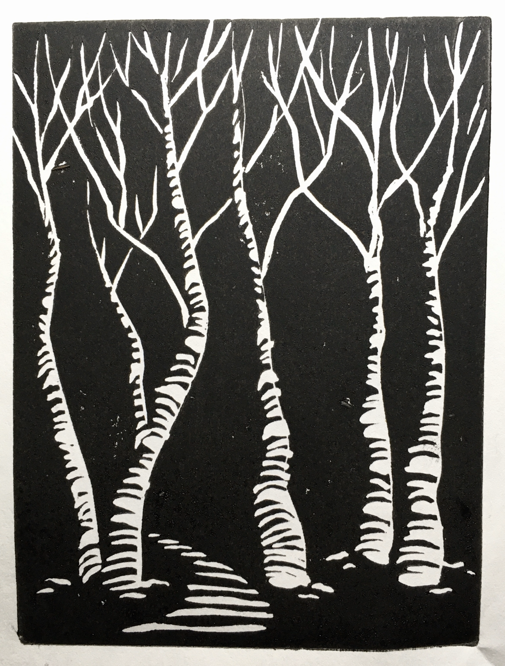
I will get it in a frame and have it ready to hang with the rest of the show on Monday. I've also carved and printed a small gallery card for folks coming through the museum to pick up and have my information available. This is one of the handful that print two tone when I add a second color once the first is established. I love the variegated effect. I usually get three or four of these before the inks blend to a solid color again, so most of the cards will be a little less wild, but I always love these the best.
0 Comments
I ran the press yesterday to print cards for WAMA, and I decided to do a short video to introduce myself to their folks who haven’t followed my work before. It’s always fun to show off the press. It’s such a superstar. And beautifully, the set up yesterday (getting a solidly good print across the whole frame) was easier than usual, so printing was a lot of fun. I was tired last night (I ended up doing almost 700 cards, since I’ll need a lot for a six month show run), but it went really well. 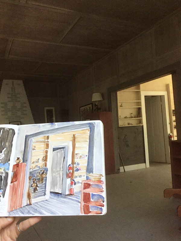
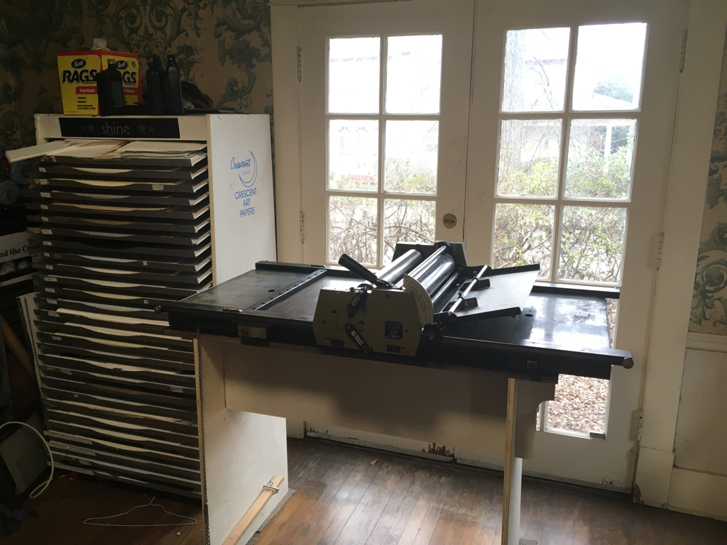 I’ve had quite a week. I’m a member of a letterpress sale group on facebook, basically a worldwide classifieds site for letterpress equipment. Which means that usually when I see something interesting, it’s in Belgium. Or Brazil. Or somewhere enough remote from me to make it impractical. I was beautifully lucky years ago to stumble into a Line-o-scribe proof press when a friend of mine was upgrading. It’s expanded my range and ability exponentially from what I was willing to do rubbing on the back of blocks with a flat wooden spoon. But the press bed is limited to 14x21”, which means if I want any margin at all, I end up cutting the 18x24” blocks I buy down to at least 12x20” and maybe smaller. I just rededicated myself to prints over the new year after spending more of the last year and a half painting. I’ll always likely move between the two, but I do think my most original voice is in prints. And I’ve been longing to do bigger prints. Just before this press floated across my fb feed, I had started a diptych on the old one, to be able to have a larger image and impact, even if it was in two parts. Then this beauty showed up. It’s a Reynolds Printasign model 40 with a 22x30” bed, a huge upgrade. And it was in Oklahoma City, just a 7 hour drive. So perfect. It also has a self inking system and a custom table with a foot pedal to release the paper gripper. So I drove over Thursday to get it. I’m feeling ridiculously lucky this week. There’s going to be another learning curve. My brain is really not skilled at mechanical things, and this has a couple of serious differences from the press I’m used to. I’m not sure if I’ll be able to get the inking coverage I really want for my velvety black prints. I may keep hand inking a lot of what I do, but it would be beautiful if I can figure out a way to get that depth without hand inking the plate each time. Repetitive printing is my least favorite part of all of this. I love the designing and carving and tweaking to get the image I want, but once I have it, the rote printing is a chore for me. So fingers crossed. This press was also made for use with its own type, which rests on rails, so regulation type (.918” for standard North American type) is too short for the inking rollers to even touch. I’ll have to build up the bed to use the type I have. It may be that my old press is better for some of the things I do. But having this size is just amazing, and I’m excited to have it placed in a window with lovely light to work in during the day time. I can’t wait to do a big print for it, though again, I’ll have to go out and find something to lay in the bed and raise the print up to the roller height. That should be easy enough though for a life changing kind of thing.
I played around with it after several really lovely friends helped me move it inside. Here is the first print, a celebration of the press and of this year when all my art ideas seem to be coming beautifully together. You can see that I used the heavy magnets that came with the press to hold the type steady in the bed. They’re not as totally firm as building wood all around it, like a jigsaw, but a lot faster. You can also see that I wasn’t getting a really sold, dark print. This faded look is really cool for some things, but for others I’m going to want something darker.
I’m having a letterpress weekend this long holiday weekend, working on getting cards ready for the coming holiday sales. I’m quite happy with this one, so I’ve been printing it in black (letting the ink fade as I go) and silver (below). I’m still struggling to get the bird how I want it, so I’ve mostly held off on it so far. When I get to the red, I’ll do it and the trees both. It’s possible that I just don’t like how the bird printed in the silver, which is always runnier than my other inks. The color tests came out well, though I can’t quite decide how much “noise” to leave in the background behind the bird. At the bottom is a quickie video of my view when I’m running the press. 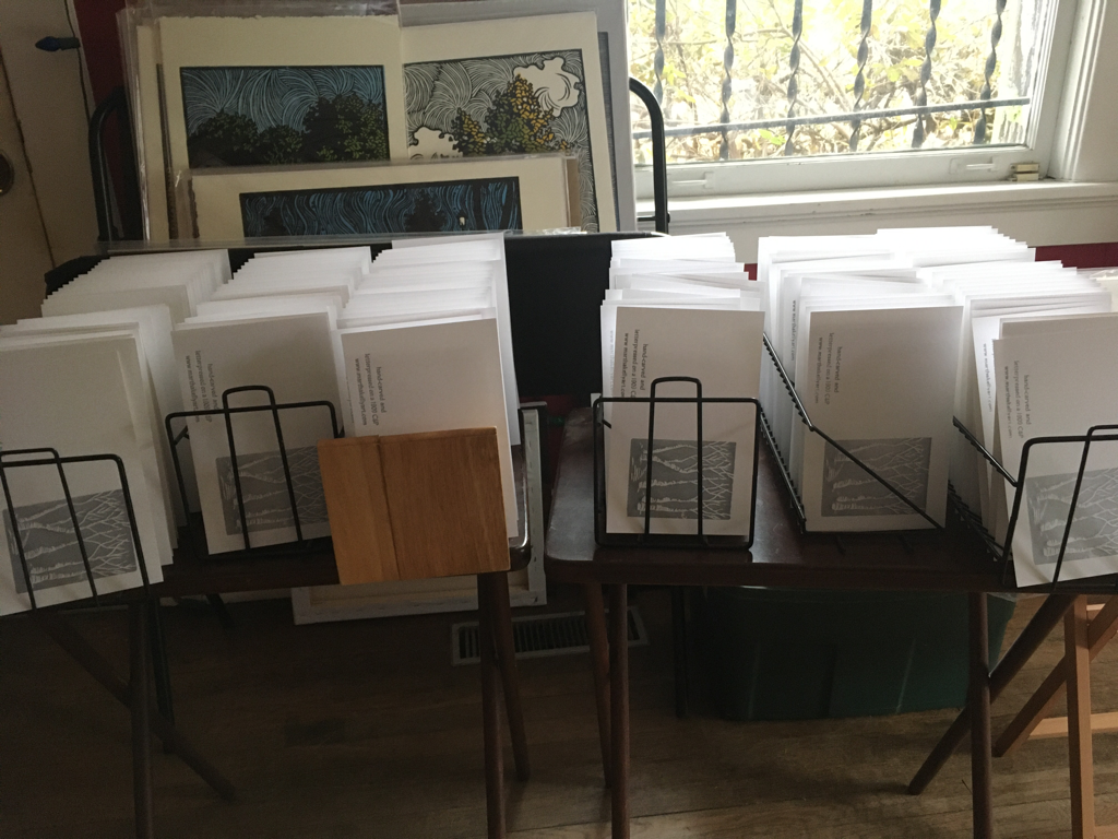 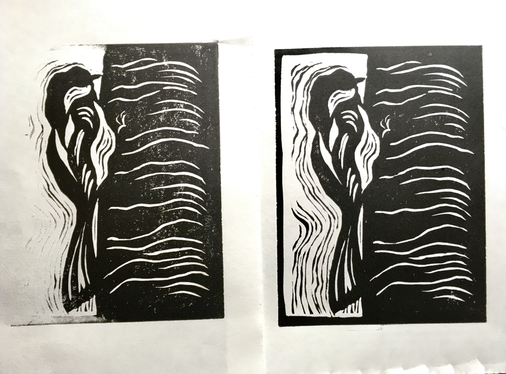
I was a guest on Memphis on the Mark this week, which was great fun. I've known Mark Jones my whole life, since we both grew up at Idlewild Presbyterian here in Memphis. He's a film maker with a number of movies (including Tennessee Queer, a small town family drama, which uses my house as one of its main sets) and several web series to his credit. His newest venture is an interview show with film makers, artists, and other creatives. I was thrilled to be on. We talked a lot about my printing presses and how they work, for those who are interested in that. And I found out that I talk with animation and apparently need to ask for a clip-on mike instead of a stick-on one. The stick-on one fell down my blouse quite early in the process and can be heard rustling throughout the interview. I'm not ready for prime time yet...
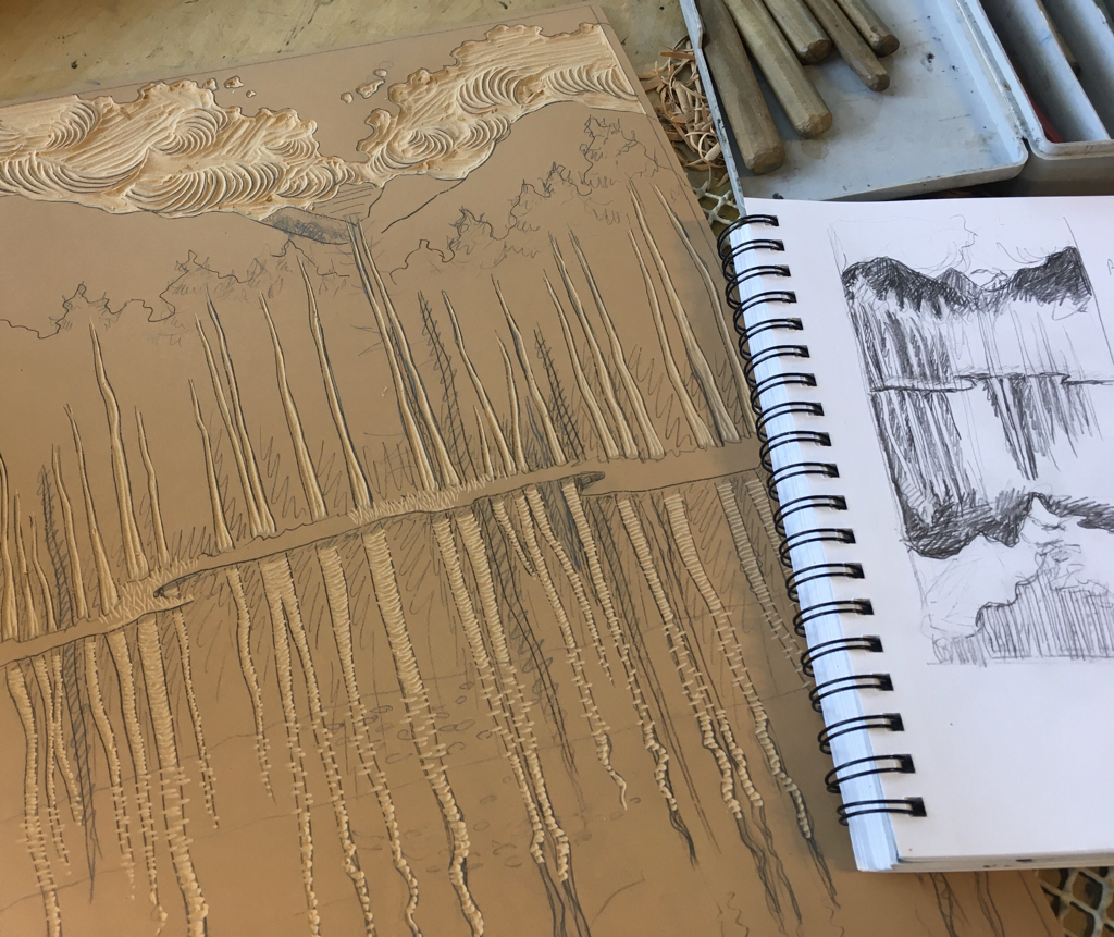
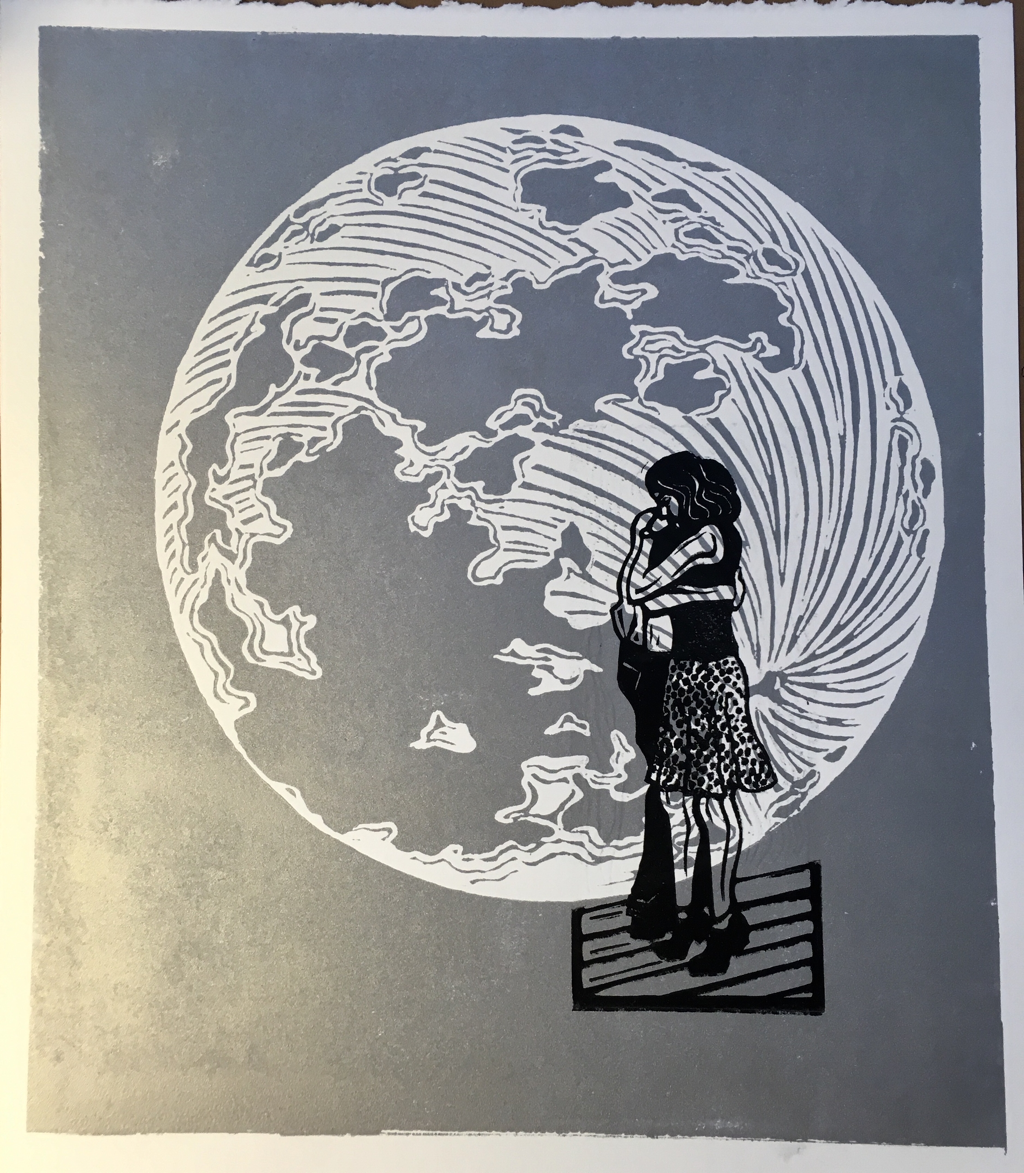
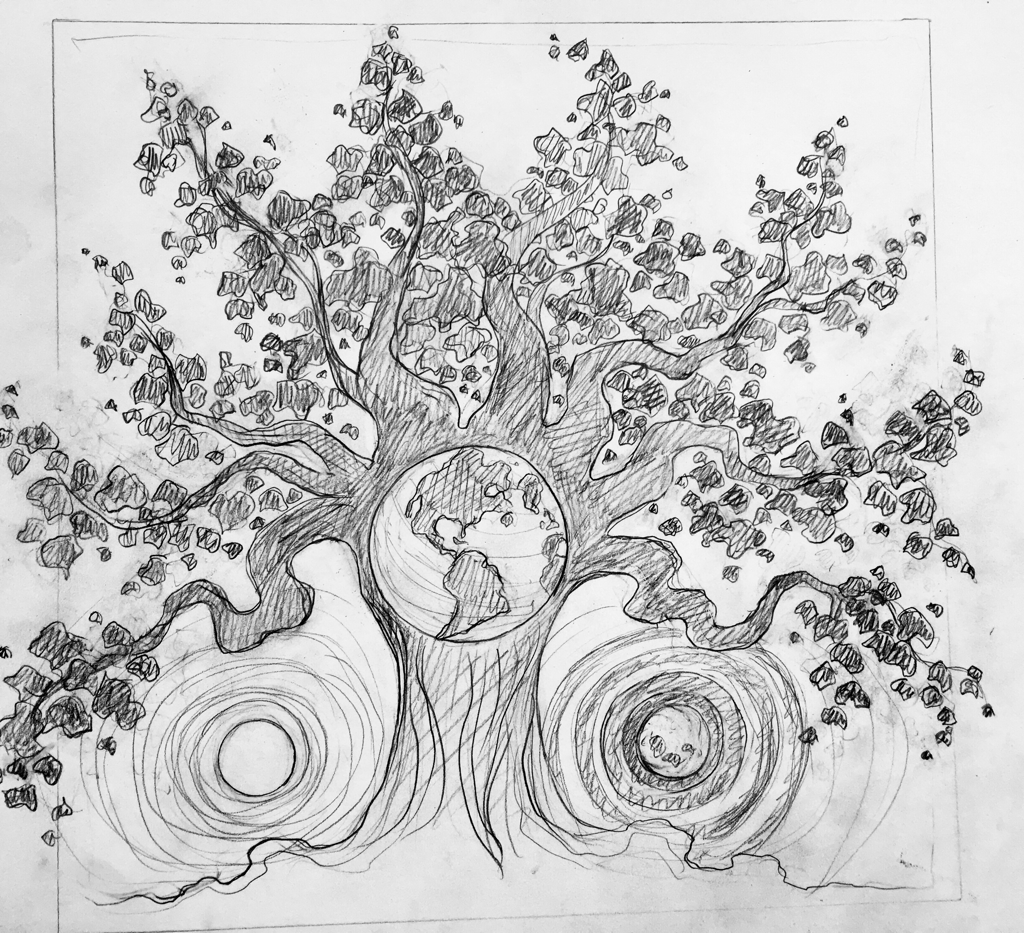
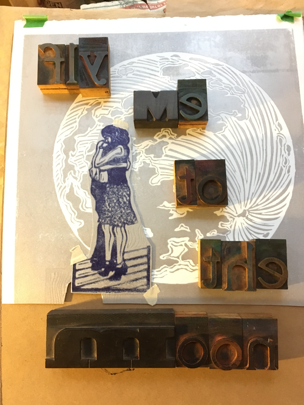
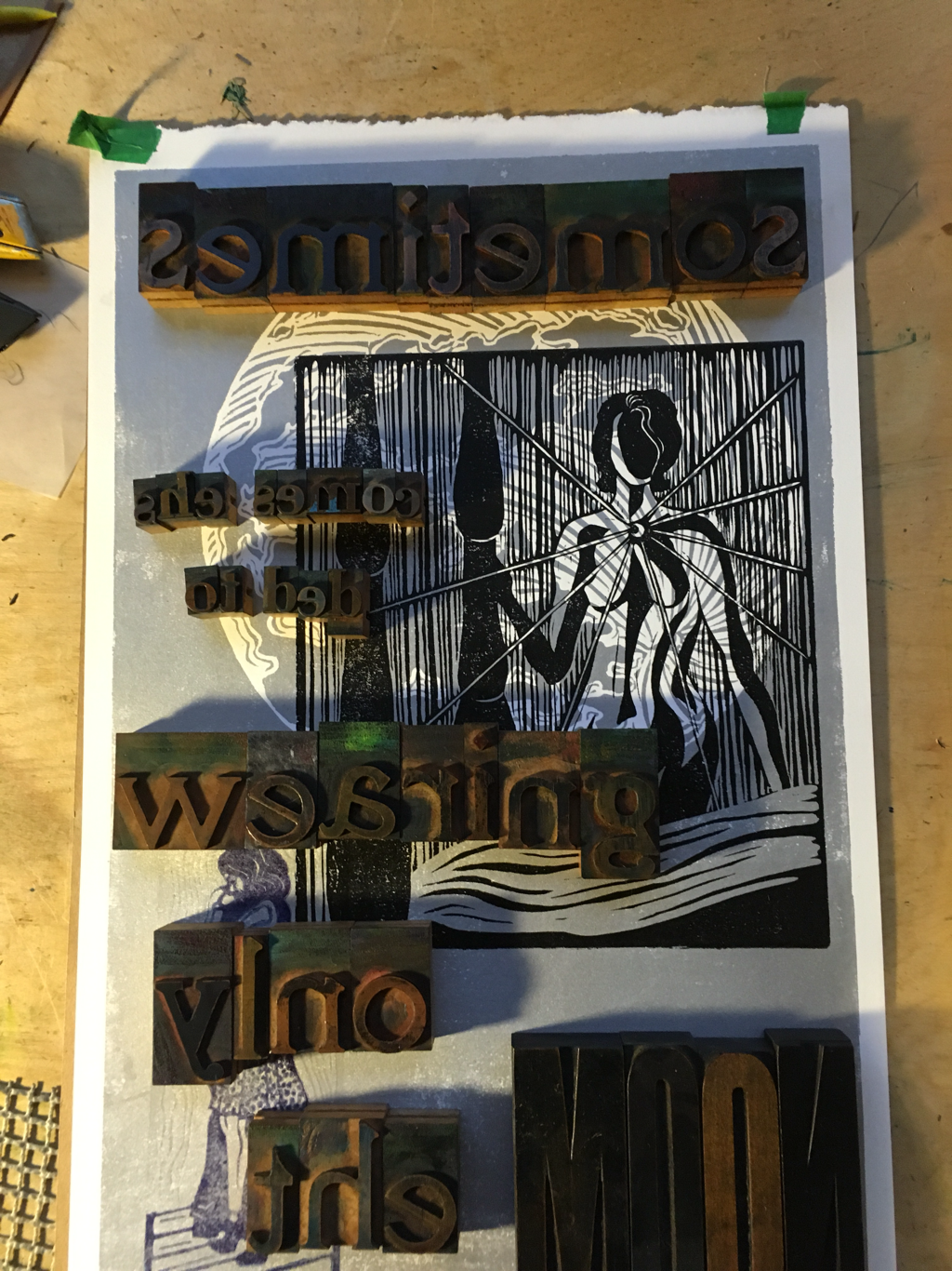
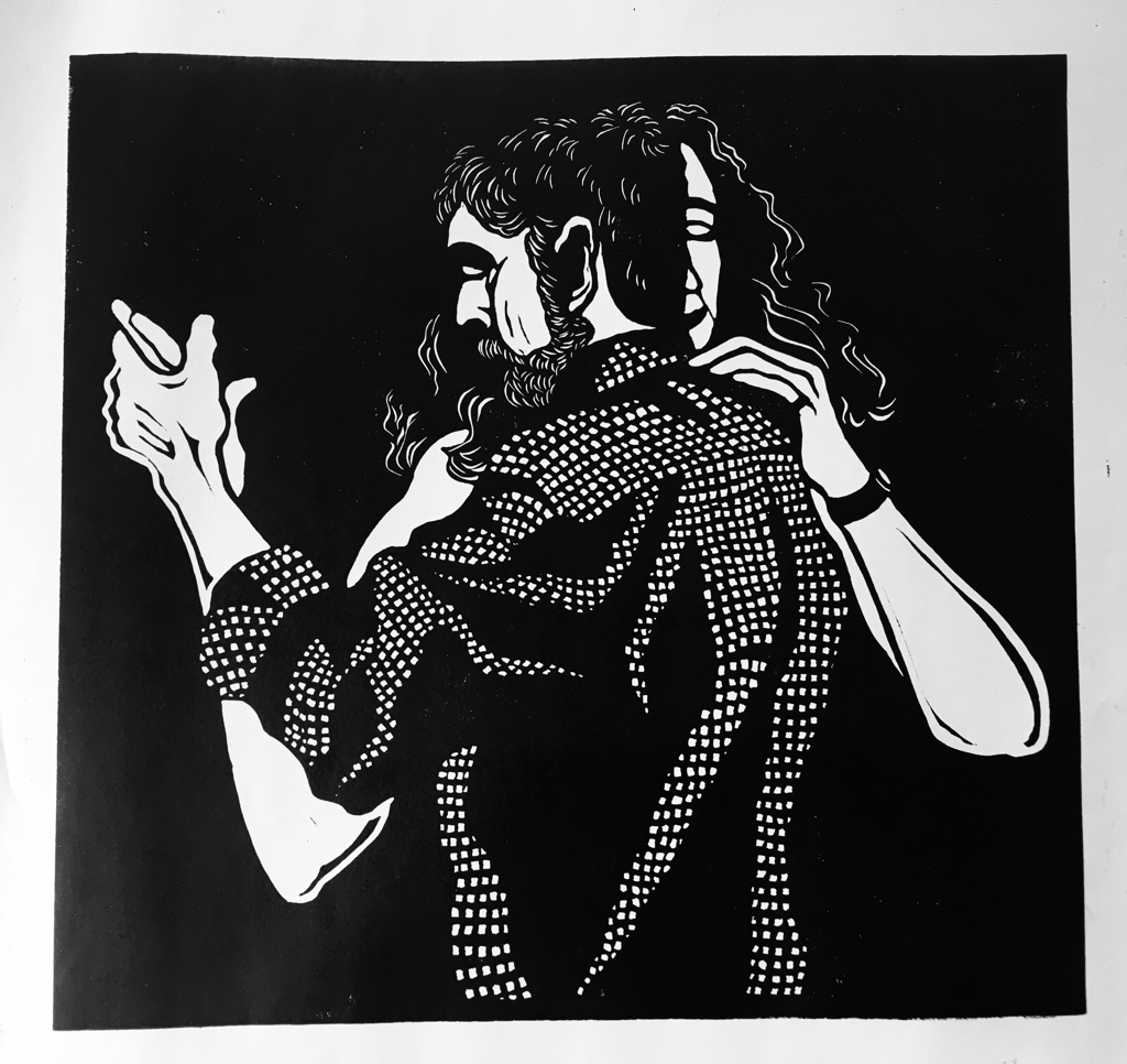 After a good bit of time deep in oil paints, it’s been fun to dive back into prints again recently. I’ve got several different combinations of moon and/or dance prints that I’m working on. Above is the newest dance print, which is the biggest and most close up attempt at figures I have made to date. I’m overall pretty pleased. There’s a bit more work to be done in the hair, but I think it’s close to finished. I had a background pattern in mind, but I wasn’t sure enough to carve it straight in, and after pulling this proof (this is the second one I’ve pulled in progress to look at), I think I like the figures against the deep, black background. Below is the second layer of the moon print that I showed the base layer of in the last post. I’m going to do two different prints over the moon, and this is the first one. I’ll have a layer of wood type to finish this off, but I’m also realizing I kind of like it just with the figures. I may do a small edition of each. Also below is a drawing for yet another new print. I’ve been thinking about Genesis and creation a lot for an upcoming project, and this is kind of squeezing in on the edges of that.
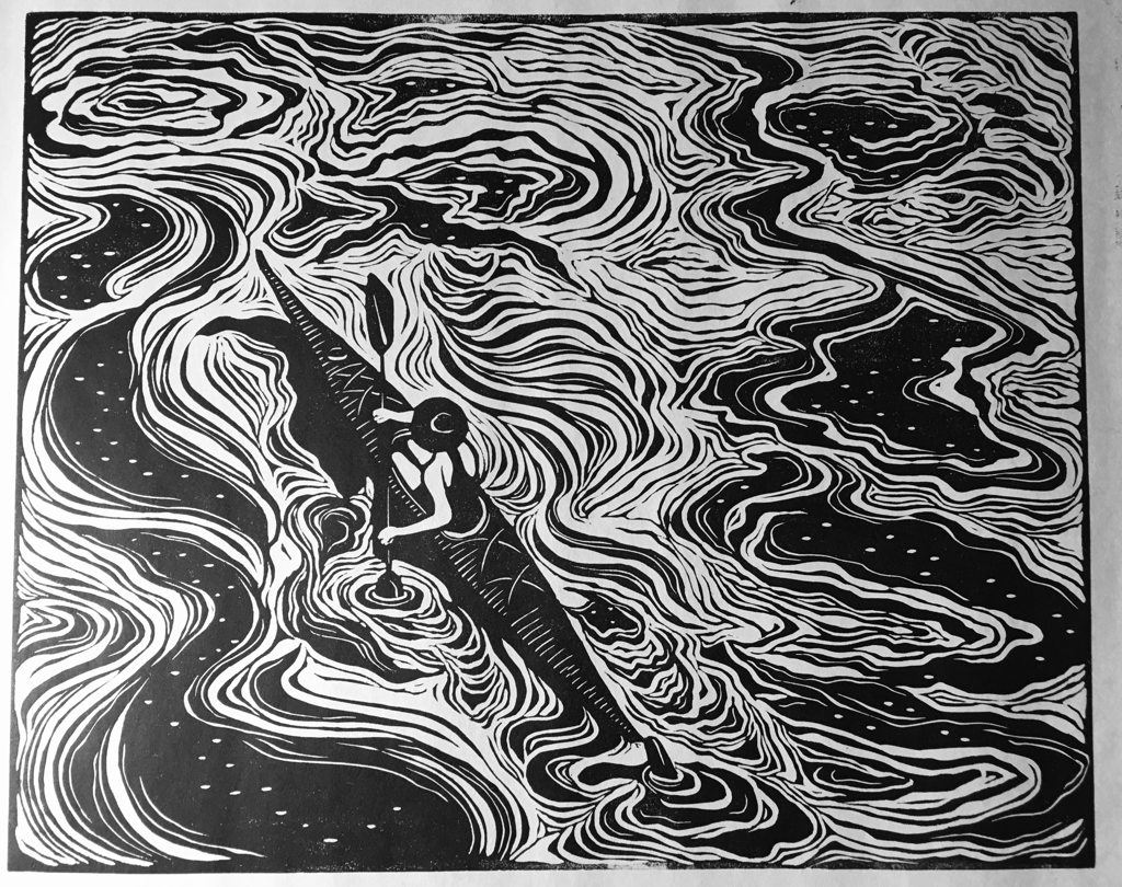
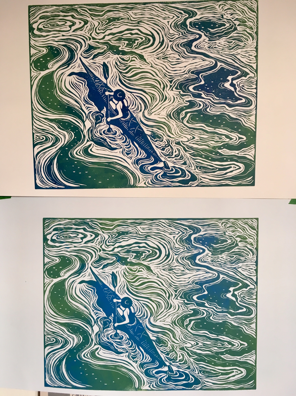
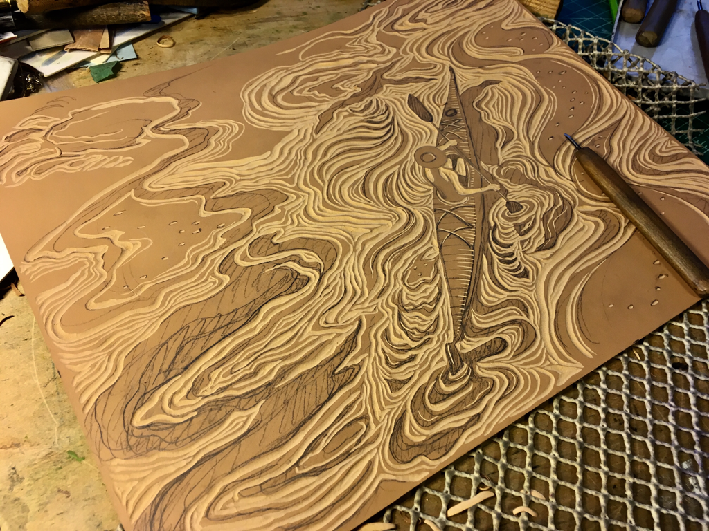 I’ve been working more slowly this week, struggling a little with a cold, so stand up painting has been out, but prints lend themselves to sitting quietly. I’ve carved this one pretty fully at this point. It’s based on one of my larger waterscapes, but I liked the image enough to want to play with it in carving as well. I’ve tested it in black and white and in color, and now all the options are hanging in my work room while I ponder them and decide what I want the final edition to be. I like several options, so I think it will end up a “varied edition” where there are a total number of final prints, but they don’t all look the same. That way people can choose which they prefer.
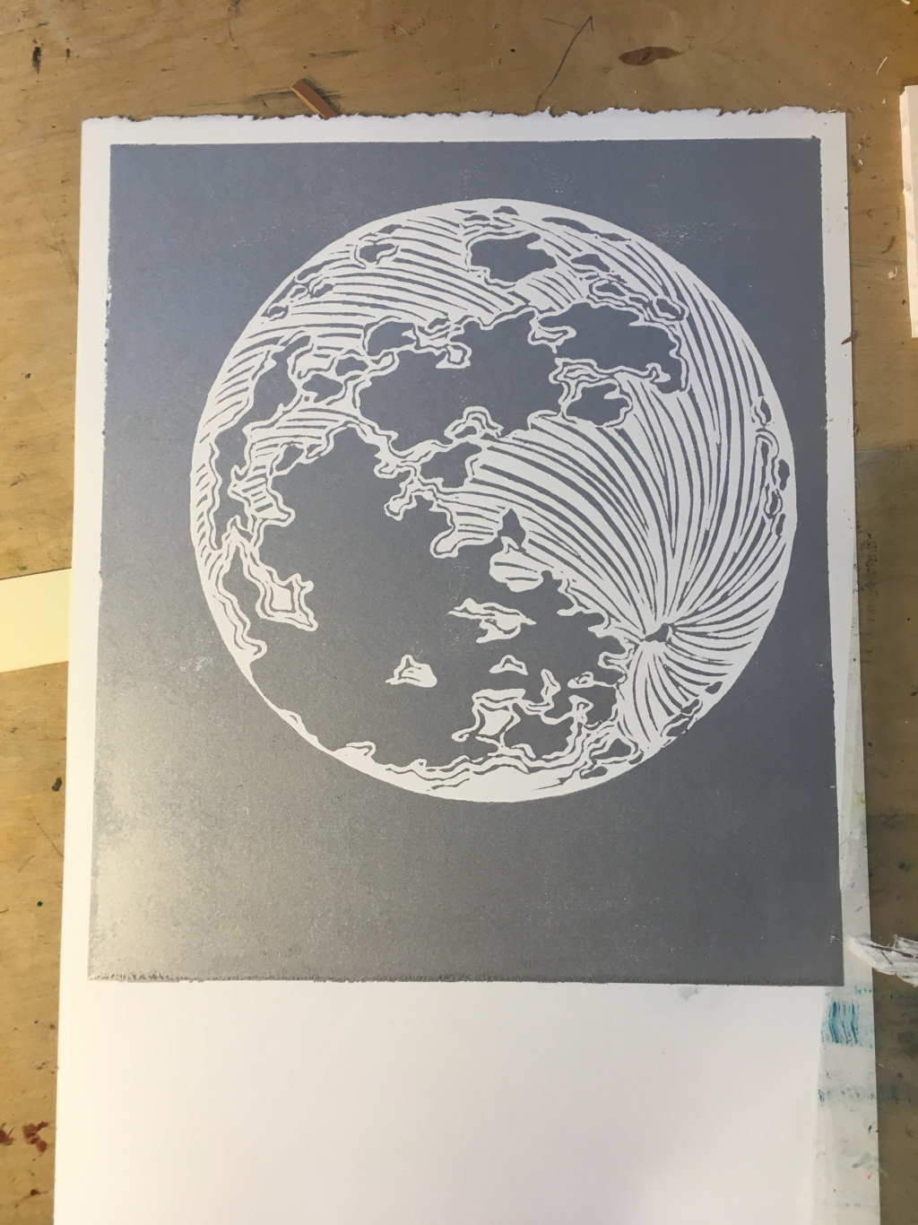
I also pulled out an older block I had abandoned several years ago and did some more work carving it. I like the moon, but it needs something to go with it. I’m pondering using it with two different other blocks I already have that I would like to revisit and use in different ways. I tend to think about one single image at a time, and collaging prints like this is good mental stretch for me. So lots of smaller things are happening at once around here, which is great for prints, because you can let one project dry while you work on a different one for a bit.
|

online store Martha Kelly is an artist and illustrator who lives and works in Memphis, Tennessee. Get occasional studio email updates. Categories
All
Archives
June 2024
|