 It took me getting to Washington to get to a scanner and clean up my St. Louis sketches. I love to draw there and did some smaller, faster sketches as well as full watercolors. This first one is walnut ink with a dip pen of an Osage Orange tree. They always grow in such fascinating shapes. I also got a fantastic blueberry/lemon curd crepe from a food truck creperie that flashed me back to Paris. I loved both the food and the fun little bus, so I did a sketch to remember.  There was also a great book signing at the graphic bookstore Betty’s Books. Beautifully they got in an art hero of mine Lucy Knisley. I found her first graphic memoir An Age of License some years ago, and it (plus my first Ben Hatke book found at the same time) made me want to include more storytelling in my work, which had been purely landscape up until that point. She had a huge influence on my work, and I trace a direct line back from her book to doing several of my own, even if they’re quite different in feel. It was fantastic to hear her talk, meet her in person, and see her delightful hand painted cat dress.  One more lovely day in town was revisiting the St. Louis Art Museum, another favorite place. They had a Vuillard I don’t remember from before on view this time, which makes sense because it’s on cardboard and probably needs to rest for preservation purposes in between times out in the light. I love his patterned interiors and interlocking shapes and had fun doing a sketch while standing in front of it. 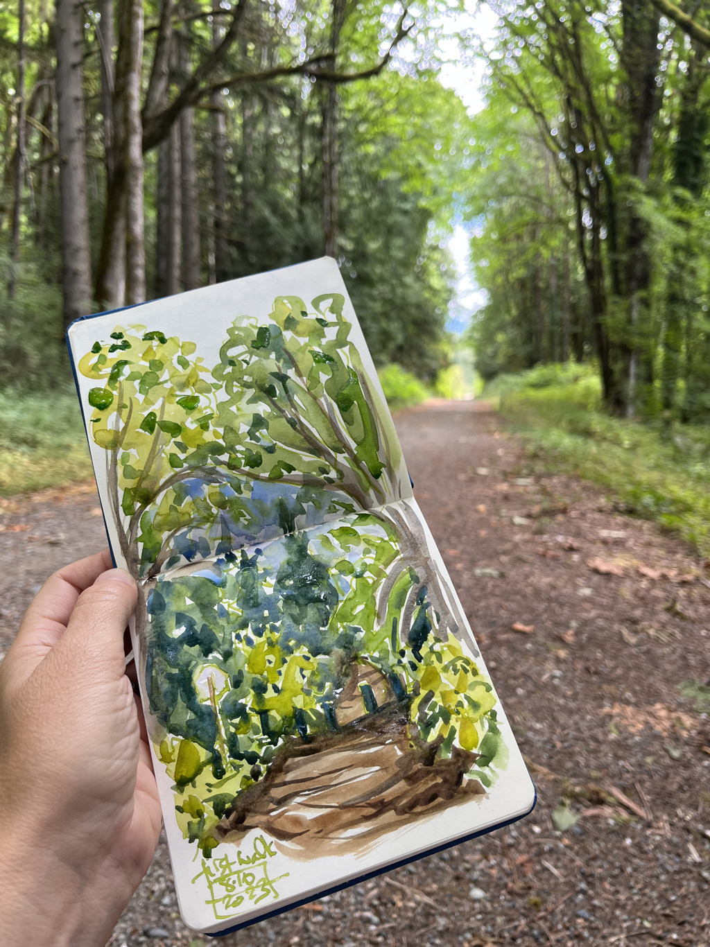
0 Comments
 I had SUCH a good time staying at this tiny cabin right by a small river. I sketched and read and sketched some more. It was perfect. Here's the second half of the sketches from my two night retreat.    I've given myself two small vacations/exhales in the past month instead of the longer trip I had hoped to be taking by now. I've mostly been nose to the grindstone on the Rowan Oak show that hangs this month, but I did take two smaller trips recently to relax and exhale. The first trip was to a cabin just outside Mountain View on the site of the Herpel P.O., right along a small bayou with large stones sitting right down by the water. I sat out there with my sketchbook, journal, and book. I had every meal sitting by the water and watching the birds. And I walked up the quiet road with my sketchbook to visit more wonderful trees. It was heaven. This is the first batch of those sketches. I was there two nights and part of a third day, and I sketched a lot after doing so much print work and missing my sketchbook.    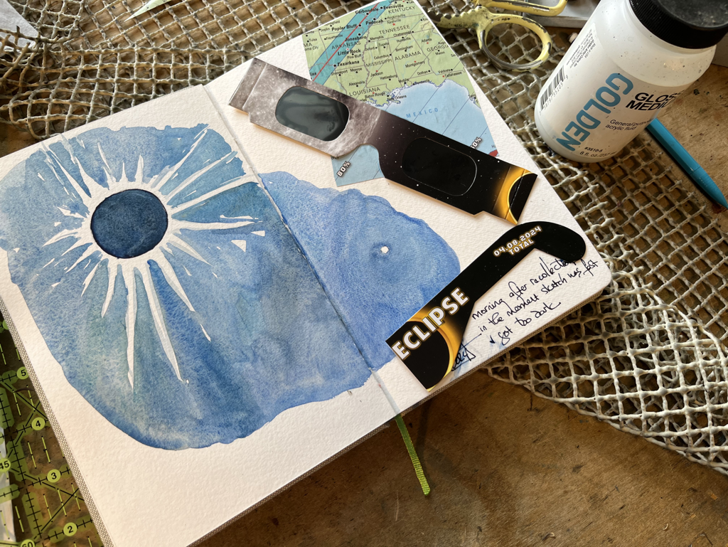 I looked back at my Eclipse sketches this week while I was working on a print from them, and this page looked a little bare. I also wanted to keep a souvenir of the cool Eclipse glasses we all got, so I ended up doing a small scrapbook page to go with the sketch. I love the idea of collage, but I’m terrible at it. My attempts always look like a 4th grade art project gone wrong. But sometimes I want to preserve a special bit or piece from a day out or a trip. Since I was in that mode, I also added my “number being served” ticket to my County Clerk’s office sketch. The number I pulled at 8:03 when the office had opened at 8…. 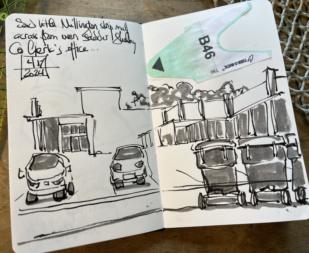 I’m a bit more prone to do this kind of thing when I travel and pick up ticket stubs or other cool souvenirs. did a couple at my WAMA show to celebrate both a gorgeous bunch of tulips from a friend and also some King cake. 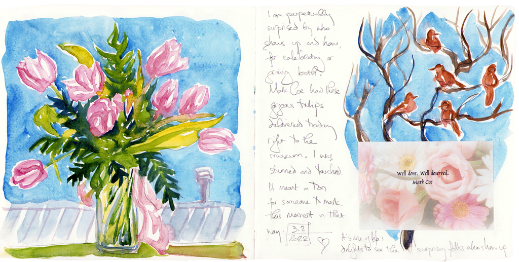 This last one is my favorite, but that might be mostly because of the King cake, which was delicious. 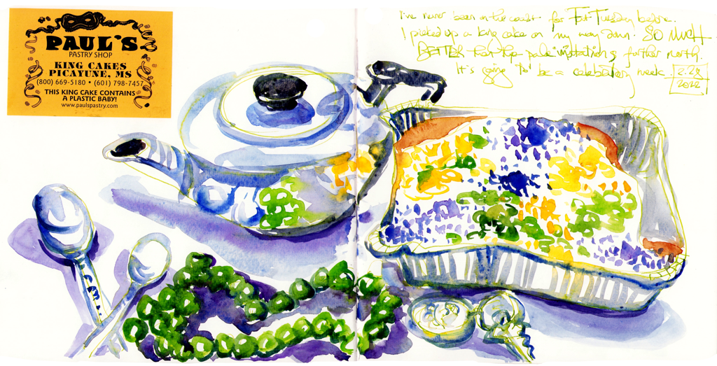
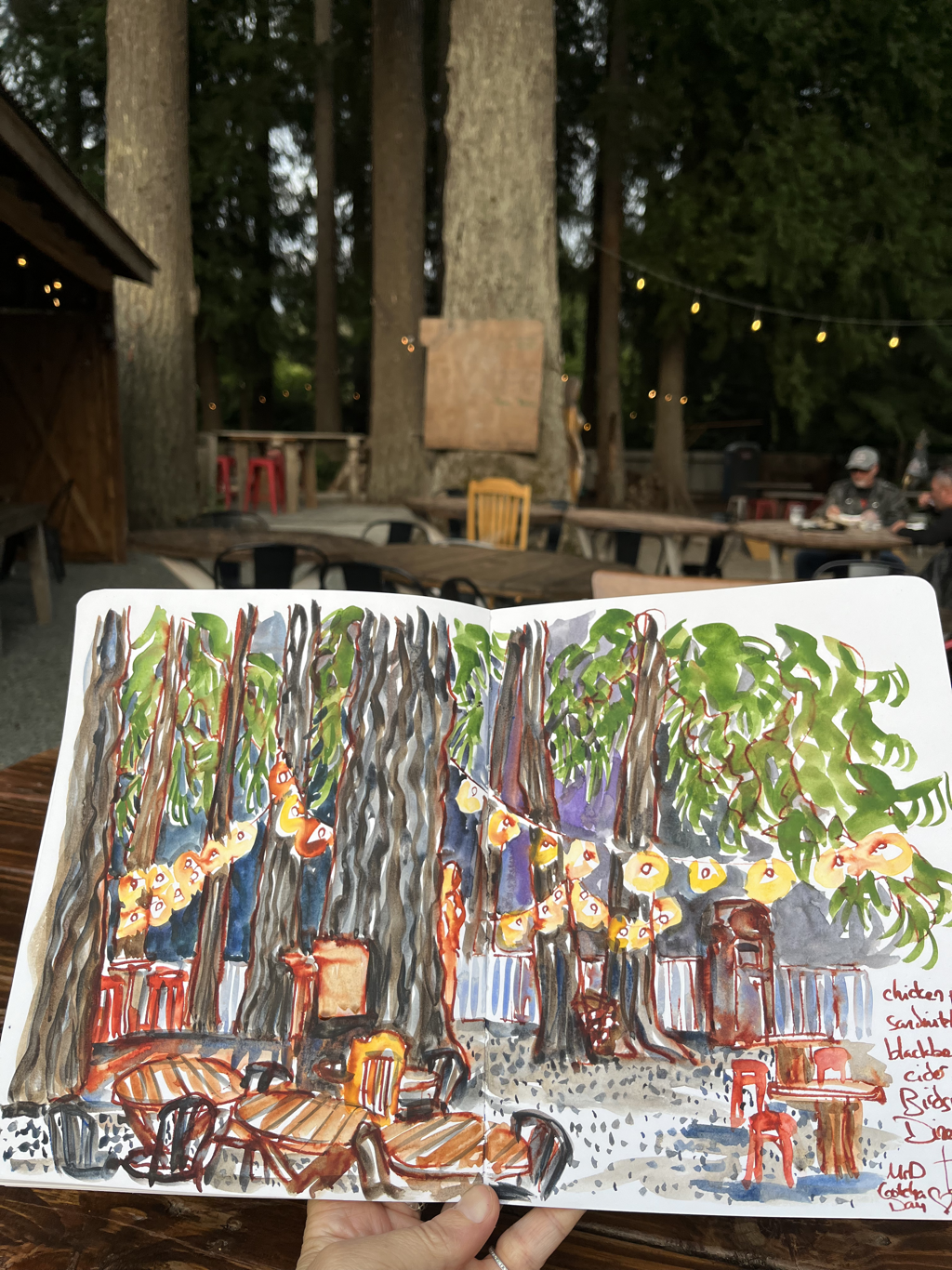
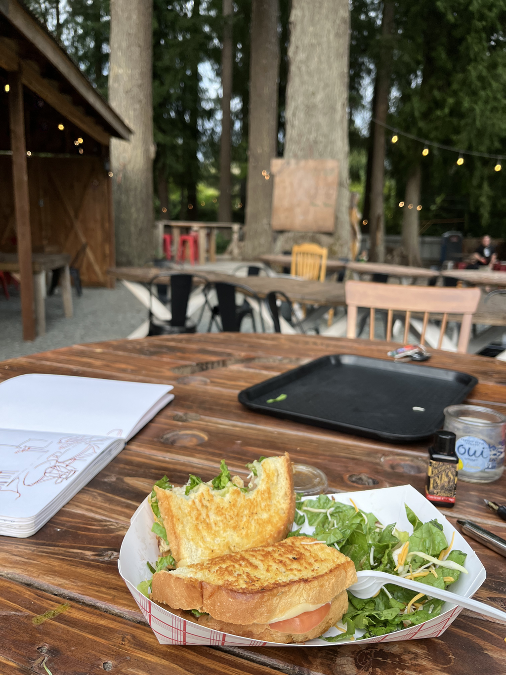
I’ve done a little bit of evening sketching lately. I had so much fun drawing in this outdoor diner. You place your order at a window and eat out under the trees. I’m in love with their chicken pesto sandwich, which is generous with the basil and comes with a side salad. So good. They also had blackberry hard cider. I sketched with my new Diamine Ancient Copper ink. I’m really enjoying it. It’s highly saturated, and could easily be too much, but it really worked for this one. I love the rich warm lines peeking through the watercolor. Then last night I sketched the new tea set I found. Small with violets, made my Spode. I’ve gotten rid of my own former wedding china and found a very happy recipient for my grandmother’s enormous set, but I kept the very incomplete set of my great grandmother’s that has violets and daisies and matching violet silver. But no teapot. This small one is just right for me to use for breakfast when I want to enjoy all the lovely things instead of just having them in my cabinet. I’m really happy. And then since I was having such fun with stripes, I kept on sketching during the (wildly unfortunate) baseball game. It’s been a tough year to be a Cardinals fan, but sketching makes it better. This ink is also Diamine, and it’s two different shades of purple. The darker shade, Eclipse, is my new favorite writing ink as well. 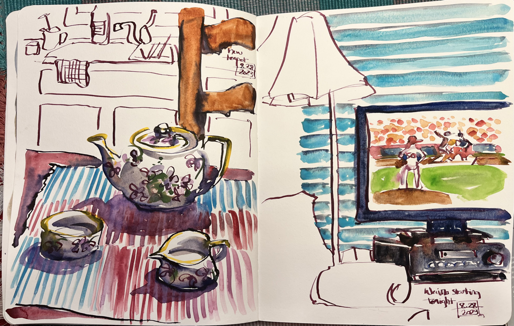
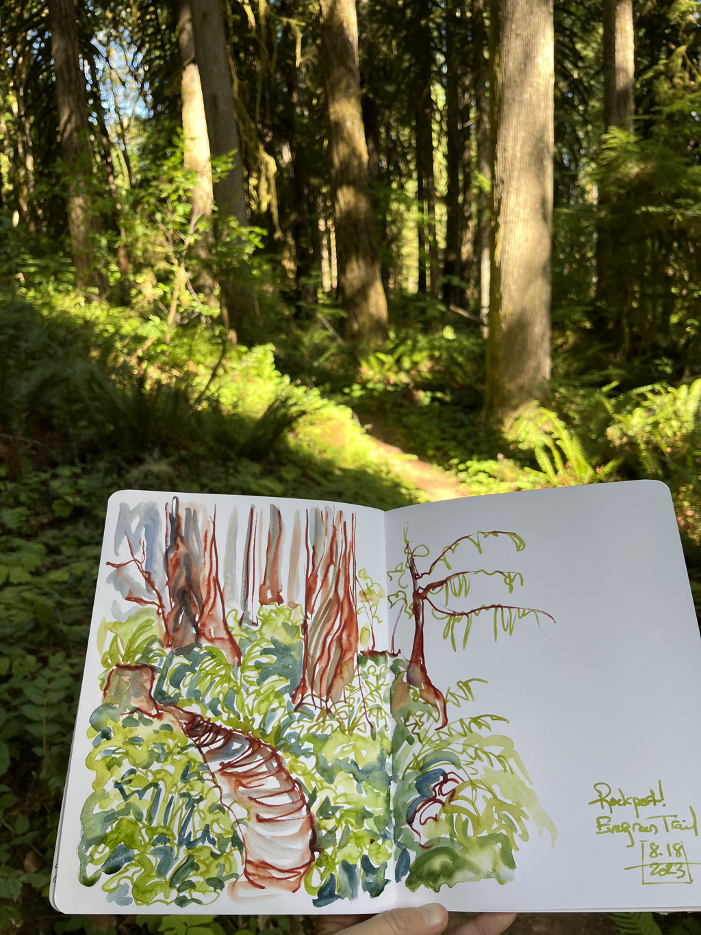
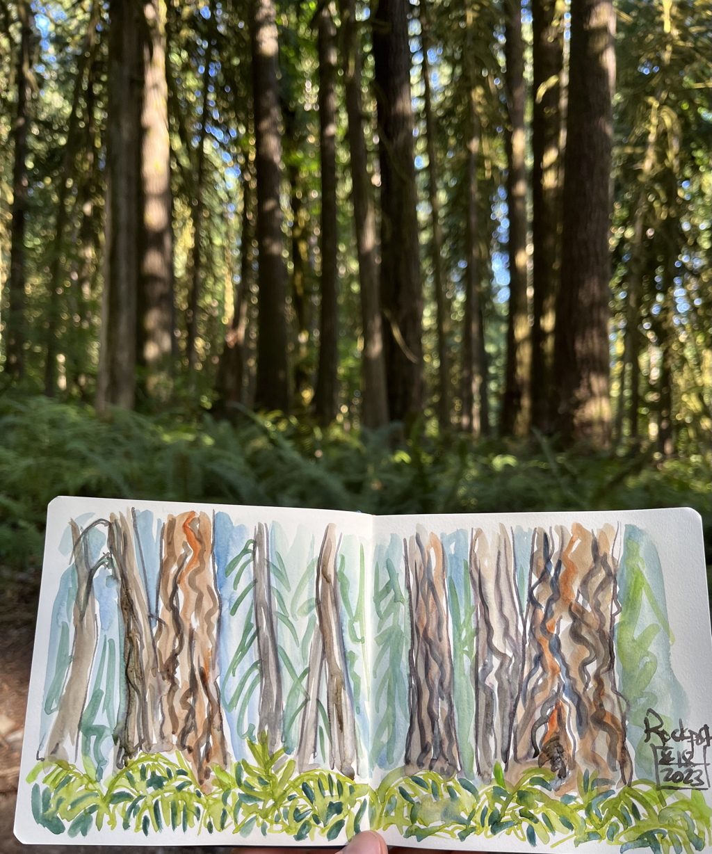
I’ve been out in Washington State visiting my partner for a while, and I’m taking some vacation time, doing some book work, and doing a bit of sketching. We’ve had smoke off and on, but the Memphis air has been so steadily bad from different Canadian fires that I don’t feel like I’m missing much good air at home. Here it’s worse on bad days, but we also get break. It looks like the South has been pretty steadily blanketed with smoke pollution for the last month. For the first time in my life, which is deeply discouraging. But I’m taking it one day at a time here, getting out to hike and sketch when I can, and doing a bunch of book work indoors when I can’t. Here’s a round up of some sketches around the Skagit valley.
I got tired of the bad air in Memphis, and I had a couple of really good weekend sales (thank you, friends!), so I decided to take a spur of the moment trip back out west. I’m still making up time a bit from being sick so long over the last year. I spent the first two nights of the trip, one day, in St. Louis and flew from there, bypassing all the connection dangers I’ve seen friends struggle with this summer. I love StL, so it wasn’t a hardship. I sketched in my B&B in the morning, went to the art museum in the afternoon, and saw a few friends. Such a lovely time. The museum had a mid century Native American art exhibition that really grabbed me. A lot of art from teachers and students at the IAIA school out west. The exquisite small woodcut is by Edna Massey, and the three abstract landscapes are views of New Mexico by Fritz Scholder.
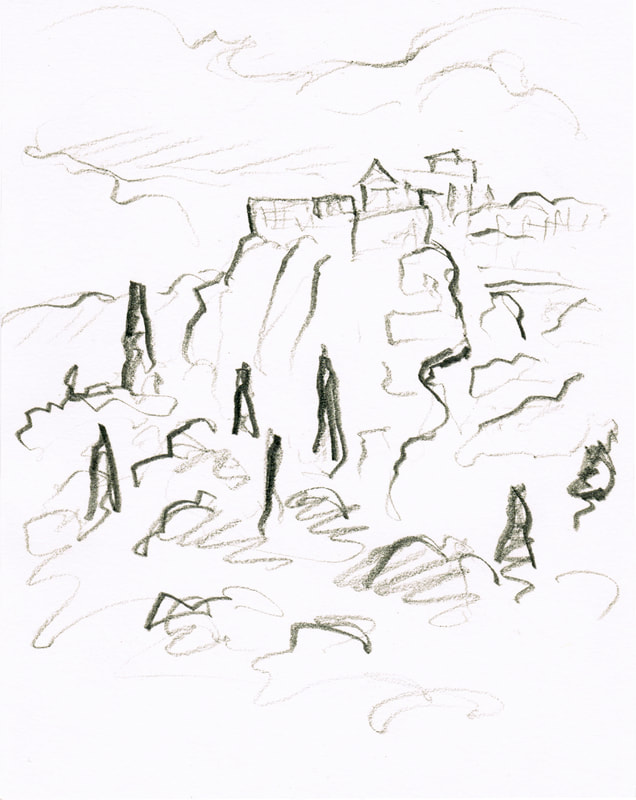
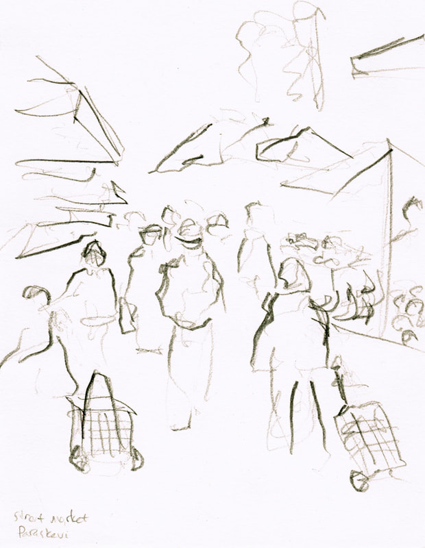
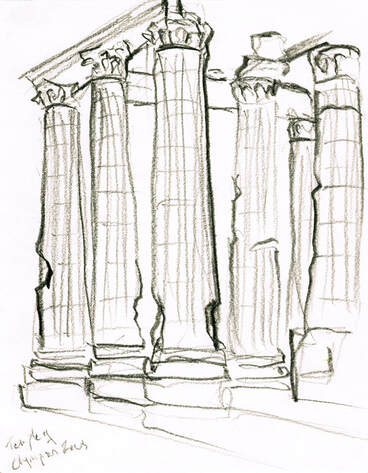
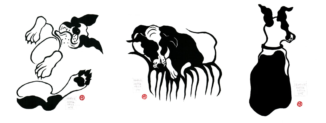 I've got three small prints of Henry (there will likely be more to come) ready to go for this weekend's Dog Days Open Studio Sale. Friday 4-8 for cocktail hour shopping and Saturday 12-5. This year we're at 719 Dickinson, a change of venue from years past, but still in the same neighborhood. These prints are all on 8x10" paper and are $65 each. It's hard for me to be regimented enough to work on standard sized paper. My old press was 14x22, so I ended up with a lot of prints that size. And I'm always drawn to different shapes. But I know it's simple for people to frame if things are standard, so I'm trying to plan at least some of my smaller pieces to be more regular. My new coastal scene is 11x14", so I've managed it four times this summer. Definitely a record! This last piece is Shoreline II, a smaller, one block version of print that was in my WAMA show last year. It's actually done from a more recent sketch and is a different shape, but it's the same view looking out from the beach at Ocean Springs, and the color scheme is similar. Instead of using different blocks for different colors, though, I wanted to keep it super simple. Repetitive printing is my least favorite part of the whole process. This block uses four colors and five small rollers to blend the colors on the block. The sky goes from pink at the horizon through grey up into the blue. There's enough space between the pink and the black to use a very small roller for the shoreline itself, and then I can put some gentler strokes into the water with that same roller to get the reflections. It's finicky to print but takes only one session instead of three. It's on 11x14" paper and is $150. I'll have these in the museum shop at WAMA once I get down there in September to deliver them and have a visit, but I'll also have some for the Dog Days sale. 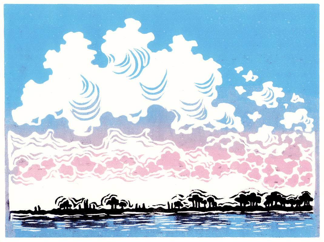 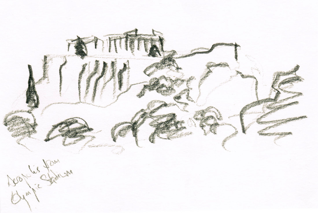 I've been working the last couple of months on a memoir about a life changing trip to Greece that followed my divorce in 2003. I wrote the first draft while I was out west, knowing I would need to come home to my journals for more detail, but wanting to get an overall framework in place. I dug out various journals from that year and was delighted to discover more sketches and photos from my trip than I had remembered doing. Sometimes your past self leaves a surprise present for the future. Today after doing some prose work I scanned in the drawings and some of my photos as well. This book, if it ever gets that far, won't be a graphic book with every sentence corresponding to a drawing or two, but it will be illustrated. It's fun to play with a whole new kind of project for me, but I'm also enjoying revisiting these super quick pencil sketches I did on the fly around Athens. Mostly ruins (Parthenon and the Temple of Olympian Zeus) but also a quick one of my neighborhood market in the Athens suburb of Aghia Paraskevi.
  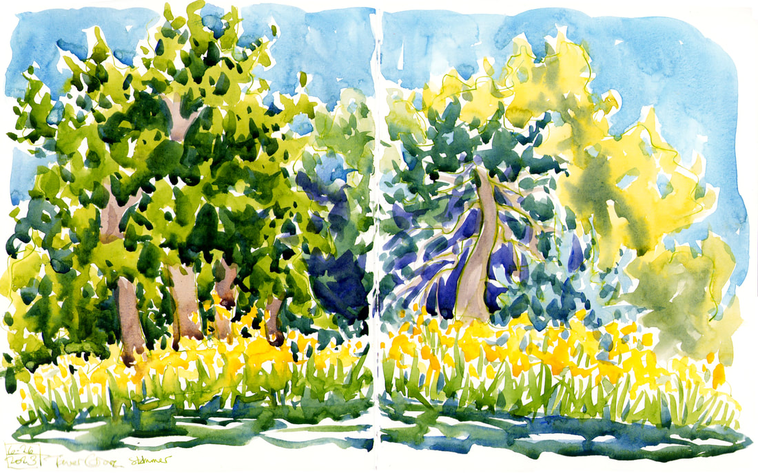 I stopped in St. Louis on my way home and spent a couple of days seeing friends, resting up, and doing a little sketching. I started the morning in Tower Grove Park with a field of small sunflowers, painted daisies and a strawberry rhubarb tart, and (of course) Ted Drewes. My favorite stop and such a funky, old time place to draw. 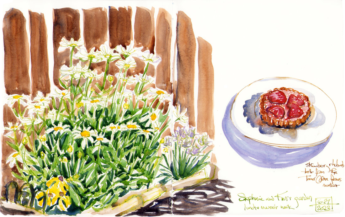 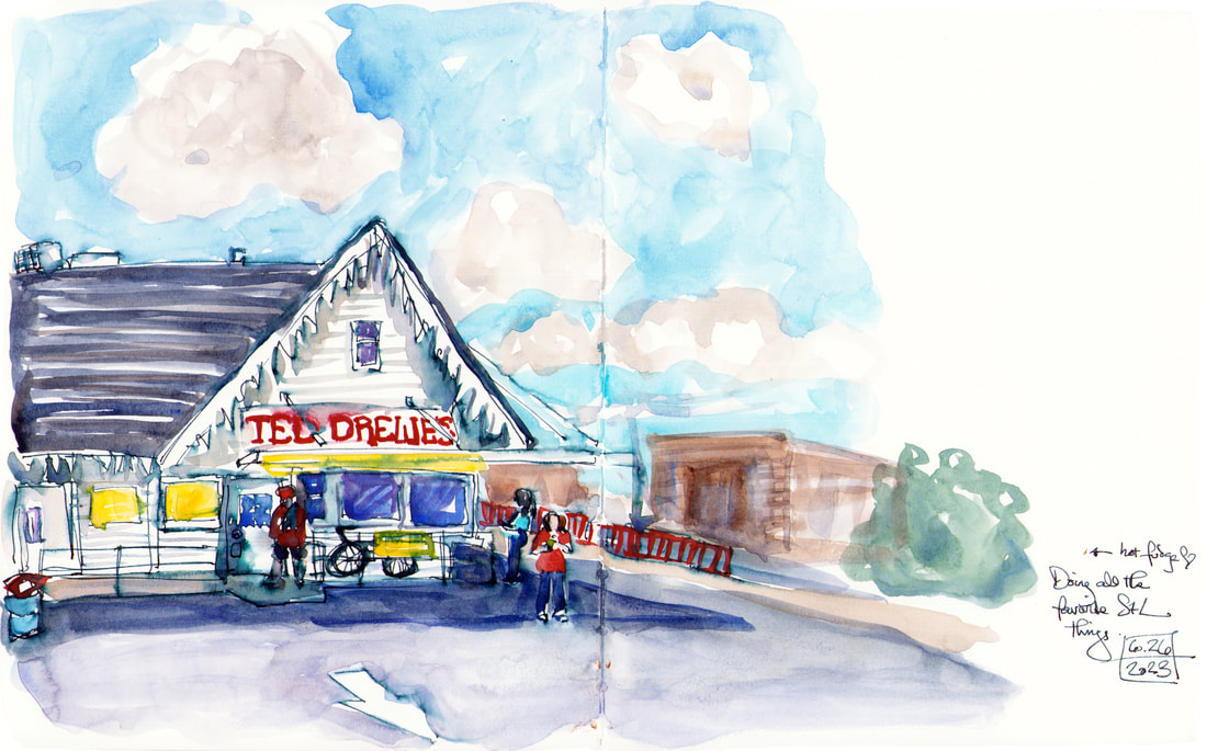 |

online store Martha Kelly is an artist and illustrator who lives and works in Memphis, Tennessee. Get occasional studio email updates. Categories
All
Archives
June 2024
|