MARTHA KELLY ART
  • HOME
  • PRINTS
  • WATERCOLORS
    • Memphis
    • Paris
    • England
    • France
    • Greece and Turkey
    • St. Louis
    • My Palette
  • OILS
  • BOOKS
  • SKETCHES
    • Quarantine Journal
    • Memphis
    • Overton Park
    • Mr. Darcy
    • Mr. Darcy's Odyssey
    • Musicians
    • Tea
    • Dutch travelogue
    • Shakertown travelogue
    • Sketching tools
  • LITURGICAL
    • Special Bulletin Sets
    • Bulletin Line Drawings
    • "The Garden"
  • BLOG
  • ABOUT
  • SHOP

American Print Exhibition

8/25/2018

0 Comments

 
Picture
Picture
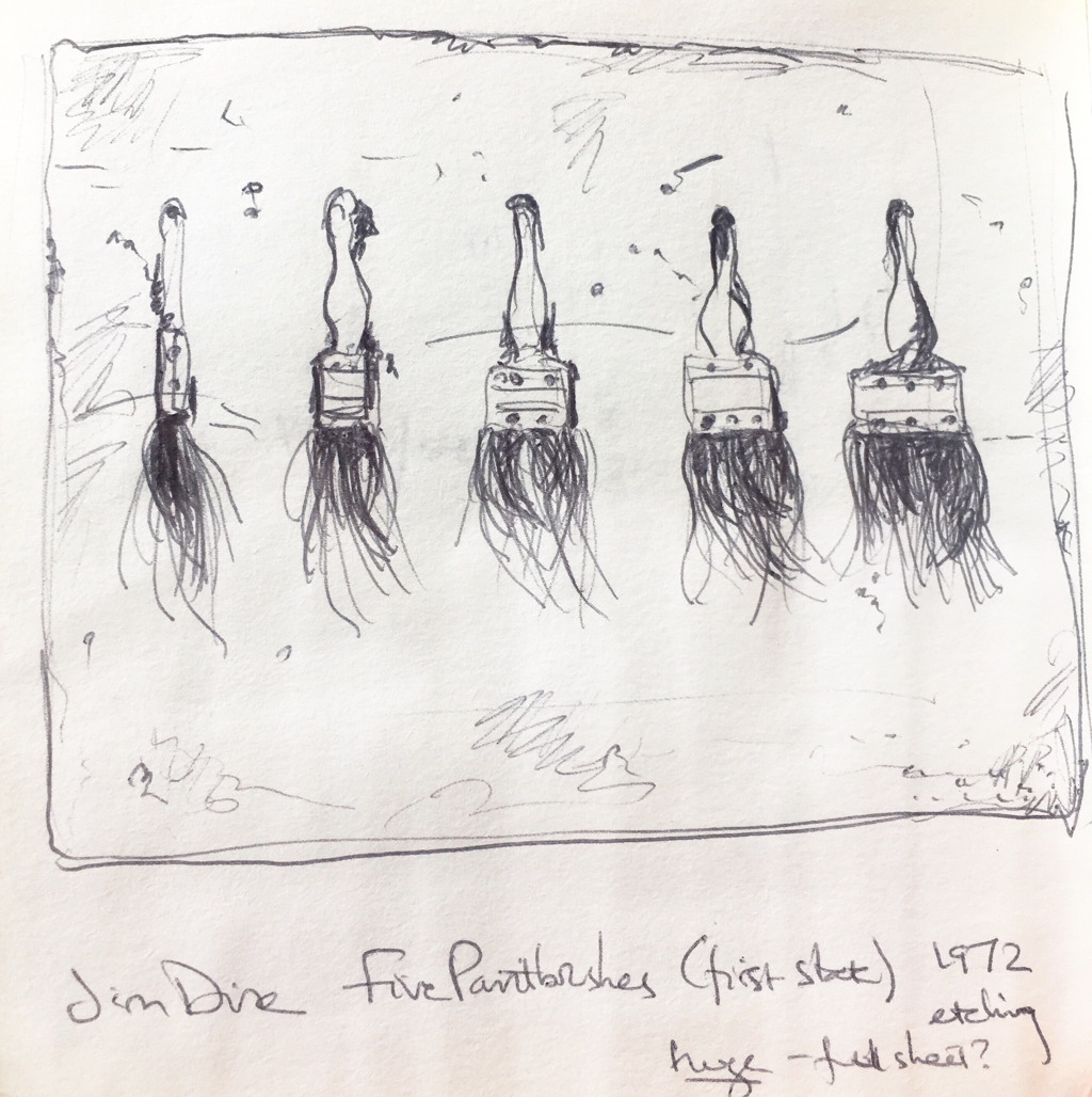
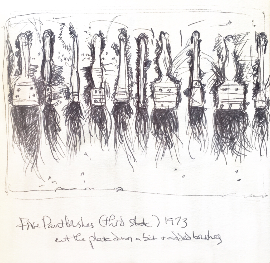
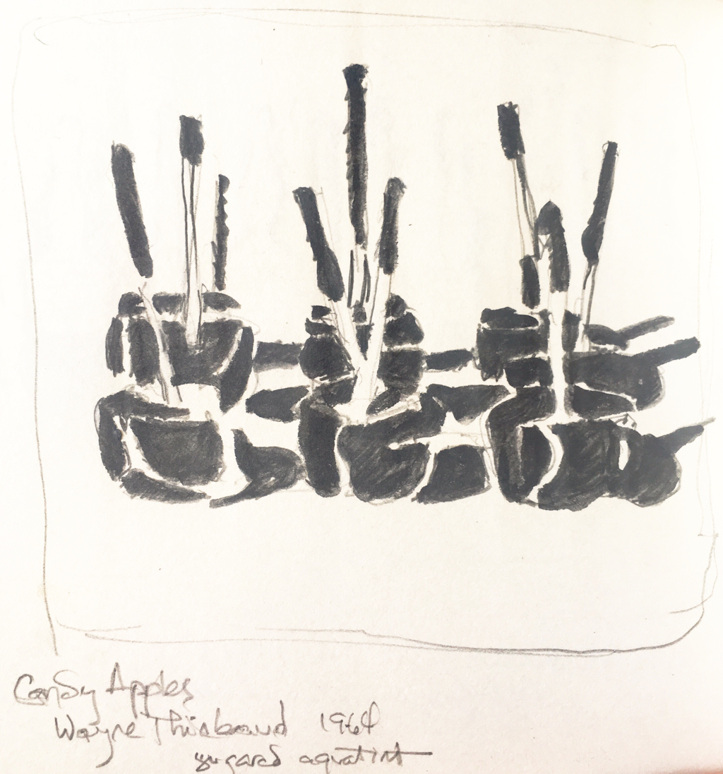
A marvelous small gallery in Paris specializing in works on paper (always a fast way to my heart) has a marvelous exhibition of up American mid century prints. They had a fabulous selection. I’m a huge fan of Jim Dine, and I loved the pair of enormous etchings (enormous for etchings, anyway — there were plenty of even larger prints in the show), both from the same plate, with a number of extra brushes added in between printings. I love the way you simply draw into a plate and can change it so radically like that. For the prints I do, once you cut something away, it’s just gone. This is like magic to me. The other thing I totally loved about the Dine pieces is that he had two also enormous prints of his bathrobe that he titled self portraits. I have a profound relationship with my own favorite bathrobes (both winter and summer), and this was genius to me.

My 20th century art knowledge is considerably less than what I know about various other, earlier periods of art history, so I was unacquainted with Rauschenberg’s “Stoned Moon” series, done in the 60’s and based on the Apollo missions. I was blown away and will have to do more research into them. Rauschenberg, Dine, and Jasper Johns were all painters who got into printmaking by collaborating with print shops that could offer their expertise and large equipment and assistants to help these artists. I felt the same relief on learning that tibit that I felt when I learned that those exquisite floating world Japanese printmakers largely worked in watercolor and then had professionals to both carve and print for them. I feel like my work is clunky next to some of the professional printmakers out there, but doing it all by hand myself is satisfying. It may not be as perfect, but it is fully mine.

I saw other, more contemporary printmakers that I would like to learn more about, including Al Taylor, whose “Hanging Puddles” charmed me. I did a small study of it, and I also did one of Wayne Thiebaud’s exquisite sugared aquatint “Candied Apples.” The sugar technique adds a gorgeous texture in person. I’ve loved Thiebaud since college, and it was fun to see a couple of his prints in person.

These were all I managed to sketch on my first visit, but I think I may well have to go and see this show a second time before leaving Paris. I walked home feeling inspired to make more art, which is always the sign of an excellent show for me.
Picture
Picture
0 Comments

More Mixed Media

8/19/2018

0 Comments

 
Picture
This is why I come to Paris. I see art and get excited about the possibility of working in new ways. I’ve been out playing around with the combination of watercolor, graphite, and ink ever since seeing the Impressionists in London exhibition. It’s not a purely Parisian inspiration. I’ve been following the work of Norwood Creech at home, and she mixes charcoal and watercolor and various paints on canvas. I also had a period some years ago of working with charcoal and gesso, which was great fun. Remembering that, I’m looking forward to getting back home and trying all this a little bigger. I’m so glad I brought a 9x12” pad this time. That’s larger than I usually work in watercolor, but I’ve been trying to up my size game this summer (which is helpful if I decide to pursue more illustration work), and the mixed media works nicely at that scale.

Two of these are water soluble graphite (done with a brush) plus ink, and the two colored ones also add watercolor to the mix. More to come...
​
Picture
Picture
Picture
0 Comments

Mixed Media

8/17/2018

0 Comments

 
Picture
I wrote my last post on the Impressionists in London exhibition as a general take on it. But I saved one crucial piece to talk about by itself. In a smaller side room, portraits the artists did of each other, was a fairly unassuming mixed media drawing (above) by William Orpen of a group of artists (Rodin, second from the left, being the main reconigizable one). I was totally enchanted with it. I love the misty, deftly light watercolor in the background, the mix of line and tone in the figures, and the quick ink lines that go over the graphite and lighter ink wash. I’ve been playing with my brush pens again lately, filled with Sumi ink in two different strengths, but I hadn’t thought to mix them with both watercolor and graphite. I also recently unearthed my water soluble graphite I found and had enjoyed a couple of years ago, but it’s easy for me to get enamoured of a new medium or technique and let older ones go. This spring and summer I was working in direct watercolor or with fountain pen and watercolor (a longtime favorite). This one piece got me wanting to work more in mixed media.
Picture

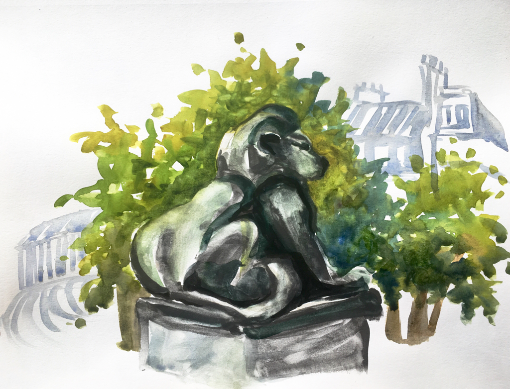
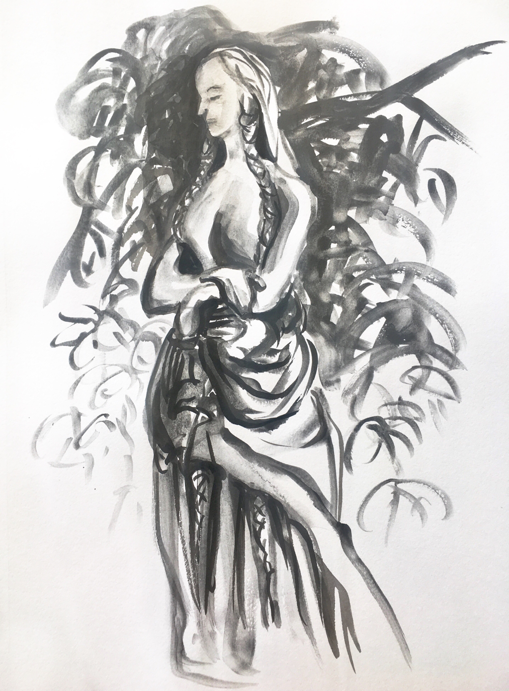
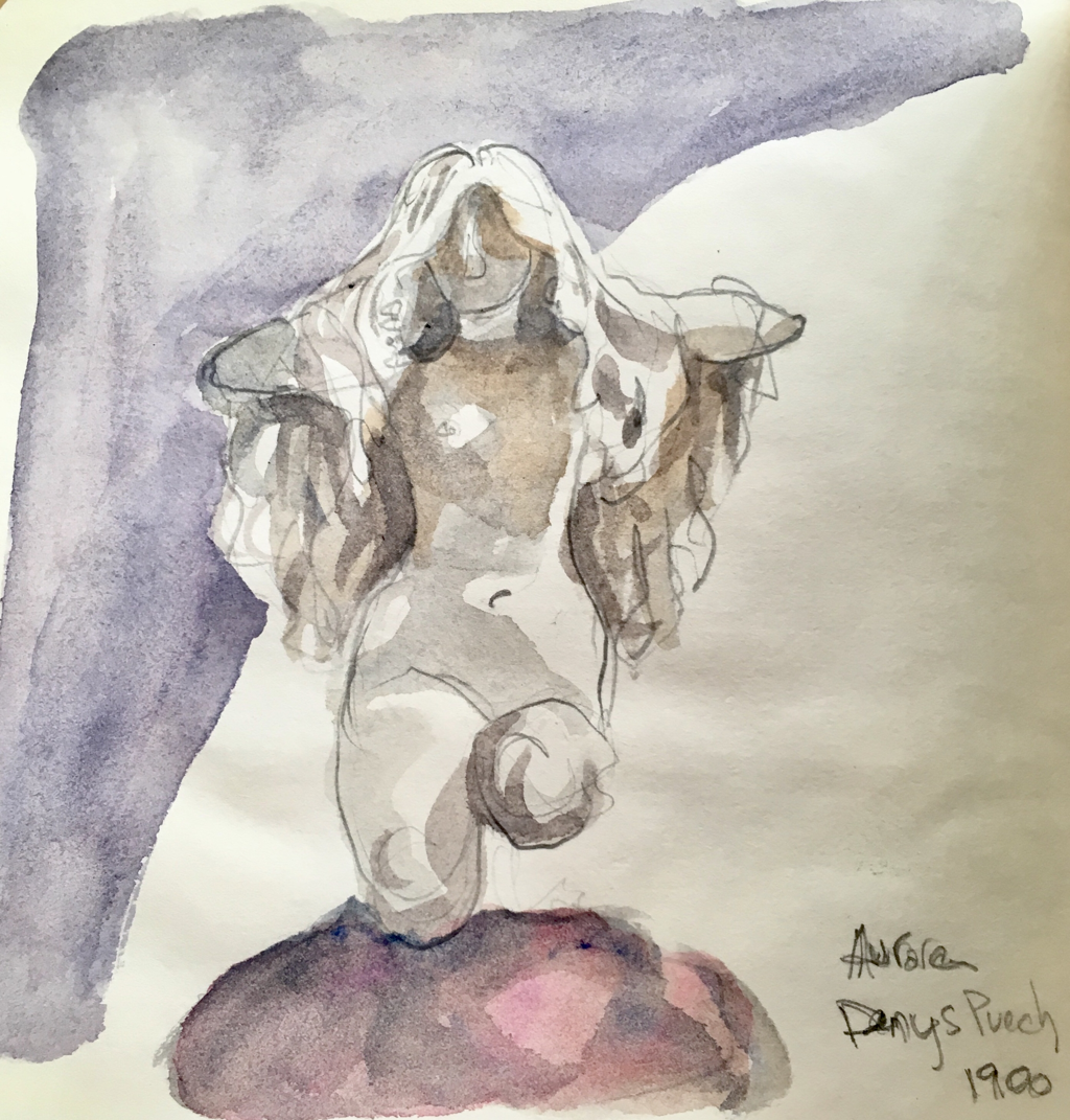
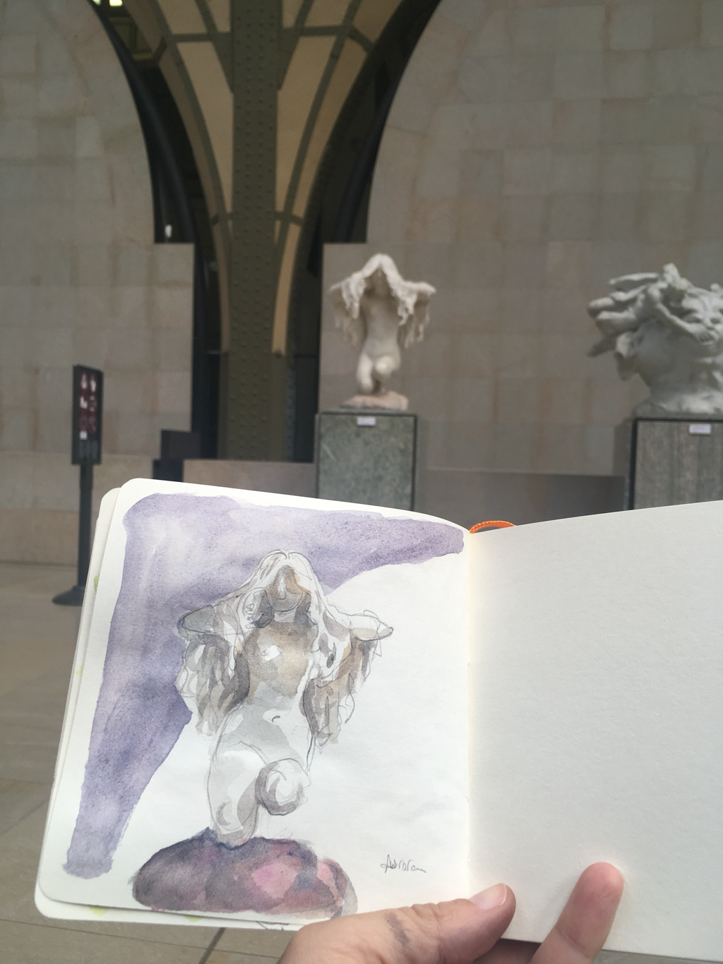
I was so inspired I did two pieces before I even got home. I started with one page in my smallest journal of the abstract sculpture by the Solferino metro station. This was what I had hoped. I kept the watercolor to a light wash and then mixed graphite and ink (the heavier tree branches) for the foreground. It was uncharacteristic restraint for me, and I was excited.

A few blocks later I stopped again and did this second piece in my bigger journal. The restraint didn’t go so well, and I ended up with much more watercolor than I had intended. It’s so hard for me not to cover the page in color. But I do like the depth of layering ink on top, and it’s hard to see here, but the graphite has a sparkly quality that also adds a richness. One place I was happy with the restraint was in the buildings on the right. They’re just sketched in with gray watercolor, no drawing of any kind first (all that direct watercolor practice was really good for me), and I was pleased with the contrast to the more full foreground. I’m not unhappy with this one, but it wasn’t what I was shooting for exactly. As can so easily happen.

Then that night I went back to self portraits. I used just the pencil and soluble graphite and the ink for the first one (no paint), but the next morning I did one where I laid in the initial “drawing” in just the flesh toned watercolor and then finished with graphite on top. No drawing, all brushwork, and I managed not to overwork it. It’s different than anything I’ve done, but I was really pleased with the outcome. Stay tuned for more watercolor and graphite mixes.
Picture
Picture
Picture
0 Comments

Impressionists in London

8/16/2018

0 Comments

 
Picture
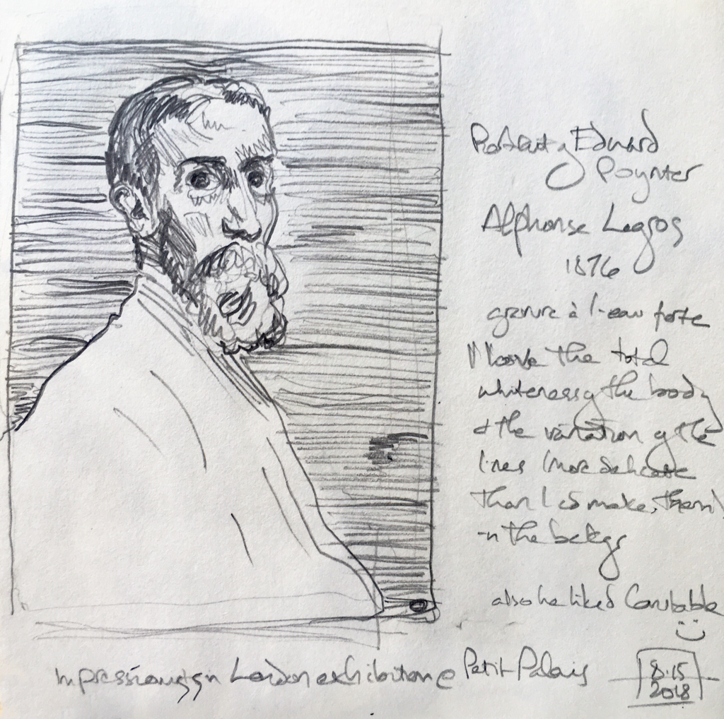
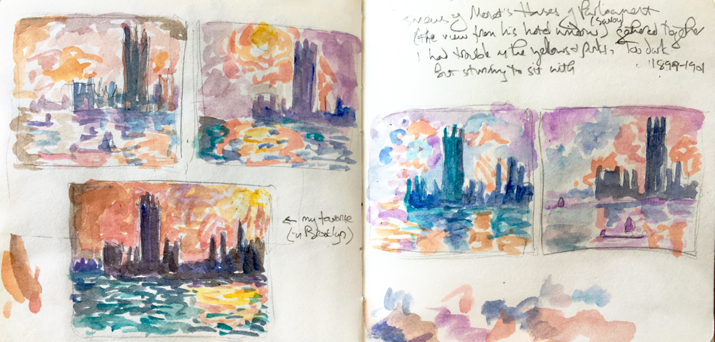
There’s a flat out marvelous exhibition of the Impressionists in London at the Petit Palais. My friend (Memphis urban sketcher and now a denizen of Paris) has a dual membership and kindly took me — and then left me to make my way at the glacial speed I travel through museums. Double kindness.


I loved the show not only for the art but also for the history. It centers around the end of the Franco Prussian war when Paris was first under siege and then in the hands of rebels for a while. Needless to say, no one much buys art under dire, wartime circumstances, so a number of French artists (and citizens) headed for London for a while, and a few stayed permanently. It was good to read how the early arrivals assisted later comers, introducing them to patrons and getting them teaching jobs. There is such press about how cutthroat the art world is, and likely there are aspects of that in the high market places, but I have found such a supportive and warm environment in Memphis with people sharing opportunities and rooting each other on. It felt good to learn about this group.


There were a number of gorgeous things in the show. There was one small room of three exquisite Whistler nocturnes, and there were many truly lovely works on paper (which I’m always excited to see), both watercolors and prints. I did a copy of one understated portrait etching by Legros with the lightest and most delicate of horizontal lines, just a bit varied, as the background. He also left the shirt almost completely white, except for a few lines, bringing all the attention to the face. The grey of the patterned background played nicely against the open space and against the strong detail of the features.


But what truly gobsmacked me was the five Monet renditions of the Houses of Parliament gathered together for this show. Usually they are scattered across continents. Monet did them all from the same vantage point, the window of his room in the Savoy Hotel. As an artist, that is a stroke of both luck and genius, to be able to set up and paint from the ease of your room. He had been unsuccessful when he first went (as a refugee from the war), and two decades later, he wanted to return and show London what he could do. I loved that as well.


I always look forward to spending time with Monet’s five versions of Rouen Cathedral at the Orsay, and seeing these together was a similar experience. I tried to sketch them, but my small and dirty travel watercolor palette didn’t handle the pinks and yellows well. It was still a good exercise for me to sit and study them and truly see the variations and differences. Even when a drawing doens’t turn out as you had hoped (which is often, even for professionals), you learn a lot from the doing of it.

​Here is the Legros etching. I spent three hours in there and longed to do more drawing, but I was kind of tapped out and hungry, so I settled for two sketches (or six, depending on how you count them).
​
Picture
0 Comments

More Self Portraits

8/14/2018

0 Comments

 
Picture
These first two are direct watercolor, which means no drawing beforehand. You just dive in with paint. That’s tricky on faces, since I’m still feeling challenged on people in general and faces (and hands) in particular, but it’s a good exercise. I’ve also found that I can sometimes over work a piece if I take too long. I’ve been trying different expressions sometimes as well, and the smile above followed a frustrating 45 minute self portrait that got way too overworked and frozen on me. (See below.) I finally just started over and did the 10 minute version above, using the information I’d gleaned from the long one. It’s my favorite so far.
Picture
Picture
I’m on a kick of self portraits lately. Partly self portraits are the poor woman’s model session — available at any hour and free. And I’ve been thinking about figures all summer, so these are good practice. They feel a little self indulgent, but last year when I was here there was a David Hockney exhibit up at the Pompidou, and there was an entire room of self portraits. I think I remember that he did one every day for a while. It’s an interesting exercise, and I’ve been doing that lately as well, practicing various techniques in the process.
Picture
I’ve also been doing them with drawing first, as I did in the overworked one (where I was also trying to incorporate architecture again). I found a new ink that I’m in love with. It’s by J. Herbin, a company that has been making inks in Paris since the 17th Century. They have small bottles you can try as well as the big ones, and I got a small bottle of amber ink just to test. It’s perfect for figures. It’s light enough that if you mess up the drawing, you can just move the ink around with your paint, but it gives you a nice base to work into. In the places where the line remains, you have a nice texture added to the sketch. Here’s a preliminary drawing in just the ink. I took a shot before moving onto paint.
Picture
Here’s the finished piece. And finally one more done with ink first and then paint. I’m realizing that it’s often the eyes that get overworked. I start with a big brush and feel quite happy with how the sketch is going, but then I get persnickety around the eyes and lose all the nice looseness and expression. So today I did the second direct watercolor (with the pony tail) to try to counteract that tendency. Still there, but I’ll keep practicing.
Picture
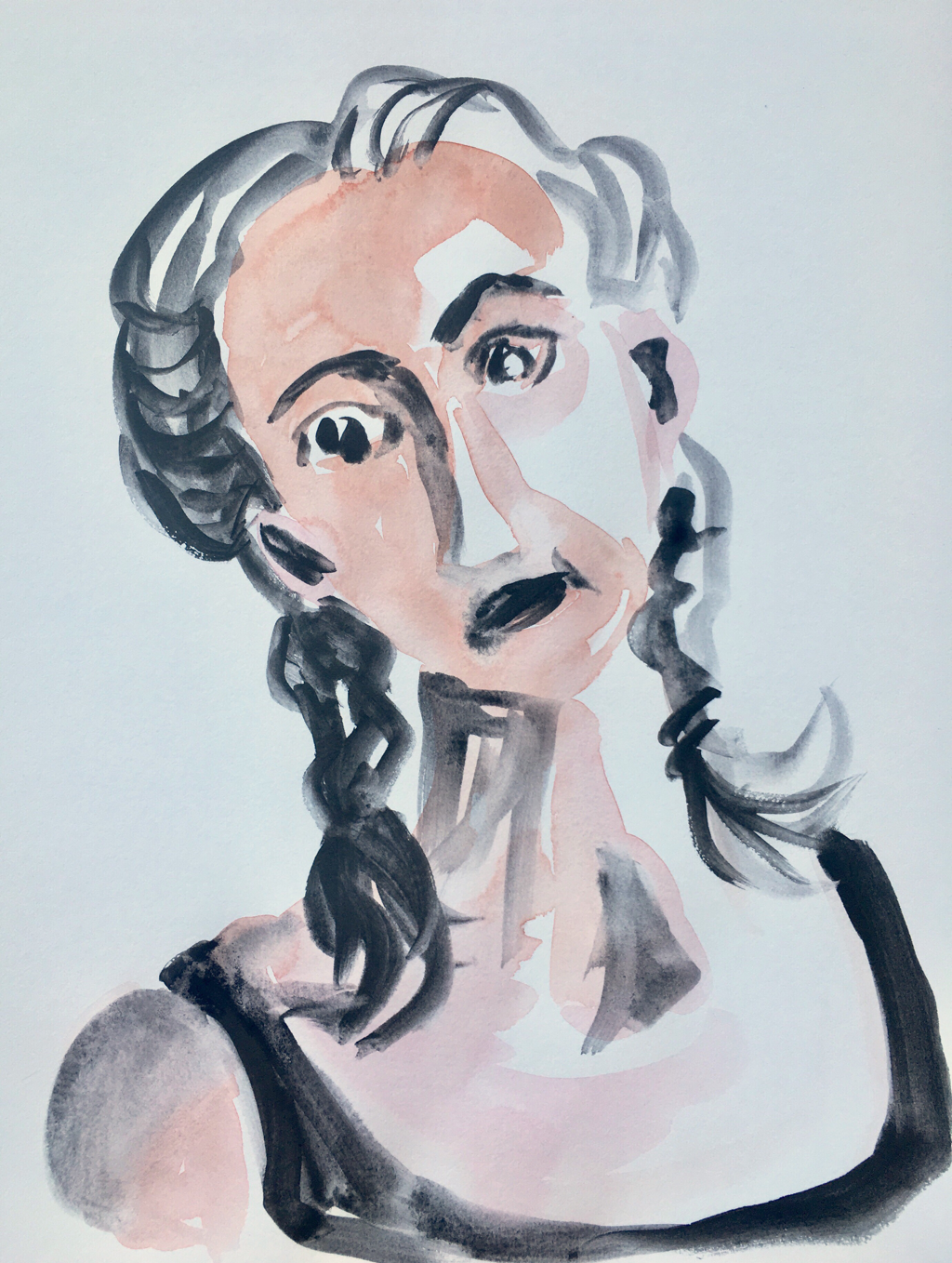
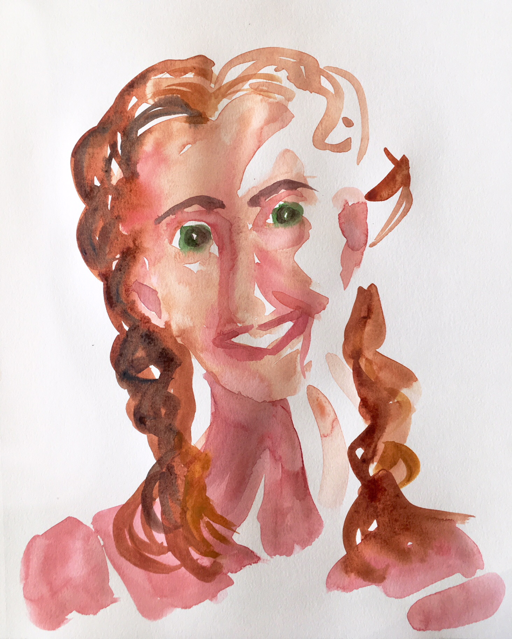
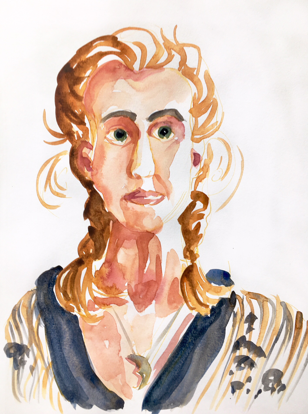
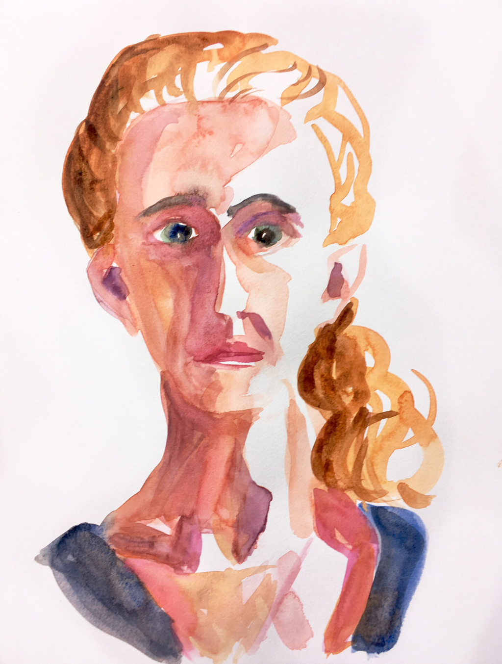
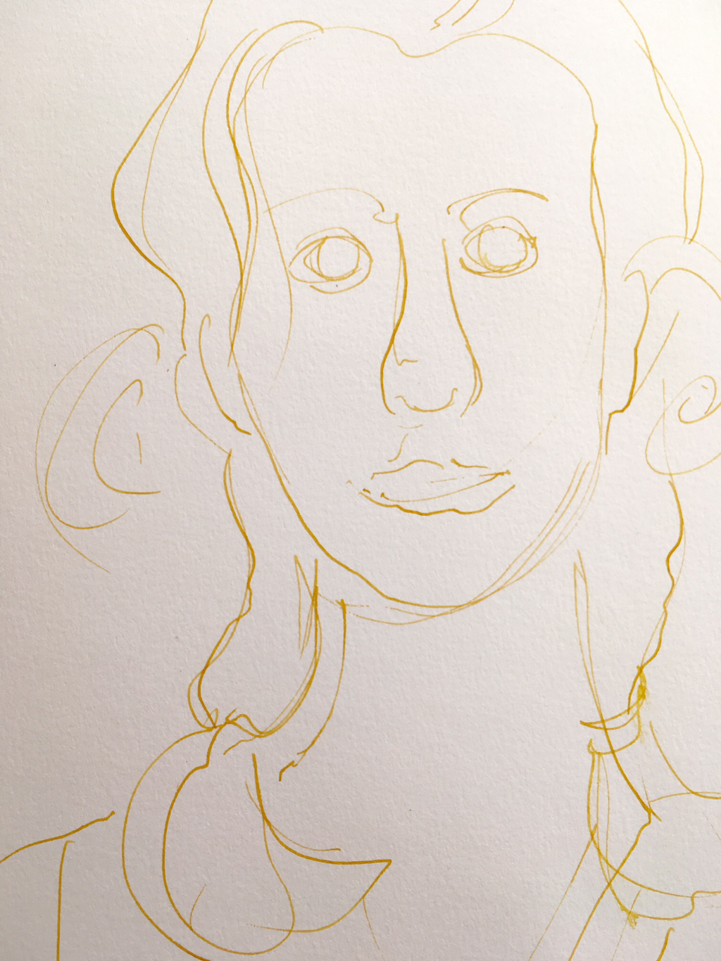
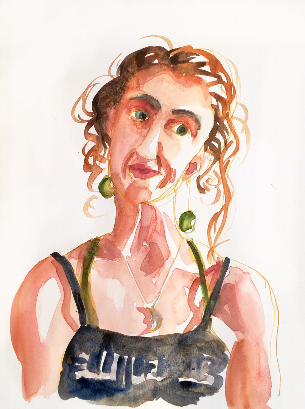
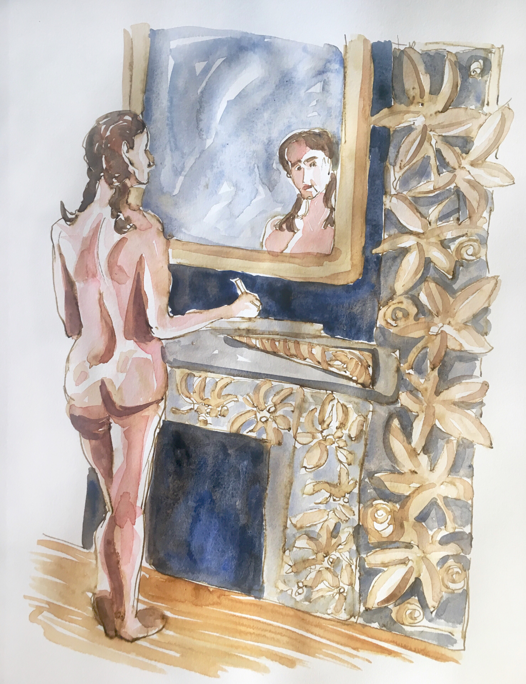
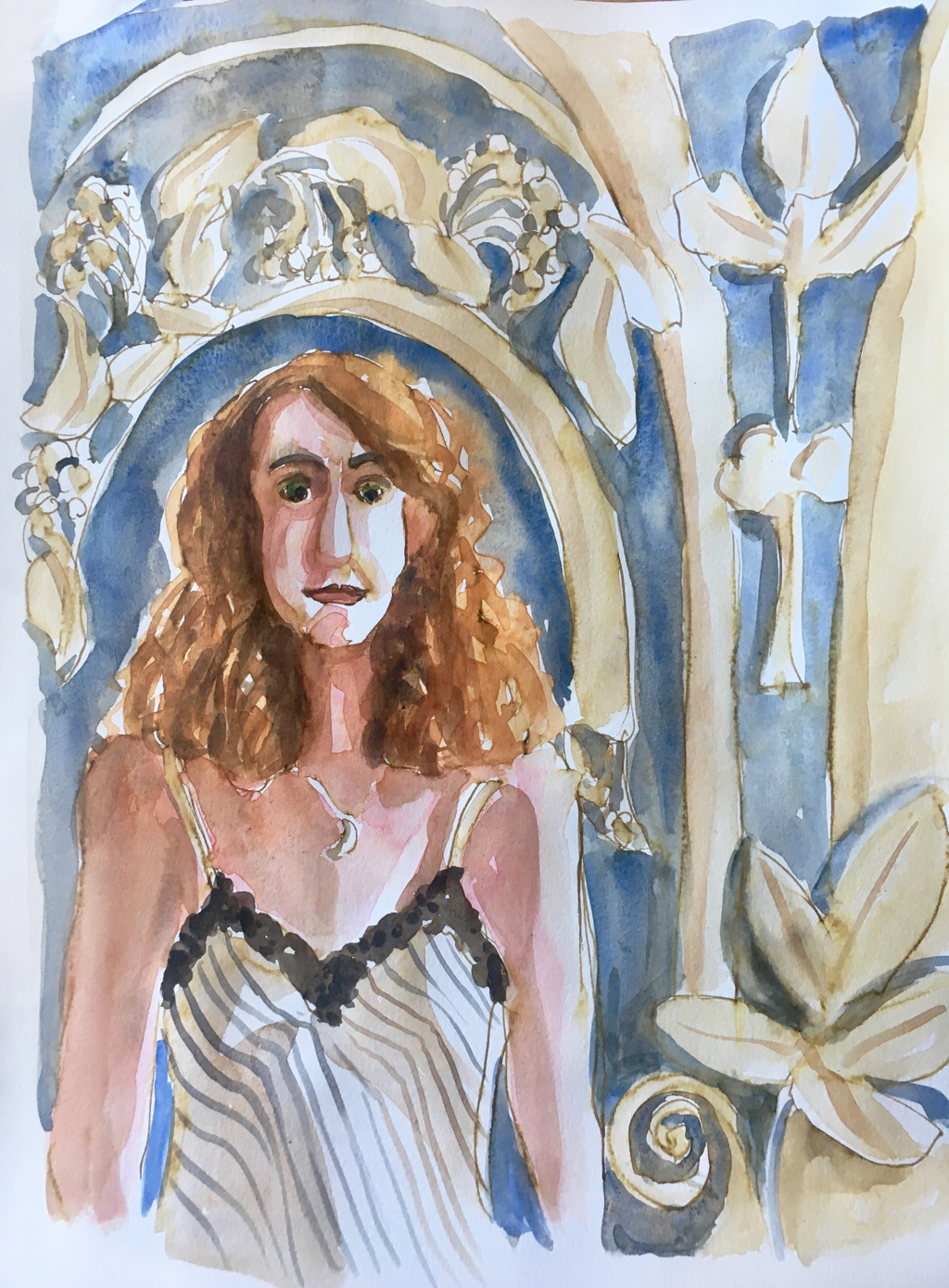
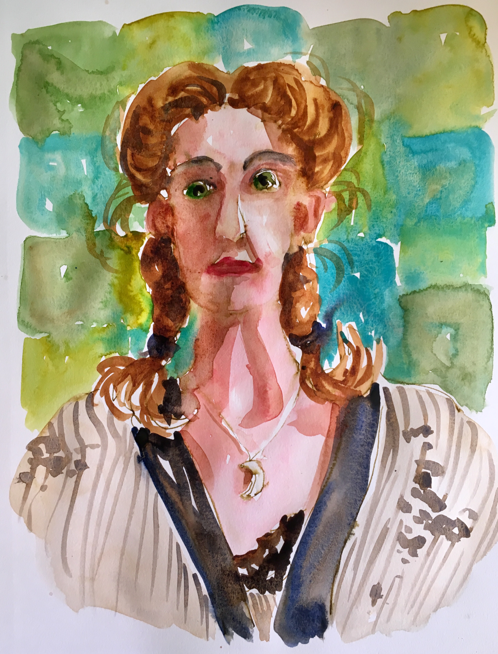
I do know that it’s a little odd to come to Paris and paint myself, but there’s a lovely huge bathroom counter and great directional light and a largish mirror (none of which I have in my midtown, old fashioned home), so it’s an inviting place for self portraits. It’s also my 6th year here, and I feel like I’ve kind of exhausted, for now, what I’d really like to say about this place in watercolor. I brought oil pastels to try, but as much as I want to like them, I’m really not enjoying working in them. Plus Paris is also my time for self examination, and that is always literal for me, going hand in hand with self portraits as I think and plan for the year ahead. All of which adds up to a number of self portraits.
0 Comments

Walking Day

8/10/2018

0 Comments

 
Picture
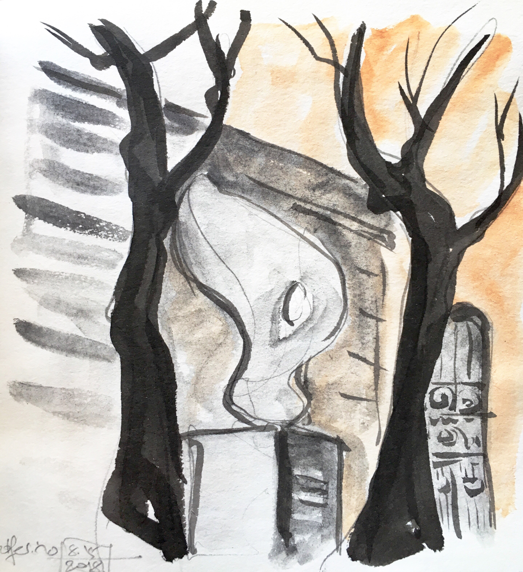
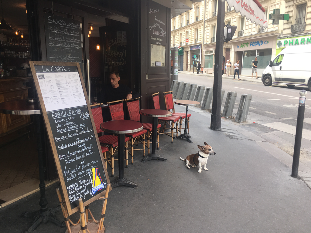
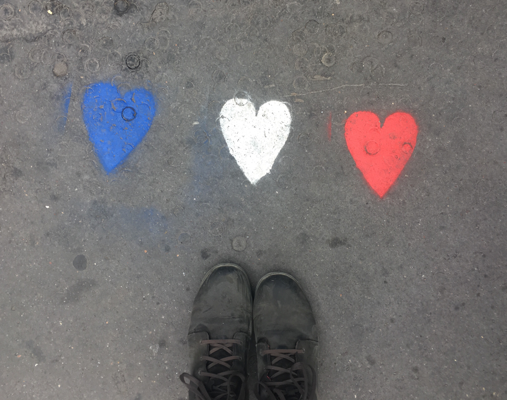
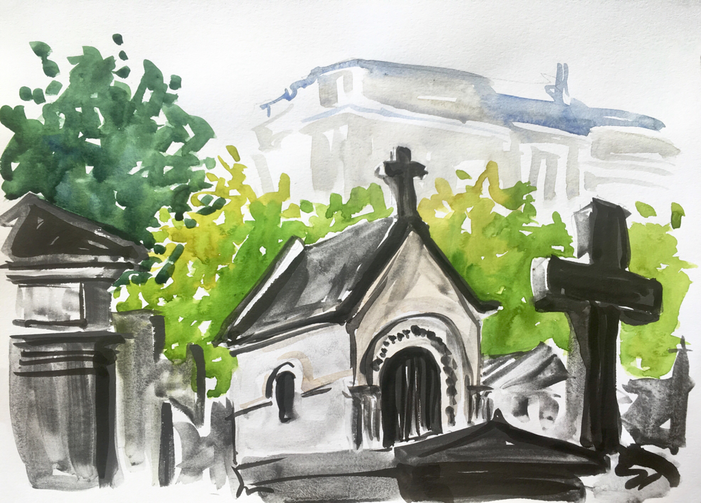
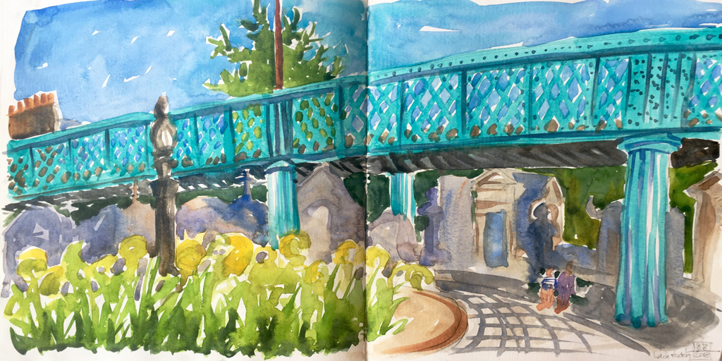
The heat finally broke in Paris, so I celebrated by walking a decent circuit of the city (over a day, with lunch and sketching and knitting breaks). It felt good to get to some of my favorite spots and just move around a bit after several pretty quiet days in mid to upper 90’s.

I had lunch and then painted in the funky Montmartre cemetery, which is now partly under a visually quite lovely overpass, even though I understand some of the neighbors weren’t happy about the addition. It adds a level of gothic funk to the cemetary that quite pleases me, though.

And I sketched my favorite door on Rue Damremont, plus a few other decorations, as I continue to think about ways to use the marvelous profusion of architectural delights in my work.
Picture
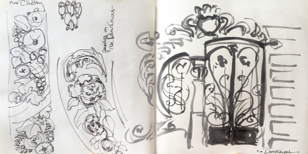
Finally, here are a couple of my favorite shots from that day, both along Rue Damremont, my old “home” neighborhood and favorite area of Paris. I loved the cafe dog.
Picture
Picture
0 Comments

Museum sketching

8/8/2018

0 Comments

 
It’s been crazy hot in Paris lately. 98 degrees yesterday, so I decided to go hang out in the Orsay, since they have air conditioning. I did a lot of looking and some sketching and even a little knitting over my lunch break. It’s good to have a pass and be able to go in and out and appreciate a bit at a time. I got there early and really enjoyed the Impressionists before all the crowds got there. Then I headed for some quieter parts of the museum.
Picture
I knitted for a while underneath this St. George and the dragon statue and decided to sketch it after I’d looked at it for a while.

I really fell in love with this tiny Vuillard oil study, but I didn’t manage to do the colors justice. There’s a depth and a layering you can get in oils that just aren’t possible in watercolor. I enjoyed looking deeply at it, though, so even if the sketch isn’t right, it was a helpful aid to my seeing more about the original painting.
Picture
Picture
Picture
0 Comments

Apartment Sketches

8/6/2018

0 Comments

 
Picture
I’m having a quiet day today. It’s hot, the Orsay is closed, and I’m on vacation. So lots of sewing on my next to last quilt block going on, and a couple of around the house sketches. I found this new teapot at a pop up street flea market yesterday, and careful readers of my blog will know how much I adore drawing teapots. I’m also on a self portrait jag, so here’s one more of those. I was trying to get a little more facial expression. I remember the artist who did pastel portraits of my sister and me as kids alway said that “a portrait is a picture with something funny with the mouth.” Nothing could more encapsulate my attempts to branch out into figurative work.
Picture
0 Comments

Architectural Details

8/5/2018

0 Comments

 
Picture
Picture
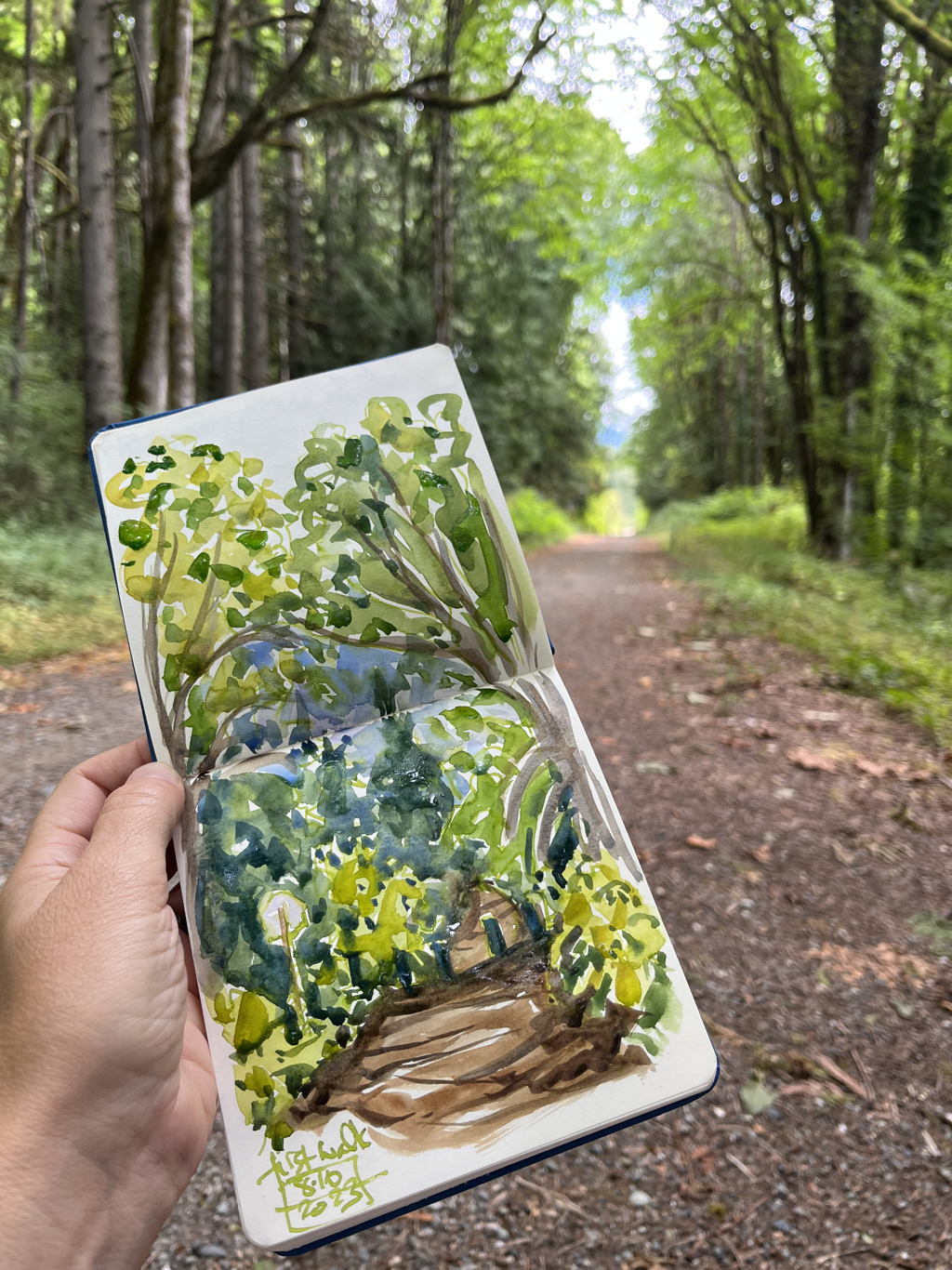
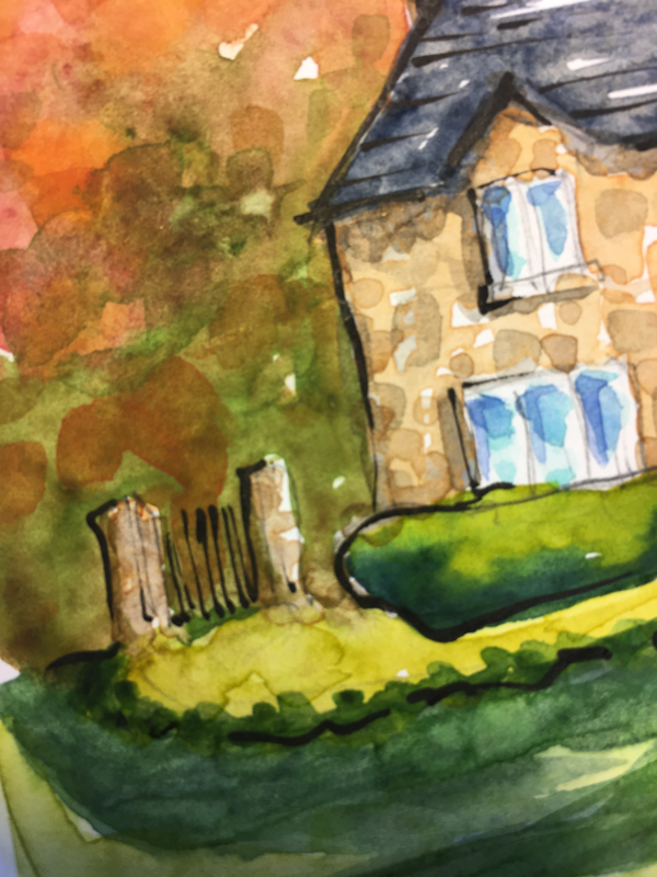
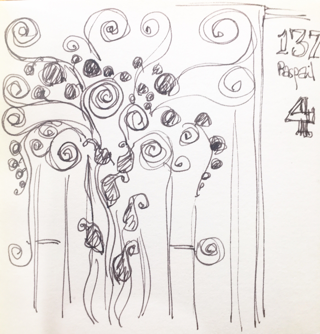
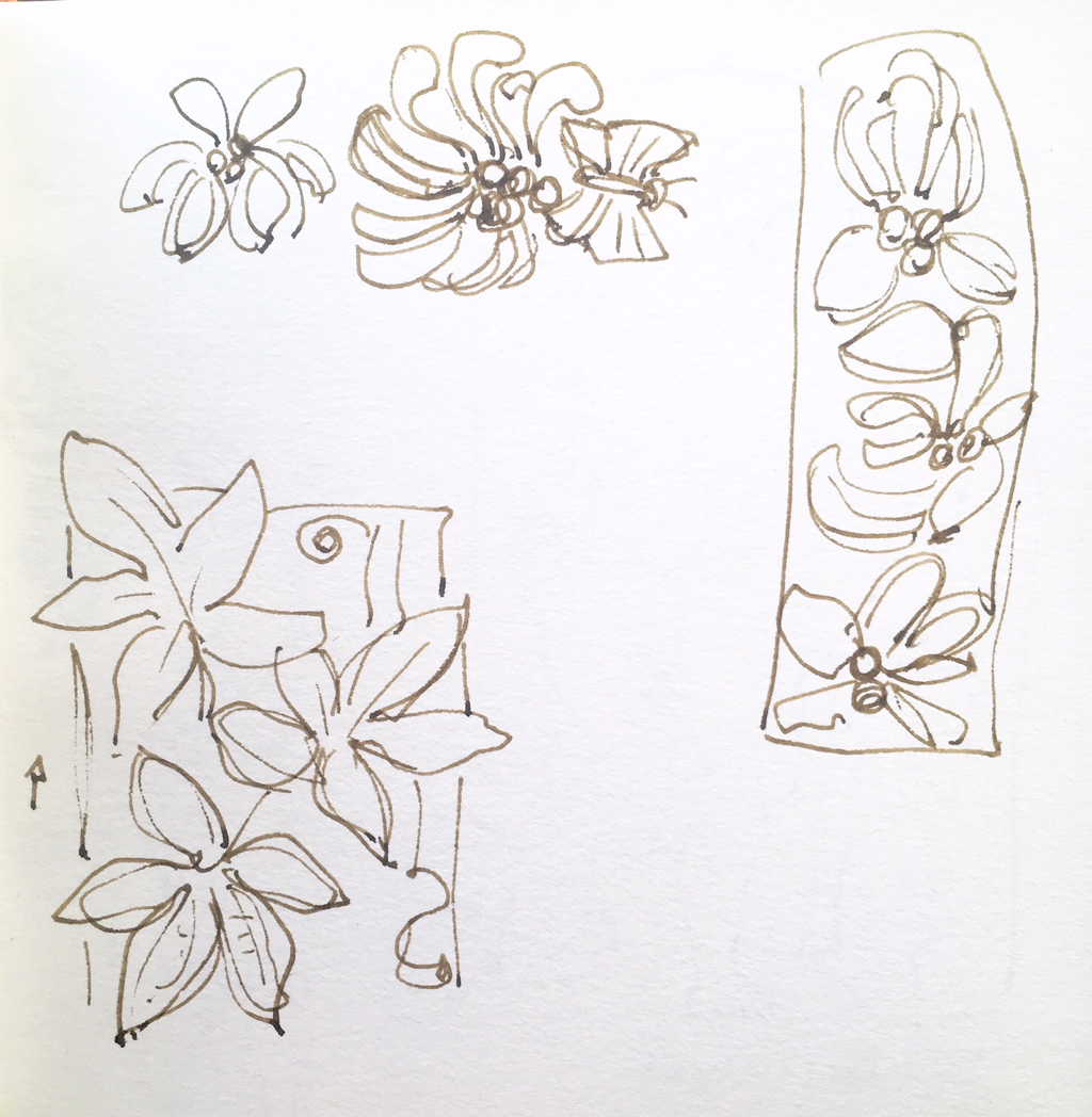
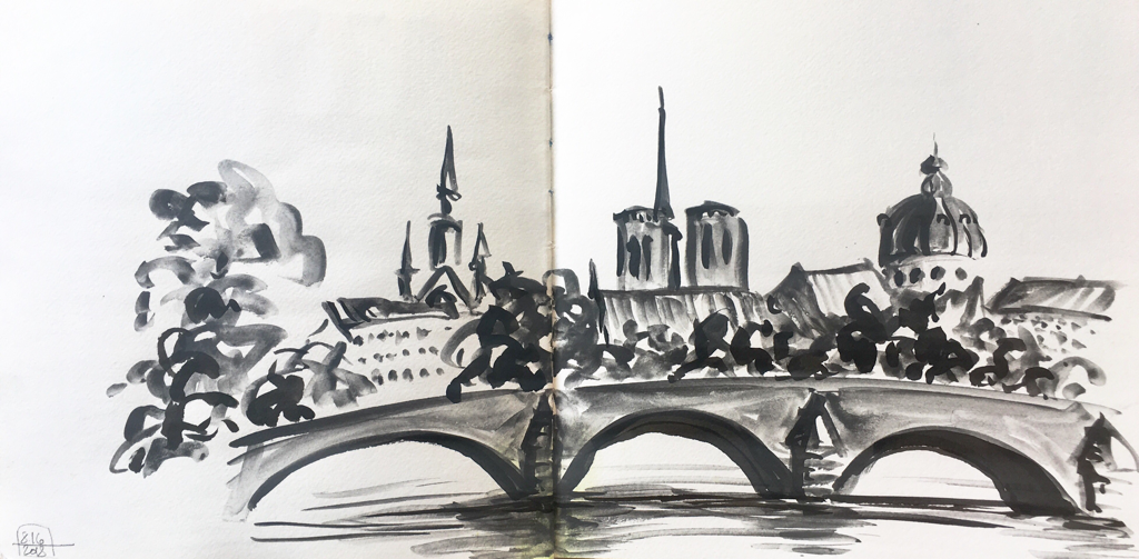
One of the things I love about Paris is that it is created for beauty. The details on so many of the buildings are exquisite and fascinating. I began to have an idea about them and spent walk home from the Orsay sketching a good number of them (which tripled my time home, but it was so worth it.
Picture
Picture
Picture
Picture
I am always amazed in the Orsay by the Surrealists. I love their feel of otherworldliness that is so different from my own art. I keep thinking about their distinctive visual vocabulary (Redon with his floating flowers, Van Gogh’s portrait with the stars behind it), and I would love to achieve that feel in my own work without knowing exactly how to do it that doesn’t feel completely derivative. I saw an Andrew Wyeth exhibition recently, and he’s such a hardcore realist, but he had one amazing landscape with feathers floating across the picture plane in the foreground. It was perfect for who he was as a painter. As I’ve been looking at these details, I’m daydreaming about using them in conjunction with figures. I did the first self portrait on the right, and (aside from the deer in the headlights look — faces are still hard for me), it had something of that Medieval sense of pattern and symbolic space that I was hoping for. The second has more realistic space in it, but with the added Art Deco details I sketched on various buildings. I’m going to keep playing with this for a bit and see what happens.
Picture
Picture
0 Comments

More people

8/2/2018

0 Comments

 
Picture
Picture
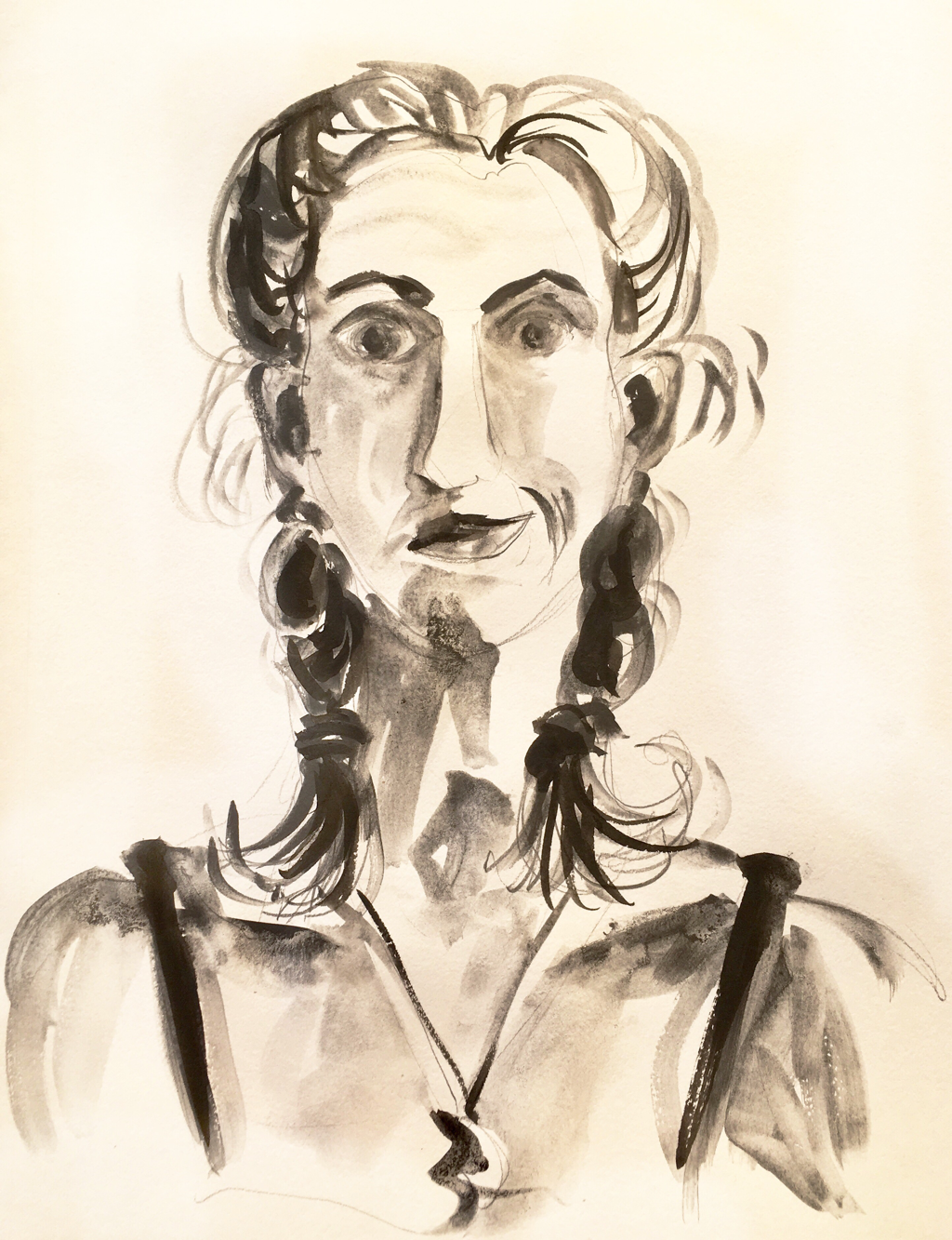
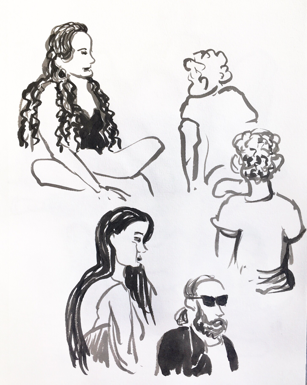
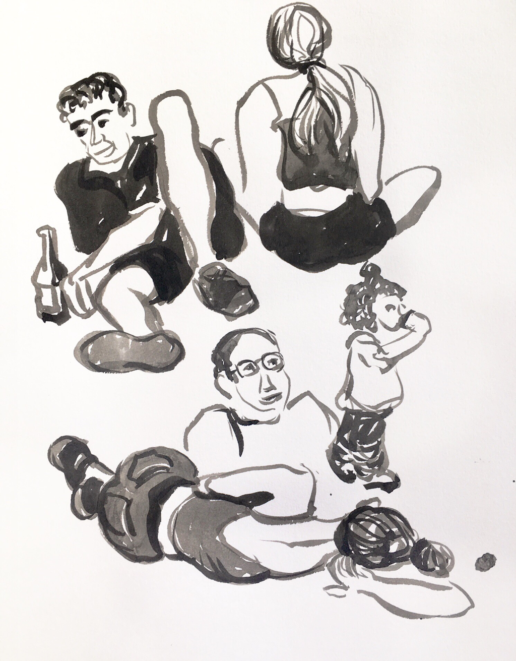
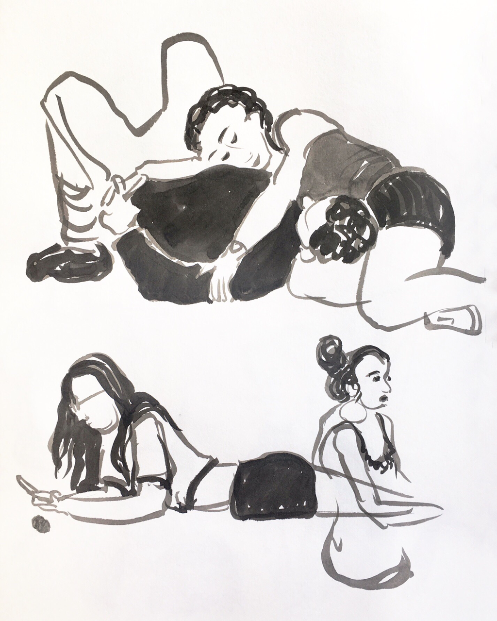
I’m a little bit in love with my two brush pens filled with sumi ink of two different strengths. I went to Luxembourg Gardens the other night to sketch people lying on the lawn after dinner. One thing I love about Paris is how everyone floods out into public spaces together instead of staying hermetically sealed up in their own homes and cars. There’s always a party on the sidewalk and in the parks.


I hung out and sketched a while, and I also did another self portrait, moving back to watercolor to keep in practice after my figure sessions earlier in the summer.
Picture
Picture
0 Comments
<<Previous
    Picture

       online store


    Martha Kelly is an artist and illustrator who lives and works in Memphis, Tennessee.


    Get studio email updates from Gideon and me.
    Submit

    To subscribe to this blog, by email:

    Enter your email address:

    Delivered by FeedBurner


    Categories

    All
    Artist In Residence
    Art Workshops
    Calendar
    Chalk Line Books
    Commissions
    Country Workshops
    Daily News
    Dixon
    Dogs
    Exhibition
    Food Sketches
    Fountain Pen
    Fountain-pen
    Gouache
    Graphic Essay
    Graphite
    Illustration
    Letterpress
    Liturgical
    Markers
    Memphis Theological Seminary
    Memphis Urban Sketchers
    Museum Sketching
    Musicians
    Oils
    Open House
    Overton Park
    Paris
    Pastels
    Pen And Wash
    Pink Palace Crafts Fair
    PNW
    Prints
    Publications
    Radio
    Self Portrait
    Still Life
    Tea
    Television
    Travel
    Trees
    Urban Sketching
    Video
    WAMA
    Watercolor
    Watercolor Crayons
    Wedding


    Archives

    March 2023
    February 2023
    January 2023
    December 2022
    November 2022
    October 2022
    September 2022
    August 2022
    July 2022
    June 2022
    May 2022
    April 2022
    March 2022
    February 2022
    January 2022
    December 2021
    November 2021
    October 2021
    September 2021
    August 2021
    July 2021
    June 2021
    May 2021
    April 2021
    March 2021
    February 2021
    January 2021
    December 2020
    November 2020
    October 2020
    September 2020
    August 2020
    July 2020
    June 2020
    May 2020
    April 2020
    March 2020
    February 2020
    January 2020
    December 2019
    November 2019
    October 2019
    September 2019
    August 2019
    July 2019
    June 2019
    May 2019
    April 2019
    March 2019
    February 2019
    January 2019
    December 2018
    November 2018
    October 2018
    September 2018
    August 2018
    July 2018
    June 2018
    May 2018
    April 2018
    March 2018
    February 2018
    January 2018
    December 2017
    November 2017
    October 2017
    September 2017
    August 2017
    July 2017
    June 2017
    May 2017
    April 2017
    March 2017
    February 2017
    January 2017
    December 2016
    November 2016
    October 2016
    September 2016
    August 2016
    July 2016
    June 2016
    May 2016
    April 2016
    March 2016
    February 2016
    January 2016
    December 2015
    November 2015
    October 2015
    September 2015
    August 2015
    July 2015
    June 2015
    May 2015
    April 2015
    March 2015
    February 2015
    January 2015
    December 2014
    November 2014
    October 2014
    September 2014
    August 2014
    July 2014
    June 2014
    May 2014
    April 2014
    March 2014
    February 2014
    January 2014
    December 2013
    November 2013
    October 2013
    September 2013
    August 2013
    July 2013
    June 2013
    May 2013
    April 2013
    March 2013
    February 2013
    January 2013
    December 2012
    November 2012
    October 2012
    September 2012
    August 2012
    July 2012
    June 2012
    May 2012
    April 2012
    March 2012
    February 2012
    January 2012
    December 2011
    November 2011
    October 2011
    September 2011
    August 2011
    July 2011
    February 2011
    January 2011
    November 2010
    October 2010
    June 2010
    April 2010
    January 2010

  • HOME
  • PRINTS
  • WATERCOLORS
    • Memphis
    • Paris
    • England
    • France
    • Greece and Turkey
    • St. Louis
    • My Palette
  • OILS
  • BOOKS
  • SKETCHES
    • Quarantine Journal
    • Memphis
    • Overton Park
    • Mr. Darcy
    • Mr. Darcy's Odyssey
    • Musicians
    • Tea
    • Dutch travelogue
    • Shakertown travelogue
    • Sketching tools
  • LITURGICAL
    • Special Bulletin Sets
    • Bulletin Line Drawings
    • "The Garden"
  • BLOG
  • ABOUT
  • SHOP