 It took me getting to Washington to get to a scanner and clean up my St. Louis sketches. I love to draw there and did some smaller, faster sketches as well as full watercolors. This first one is walnut ink with a dip pen of an Osage Orange tree. They always grow in such fascinating shapes. I also got a fantastic blueberry/lemon curd crepe from a food truck creperie that flashed me back to Paris. I loved both the food and the fun little bus, so I did a sketch to remember.  There was also a great book signing at the graphic bookstore Betty’s Books. Beautifully they got in an art hero of mine Lucy Knisley. I found her first graphic memoir An Age of License some years ago, and it (plus my first Ben Hatke book found at the same time) made me want to include more storytelling in my work, which had been purely landscape up until that point. She had a huge influence on my work, and I trace a direct line back from her book to doing several of my own, even if they’re quite different in feel. It was fantastic to hear her talk, meet her in person, and see her delightful hand painted cat dress.  One more lovely day in town was revisiting the St. Louis Art Museum, another favorite place. They had a Vuillard I don’t remember from before on view this time, which makes sense because it’s on cardboard and probably needs to rest for preservation purposes in between times out in the light. I love his patterned interiors and interlocking shapes and had fun doing a sketch while standing in front of it. 
0 Comments
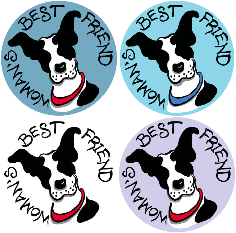
 I have always loved those golden age British mysteries with a map at the front. Probably because my dad collects maps and often hand drew ones for us to follow along with from the back seat on family vacations. Since all the trees in the exhibition at Rowan Oak are actually on the grounds of Faulkner’s home, I thought it would be fun to give people the opportunity for a self guided scavenger hunt to compare the prints with the originals. There are no prizes, but if there were, there would definitely be extra credit for Portrait III, which is by far the trickiest to spot.  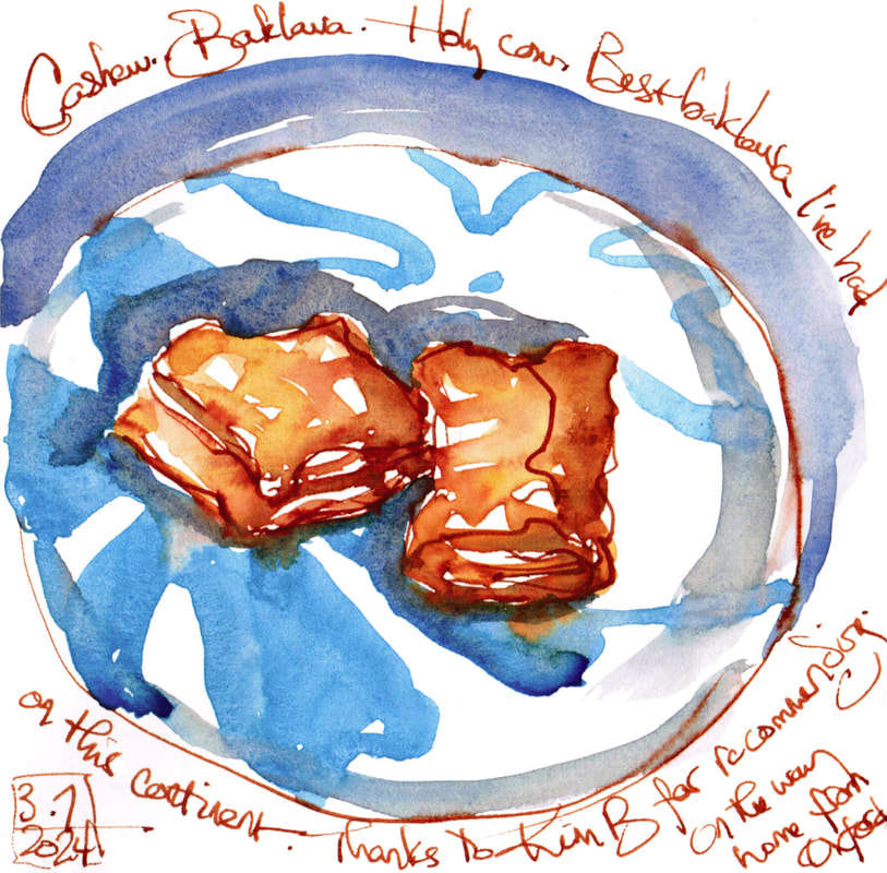 I've been getting back into printmaking, which is slow to have something to show, but I've also been doing smaller things over the past week or so. One is finding the best baklava I've had (by a lot) on this continent, and doing a little sketch of it in Diamine Ancient Copper ink plus watercolor. Sometimes the ink gets too hot, but sometimes it's really right and rich, and it felt right here. If you're in striking range, getting down to the Mediterranean Bakery and More market in Southaven, MS, is so, so worth it. Ridiculously worth it. Speaking of worth it, I also took a mini, free online illustration portfolio class with Mike Lowery, an illustrator I follow on IG and admire. I generally dislike online classes, but this one was in easy bite-sized chunks, and we did one achievable project. He walked us through both Photoshop and Procreate for adjusting a basic on-paper sketch, and I learned how to color in layers. Usually I just clean up finished watercolors. I mostly like to work on paper, but this is a good, small set of starter skills I'm happy to have. The project was to make a sticker, and I haven't ordered them yet (I'm still tinkering with the lettering on the Woman's Best Friend one), but I plan to. (I mean, how did men get dogs and women got stuck with diamonds?? What a racket. I'm making a play for the dogs.)
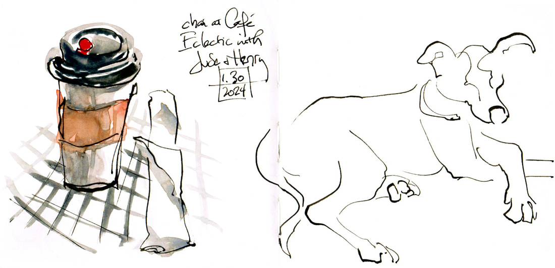 I've mostly been doing book work lately, illustrations meant specifically for M is for Memphis. I'm excited about how it's going, but I also feel myself tighten up a bit when I'm painting for a purpose like that. It felt good yesterday to take advantage of a sunny 60 degree day and go get chai with my partner and then head over to the park for some sky studies. The clouds had been amazing as we sat on the cafe deck, but they were moving rapidly out by the time I got to the park and was settled on a picnic table with Henry tethered beside me to hang out. I did one quick cloud study as the front piece to a new sketchbook. I'm kind of excited about this one. It's a Handbook watercolor book, like my normal bigger (8x8") size, but it's 8x4" or so. I had a vertical one this summer that was 8x10". It was fun to branch out of my normal landscape format double truck and have something more upright, but it was SO much real estate to cover that I was a little reluctant to start a piece if I didn't feel I had a good long time. I don't need a sketchbook that makes me reluctant to open it. The nice thing about that one was that it was slightly landscape format, but tallish, when open. This one is purely square, which isn't my favorite, but it's good to mix up my shapes, and I love the size. I stumbled on it in an art store out west and have been waiting to finish my last bigger Handbook to start the new one. I had fun and did a sycamore tree I love against the blue, blue sky once the clouds had gone. I'll be curious to see how this format feels as I use it more. 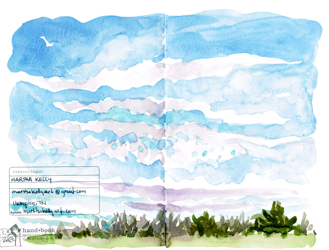 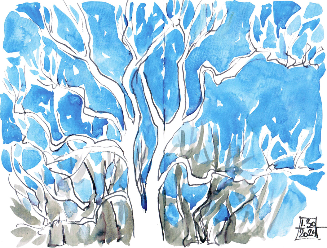
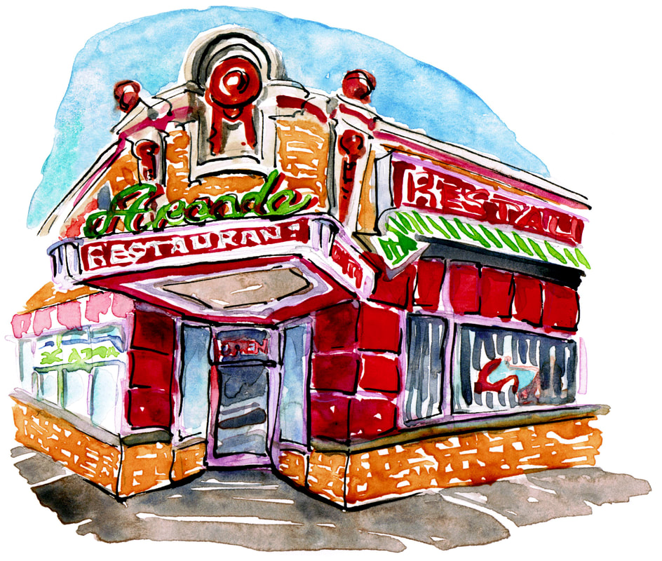
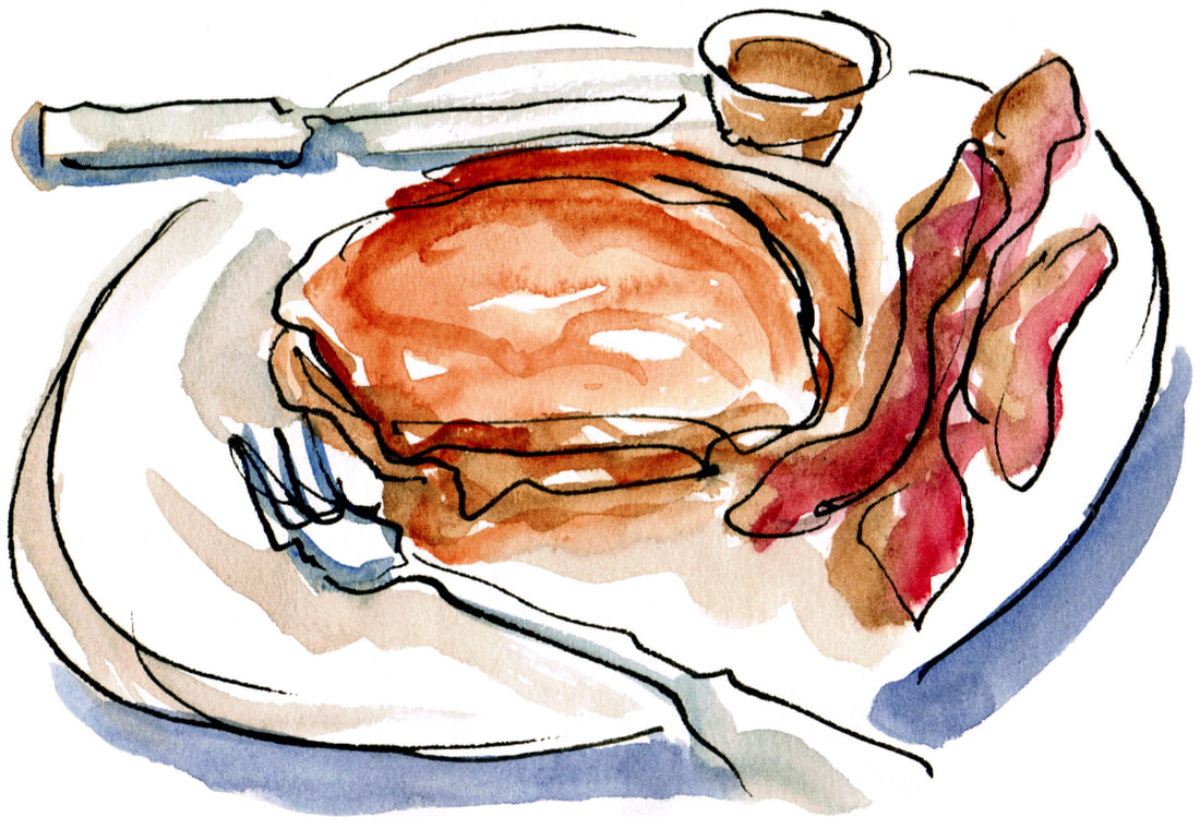
Memphis had eight solid days of snow and ice, so I treated myself to a staycation writers retreat. One of my two big goals for this year is to get a new alphabet sketchbook done. It's M is for Memphis, which my local bookstore has been nicely requesting. They sell a lot of P is for Possum and would love a broader Memphis book as well. I've been tinkering with the alphabet for over a year, but the last few weeks I've made a strong start on actually getting art together and putting it on pages. I'm doing a good bit of new work (A is for Arcade at the top)but also plundering my sketchbook to see if I've banked sketches over the years that would go well in the book. I sketched the Arcade's sweet potato pancakes several years ago and will add that sketch to the overall piece of the building itself. I go back through my sketchbooks fairly regularly for inspiration for prints or paintings, but it's fun to be able to pull out those done-on-the-spot images to use as they are.
This is going to take most of the year, but I'm hoping to be able to have it out for fall. Fingers crossed. Books always take longer than I think they well, but I'm pleased with how it's going so far.
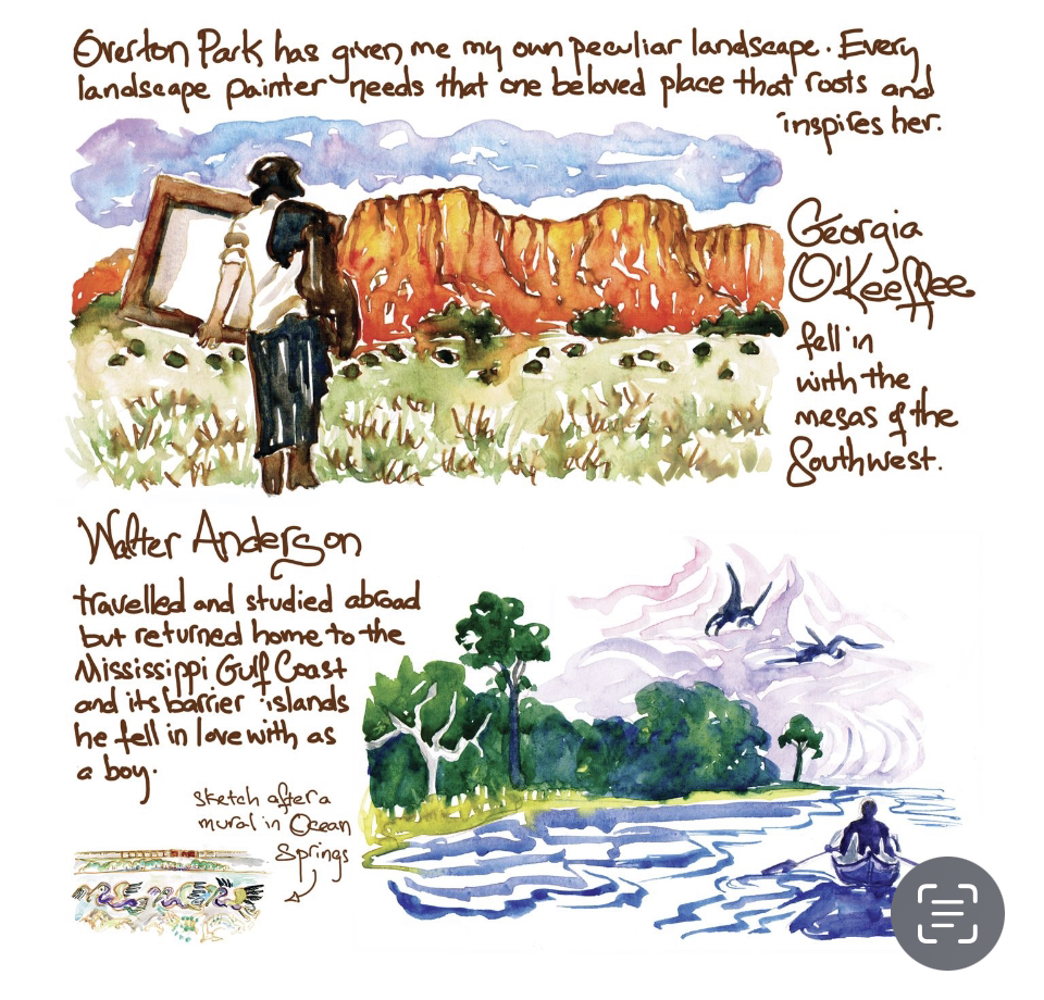
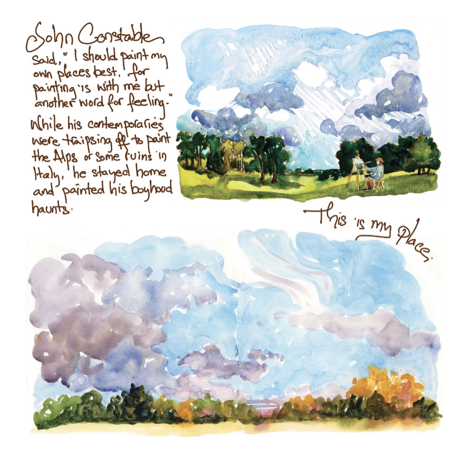
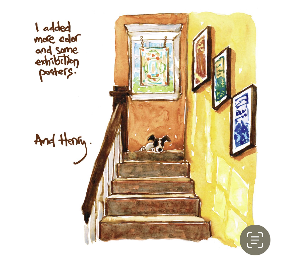
I’ve been doing a bunch of book work this week since getting the Apple pencil. It’s taken a bit of getting used to, but is so much better than scanning in and cleaning up huge blocks of text. I can also play with it and change sizes, wrap it around images, etc. It feels much more immediate, and while I’m working to keep my handwriting legible, I hope that energy will translate into the book. I see that the pencil somehow migrated in color a bit, but overall I’m getting the hang of things and am grateful for this new tool. This is a double page spread. Georgia and Walter were in the Oxford American essay, but no one who knows me will be surprised to see that I added Constable now that I have a bit more room. He’s my number one influence on work habits and art philosophy, but OA is about Southern culture, so I leaned into American artists for it. I’ve got a few more watercolors and a back cover to do, but I’m getting close. I forget how very much longer all this takes than I think it will, but it’s always worth it to have a book in my hands.
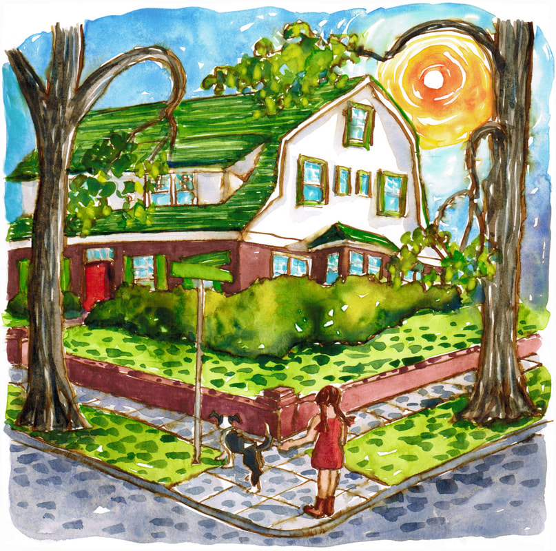
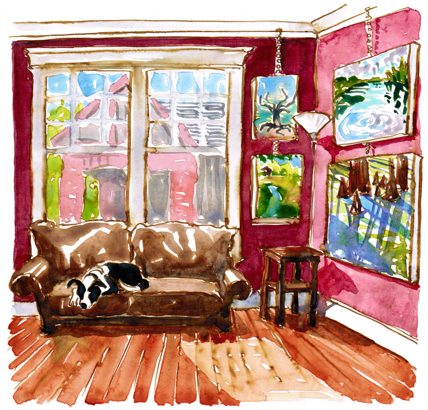
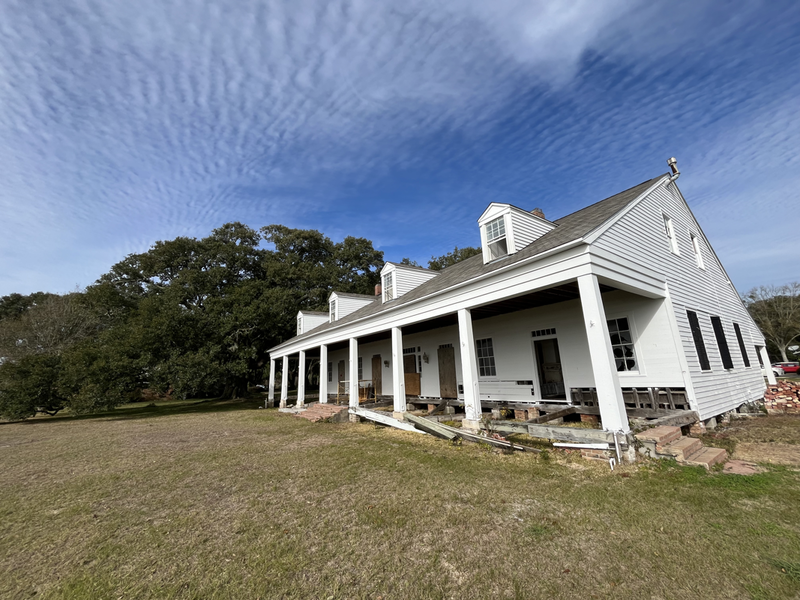
 Depending on your point of view, I either got a new toy or invested in my work last week. I love making art on paper with paint or carving, but the text part of making a book is painstaking if I write by hand and scan in, cleaning up lines of text and trying to keep them in the correct area around the images and in a ballpark of the same size. So this week I got an iPad Pro and Apple pencil. Being able to write directly on the book page without the smudges and dirt a scanner can add in is a huge pleasure. I’m still getting used to the iPad version of photoshop and the feel of the pencil itself, but I’m feeling encouraged. I’ve got a couple of different book projects in mind, and I think this will be a huge help. I’ll lose that variation of ink that a real pen gives you, but I’ll regain the energy and creativity of wrapping text around the images and playing directly with the spaces instead of trying to replicate that on a separate page. I’m still working to figure out sizes and keep my writing neater with the pencil, but I’m very happy with the early progress.  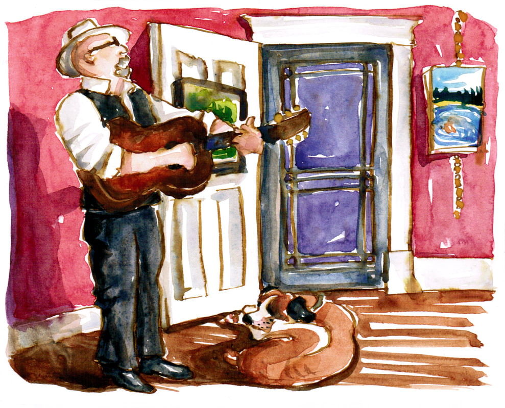 One of my big projects this year was the Oxford American graphic essay Memoir of a House. It's still on the new stands in the Summer issue, but once the Fall issue comes out, I'll be free to publish it as well. I'm expanding it just a little and making it into a book, which I plan to have out before Christmas. I'm adding in maybe a dozen more watercolors to go with the 30 that were in OA, with a few more tidbits about the history. One bit I'm adding is more of how I use my front room. It's always a gallery, but it has been known to double as a dance hall or a space for house concerts. The inimitable Joe Newberry played his songs and told his stories with Mr. Darcy lying at his feet, and I wanted a sketch of that moment for the book. I've also been known to have swing parties with a live band, as part of the local contra dance weekend we used to put on in town. It's been fun to revisit and expand this project a bit. 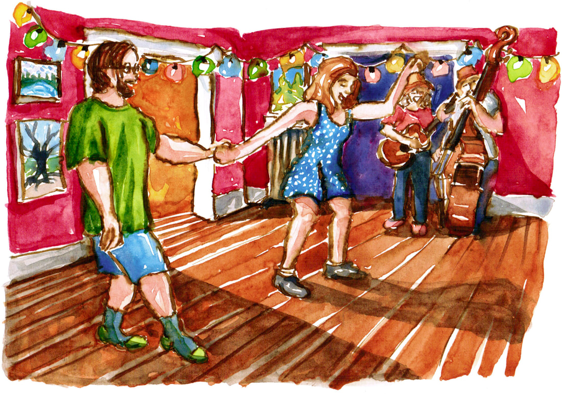 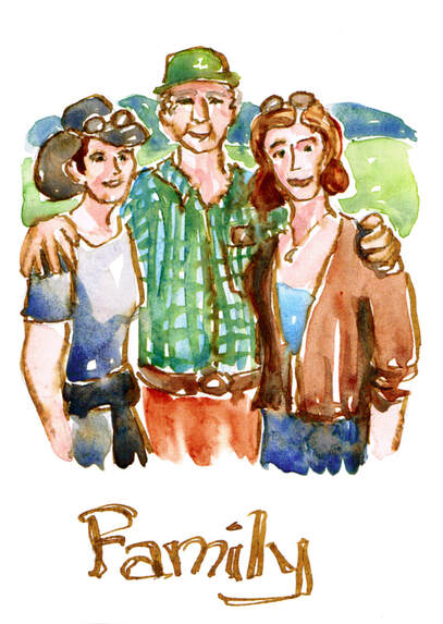 My sister was in town all week, which is always both a delight and a whirlwind, so I just blocked off the week for family stuff. We had a ball. And she came through with her movie quote oracle cards she's been making off and on since her teens. A friend has opened a store that leans heavily into both oracle and tarot cards, and I'm always intrigued by the artistry. All of this reminded me of my "full deck year" project of my own set of cards, personal motifs and nudges, that I had started last summer. I always do one off the wall project over the summer just for me. It's my slow period, and it's good to play. And then I allow myself to fizzle on it when it is no longer serving me. So I managed eight last year and shelved things. This week I did a 9th. We'll see if I pick up any steam again or just enjoy the reminder and memories invoked by this one of the two of us with Dad. Below is the batch from last year. 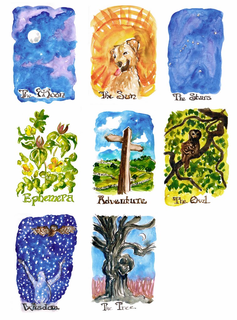
Oxford American is on newsstands and in bookstores (Burke's and Novel locally), and my essay is also up on their website. I'm so delighted to see it out in the world! It was a great pleasure to have a physically small winter project to do through the worst of my long covid. I could be on the sofa, under a fuzzy blanket, with Henry on my feet, and work on the 30 small watercolors while watching British mysteries. It meant so much to have a hopeful, exciting project that was also manageable for me. I'm still not standing up to do oil paintings, but I'm back to doing a bit more print work again. This essay saved me through the worst of being able to do none of my regular, much loved activities. WKNOfm hosted me to talk about the essay (and to announce my next big project), and that interview is here. They do such a great job supporting a whole range of arts in Memphis. Here is one more painting from the essay. I had such fun doing a small portrait of Georgia O'Keeffe in her adopted landscape. 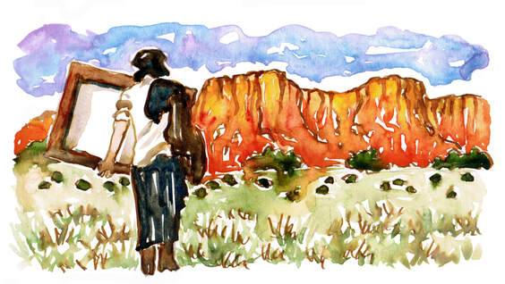 |

online store Martha Kelly is an artist and illustrator who lives and works in Memphis, Tennessee. Get occasional studio email updates. Categories
All
Archives
June 2024
|