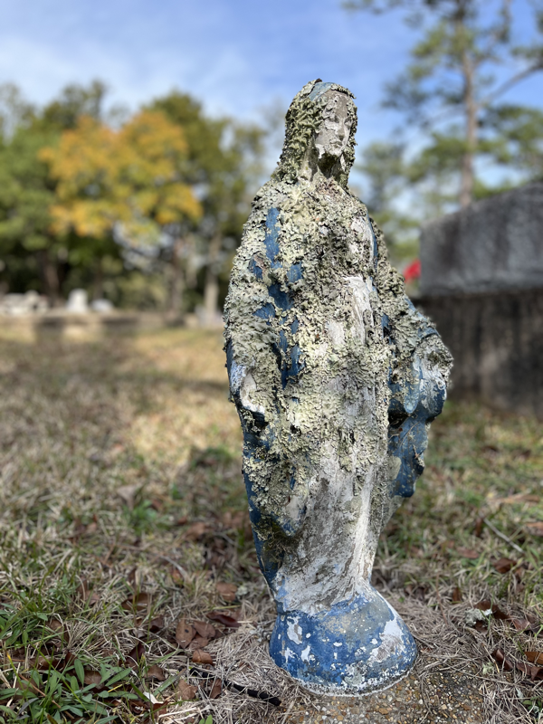
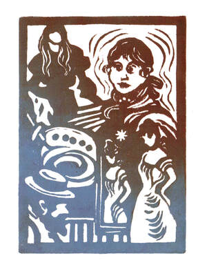
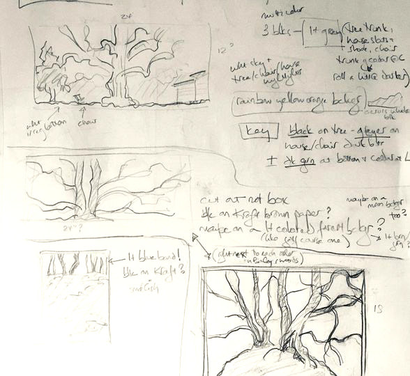
 I have always loved those golden age British mysteries with a map at the front. Probably because my dad collects maps and often hand drew ones for us to follow along with from the back seat on family vacations. Since all the trees in the exhibition at Rowan Oak are actually on the grounds of Faulkner’s home, I thought it would be fun to give people the opportunity for a self guided scavenger hunt to compare the prints with the originals. There are no prizes, but if there were, there would definitely be extra credit for Portrait III, which is by far the trickiest to spot. 
0 Comments

I will get it in a frame and have it ready to hang with the rest of the show on Monday. I've also carved and printed a small gallery card for folks coming through the museum to pick up and have my information available. This is one of the handful that print two tone when I add a second color once the first is established. I love the variegated effect. I usually get three or four of these before the inks blend to a solid color again, so most of the cards will be a little less wild, but I always love these the best.
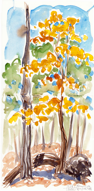
 My main work lately has been my upcoming Faulkner's Trees exhibition. I'm trying to get final prints of everything, get started on the framing, and finish carving the last two prints. I'm working slowly with my fatigue making an unwelcome return, but I'm chipping steadily away at it. We haven't set a hang date yet, and I'm grateful for Rowan Oak being flexible. It will go up some Monday in June so it's in time for the Faulkner scholarly conference that meets there in July. I'm so grateful to them for wanting my work for that. So carving and printing every morning while I'm fresh. There has been lots of tea involved.  I've got the first couple in frames already. It's nice not to leave all of that till last, since it's my least favorite part of the process.  This is the last piece I'm working on. It's three colors, and I'm carving on the last block now.  I haven’t been sketching this week, and I’m missing it, but I’ve been getting some good work done on a new print for my Rowan Oak show next year. This is an especially complex piece. I had a lot of colors I wanted to include, and I hate to carve and print more than three blocks per print. So laying it out got complex, and I’m mixing more than one color for each block, but I loved the sketch I did of this tree, and it’s worth the aggro. I’m doing a series of color proofs as I keep refining the carving as well. At top is the best one so far. The key block is usually all black for my prints, but that was too harsh in this case, so for the top layer I’ve added a brown tree trunk for the cedar and softened to more gray around the edges. You can see the all black version at the bottom of the three proofs together just below. On the middle one I went too grey away from the tree and lost definition on the building. this one I think is the closest to what I want, but I need to clean up some carving, especially in the tree and the building. I’ve also added a snapshot of the three blocks together. The orange green goes first, then the grey of the building, tree, and grass along with the green of the cedar. Finally the black of the tree, the cedar trunk, and the definition of the building go on top.
 Here is the original sketch with the first layer of the print.
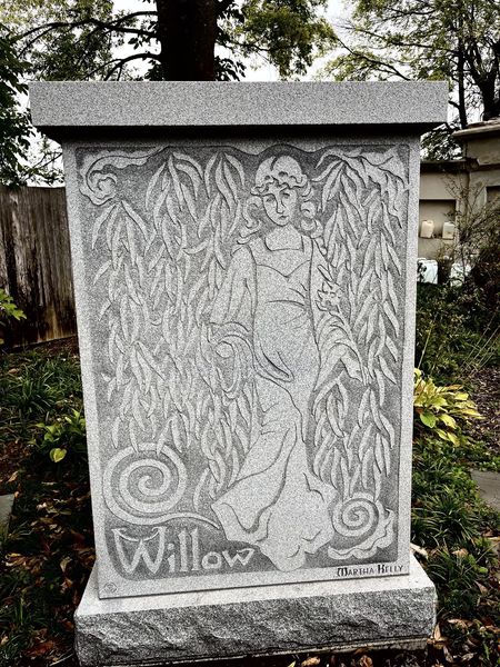
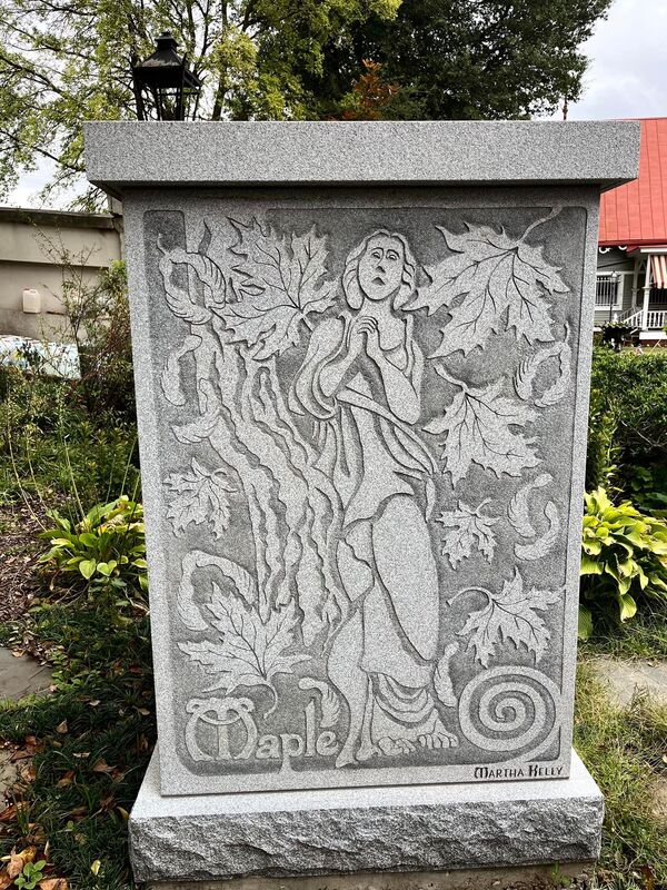
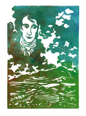
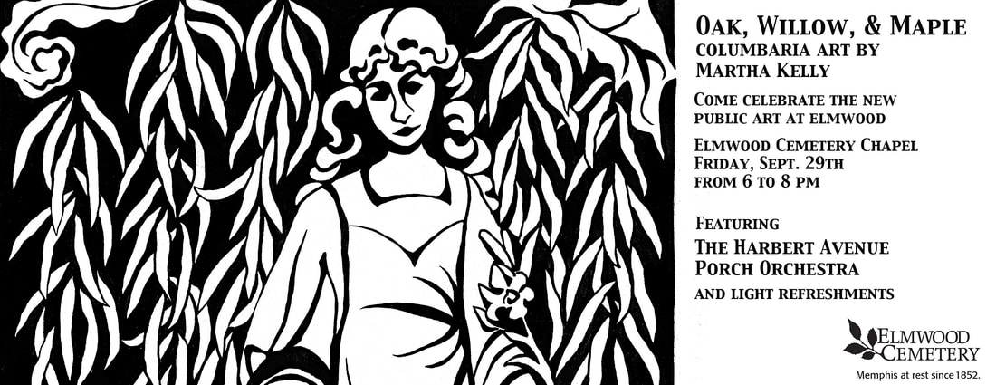 The stone carving is done, and we're having a party at Elmwood this Sunday to celebrate my first public art ever. It's free and open to the public, and we'd love for everyone to come. If you know you can make it, Elmwood would love to get you in their headcount for food (you can sign up here), but all last minute comers are welcome for sure. I did a set of 9x12" prints based on the columbaria designs, and you can see the trio below. I'll have those out there as well as a selection of my other prints, but mostly it's just a fun party with a fun band. 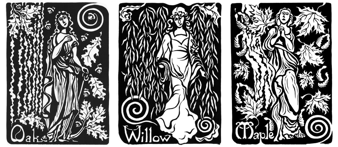 Here is what they look like in five foot granite. They came out even better than I had dreamed, and when does that happen??
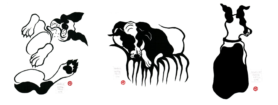 I've got three small prints of Henry (there will likely be more to come) ready to go for this weekend's Dog Days Open Studio Sale. Friday 4-8 for cocktail hour shopping and Saturday 12-5. This year we're at 719 Dickinson, a change of venue from years past, but still in the same neighborhood. These prints are all on 8x10" paper and are $65 each. It's hard for me to be regimented enough to work on standard sized paper. My old press was 14x22, so I ended up with a lot of prints that size. And I'm always drawn to different shapes. But I know it's simple for people to frame if things are standard, so I'm trying to plan at least some of my smaller pieces to be more regular. My new coastal scene is 11x14", so I've managed it four times this summer. Definitely a record! This last piece is Shoreline II, a smaller, one block version of print that was in my WAMA show last year. It's actually done from a more recent sketch and is a different shape, but it's the same view looking out from the beach at Ocean Springs, and the color scheme is similar. Instead of using different blocks for different colors, though, I wanted to keep it super simple. Repetitive printing is my least favorite part of the whole process. This block uses four colors and five small rollers to blend the colors on the block. The sky goes from pink at the horizon through grey up into the blue. There's enough space between the pink and the black to use a very small roller for the shoreline itself, and then I can put some gentler strokes into the water with that same roller to get the reflections. It's finicky to print but takes only one session instead of three. It's on 11x14" paper and is $150. I'll have these in the museum shop at WAMA once I get down there in September to deliver them and have a visit, but I'll also have some for the Dog Days sale. 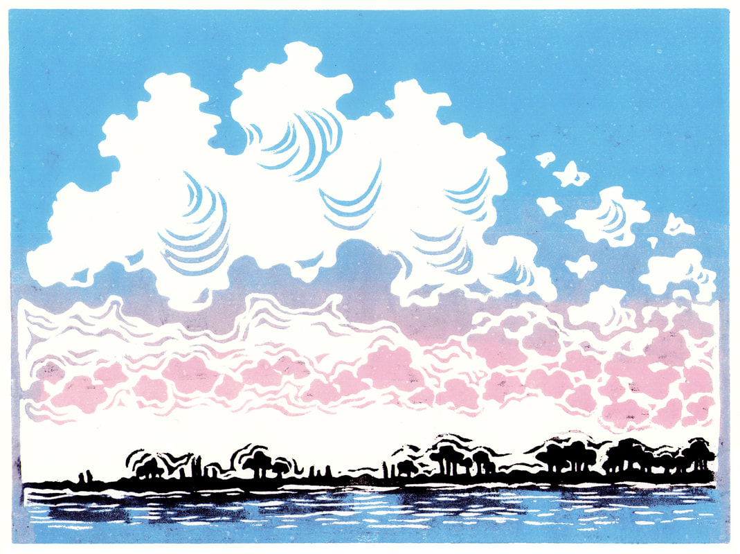
My museum lecture at Dixon Gallery and Gardens is today, and I'll be talking about my art heroes and all the things I've learned along the way about making an art centered life. They're between exhibits, so they didn't need me to tie into any particular show, as I did when I talked about the history of plein air painting to go with their Barbizon exhibition some years ago. So I'm going to be self indulgent and talk about all my favorite artists and what I've learned from them in a slight gallop through art history.
I'm also going to talk about taking the time to do small projects for yourself, just because you want to. This was one of mine a couple of summers ago -- a series of tiny prints (I think they're 3x5") of my most formative artists. Constable, of COURSE, on the top left, for painting outdoors and non stop and in his own home places. Walter Anderson underneath him for pretty much all the same reasons plus printmaking. Georgia O'Keeffe for charting her own path and claiming the right to live where and how her muse dictated. And Berthe Morisot for just GOING for it, in an age where women didn't much. And also making her own career against the advice of older, established male artists who leaned heavily on her not to exhibit with those ragtag Impressionists. She was remarkable. The project fizzled there, and I hadn't even gotten a finished print of Constable until this week, but that also is good. Things you do because you want to but don't have to finish if you don't. The Anderson print made it into my show at WAMA, but the others were just because they sounded like fun. 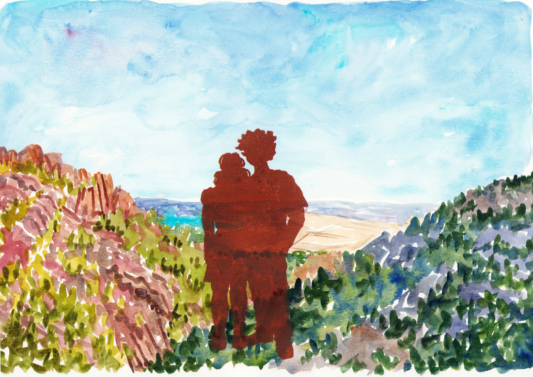 I've cut way back on the commissions I take lately after a year of serious deadlines, but I did do this one for a cool young couple who want a portrait of them each year from an artist to reflect the year they've had. I loved the idea of this, and they let me play and try something new. Since it's an annual thing, I didn't feel like I needed to try to do a traditional portrait (not my strong suit anyway). I've never really mixed print and sketching, even though they feed each other all the time, sketches moving into prints, and prints pushing me to sketch specific topics. I felt that this idea could either be really good or go very badly indeed. I was pleased with the final outcome. I printed in sienna since black felt like it would overwhelm the painting underneath of one of the special places they went to this past year. I also printed out just the figures for them to have as well. The whole project is making me think more about combining blocks and other media in new ways. 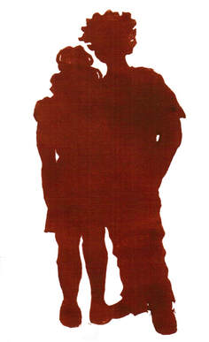
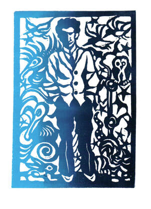
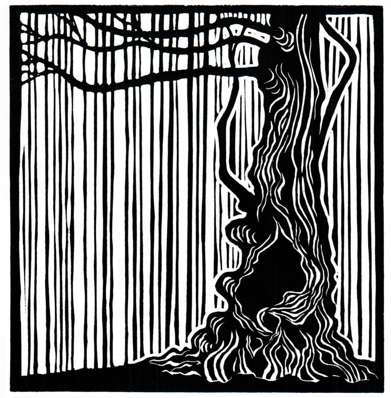
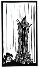
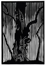
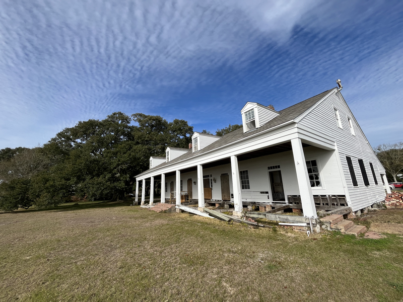
I went searching this blog for tree prints and realized that while I had scanned in this small trio of new prints, I hadn't yet posted them here. I've been working on a HUGE companion to these three (18x24", which is at least huge for me, and which took me multiple days to carve), but I had wanted to start small to make sure things worked visually before I invested that amount of time into a large print. I went to Faulker's home Rowan Oak in Oxford, Mississippi, earlier this year for the first time since my teens. It's a fantastic house, full of his personality and creative spirit, but what grabbed me most (as always) was the trees. They are as full of character as Faulkner was himself. I sketched a whole series of them and have been back to sketch several more time over the last few months. The same first trip, I stopped at Eudora Welty's house in Jackson, and I was surprised and delighted to find a series of five Barry Moser carved prints of her at various stages of her life. I think those two experiences fused, and when I worked on this trio of prints, I was very much thinking about how Moser handles his backgrounds. These are portraits of trees instead of faces, but the prints felt similar to me in style and intention. These small three are all 9" high and various widths, to suit the individual trees. I've got finished prints of them (even though my holiday show plans went off the rails this month). They're $60 each or $150 for the trio. I plan to do some color prints from Rowan Oak next, but I've been easing in with the black and white ones. Here's the first proof of the 18x24" one. I'll have a black and white edition for sure, once I smooth out some edges and balance a few of the limbs for width. I'm also going to test it with a couple of different color backgrounds and see what I think about them. 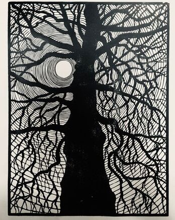 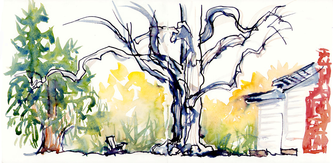 I'm still finding myself completely obsessed with the trees at Faulkner's home Rowan Oak. I took a last minute trip down there recently to sketch before more rain moved into the area and knocked down what was left of the trees. I poked around Square Books, had a quick picnic on the grounds, and roamed around with both my camera and sketchbook for several hours. I'm deeply grateful I did, because Covid finally caught up with me, and I'll be holed up solo here for a good while before it's safe for me to be around other people again. So I'm watching a bunch of guilt free BBC television and drawing out new prints in my lap. It's so good to have an absorbing project and a pile of good books. 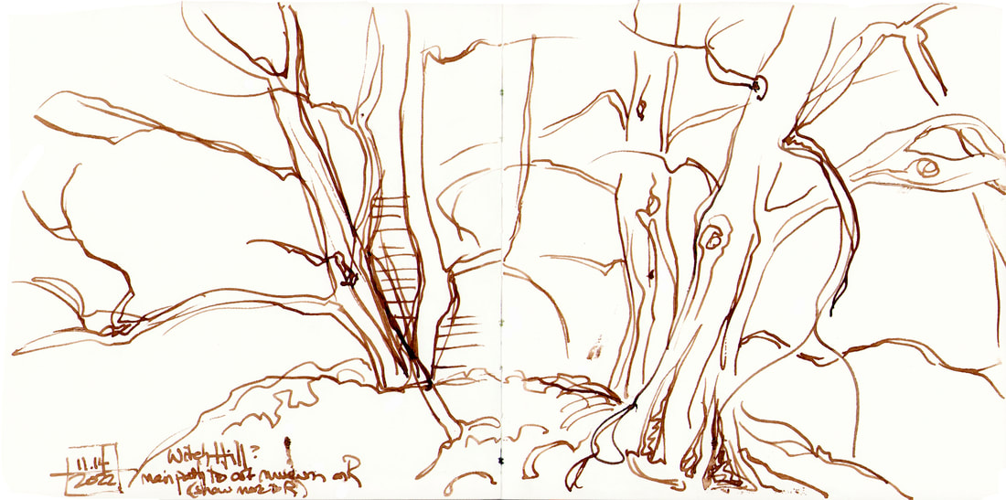 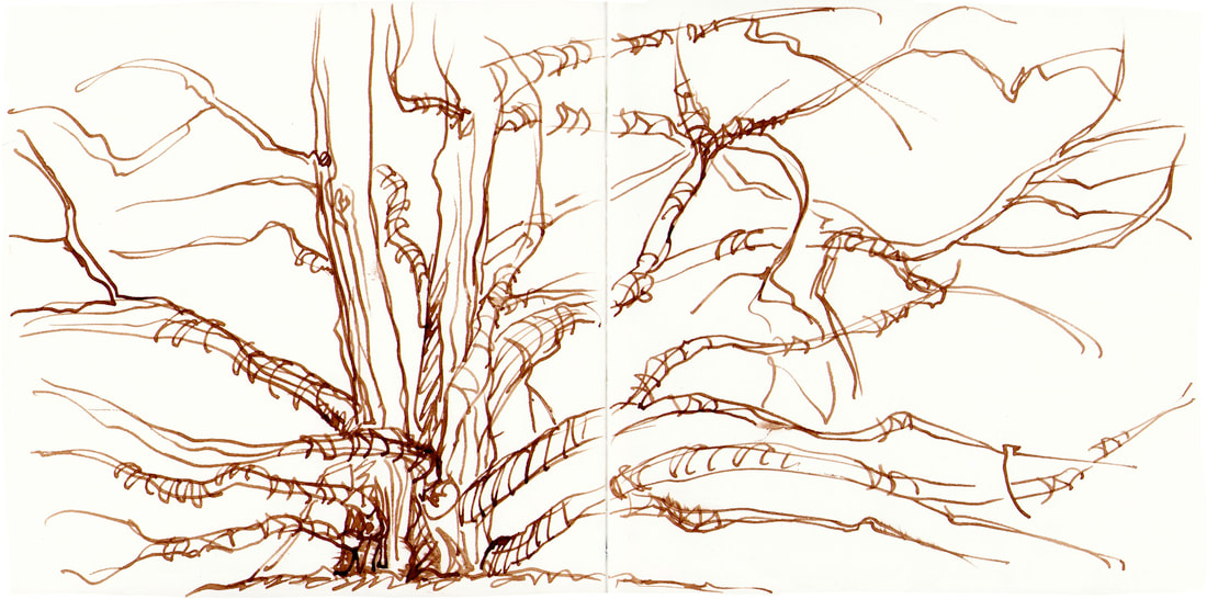
|

online store Martha Kelly is an artist and illustrator who lives and works in Memphis, Tennessee. Get occasional studio email updates. Categories
All
Archives
June 2024
|