|
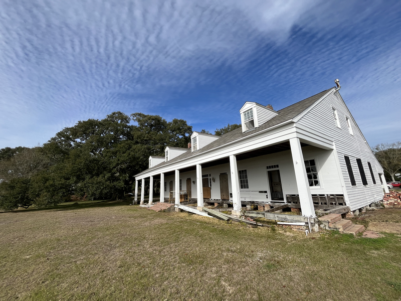
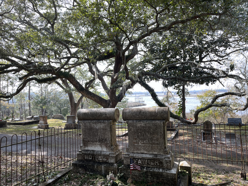
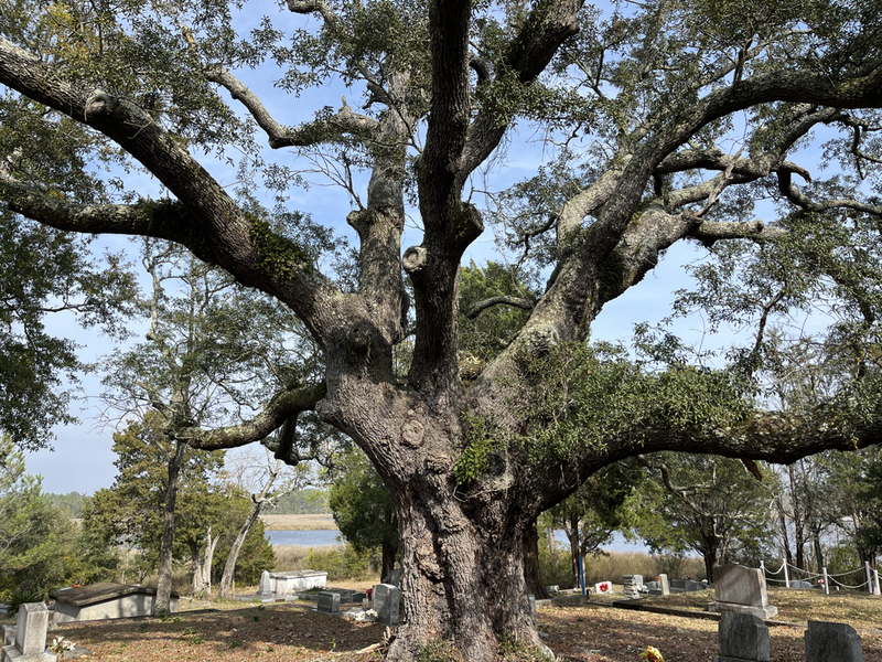
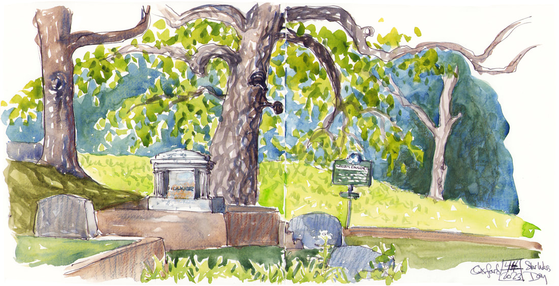
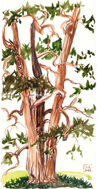
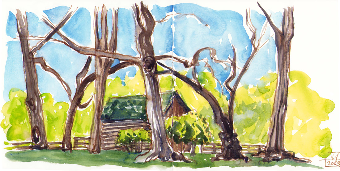
I have always loved those golden age British mysteries with a map at the front. Probably because my dad collects maps and often hand drew ones for us to follow along with from the back seat on family vacations. Since all the trees in the exhibition at Rowan Oak are actually on the grounds of Faulkner’s home, I thought it would be fun to give people the opportunity for a self guided scavenger hunt to compare the prints with the originals.
There are no prizes, but if there were, there would definitely be extra credit for Portrait III, which is by far the trickiest to spot.
0 Comments
I will get it in a frame and have it ready to hang with the rest of the show on Monday. I've also carved and printed a small gallery card for folks coming through the museum to pick up and have my information available. This is one of the handful that print two tone when I add a second color once the first is established. I love the variegated effect. I usually get three or four of these before the inks blend to a solid color again, so most of the cards will be a little less wild, but I always love these the best.
My main work lately has been my upcoming Faulkner's Trees exhibition. I'm trying to get final prints of everything, get started on the framing, and finish carving the last two prints. I'm working slowly with my fatigue making an unwelcome return, but I'm chipping steadily away at it. We haven't set a hang date yet, and I'm grateful for Rowan Oak being flexible. It will go up some Monday in June so it's in time for the Faulkner scholarly conference that meets there in July. I'm so grateful to them for wanting my work for that. So carving and printing every morning while I'm fresh. There has been lots of tea involved. I've got the first couple in frames already. It's nice not to leave all of that till last, since it's my least favorite part of the process. This is the last piece I'm working on. It's three colors, and I'm carving on the last block now.  I haven’t been sketching this week, and I’m missing it, but I’ve been getting some good work done on a new print for my Rowan Oak show next year. This is an especially complex piece. I had a lot of colors I wanted to include, and I hate to carve and print more than three blocks per print. So laying it out got complex, and I’m mixing more than one color for each block, but I loved the sketch I did of this tree, and it’s worth the aggro. I’m doing a series of color proofs as I keep refining the carving as well. At top is the best one so far. The key block is usually all black for my prints, but that was too harsh in this case, so for the top layer I’ve added a brown tree trunk for the cedar and softened to more gray around the edges. You can see the all black version at the bottom of the three proofs together just below. On the middle one I went too grey away from the tree and lost definition on the building. this one I think is the closest to what I want, but I need to clean up some carving, especially in the tree and the building. I’ve also added a snapshot of the three blocks together. The orange green goes first, then the grey of the building, tree, and grass along with the green of the cedar. Finally the black of the tree, the cedar trunk, and the definition of the building go on top. Here is the original sketch with the first layer of the print.
|
online store Martha Kelly is an artist and illustrator who lives and works in Memphis, Tennessee. Get occasional studio email updates. Categories
All
Archives
June 2024
|
