|
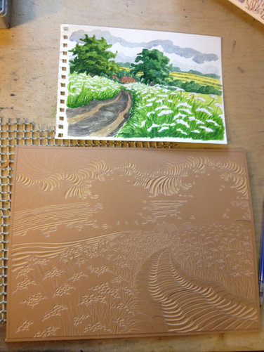
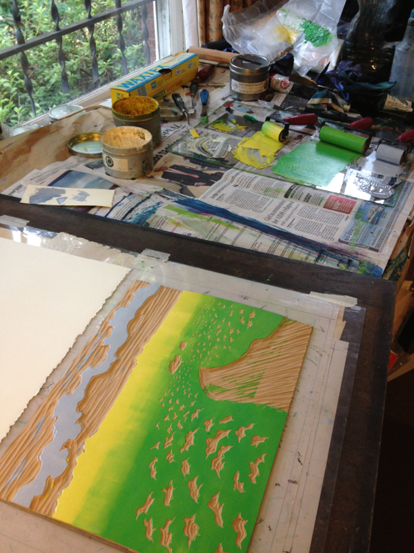
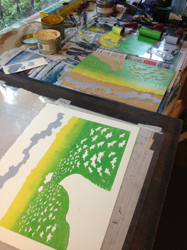
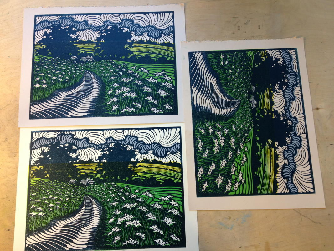
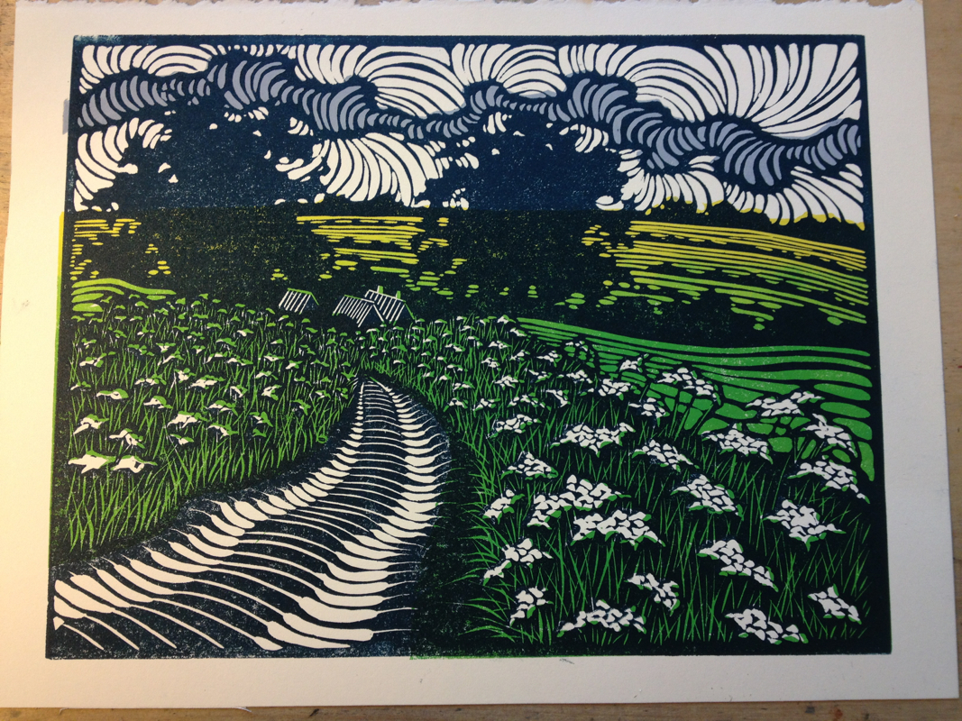
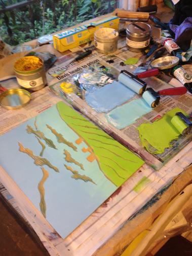
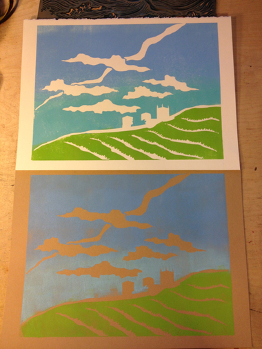
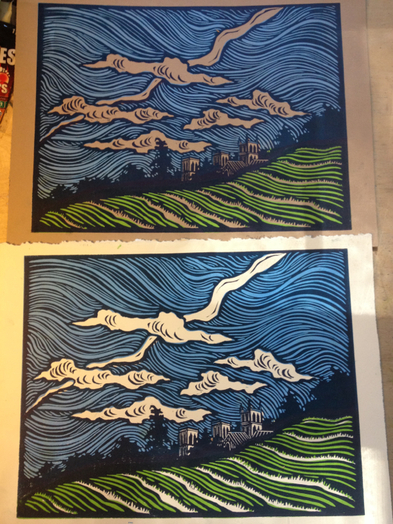
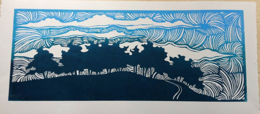
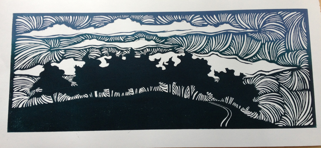
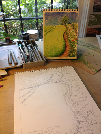
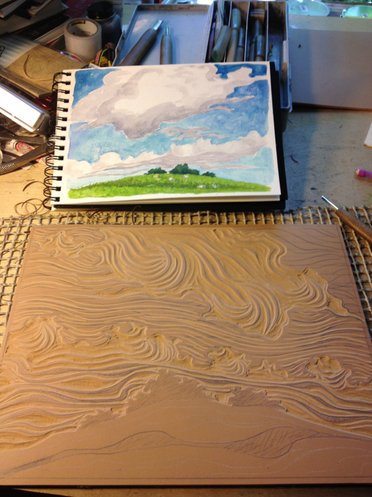
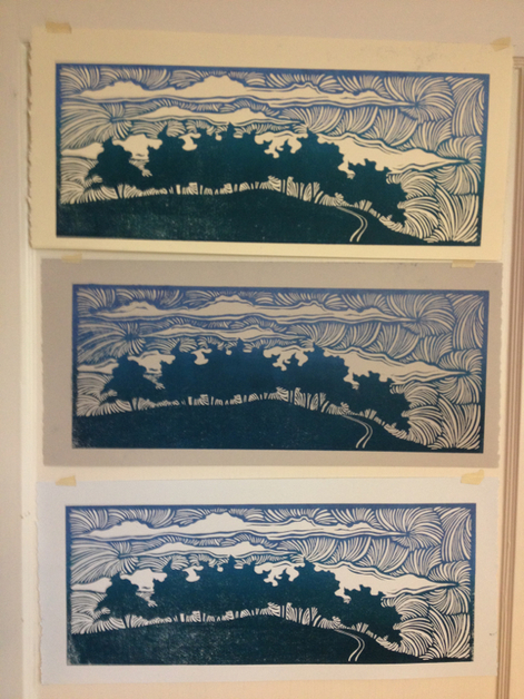
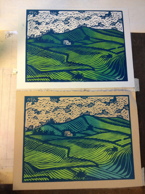
I've still got a number of prints in progress right now. I've been trying to get a lot of them drawn out and maybe carved before I leave on my next trip, so I haven't been moving just one or two from start to completion before I begin the next, which is my more normal way of working. This print is the road down from the moor and back into the village of Levisham. I walked it at least once a day while I was there, and the final day I realized I really needed to do a watercolor of it before I left. I'm still trying to streamline the printing process, so you can see that with the clouds being fairly removed from the ground, I can ink the grey on the same block as the green without the two getting mixed. Then I deliberately mix the yellow into the green for a little more depth and interest. Below on the left is the block with the ink rolled on it, and on the right is the print on paper. Once the color part of the print dries, I can print the "key" block on top. That's the block with the main image and pattern, usually done in a darker color. I tried this print on several different shades of paper, so below are those color tests. Warm grey, natural, and a fawn (light tan) on the right. Here is the color proof. I've done a bit more carving to keep the yellow from creeping into the sky and to get some more of the Queen Anne's lace staying white, but I haven't gotten a chance to print a final version yet. And I won't for a while. I'm lucky enough to be house sitting in Paris again this year (I'm so grateful they're having me back), so I'm off tomorrow. I'll be posting photos of sketches and watercolors from there. I'm glad I got most of the England prints I wanted to done, and hopefully I can pick up the threads of the few I still want to do when I get home. It's been a good month to be home working like crazy, but I'm excited about the next trip now.
0 Comments
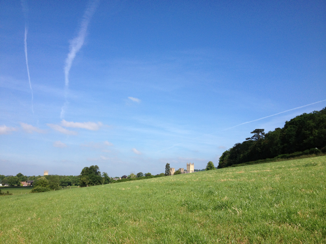
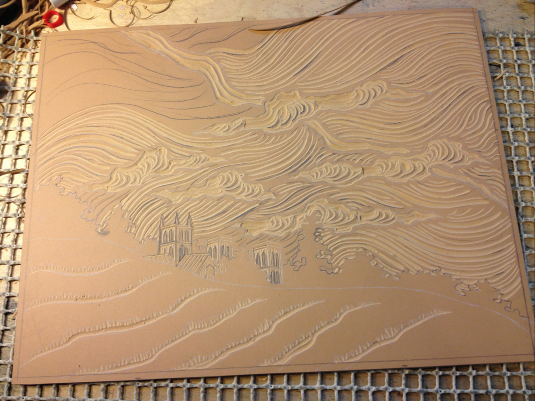
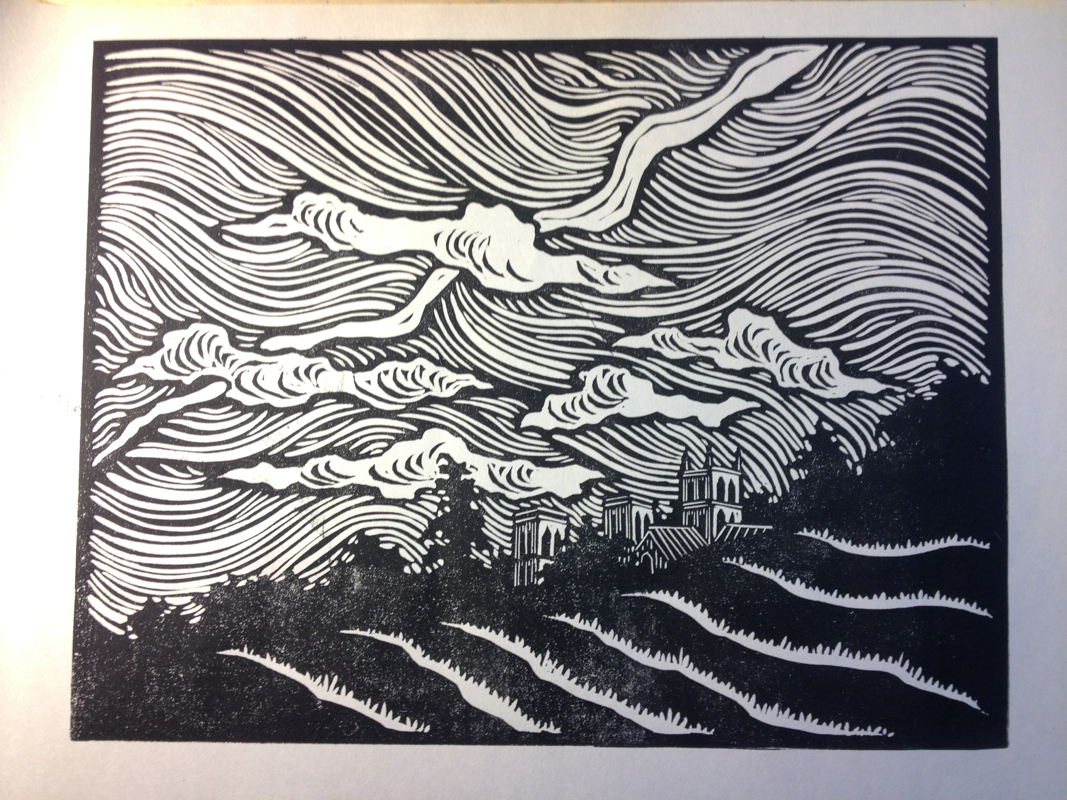
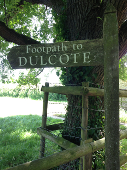 One of the places I had most been looking forward to painting on my trip was Wells Cathedral rising up over the fields from the footpath just behind it to Dulcote. It had been an image that blazed itself into my memory when I was there at 17 with my grandmother, and I spent a day out on the footpath painting views along the way. Now I'm working on a print of that image. Some art takes a long time to come into full flower. Here's the first black and white proof of the key (or main image) block. Because of the division between blue and green, I can print both on the same block, reducing labor and keeping registration problems to a minimum. Lining up each block for subsequent printings is tricky, so using fewer blocks means fewer mistakes in the printing process later. I'm using three colors and three rollers, blending the sky out of two colors and having just one for the grass. I tested the block on a couple of different colors of paper. Almost finished. The green is a little too virulent, so I'll fix that in final mixing and printing. I think I'm going with the brown paper to have the cathedral be a warm, not too harsh color. I may try it on a little bit lighter fawn color too, just to see.
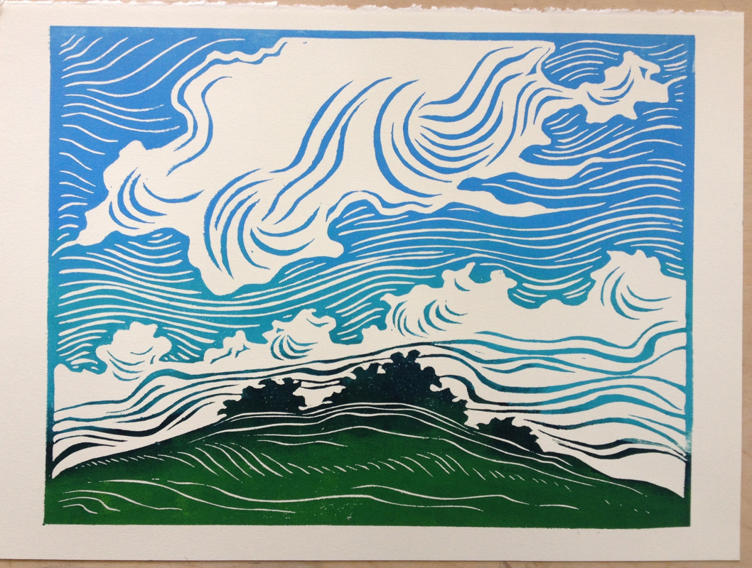
I've been pretty obsessive about my prints lately. I've got lots of them floating in my head, and I'm trying to take advantage of the momentum and get as many as possible out and carved and onto paper. So there are currently three that are in various stages of carving and final printing, but here are the first two in the series. The actual printing is my least favorite part, trying to get a goodly number done in a quality control kind of way, and I didn't want to dig myself too deep a hole by having a whole mound of them still needing printing. So I settled in one afternoon, cut paper, and printed final copies of the first two in the series. Both of these first prints are just single blocks but with multiples colors of ink rolled on at the same time. It's a looser form of printing than I've done before (I played a bit with it in my Psalm series, but this series is the full flowering). I like several different versions of these prints, color-wise, so I decided to print on a variety of tints of Stonehenge papers. The top one I printed on natural (shown), light blue, and light grey. The second one I printed on all three of those plus a slightly darker grey. I also varied the amount of value change in the sky. Some have a more vivid change to light blue (above), and some are a subtler gradation (below). I'm not sure if my printmaking professors would approve of that. Editions are supposed to be a sheaf of identical prints. But I come out of a painting background, where it's all about the image you get, so I decided to go a little looser than the tradition in this series. I'm just having too much fun playing, and I think different colors will appeal to different folks. In spite of three more in progress (one is thankfully in final printing), I drew out a seventh print in the series today and will transfer it to a block and start carving tomorrow. I've got another trip at the end of the month, where I'll be doing very different work, so I want to get these done before my focus shifts. Or at least get them all well on their way, so I can pick up the threads when I get home.
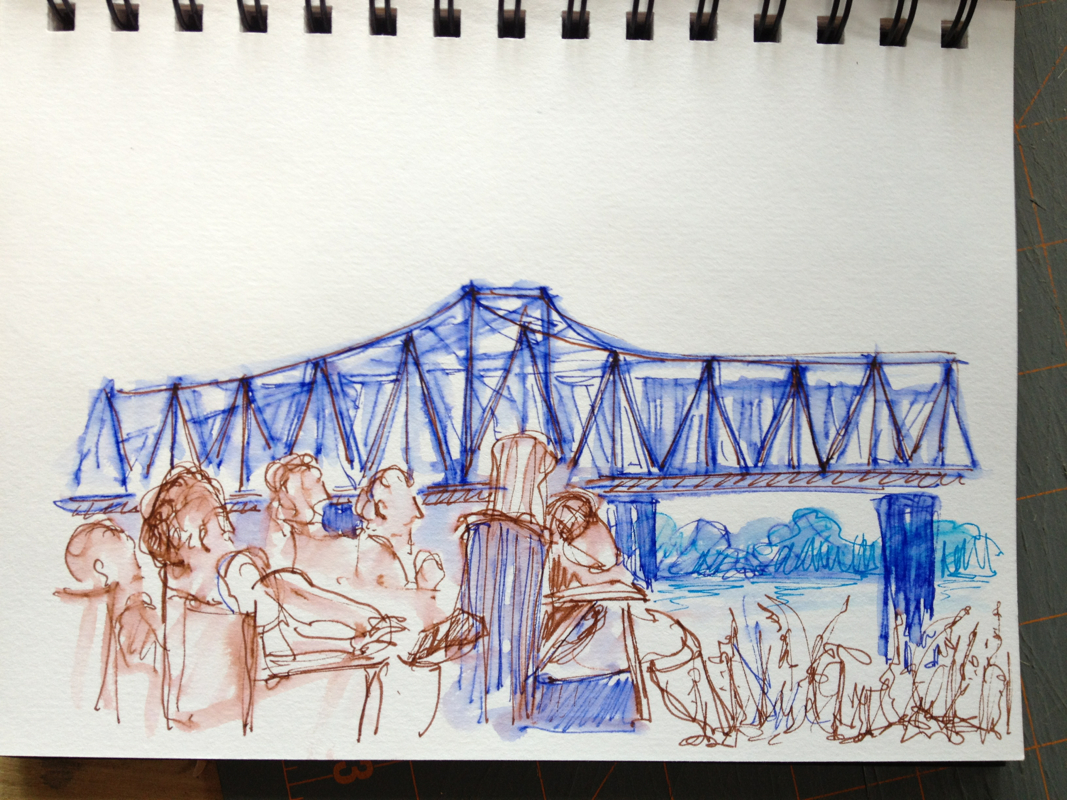
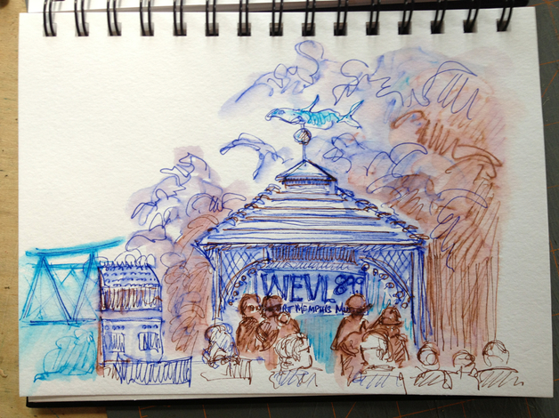
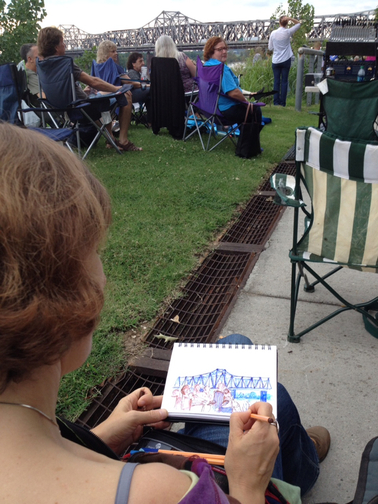
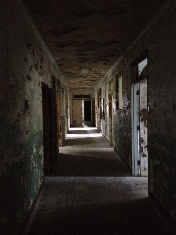
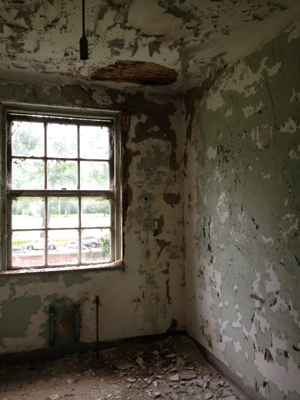
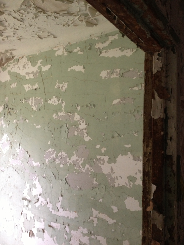
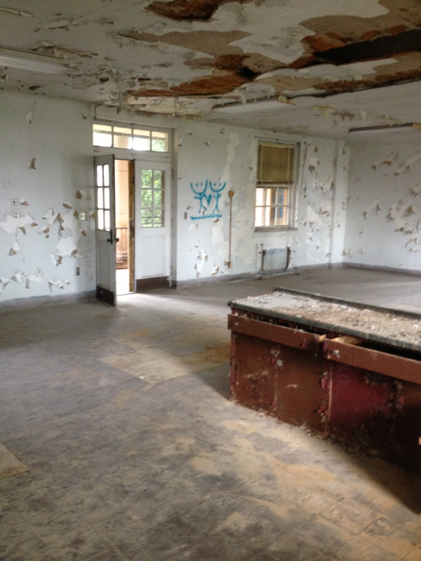
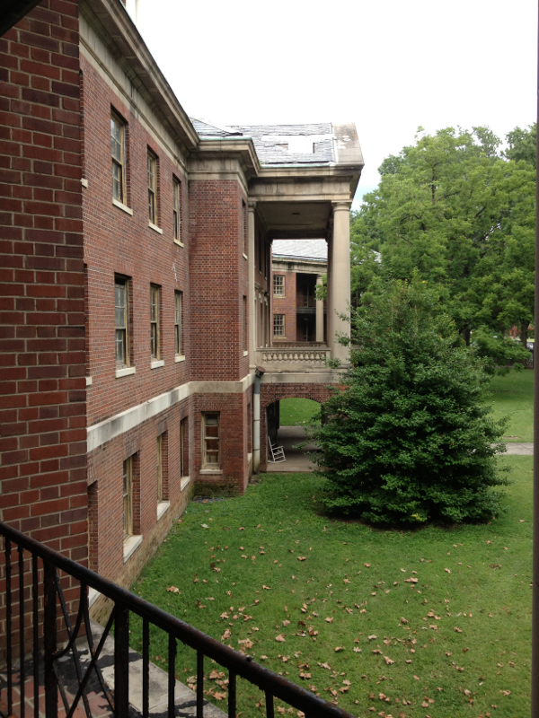
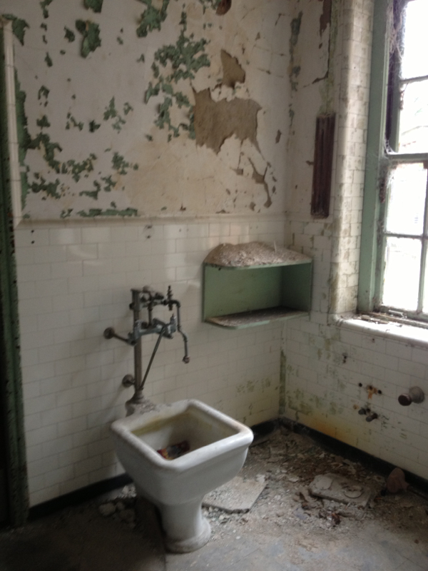
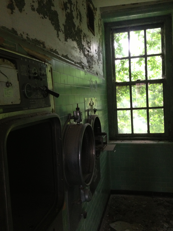
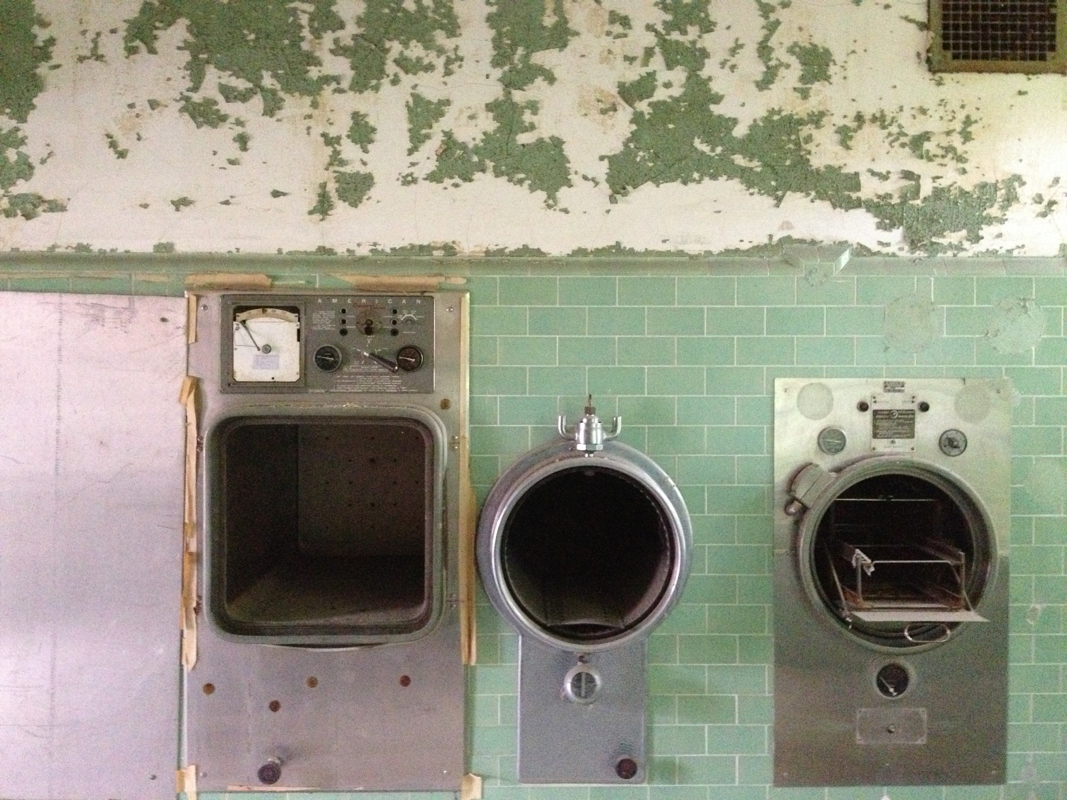
I'm still playing around with new pens in between intense bouts of printmaking. My friend Natalie suggested we go together to Blues on the Bluff this past Saturday night. It's the best fundraiser ever, put on every summer by WEVL, Memphis's volunteer radio station. It's right down on the bluff overlooking the Mississippi river, and they get marvelous local blues bands to do five sets of music while you eat Central BBQ (Memphis's best, though I know those are fighting words for some) and watch the sunset. This year was beautifully and surprisingly cool, so it was even nicer than usual. I enjoyed sketching, as I often do when listening to live music. Don McLean, the husband of a friend, was sitting next to me watching me sketch, and he asked if he could take this photo of me. It's fun to get to see the process from over my own shoulder. Natalie suggested getting there early enough to poke our heads into the preservation tour of the U.S. Marine Hospital, just next to the National Ornamental Metal Museum that hosted the fundraiser. It was built in the 1930's (with a back building from the Civil War era), and it's obviously been sitting vacant a good while. It was neat to get to roam at our own pace, unlike last year's Urban Sketchers group in a similarly dilapidated (but much higher and vaster) Sears Crosstown building. If I'd known we could just stop at will, I might have gone down to sketch this one too. It's frustrating to be herded along as I'm trying to sketch.
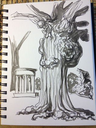
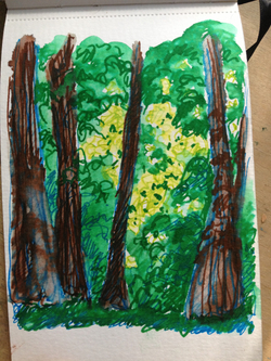
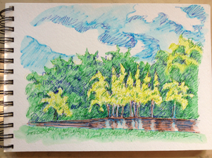
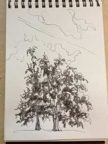
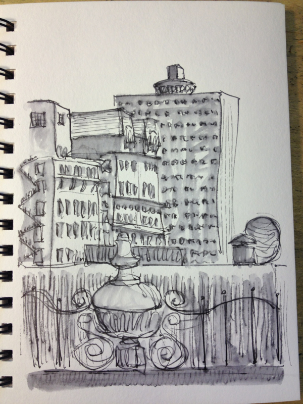
Anyway, I took a few photos that I'm posting for the fun of it, in case anyone is interested. I've continued to play with the new pens I bought after our weekend Memphis Urban Sketchers meeting. I really like the top drawing with the Pentel light black brush pen. It's a warm grey that goes nicely with the cooler black of my fountain pen, and it doesn't hide my lines. I'm doing less well with the colored markers. I always really WANT to like markers, for the ease of them, but the colors are so strong and unvaried. I tried a quick sketch in the forest on my walk the other morning, but I wasn't pleased with it. The weather has been utterly gorgeous here, so Mr. Darcy and I went back over to the park yesterday evening, and I did a couple more sketches sitting on a blanket with him. The color one is a bit better, but still not nearly as satisfying as watercolor would be, and I think I regressed on using the brush pen. I'm hoping it was just too late in the day. Tom Pruett, who inspired me to try these Stabilo felt tip pens, just posted some of his work on our local Urban Sketchers blog. He's amazing. Be sure to scroll down to the last one, which is my very favorite.
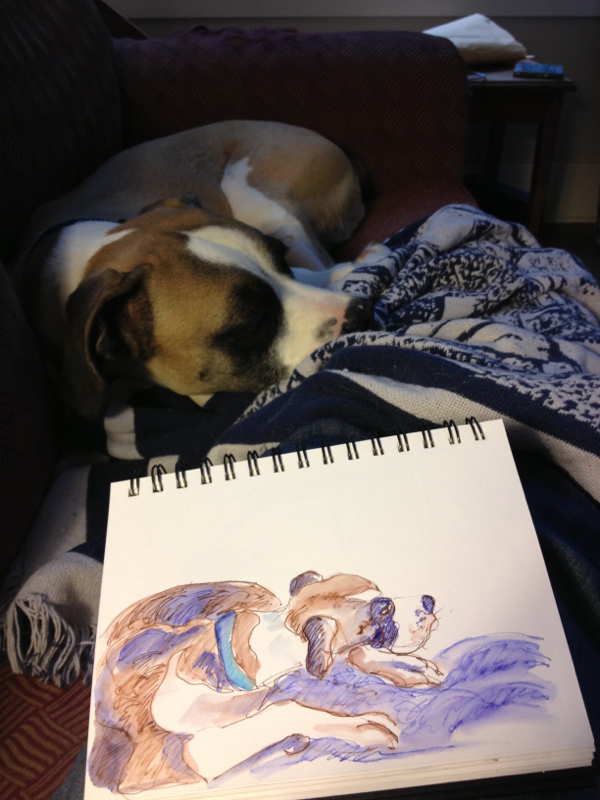
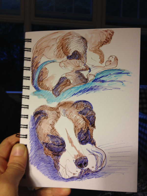
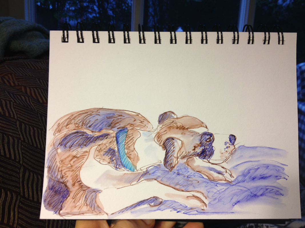
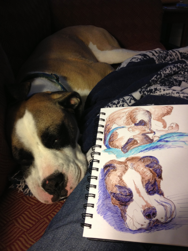
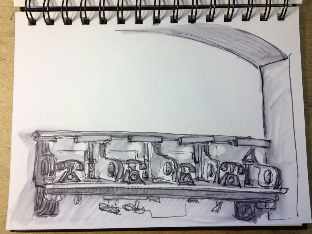
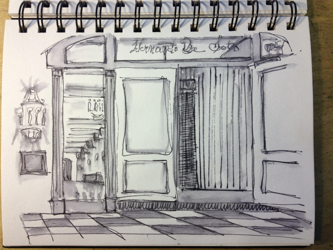
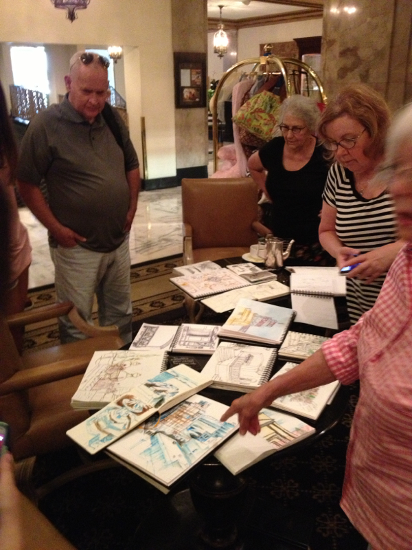
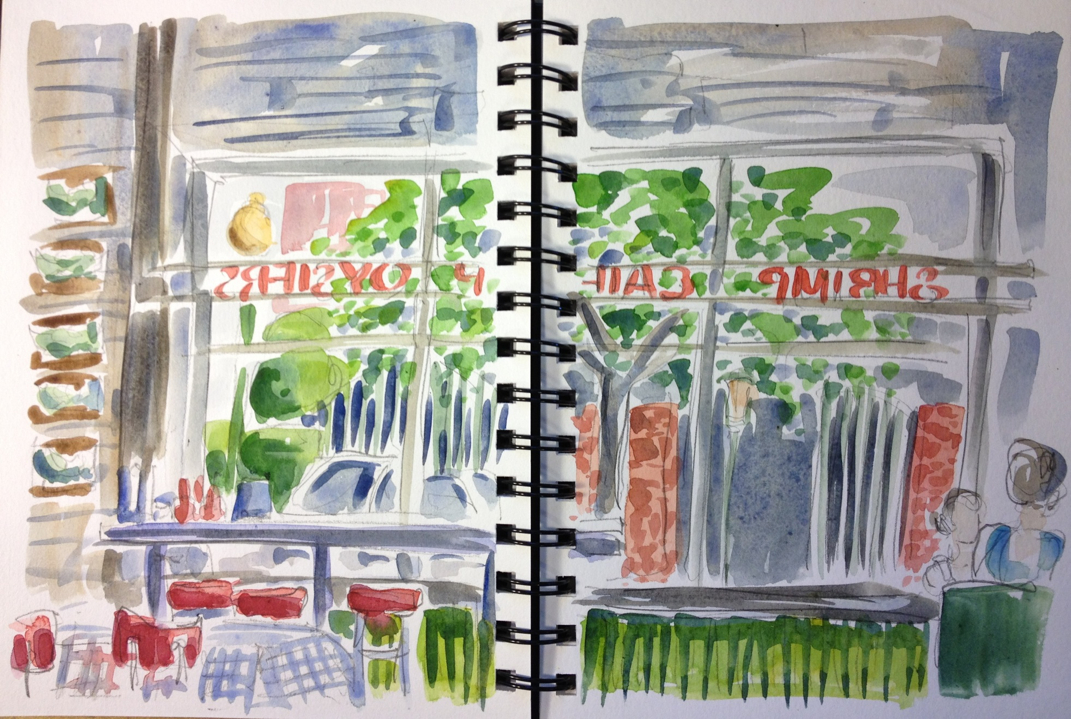
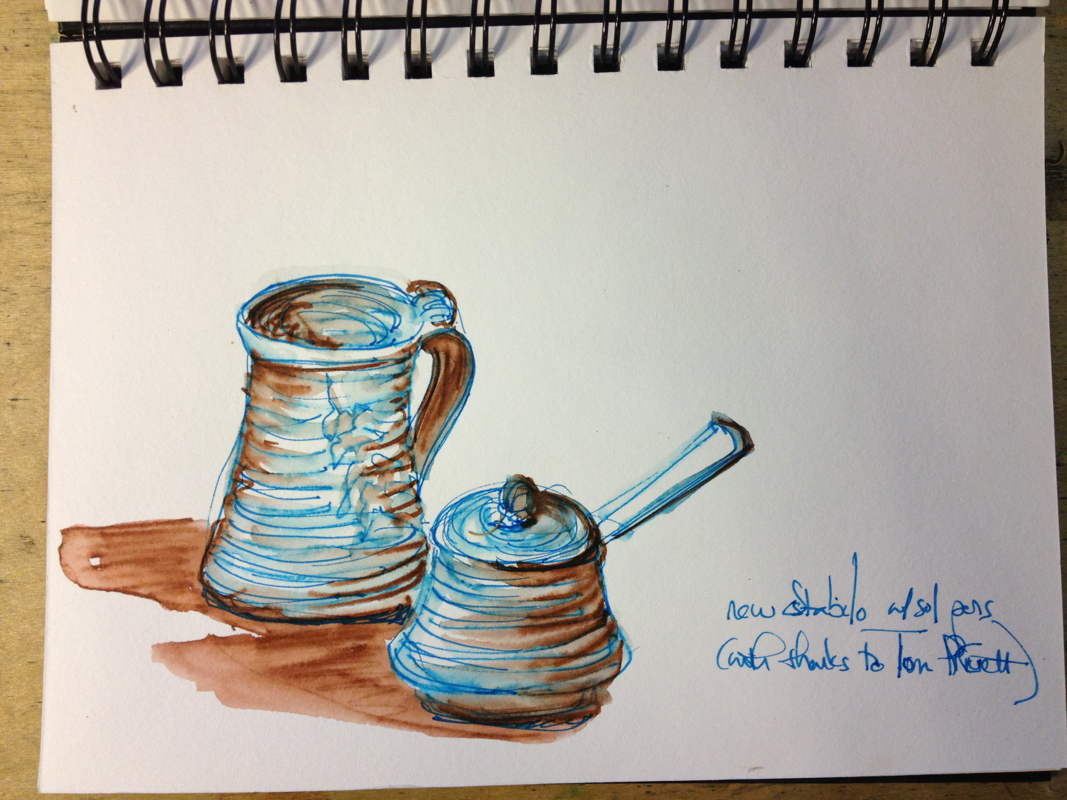
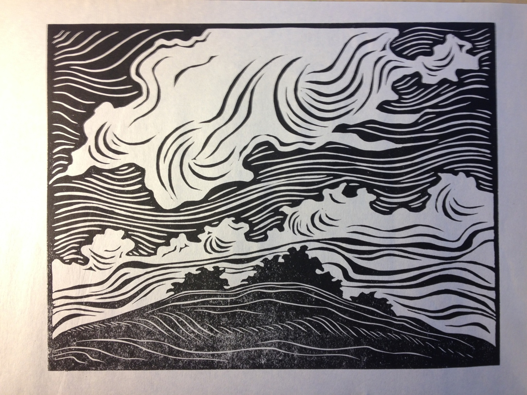
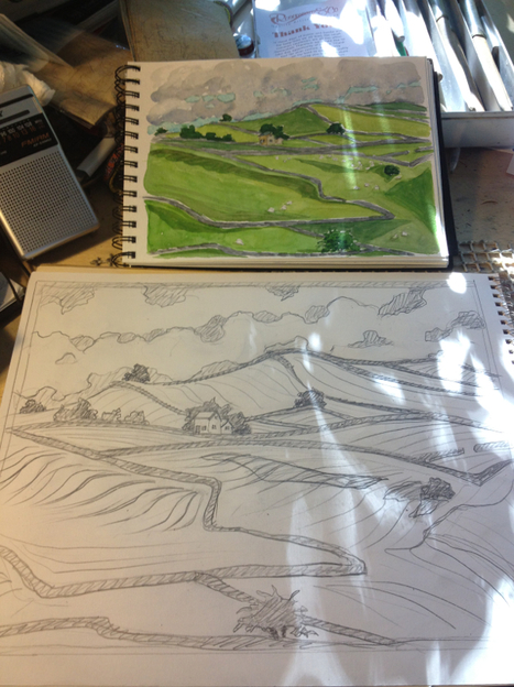
He's not working to get the actual color of things with these pens. He's just using blue and brown for more or less monochromatic sketches, blending the two colors for various greys. I tried more of that tonight, sketching Mr. Darcy as he lay on the couch with me. I'm not getting as much blending/washing as Tom is, but I'm going to keep playing with them. Memphis Urban Sketchers participated in the International Sketch Crawl today, along with sketching groups all over the globe. We met at the Peabody Hotel and sketched on the roof before moving downstairs to the mezzanine. There I stayed out of the duck march crowds and sketched a side hallway with nifty old fashioned telephones. We gathered back together to check out each other's sketches.... .....and then went to lunch across the street at the Flying Fish to compare pens and other materials and to keep on sketching. I stopped at the Art Center on the way home to buy some water soluble Stabilo pens thanks to watching Tom Pruett work with them, and I also got a Pentel brush pen with grey ink, thanks to Elizabeth Alley. I love how much I learn from this group. They always push me to try new things and different ways of drawing. I tried a quick sketch with the Stabilo pens after dinner tonight. That's my favorite mug, made by John and Judy Munn from Mountain View, AR. They come to Memphis several times a year for various shows. I've been in a bit of a frenzy since getting home from England. I have a number of prints dancing in my head, based on the watercolors I did on site while I was traveling, and I'm trying to get them out and carved before they dim and vanish. I occasionally have these strong bursts of creativity on a certain project, and I try to ride them as long and well as I can. They usually end up in work I'm pleased with. Here's the proof of the first one. I haven't tried it in color yet -- I got distracted carving the next two instead. But I just bought a whole sheaf of paper today to start printing on. Here are color tests for the second block, a row of trees I kept painting along the top of Levisham moor. I'm trying it on different colored papers (natural, grey, and blue), and I may print on a variety of colors, as per my friend Peter Ceren's suggestion. Drawing out the third block, this one from my day in Derbyshire.
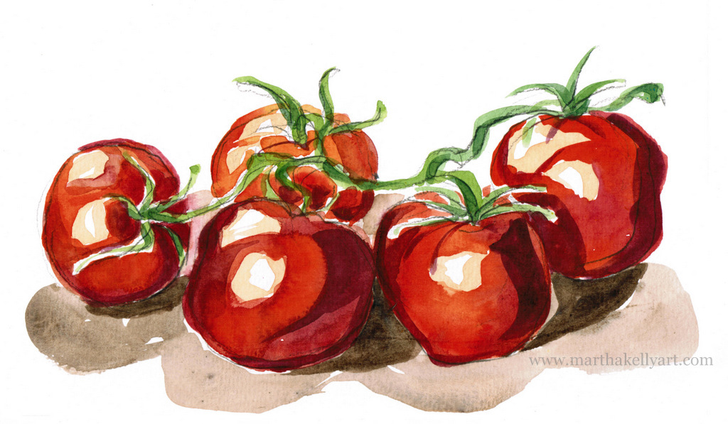
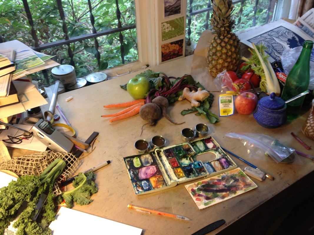
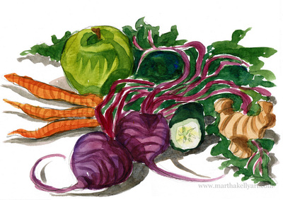
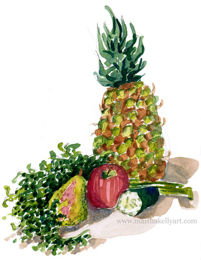
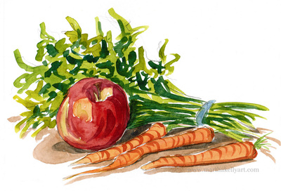
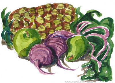
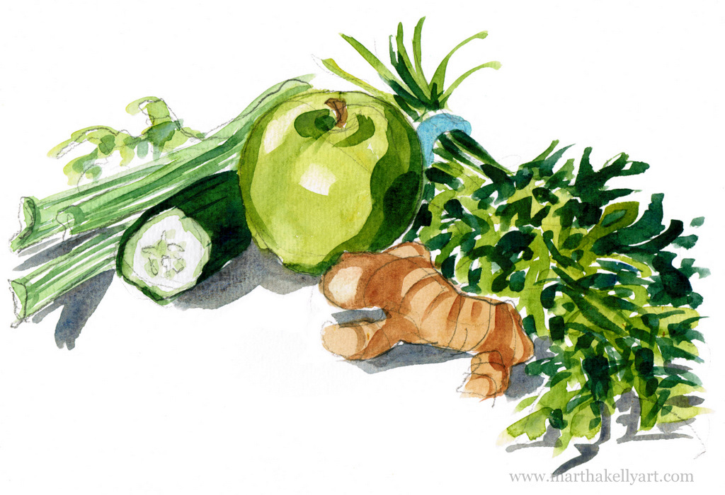
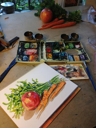
I got an email from Cape Resorts in Cape May yesterday. They've got summer juice specials and a tomato summer sandwich menu and needed some illustrations. I love doing still lifes, and more and more I love the illustration piece of my job, so this was a welcome assignment. I hit the produce section of the grocery yesterday and took the day today to just focus in and do a series of quick watercolors, rotating the produce in and out of the various compositions. Here's what my work table looked like. I wasn't really planning to do them all today, but I've been working pretty obsessively ever since getting home from England last week (despite the utter absence of proof of that here....). I've been working on prints from my watercolors, and it made sense to just take a day to do this project, get it out of the way (since it was rolling along nicely) and be able to get back to the prints tomorrow with minimal interruption. If the work wasn't flowing I would have taken more time over it.
I hit streaks where I work and think about work at all hours, and then I take some time between streaks to recharge. That's the beauty of being self employed. Ideally the productive streaks line up with projects and shows. Having a fallow period with deadlines looming is pretty nerve wracking, but I've gotten better at focusing in and staying on track with projects over the last few years. I ended up doing six small (6x8") still lifes today. Here are the rest. Tomorrow I'll get back to England, artistically anyway. |
online store Martha Kelly is an artist and illustrator who lives and works in Memphis, Tennessee. Get occasional studio email updates. Categories
All
Archives
June 2024
|
