|
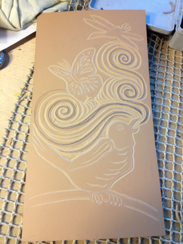
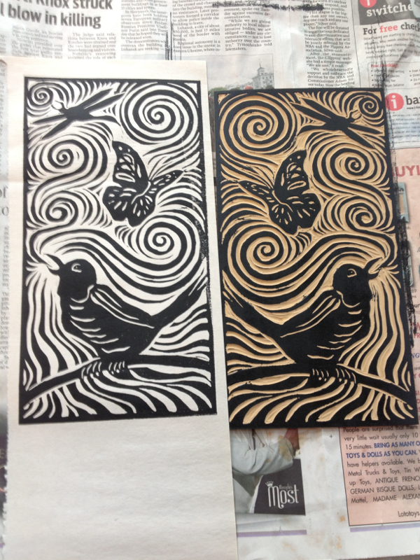
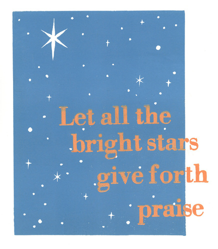
Five down, three to go. Here's this week's psalm. I think I may do an edition of the block alone, without the text, as well as a small edition of the psalm. 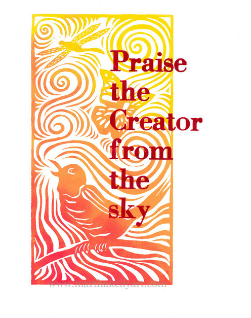
Below are the block halfway carved and the very first proof. I pull a couple of proofs, hone a few things I don't like, and print in color only when I've got it the way I want it.
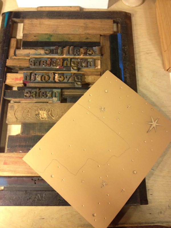
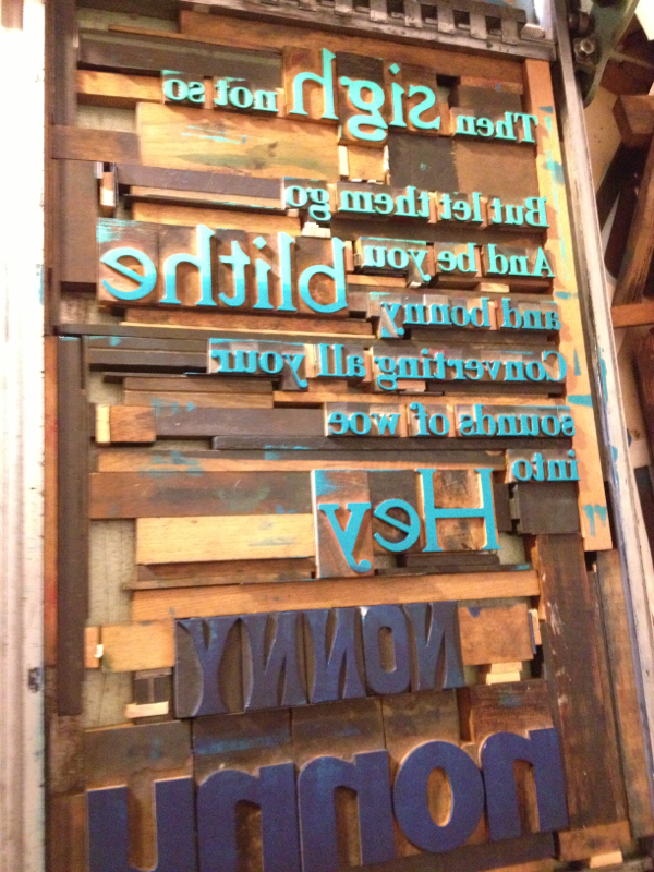
Once the image is printed, I move on to the text. I took a little wider area picture this week. You can see the metal chase (frame) that I set the type in. I build around it to the edges, like working a jigsaw or piecing a quilt. The final stage is the lock down. The metal strips at the right and bottom with round holes in them are "quoins." There's a "key", a metal tool, that fits into that hole and turns, and as it turns, the quoins expand a bit to make everything snug so that I can pick up the chase and put it in the press without the type falling everywhere. This is after I've printed. I've cleaned up the type, but you can see the roller with the dark red ink on it. 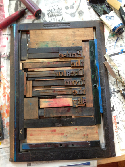
0 Comments
I'm finding it quite a challenge to have one of these finished every week, so this week I took a moderately easy route and went with a very simple to carve design. Now I'm trying to work ahead a bit before I'm out of town a good bit of next week. Thank heavens for a marvelous house mate.
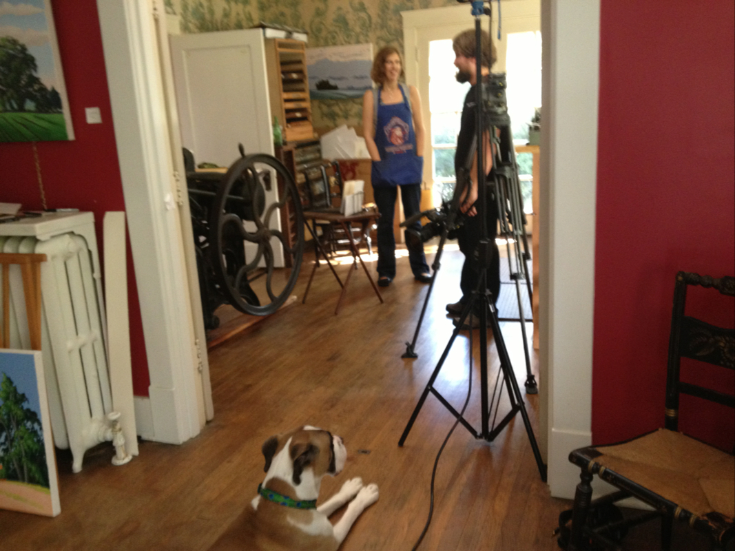
The segment about me that was filmed by the PBS show Tennessee Crossroads is out and up on You Tube. You can watch the six minute segment at: http://m.youtube.com/watch?v=VTSrzY5QPrs&feature=youtu.be 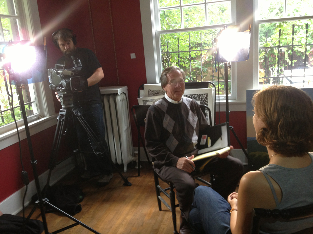
I'm always a little stunned at how Southern I sound outside my own head, and occasionally I feel like there's a reason I'm a visual artist instead of a verbal one, but they did a really nice job of putting together an overview of my life, work, and creative philosophy. And they showed off Mr. Darcy.... 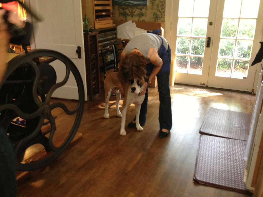
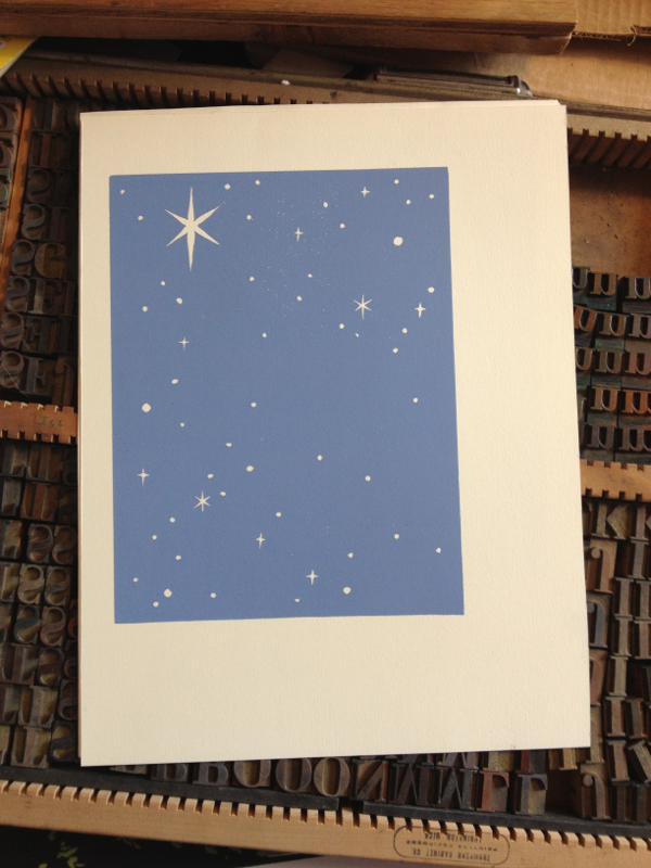
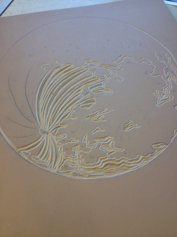
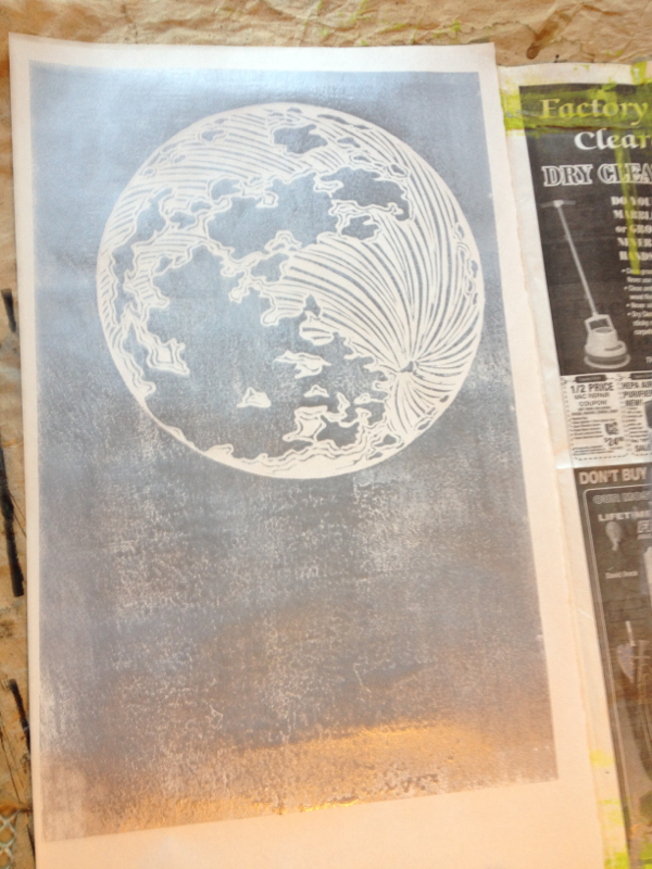
I've been slow working lately and am likely to continue to be so for a bit. I've been out of town a little, had a cold, and been stymied in my carving by a very dull gouge, the one I most rely on. I'm way overdue for my yearly tune up with all my gouges done by my toolmaking friend in North Carolina, and my most used one just got away from my ability to sharpen it. I'm still trying to learn to be better at that. So I took a break from carving the moon (above) for my next letterpress poster. I finally got back to it today and got to proof it (on the right). I'll thin out those lines a bit more, and then it will be ready to be a background for some more wood type text. I did some book-keeping, emails, packaging, and other uninspiring work during my break. I also went ahead and started a different letterpress poster (below). I had the block already carved, but I want to try it with a different color scheme and with different text. I've got the backgrounds printed now and just need to set the type, hopefully when I get back in town next week. 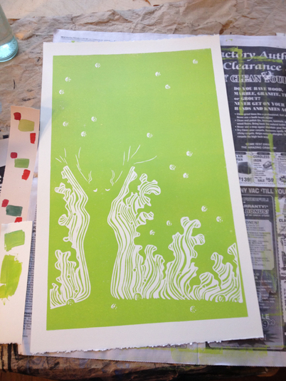
First, though, I'm going dancing this weekend with my sisters and assorted old and marvelous friends!
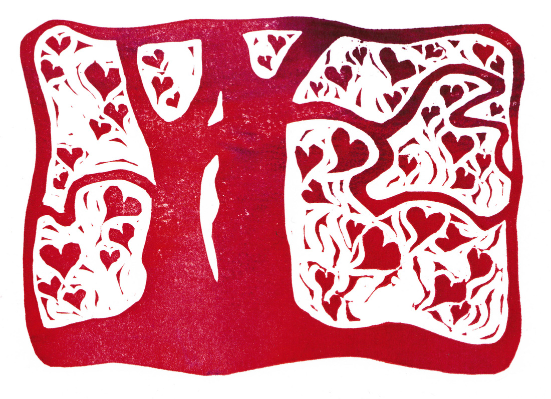
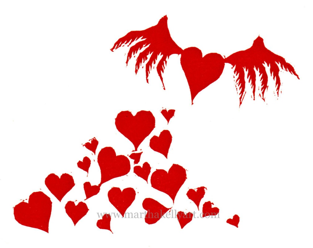
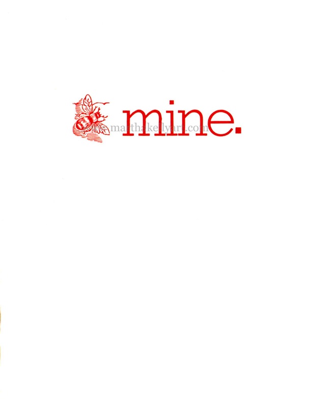
I got my beloved Chandler and Price press just on four years ago, and the very first block I carved was a valentine. Really it was a valentine for the press itself. The next year I created a letterpress valentine from old metal type and and a vintage bee ornament. Last year I was in a bit of turmoil and more or less skipped that holiday, but this year I'm celebrating printmaking and life in general, so here is the new one. I'm still playing around with inking two different colors. This time I used warm red and a warm purple. It worked for a little while, but the colors were similar enough that pretty soon they flattened out into one solid for most of the run. Mixing yellow and blue to make green is a more lasting contrasting effect. These two colors were just a little too close, I think. I got some nice mixed ones like the one on top, but mostly they looked like this: 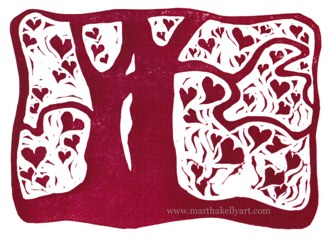
Here are the previous years' valentines.
And here I am with my valentine press. And my beloved dog Merlin. Thanks to Kelly Cox for the photo, from back in 2011. 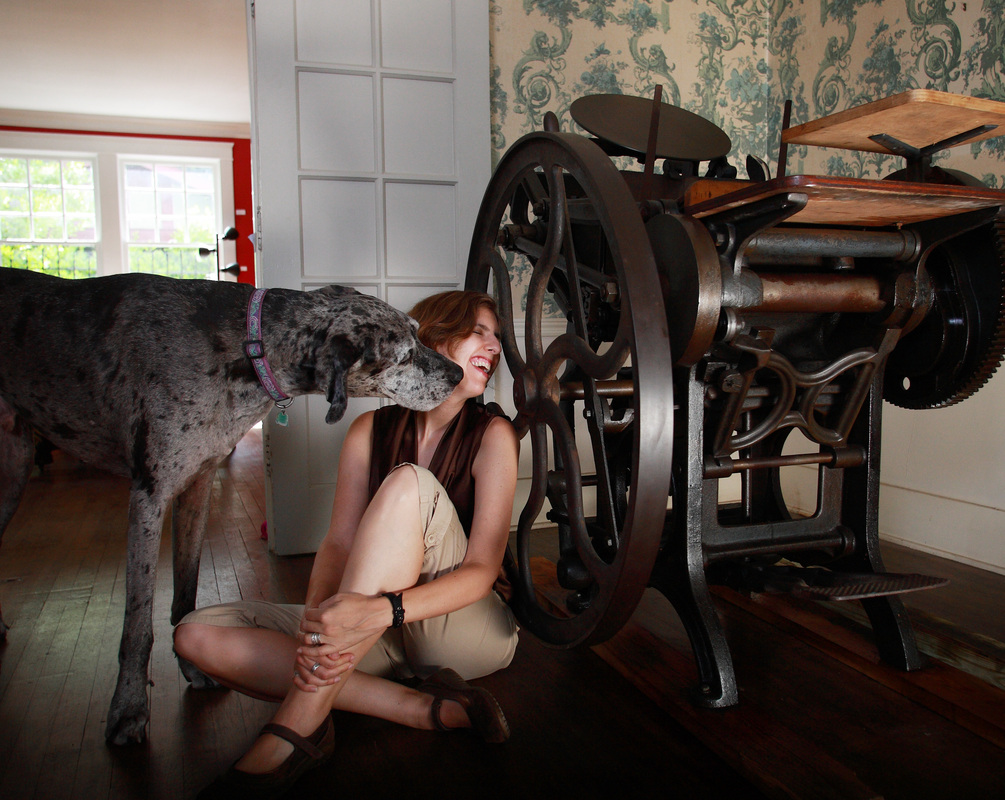
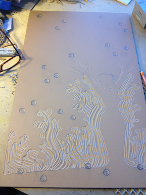
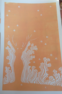
I'm continuing both my January freedom to play with different kinds of projects and also my run of feminist letterpress posters with this offering. It's another bluegrass one, to go with my Little Maggie poster. The quote is a quite old verse that has floated around into a lot of songs, but I know it from "Sitting on Top of the World", a standard in both blues and bluegrass. Above is the finished product. I did an edition of 20, about as many as I want to hand ink at one sitting, especially since I'm still playing around with grading the ink through several colors. I've been having fun with my wood type lately, and I wanted to try combining it with a carved image. My first step was to carve the block and print it.
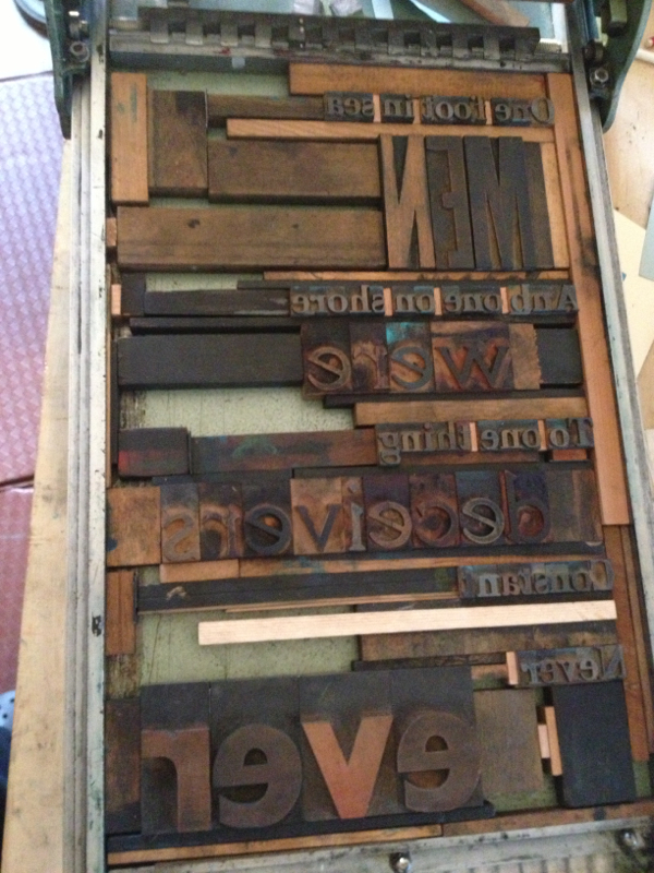
The next day I typeset the words I wanted. 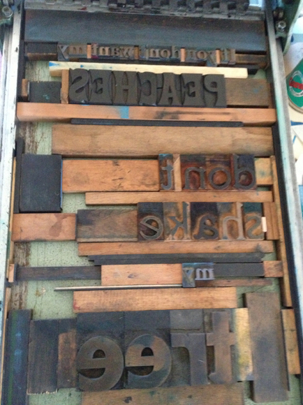
Then I printed them and realized I had the words on the left by mistake instead of on the right. I was looking at a proof of the print as I laid things out. Next time I'll use the actual block instead, since it's also in the mirror image state. But I was a little sleep deprived that day, and this is all still a learning process for me. I had done a couple of proofs to play with instead of using the good paper right off, so after printing the one below and realizing it was wrong, I moved things around and printed the actual prints. 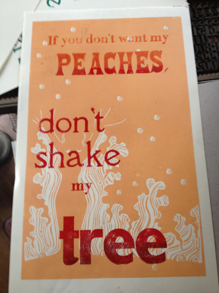
If I'm not careful I'll end up with a wood type letterpress show somewhere. I'm really having fun with these.
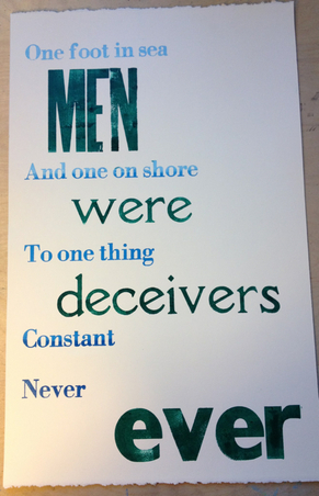
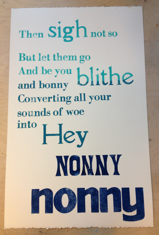
I recently re-watched "Much Ado About Nothing" with Emma Thompson and Kenneth Branagh (directed by him as well). It's one of my all time favorite movies, and my favorite part may be the very beginning with a dark screen where Emma just speaks the words of this song. Breathtakingly beautiful. Being in a flux period of dating at the moment, the song also seemed good to have in my arsenal at the moment. I find it helps to have a few songs that see me through those occasional "Boys are stupid" moments in life, even though I generally enjoy the company of men just fine.
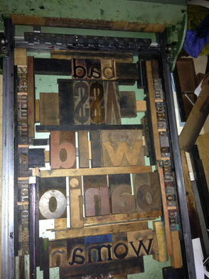
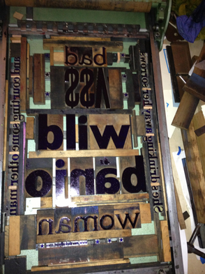
I'm also playing with inking on these posters. I've been mixing gently gradated colors and using several different rollers to gradually fade the colors from top to bottom. You can see the ink on the letters in the above right picture of the type set into the bed of the proof press. You can also see the jigsaw puzzle nature of typesetting. It's fun to fill in the holes and make everything snug. My other experiment was interweaving the two different phrases in the poster on the left, seeing whether different sizes and colors would leave the phrases legible and discreet. I'd be happy to hear how it strikes those of you who aren't as familiar with the poem. It's hard for me to come at it with fresh eyes since I know what I was trying to accomplish. I did an edition of 10 for the "Men were deceivers ever" and 20 for the "Hey Nonny Nonny" (I thought there might be a little more call for the happier one). The posters are $30 each or $50 for the pair, since I really made them to go together. 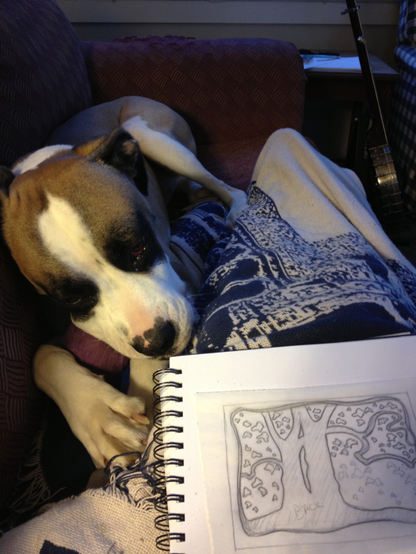
Mr. Darcy and I have spent a lot of time like this this past week. I managed to sprain my ankle on Christmas Eve, so sitting up with it down on the floor at my work table is less comfortable than being on the couch just now. Mr. Darcy likes this new approach to working. He's been keeping me company very happily. Above is a new letterpress block, and below are illustrations for the new e-book I'm working on called the Night Squad by David Goodis. This is my second project for the new publishing imprint called Chalk Line Press. 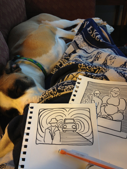
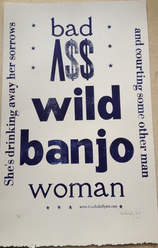 I was having a discussion with a music playing friend about strong blueswomen and the badass women of bluegrass. Think Little Maggie and Darlin' Corey. I love that they all play banjos. (That's a quote from "Little Maggie" up the side of the poster.) I was saying it's important for me to have a range of songs to see me through the transitions that come with life and be able to sing out all those emotions. I'm still missing Di Anne Price, my favorite blueswoman and also a friend who had a song for every possible situation I could find myself in. The upshot of this conversation was that I got called a badass wild banjo woman. I loved it. And since I know several more badass wild banjo women, I decided I just had to make some art from this. I broke out the wood type and set a poster that night. Below was my first proof. 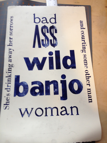 It looked a little bare. My collection of poster ornaments is pretty small, but I did have some not-too-tiny stars I could add for just a little more pizazz and visual cohesion. I'm now thinking I need to carve myself some old time-y poster frills, but I'll have to get through the Christmas crunch time first. Below on the left you can see the first set up, with just a few blocks on either side of the "bad ass" lettering. On the right I've added the stars. It's a lot like a jigsaw puzzle. I had to fill in the spaces with blocks and slivers of wood just the right sizes to make it all fit snugly in the frame. I love this kind of puzzle. It's fun with the big type and a little more challenging and persnickety when I'm using smaller metal type. But still fun.
I'll be mailing out a few of these posters to the banjo women who have been kind enough to mentor me in my playing and help me have more fun with my banjo. I have several more left from the edition of 20, and I'm selling them in my online store for $20 each.
I'm also sending one to a friend with a new banjo who, God help her, is looking to me for a little of that mentoring. Fortunately she also has some other folks to call on. But I love the banjo sisterhood. Long live badass wild banjo women! 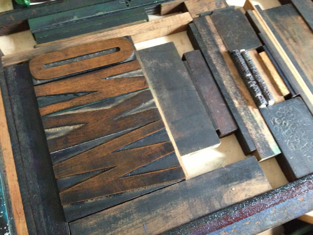
I spent much of the day running note cards for WKNO fm, our local NPR station. I had fun getting the slightly battered, large wooden type out for the project. 
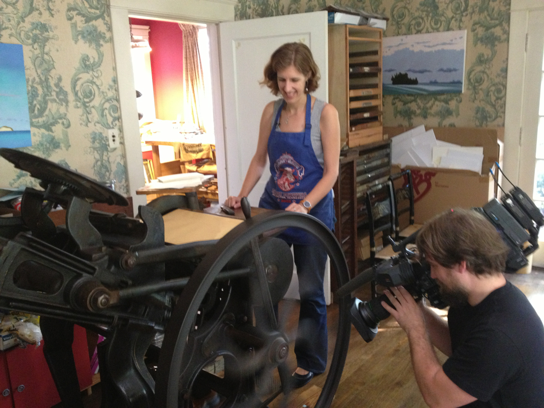
Here's a short video of the press operating. I had to hold it myself, so it's a bird's eye view from the printer. It's also a little slower (not too much) than my usual press speed, since I was trying to handle the camera as well. Final results. 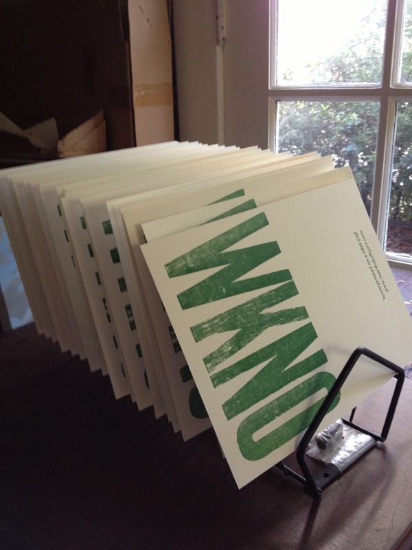
|

online store Martha Kelly is an artist and illustrator who lives and works in Memphis, Tennessee. Get occasional studio email updates. Categories
All
Archives
March 2024
|