|
I'm printing invitations to our home show today. I've got a 1909 Chandler and Price letterpress that I am the current caretaker for, and I feel so privileged to have it in my home. I mostly carve blocks for it and do note cards, but occasionally I have an invitation I'd like to print, and (thanks to a letterpress fairy godmother here in town who's traded me type for paintings), I have type I can set to create my own postcard. It's a satisfying process to do that from start to finish. Today several people have dropped by to pick up calendars or prints and have gotten to see the press in action. I realize this isn't something most people are able to see in their everyday lives, and one friend too far away to drop by requested a video. So here it is. It's the first time I've used this feature on my small digital camera, so the sound isn't great, but you can see the beauty of the press in orbit. Here's a scan of the invitation I'm printing. It's fun to try different type and ornaments that Cheryl has given me. 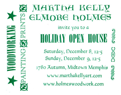 And here's what the first 100 or so looked like, before I caught the mistake. 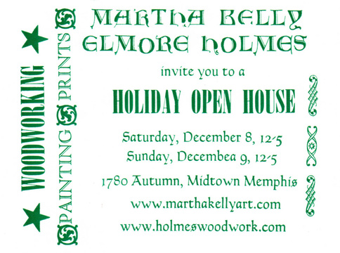 At least I'm in good company. I learned in my Meeman Center class on Shakespeare with Mike Leslie earlier this fall that when they were printing Shakespeare's First Folio editions, someone would stand by the press and proofread as it was running. If he found a mistake, he'd yell, "Stop the presses!", and they'd fix it, but they wouldn't waste the pages they had already printed. So there are several different versions of the First Folio floating around with various typographical errors. In my case, the places for the "a" and the "r" letters in a California case are right next to each other, and obviously I just grabbed the wrong one. Here's how the letters are laid out in print shops. I still have to use a diagram to go very quickly, but I'm learning. It's a fun trade to learn. I feel connected with centuries' worth of important history as I print with moveable type. My whole church (Presbyterian) sprang out of the printing press and the new ability it offered to spread both vernacular copies of the Bible and theological tracts. 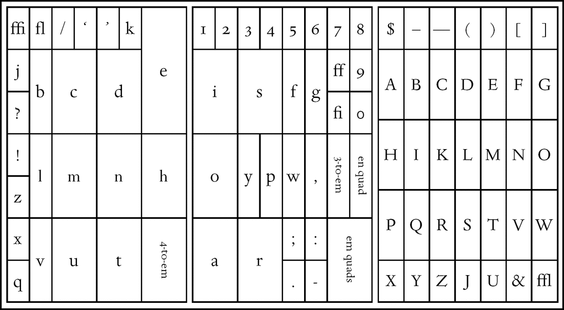
0 Comments

One of the many things I love about being married to a fellow artist is hand-made valentines. Elmore forged this heart-shaped hook for me in his small forge made from a fireproof brick. He's been making other hooks and bottle openers for our kitchen, and I love carrying on our daily lives in the midst of things he's created for our home. In other Valentine news, it's just on a year since Elmore reinforced the floor to receive my new letterpress. He spent four afternoons on his belly in the crawl space digging holes and sinking posts into concrete. It was the best Valentine ever, and I could not be more lucky. I'm also still madly in love with my letterpress a year on. The first block I carved for it was a valentine. I was thinking of Elmore, of course, but I'm glad to report that the letterpress and I are also thriving in our relationship. 
 One of the great privileges of being an artist is being able to preserve a special or beautiful moment in time and share it with others. I was painting the other day when the moon rose above a line of fir trees. I did the above watercolor sketch quite quickly, before moving on my next planned, much more detailed work. The scene stayed with me, as several moon rises through the years have done, and on Saturday, I sat down and did a small carved block from it. Yesterday, I ran the block on the letterpress for new note-cards. 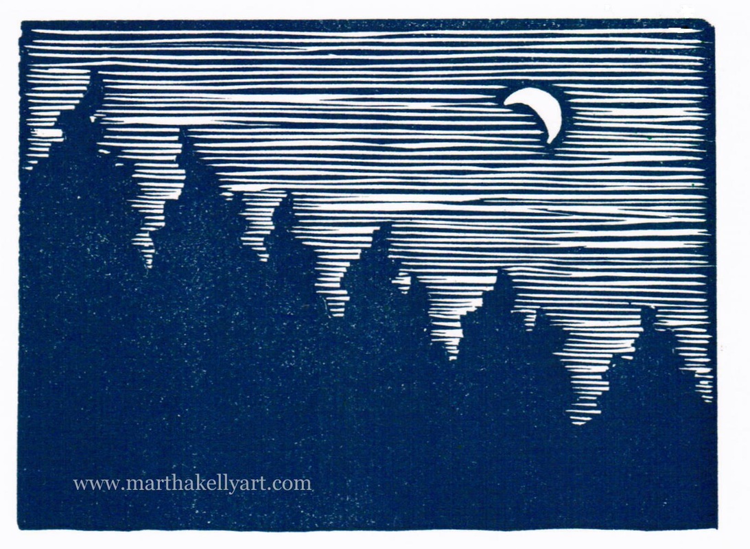 Most of the cards look like the one above, but instead of mixing the ink on a palette, I added the green and blue separately on the ink disc itself, so the first several (before it got mixed thoroughly by the rollers) have a more tie-dyed appearance (called a "rainbow roll" in printmaking). It's more subtle than the tree I did in yellow and blue (mostly because of the darker colors involved), but it's there.  The light and dark contrast of a single color block really changed the feel of the image away from the lightness and color of the original watercolor. I'm now working on a three color block that would let me get a little more of the original feel in a print. This scene hasn't quite let me go yet.
 So I got an email a few days ago from the Brooks Museum store asking if I have any Valentines. I personally feel like I only just got done with Christmas. In this first year of having the letterpress, I'm still unused to the retail deadlines and seasonal changes. I got on the press yesterday to catch up and printed two different Valentines. The first uses a vintage cut that I've borrowed from a friend. I'm going to do some cards for Bridgman Pottery (Melissa stamps all her pots with a honeybee stamp), and I thought this would make a fun, if not highly original, Valentine. The second is the very first block I carved for the letterpress when I got it last year right about Valentine's Day. Printing it again brought back the exotic, historic feeling I had when the press first came into my home. I love being familiar with its ways and adept in its use, but it was fun to be reminded again of that brand-new, fizzy feeling of doing something new and being the new caretaker of something this amazingly cool.  Last year I didn't have any type (nor any idea of how to set it), so I was writing my website by hand on the back of each card. This year I'm thrilled to have a nice collection of type I can use in all kinds of ways.  
Here's the start of a new block I've been carrying around in my head for a couple of weeks but been too busy to start on. I finally got to work on it yesterday and will do more today (though it's also beautiful outside, so I'll be doing some urban sketching as well). This is the first multi-color block I've tried on the letterpress, and I'll be curious to see how the registration goes. When you're only printing once, there's a lot more wiggle room for dropping the paper in. 
 I've been busy with Christmas the last few days -- making cookies instead of making art. Tomorrow I'll get back to work. I've got a four-color letterpress block in my head and sketched out, ready to start on. It will be the first one I've tried, a grand experiment, but since my commissions are now down to a manageable level, I've got time to play around a little bit and try some new things. In the meantime, I hope you and yours are having a marvelous holiday season!  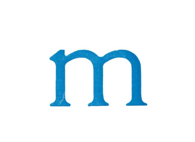
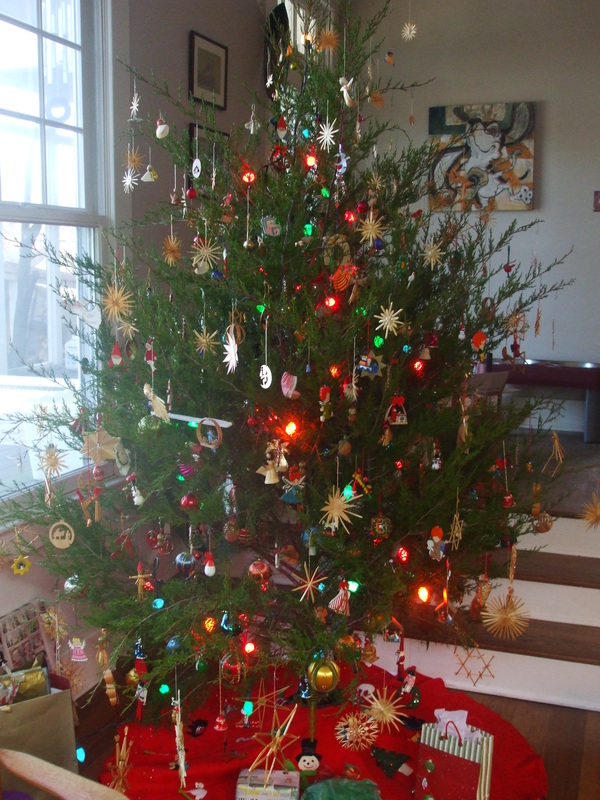
Elmore and I had our annual open house this past weekend, and this year it included a letterpress demonstration both days. I got a fair bit of printing done, including an "m" note card for a couple of people I know and a set of "G" note-cards that had been commissioned. 
They're both vintage wood type and show their age a bit (with a crack in the G and a bit of uneven printing in the m), but it's my new favorite font, and I'm thrilled to have it. I don't have a lot of it. t's missing the B, and many of the consonants are only present in singles, but the vowels are a bit more plentiful, so there are some things I'll be able to spell out on posters or t-shirts. 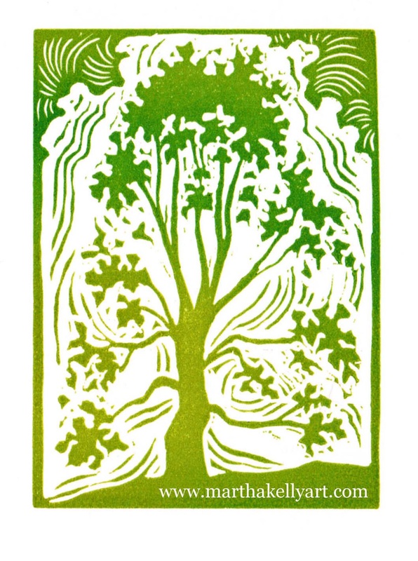
The second day of the open house I ran my new block that I'd proofed but not yet had on the press. I tried mixing the ink on the press instead of on a palette ahead of time, and I enjoyed the "rainbow roll" effect that gave me. I think it's a fun alternative to a solid color, and the organic nature of it suits the subject matter.
This is a small block, for note-cards or bookplates. I need to get on the stick and find some gummed paper so I can start doing bookplates in earnest. 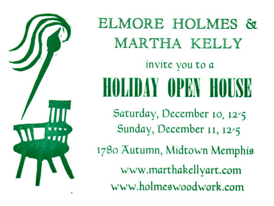
It's been cloudy and raining pretty steadily here, so I haven't been able to get out and paint. The rest of the week looks better, which is good because I have a stack of Christmas commissions to do.
In the meantime, I printed the invitation to Elmore's and my open house (it was time to get this done, anyway!). It's the most type-setting I've done, and I'm happy to report that the process is getting easier. I also got to play with several new fonts I haven't printed before. It's a little like Christmas to see how they come out the first time. Now I've got to get our home gallery hung and the house clean. It's good to have occasional deadlines for things like that. 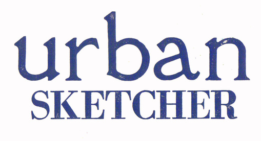
I'm hand pulling Advent prints this week, and I'm also playing with my newest fonts of wooden type while I have ink on the rollers. I haven't slotted them into the letterpress yet, just pulled by hand while I'm rolling away with my other stuff. (The press takes a lot of clean-up, so it makes sense to save it for a more serious day's work.) Because of that, these are have a few spots that are less well printed than is ideal, but I mostly wanted to see what they look like. I'm thinking of doing myself an "urban sketcher" t-shirt. If any other urban sketchers out there want in, let me know. Here's a second font possibility. I don't have an "A" with this one, so I used a "V" upside down instead. I've decided I really like condensed type (the tall, skinny stuff) and hope I can find some more somewhere. 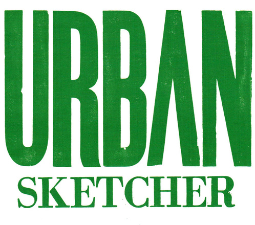

It's amazing how Advent creeps up on me each year, and it's especially exacerbated this time with my show just the week before. It's my favorite church season (gorgeous hymns, apocalyptic theology, the emphasis on Isaiah), and I try to do something special each year besides my normal line drawings. This year I'm doing a series of block prints paired with some vintage letterpress type. Above (echoing "Prepare the way of the LORD") is week one. I've carved but haven't printed "Repent" for week two. Week three will be my "Peace" image that I've already got note-cards of, and I'm still designing "Comfort" for week four. Nothing like being on top of things.
Anyway, I got this one done Monday to scan in Tuesday and get to my subscribing churches. Tomorrow I'll print "Repent". I've got John the Baptist whispering in my ear this week. |

online store Martha Kelly is an artist and illustrator who lives and works in Memphis, Tennessee. Get occasional studio email updates. Categories
All
Archives
March 2024
|