 I’ve been chasing so many deadlines this year that I told myself I would take it easy for the holiday season. I’ve only taken on a few commissions that are different and interesting to me. This couple really intrigued me though. They do some kind of portrait by a different artist each year that captures something special about the year they had. Because it’s yearly, they were happy for me to experiment a bit and not try for a traditional representation. So I decided it would be fun to cut a silhouette of them and then print onto a background painting of one of the places they went and loved. They approved the silhouette and know what’s coming, so I can show work in progress, which is also unusual for commissions, which are usually a secret present in the making. I’m under the weather this week but can carve smaller things in my lap as well as draw out some new, bigger prints. I’m excited to see how this prints when I get back to up and moving around work.
0 Comments
I have a bunch of proofs of prints that just didn’t print right — the paper moved on the block, making it fuzzy (the black and white one), or I didn’t get enough ink coverage (the base layer of the black under the blue). Usually I reuse those to test a block or do a first layer of ink on a throwaway sheet so I get good coverage on my better paper. Sometimes they get a number of layers of ink after sitting around the print shop for a while. I was printing my moon block in silver for the Black Feather Farm commission, and while I had the silver ink going, I wondered what would happen if I played with some of these sheets. I got out my pelican block and tried it on a couple of of proof sheets and then cut down to the part that worked. I’ll have to get creative about signing these, since there’s no white edge around them, but it was fun to move a little looser and seat-of-the-pants in my printmaking. These will be a 1/1 print, meaning it’s unique and unrepeatable, and I think I’ll take a few to the Pink Palace Crafts Fair later this month for fun.
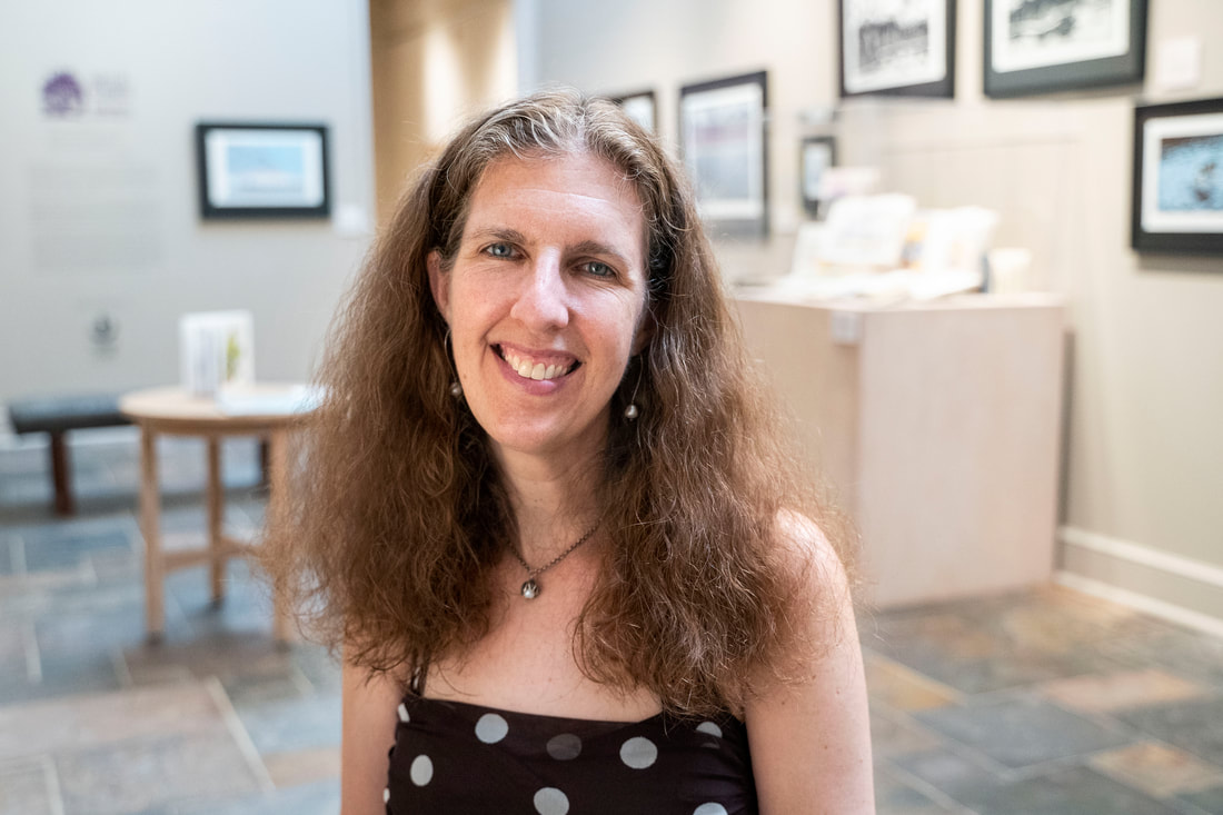
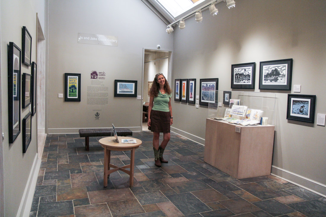
Rodin used his small cast figures in different combinations and ways as he got older and had a whole range of sculptures already done and available. I’ve always planned one print from the beginning, done it the way it was in my head, and set the block aside. I’m realizing that I now have a good number of blocks that it might be fun to combine in different ways, so I’m starting to think about new ways to experiment with them. 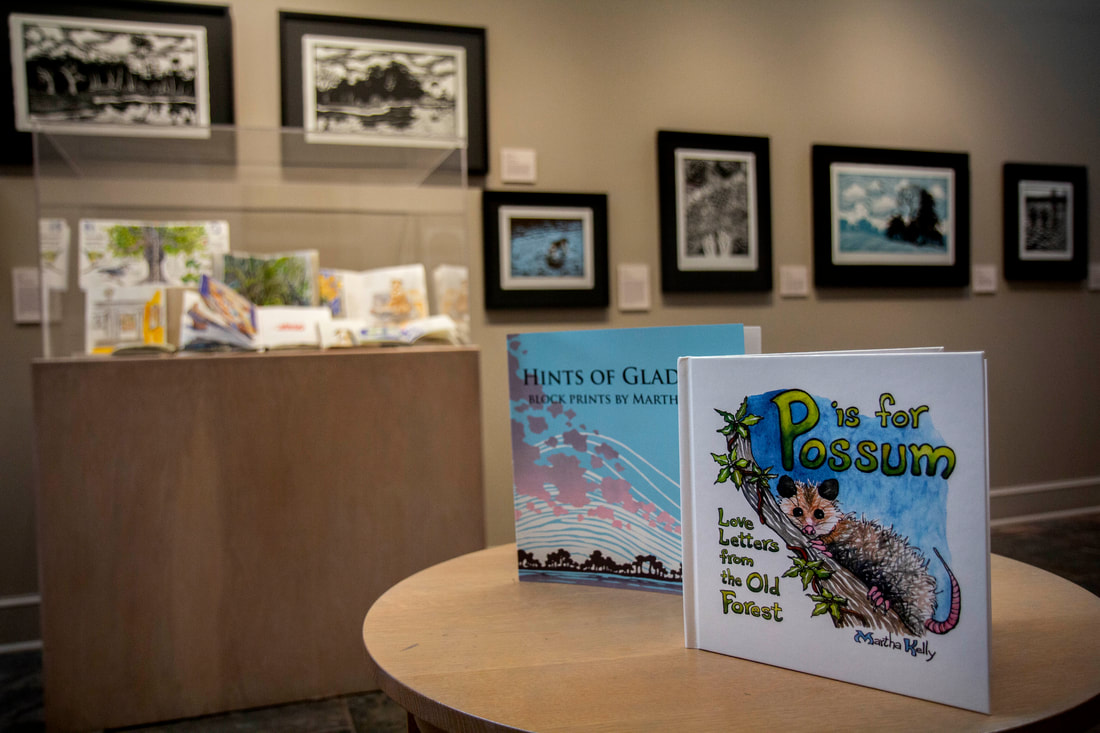 Sarah Dutton does the marketing for Walter Anderson Museum of Art (she created the entire video about the show I shared earlier), and she kindly took some highly professional photos of my exhibition hanging in their beautiful space. I'm so grateful to have this record of the show, and she also, so generously, took a bunch of me as well. I have a new head shot I'm happy with, and some fun ones in the show itself (though honestly, I should learn to just look in the mirror first and check my shirt/hair/whatever else might be slightly askew -- maybe I'll learn eventually). Anyway, aren't these lovely?? 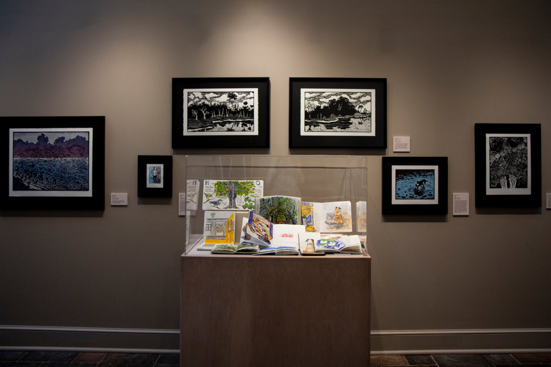 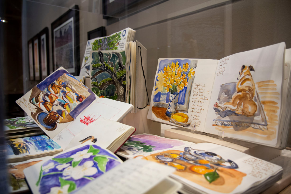 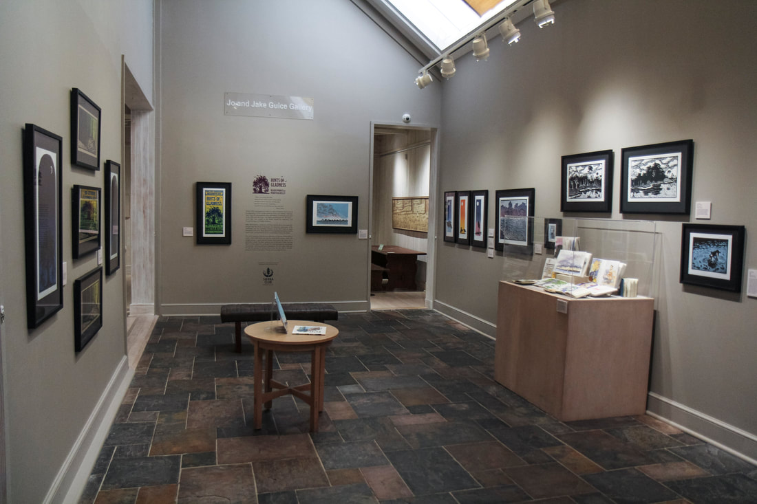
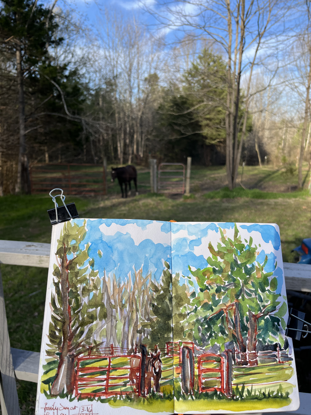
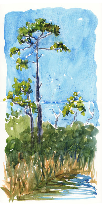
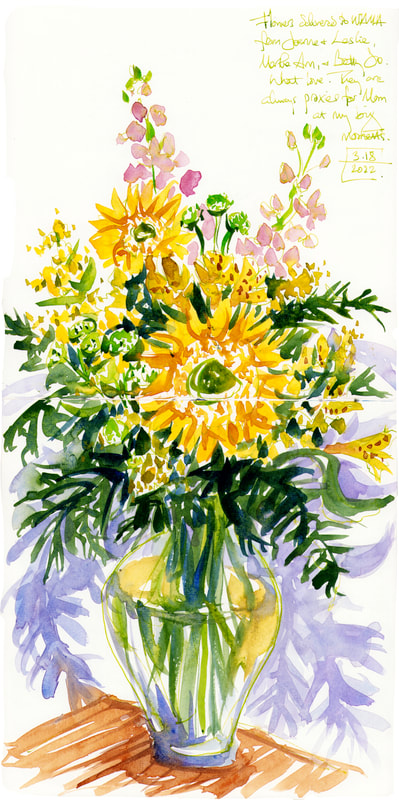
  I’m giving myself some vacation time this month after all the craziness but am also working slowly on this new print. I sketched after sunset one evening during my opening week. The family all walked down to enjoy the beach, but I got there first with my sketchbook to wait for them. You can see from the sketch on top that I need to lighten the pink and purple both, by a lot, and I’m keeping on carving on the blue block. I’ll whittle down those large blue splotches to more pattern. But I’m pleased with where it’s (slowly) headed. Here it is with the third block that has both black and blue on it. 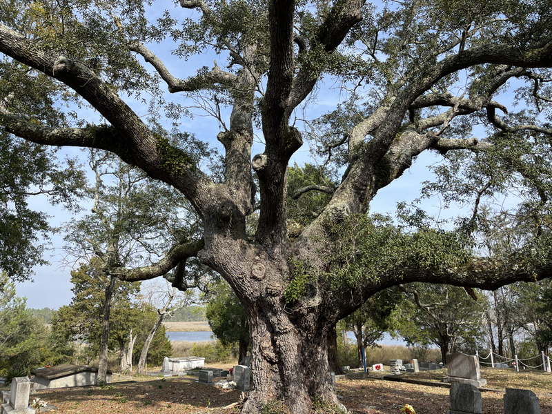 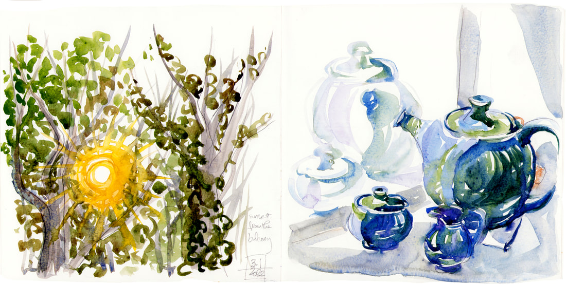 I celebrated delivering my new show by sketching lots and also buying a new "I HAD A SHOW AT WAMA" tea set that will forever hold these happy memories for me. I had gone to Shearwater Pottery just looking for a cream pitcher, since I'd recently broken one of my favorites. But of course I ended up with a teapot too. Actually not "of course" -- teapots are hard to make, and they don't always have them in stock. This blue/green/grey glaze was so gorgeous I couldn't resist. In an added bonus, when I got it home, I found that my new favorite tea infuser fits EXACTLY into the hole with the lid going just inside it, so it's my easiest to use teapot of all the ones I now have. (Lots of them, sadly, are too narrow for my infuser, so I use them less than I used to, but I do still rotate through them for joy.). Speaking of joy, they got my show up on the walls before I left, so I sat in the gallery and did a celebratory sketch of it. So much joy. 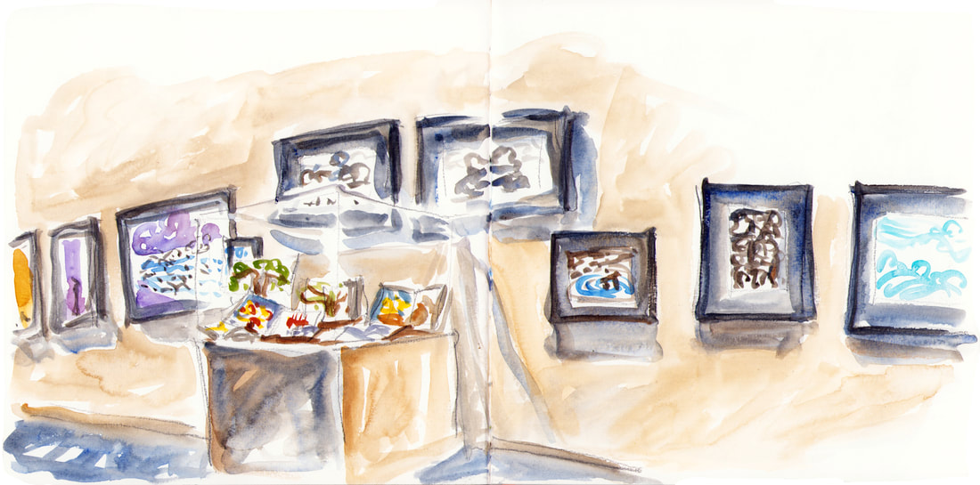 I also sketched this tall tree that I've been wanting to do a print of. It's good to have sketches as well as just photos to work from, though both are helpful in different ways, especially for more detailed subjects. And I'm adding in a second vertical that I did at my opening weekend to balance it out. My mom's three best friends have shown up for me at all the truly important passages of my life, acting as her proxies. They couldn't be at the museum in person, but they sent these gorgeous flowers to mark the occasion, and I couldn't be more grateful.
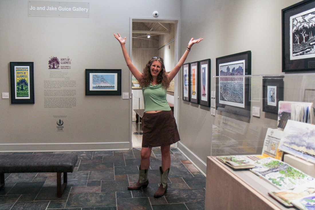
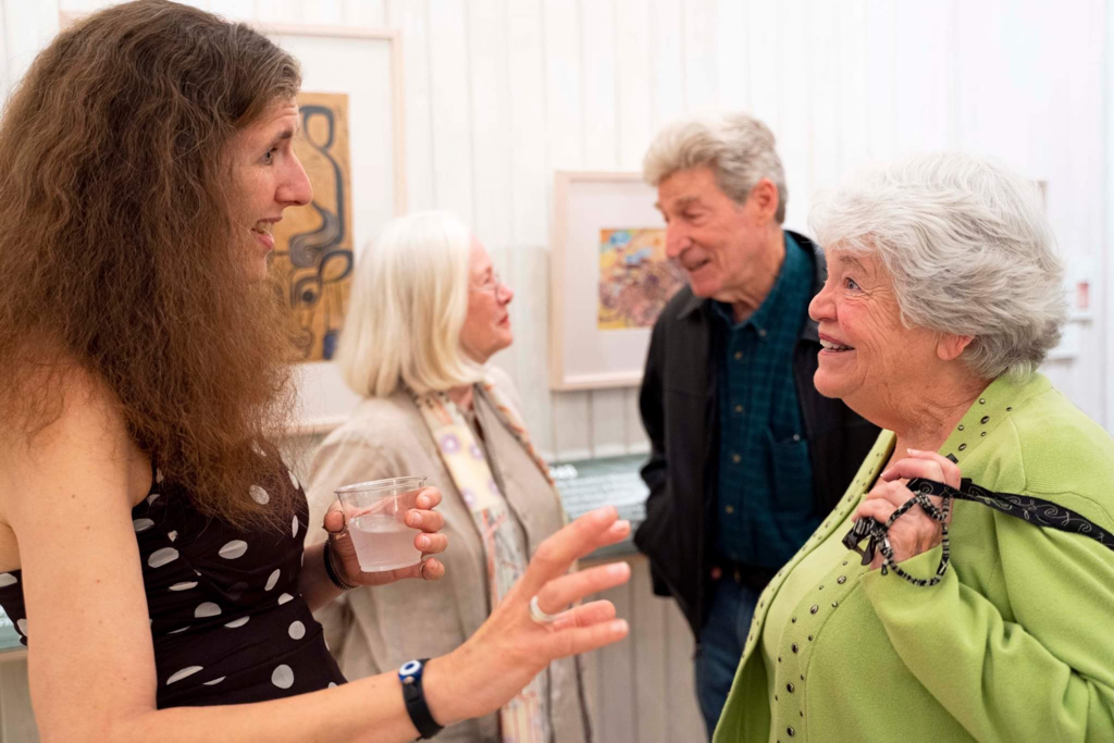 I could not be more happy this week. I just got home from five days in Ocean Springs. My family came and stayed Wednesday to Sunday/Monday, thirty-three freaking friends showed up from out of town for the reception (most of them 6 hours away and some more than that). Several other friends saw the show the same weekend or came to one of the artist talks. I’m stunned and touched that so very many people showed up. Very beautifully, three of Walter Anderson’s children came to the opening as well, sought me out, talked to me about my work, and told me that the movement and pattern and nature focus in my work was a great fit in this space and with their father’s work. Their father is one of my premiere art heroes, and that kindness from them meant more than I can put in words. Sarah Dutton from WAMA captured me talking to Mary with John in the background, and I was delighted that she caught the warmth and radiance of Mary’s kindness to me. John has been gracious over several meetings and always takes time to come talk to the children in the museum. The first time I saw my show on the walls two weeks ago, he was there talking to the kids, and I got to spend some time with him after talking art and hearing stories about his dad. Melissa Bridgman took this photo of me and Leif, the other daughter, a dancer and dog lover and gently glowing person. I was delighted to meet her and her daughter as well. 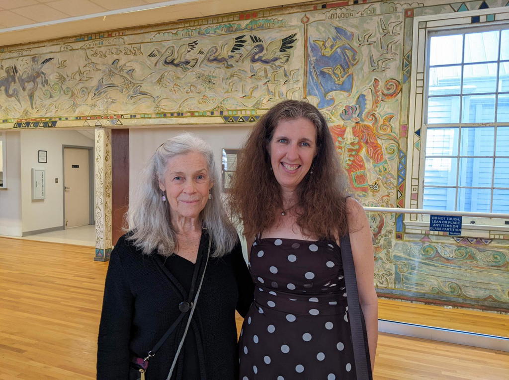 I’ve mostly forgotten how to dress up and go out in public, but Kaleigh Donnelly took this photo of me in my favorite dress that made me feel exactly how I wanted to for this occasion, and I’m grateful. 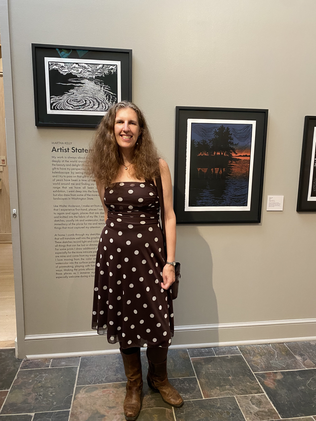 Here are a few more shots by Sarah Dutton that I loved from the opening. The Old Ways from Oxford, Mississippi, played wonderful music that was just right for both St. Patrick’s Day and this traditional music loving woman. The whole night exceeded all my dreams, and I could not feel more lucky. It’s rare you get to say that. I finally went home, sat under the stars for a while, and wrote in my journal to help me remember in times to come. 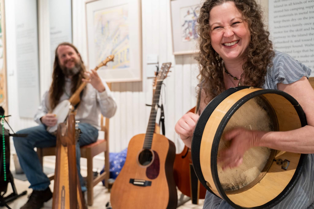 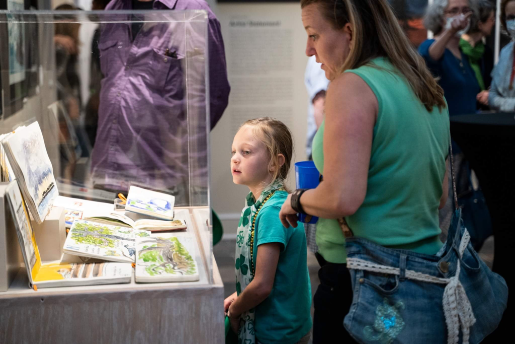 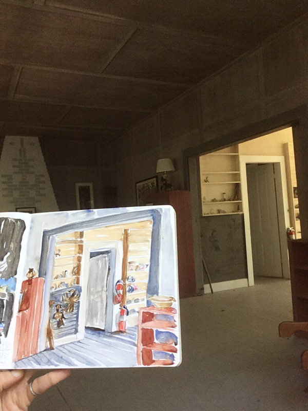 Darel Snodgrass of WKNO fm kindly hosted me again to talk about my show at WAMA, sketching (always), the new catalog for that show, and my graphic essay about Mr. Darcy. With all that, he also kindly let me go on longer than usual. I'm so grateful for this daily show about the arts in Memphis. It gives musicians, theaters, dancers, artists, and other creatives a way to get the word out about the things we're doing, and I always learn a ton when I listen.
 Y’all. I got this email from WAMA, and seeing my work side by side with Anderson’s made me tear up. I finished putting hardware on the very last framed piece today, and it’s all feeling very real and a little bit overwhelming in the best possible way.
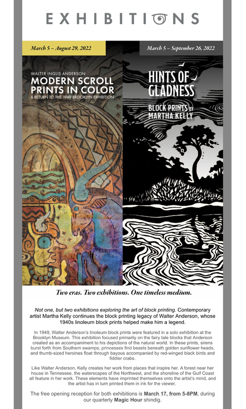
I ran the press yesterday to print cards for WAMA, and I decided to do a short video to introduce myself to their folks who haven’t followed my work before. It’s always fun to show off the press. It’s such a superstar. And beautifully, the set up yesterday (getting a solidly good print across the whole frame) was easier than usual, so printing was a lot of fun. I was tired last night (I ended up doing almost 700 cards, since I’ll need a lot for a six month show run), but it went really well. 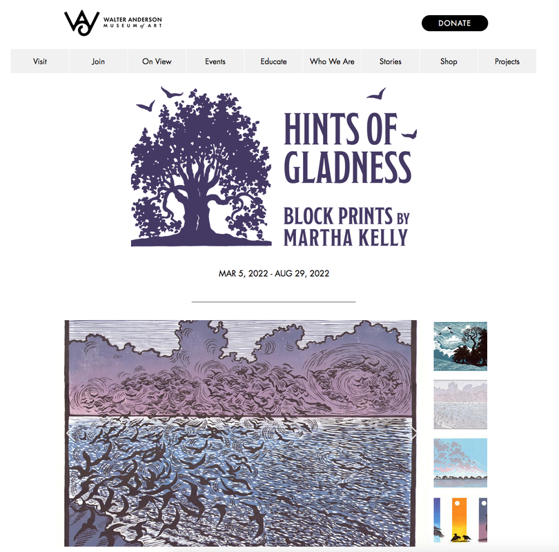 Y'all, WAMA has made a gorgeous website for my exhibition! I couldn't be more pleased. Above is a screenshot of the top of it, but to navigate the images and read all the text about the show and see photos of me working, click here. They are doing a beautiful job on every aspect of this show, and I can't wait to see it hanging in their space. I deliver art on Feb. 28th, and I have 20 of 21 prints framed. I'm partway through mounting all the pieces (20 watercolors plus text bits) for the separate graphic essay about Mr. Darcy that will hang in a separate space. It's their first time hanging just mounted art instead of framed, their first graphic essay, and their first time hanging in a salon style (a more informal, collage style grouping). I'm so grateful they're trusting me to do this new thing for them. Mattie Codling, the curator, had asked me if I wanted to write a bit of story about Mr. Darcy to go with his print in the show, knowing what a large part of my art making he had been to me. I told her I would love to and that I also had this graphic essay about his last couple of months called Daffodil Season. It doesn't go with the formal print exhibition, but she found a separate space for it in the museum and is diving into this new thing. I have so appreciated her enthusiasm and support in the two years preparing for this show. It will be special to honor Mr. Darcy in this way, and I think anyone who loves and loses a beloved companion will resonate with it. Anderson had a number of animals he spent time with and painted and called familiars, so it's appropriate for his museum to honor these muses. 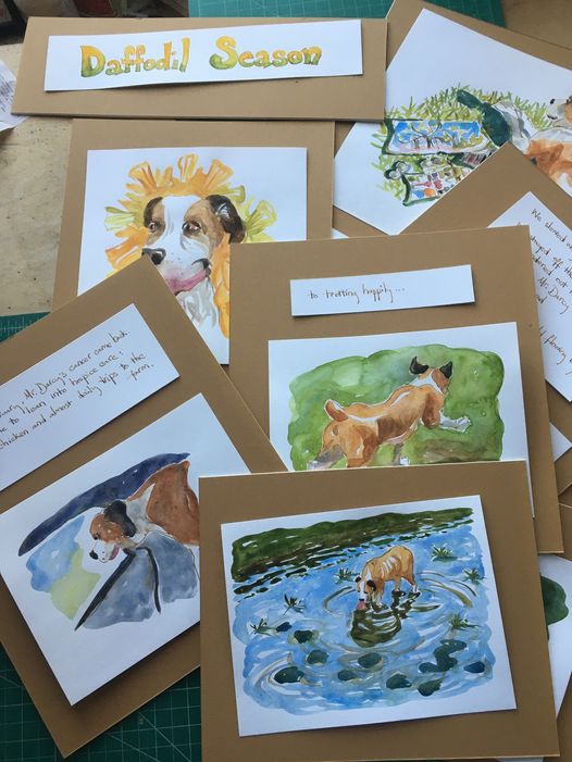 |

online store Martha Kelly is an artist and illustrator who lives and works in Memphis, Tennessee. Get occasional studio email updates. Categories
All
Archives
June 2024
|