 A couple of years ago I "plotted out" a tree alphabet book. I love trees and nature and draw all the time in the Old Forest in Memphis's historic Overton Park. I even started a print (I was thinking linocut), but it felt a little forced, and I abandoned it. This year's Quarantine Journal, dog walk sketches, and new interest in birding all have me thinking back to that project. So over the last couple of days I have laid out an ABC of the Old Forest. Broader in species, but more specific in place. That feels like a good combination to me. I'll have to get a bit deeper into it to see how I really feel about it, but I'm having a good time so far.
0 Comments
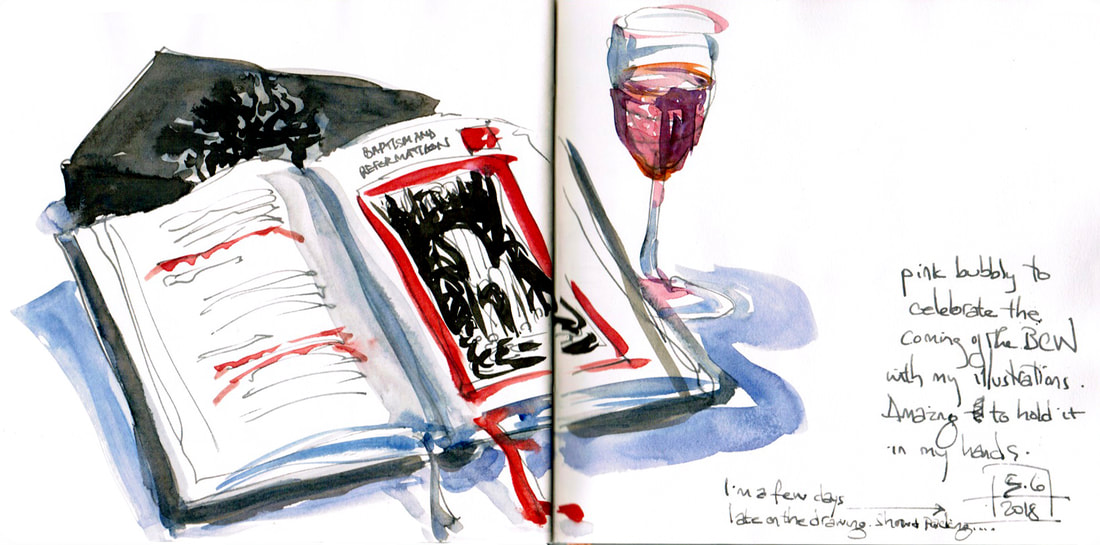
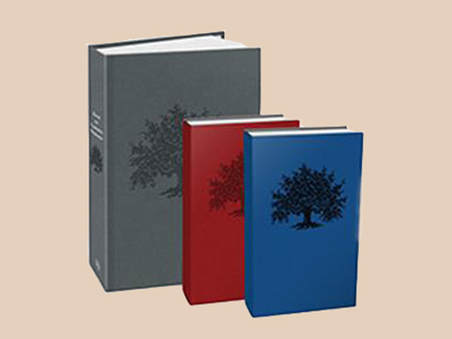 There's a lovely article in the Presbyterian Mission about the upcoming Book of Common Worship that I spent a lot of last year doing illustrations for. It's coming out in May in three different editions, all with my Tree of Life linocut stamped into the cover. I am beyond excited and can't wait to hold it in my hands. I'm going to have to get the smaller personal prayer edition as well as the desktop one. The third is for pastoral use during hospital visits, weddings, etc. -- also smaller to carry around.
 I have news! The Presbyterian Church, U.S.A., is redoing its Book of Common Worship, which they do every 25 or 30 years, and they have asked me to illustrate it. I am beyond delighted. I've done some illustration work for a couple of different publications for them in the past, but it was always journals or a year long study guide (for the Book of Revelation -- my first ever illustration job, and I dived into the deep end). Nothing that would be in print for a long time. I've been hoping recently to get to do more illustrations, and I am so excited to be offered this opportunity to work with Westminster John Knox Press. I'll be creating about 15 two color block prints, a cover plus a frontpiece for each main section of the book. The work will be due in June, so along with my March show I'll be having a busy spring, but I love having meaningful work to do, so that will be just marvelous.
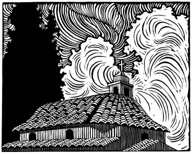
(The print at the top is an older one of a church in Athens, but it seemed appropriate for this post.) 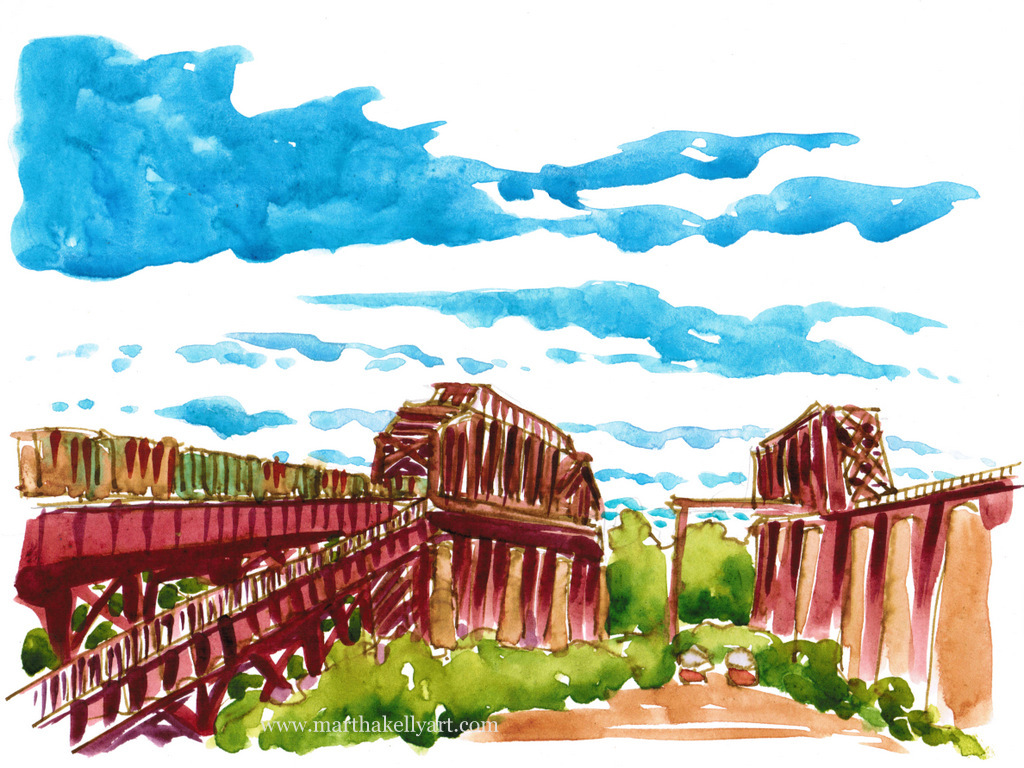 I sketched the Hanrahan bridge from the Arkansas side for the Memphis Daily News this week. The new pedestrian crossing is a great addition to Memphis (though the trains come by so close to you that I don't think I can take my usual four-legged walking buddy, since he's still nervous around even skateboards). They're working on trails on the Arkansas side so people can extend their walks and bike rides a bit as well. Above is the watercolor I did for the paper. I took a photo of it halfway through, with just the fountain pen line work and sky. If I'd been doing it for myself, I think I would have stopped there. I tried again, quickly, in my journal once I was done, but I think I got the sky too dark for it to balance well. I've been enjoying drawing with a fountain pen again, though. I'd kind of forgotten to for a while and have fallen in love with it again this fall. 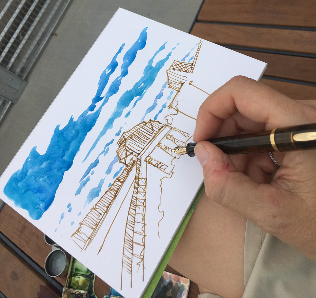 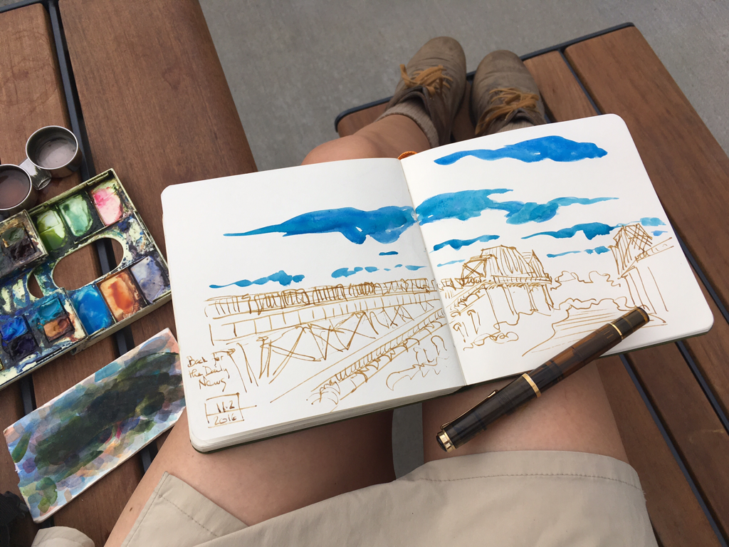 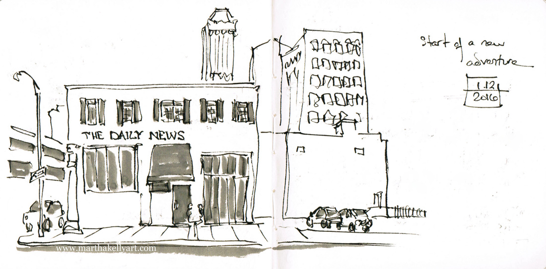 I'm starting a new adventure with this new year, and I'm really excited about it. There are several urban sketchers around the country who have regular sketch features in their local papers. They go out and draw interesting things happening in their communities, and it's like a column or other regular feature in the paper. I pitched this to Eric Barnes, who owns the weekly business paper The Daily News here in Memphis, and he was kindly receptive. With the holidays over, I met with the editorial team yesterday. They already have a weekly spot for community happenings that is usually anchored by a photograph. They're going to use my work in that space once a month and also commission me to do occasional covers for the paper, which I am utterly thrilled about. I have loved my landscape illustration work for Cape May (and occasionally Memphis Magazine) and have been wondering how to expand that piece of my career, so I am delighted to be starting the new year with a new opportunity. I did a little scouting of locations downtown after the meeting and treated myself to sweet potato pancakes at Memphis's iconic diner The Arcade as a celebration. I sketched, of course. 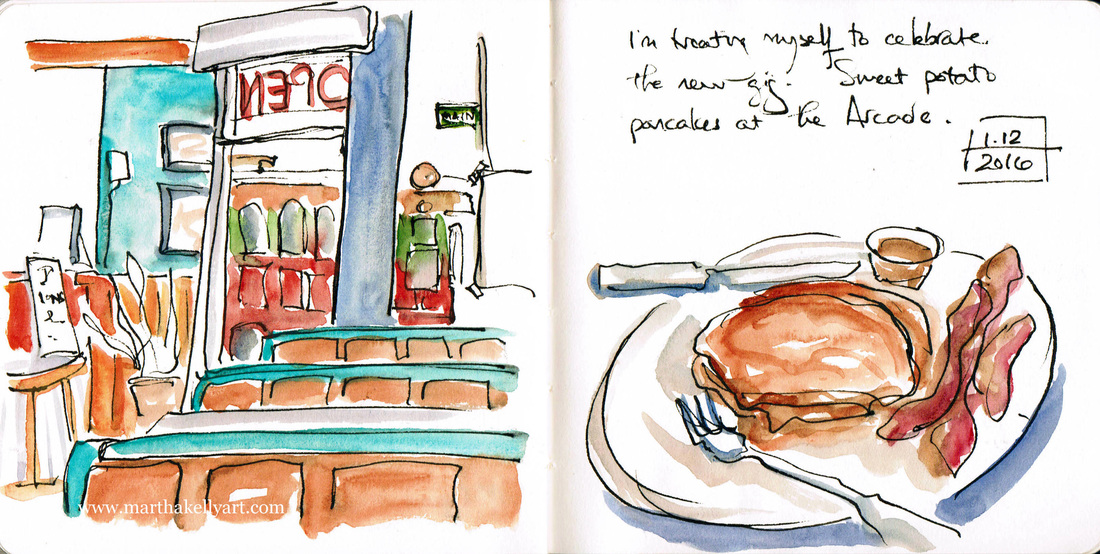  My Cape May watercolors have been featured in the Concierge Magazine printed for the Cape Resorts group for use at all their hotels. It's fun to see them in print, and I'm especially pleased with the cover. That was such a fun Victorian house to paint. It's one of several cottages they rent out. Seeing this makes me want to go back there again. I hope I get to soon. 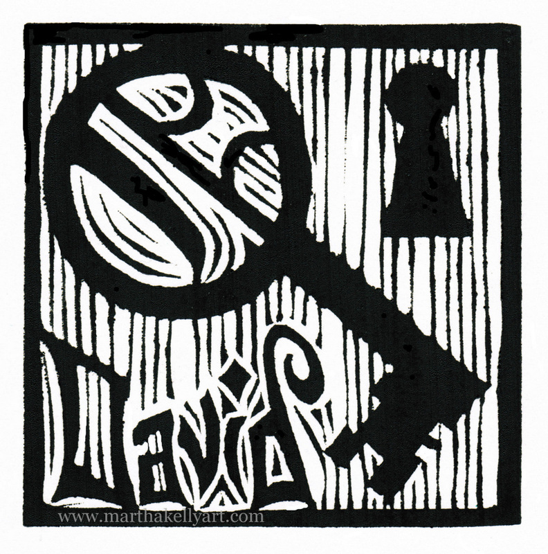
For week two of Advent, I'm delivering two more O Antiphon prints to the churches that subscribe to my weekly bulletin drawings. Usually I do lectionary based pen drawings, but Advent is my favorite season of the church year, and I like to do something special for it. Often I do a special series for Lent and Easter as well. This Advent I'm doing the seven O Antiphons. Above is O Key of David, and below is O Root of Jesse. (Given the Presbyterian nature of the churches I serve, I'm not using the traditional Latin titles. I'd like to give people an easy way into the images.) I'm having fun playing with the "O" motif and getting it prominently into each image. These images will be published next year in Call to Worship magazine, published by the PC USA. 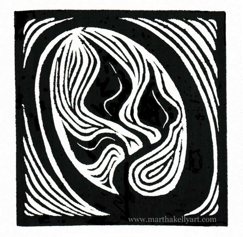
My last of four issues of Call to Worship magazine that I'll be illustrating is Advent-themed, and the deadline is a bit into the new year, but near enough that I'm thinking ahead and creating art for this Advent at the same time. I had pondered a print series based on the hymn "How Can I keep from Singing", which I love, but Call to Worship suggested the O Antiphons instead, and they grabbed my imagination. I didn't have time to do both just now, so O Antiphons it is. Advent snuck up on me this year, what with several trips, my dad's wedding, a good friend making the hospital/nursing home transition, and a few other distractions. I usually like to have time for a print series to marinate a bit in my head. This time I felt under the gun, started carving right away, and as a result have recarved three of the original four. Here's a snapshot of the first batch. 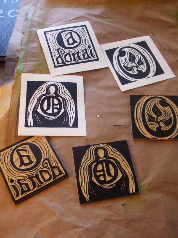
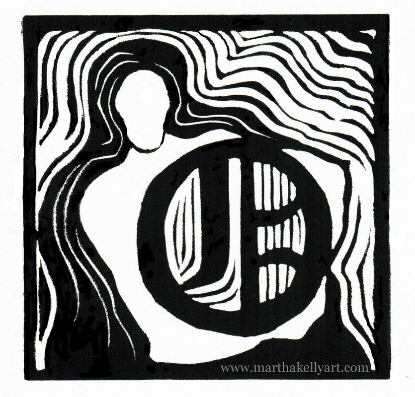
The first one is O Wisdom, or Sophia in the Latin. She is the female personification of God in the Old Testament, and I love that image of God. She was neutered into the non-gendered Holy Spirit when the Bible moved into Greek, and I'm happy for the chance to reach back into the Hebrew tradition and show the female side of God. Below is O Adonai, one of the names for God. I was happy with my original image for it, but I recarved the other two prints, as well as one more not shown here. Fortunately these are small, just 4" square, but I'm going to try to think through the final three more clearly and not be as rushed. I had to get images to my churches for their bulletins, though, and sometimes time gets short. 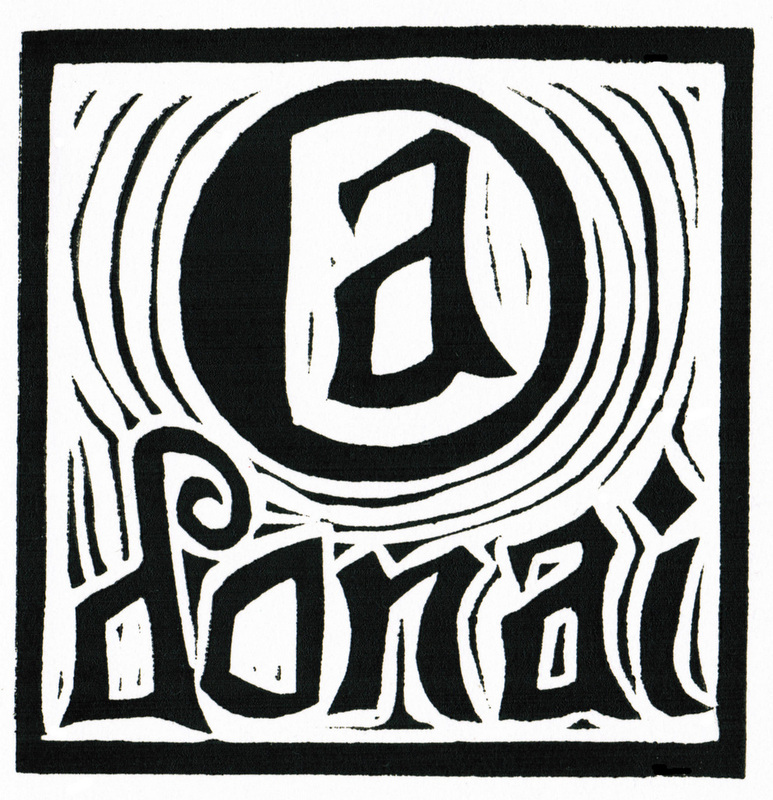
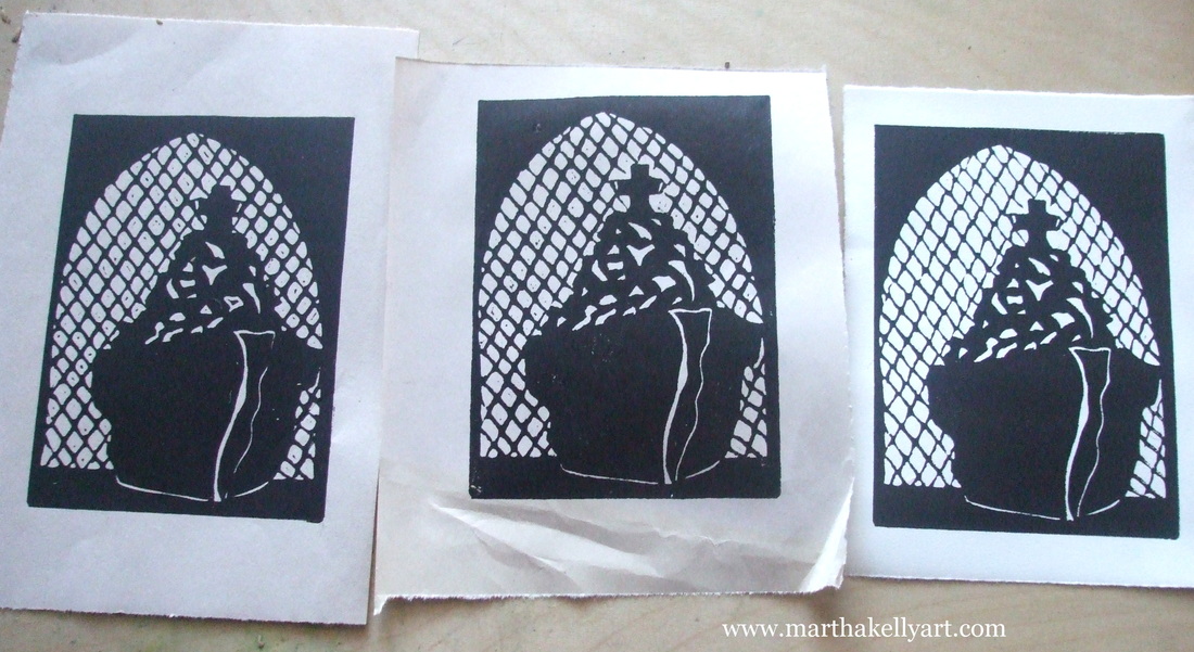
I'm the illustrator for the four editions of this year's Call to Worship magazine put out by the Presbyterian Church. For the upcoming edition, they've asked for four small prints to show the progression of worship -- gathering, word, eucharist, and sending. I'm using my own church Idlewild as a model for the prints -- sketching on Sunday mornings when I'm there and coming home to do the prints. Here they are in progress, and I'll post the finished prints soon. For the top photo, you can see three progressive proofs, where I carve a little more each time and then print again to se 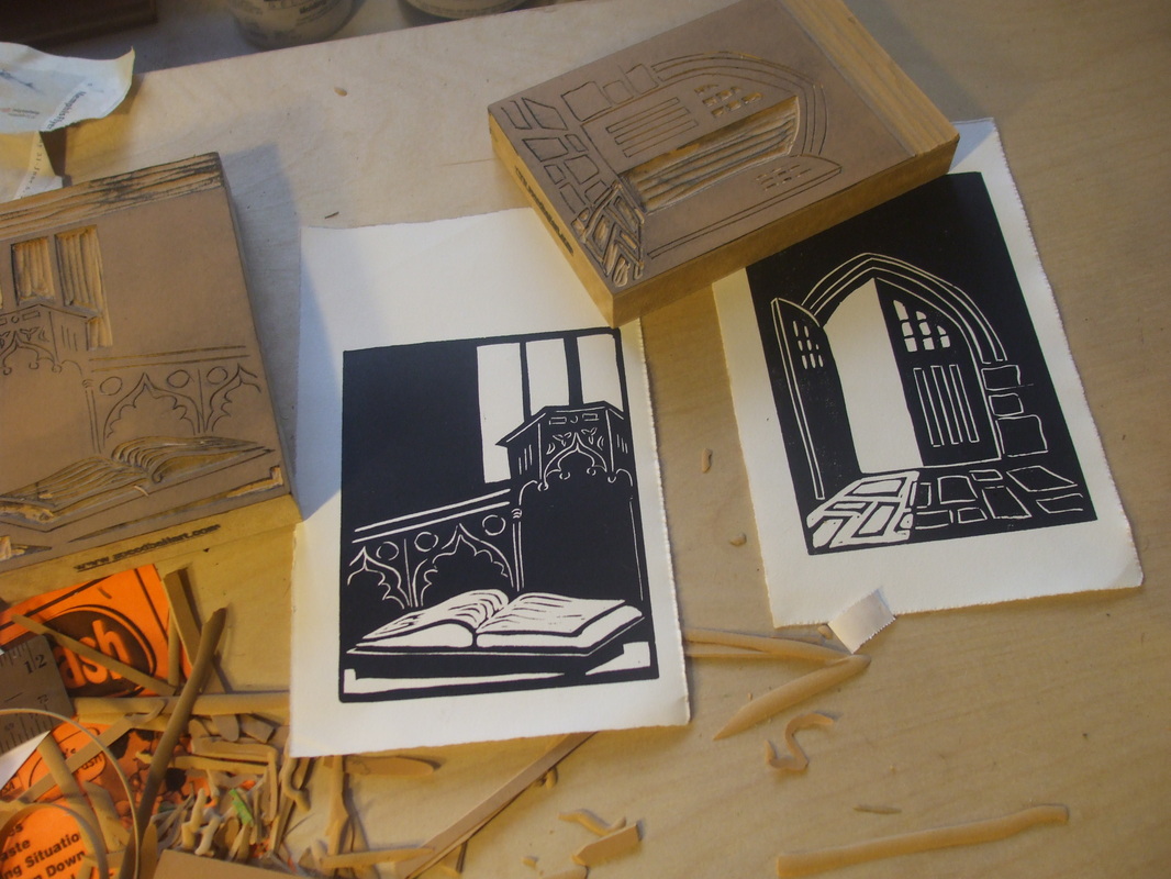
|

online store Martha Kelly is an artist and illustrator who lives and works in Memphis, Tennessee. Get occasional studio email updates. Categories
All
Archives
June 2024
|