
Yesterday it was too cloudy for plein air, so I concentrated on printmaking. I'm working on a series of blocks for Advent for bulletin covers. I have several new churches who are subscribing to my weekly drawings based on the lectionary, but I like to do blocks for Advent each year. It's my favorite church season. I'll post them when I'm finished.
In the meantime, I pulled this proof as well. I mostly carved this block on our farm retreat (it's based on a tulip poplar there), and I wanted to make sure it was ready to go now that I'm home with the letterpress. I'm going to make note-cards out of it (I think in color), but it's also the perfect size for a bookplate. I can add type at top and bottom for "Ex Libris" (or "from the library of", depending on preference) and then add a name at the bottom. I need to get serious about finding some gummed paper for bookplates. It would be very fun to do some.
0 Comments
 The Brooks Museum here in Memphis is having an exhibit they're calling "Armed + Dangerous." It's weaponry through the centuries. The museum shop has been carrying my letterpress cards and asked if I could come up with a card or three for this exhibit, since they don't have any official postcards for it. With my show coming too, this is the first one I've managed (their show also goes up this week), but once I get my own show hung, I hope to do at least one more to complement it. Sadly, my letterpress type so far does not seem to include a "+", so here's the back of the card: 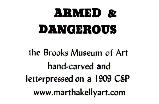 My "e" also seems to be doing something funky here, but I think I got that fixed. (The one I scanned is an early throw-away for spacing -- the real ones are still drying on the racks.)
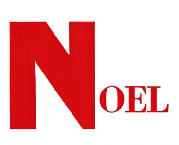 I've gotten behind posting my new work, but I ran the 1909 letterpress a few days ago with this Christmas card. I was just given a second set of vintage wooden type (the large "N", about 3 1/2" tall) to go with my smaller set ("oel"). I'm busy folding and packaging these now while I listen to the Cardinals in the playoffs.
 I'm having a letterpress couple of days around here. On Monday I ran my first holiday cards and also did some posters for Cooper-Young festival this weekend about my note cards. On the poster, I got to play around with my new fonts and show a bunch of them off. 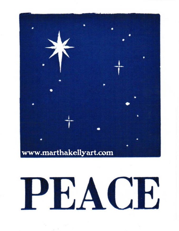 Above is the holiday card as I intended it when designing. However, it's hard to keep something that solid that dark on the letterpress, which was built to print type (with small amounts of dark and lots of white around each letter -- less pressure needed). So as the inking cycle made its way around, I got lots of notecards like the next one. 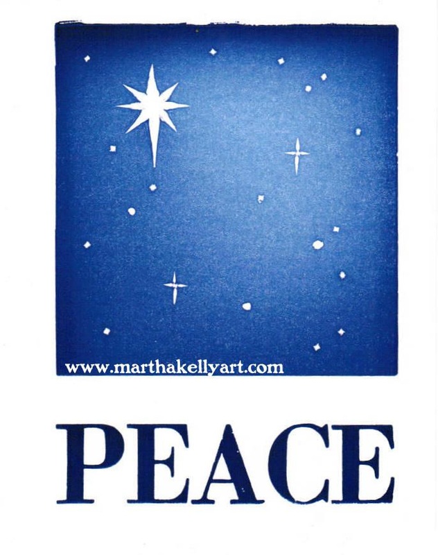 This is where the press can be a partner in the creative process, and not just a passive tool. I decided I liked the effect of a glowing sky, so I didn't fight to keep each note card dark, and I have a spectrum of them available. Folks can choose which they like. 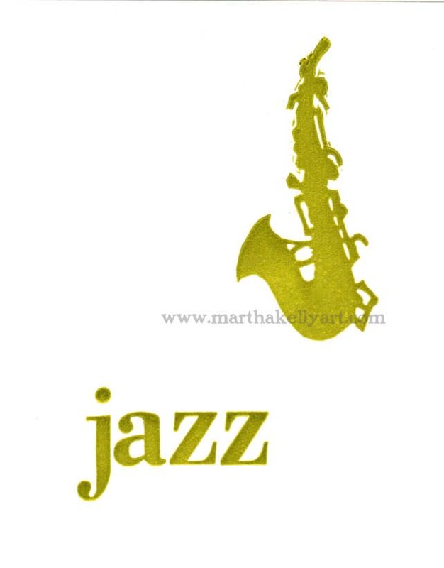 I finished up using my saxophone carving from the Park Friends Month of Music poster to make a note card as well. I paired it with a word in my wood type (the "PEACE" is the same font of wood type, only capitals) and ran a series of these. They're inspired by my friend and neighbor Jim Spake, saxophonist extraordinaire and a part of my favorite band anywhere. Memphis is lucky to have so many amazing musicians.
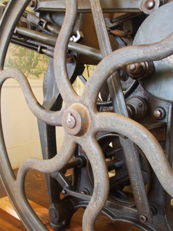 I have just become the proud caretaker for a 1902 Chandler and Price letterpress. It's treadle operated (no power needed except my own energy) and can handle paper up to 10x15". It's happier with smaller plates, so I'm working up gradually and beginning with some card and bookplate sized projects. It will be fun to explore the possibilities, and I can't wait to see how it influences my art. 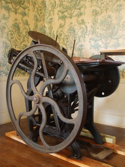 |

online store Martha Kelly is an artist and illustrator who lives and works in Memphis, Tennessee. Get occasional studio email updates. Categories
All
Archives
May 2024
|