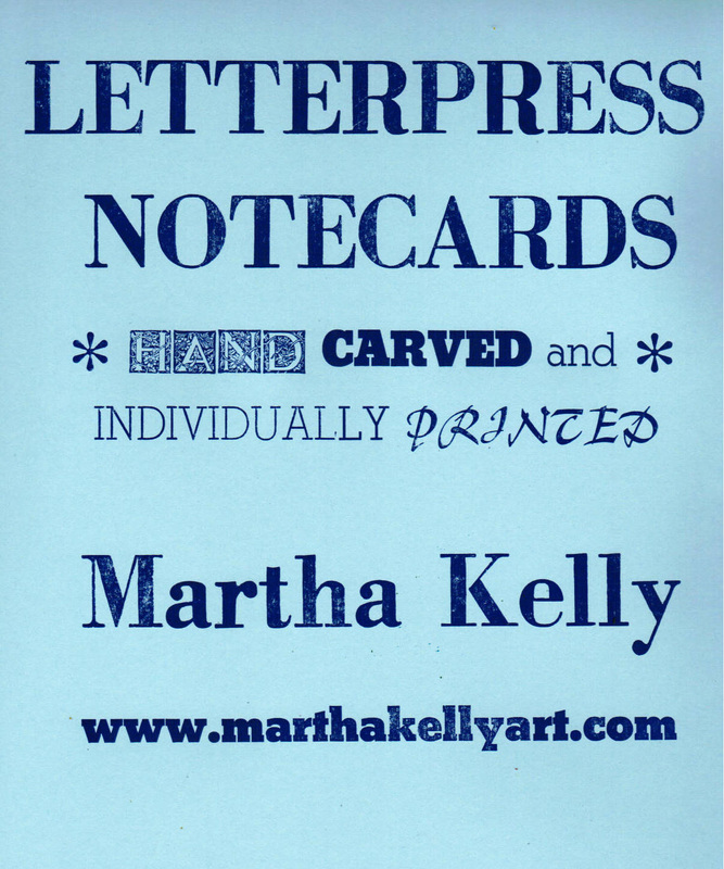
MARTHA KELLY ART
HOME
PRINTS
BOOKS
WATERCOLORS
Memphis
Paris
England
France
Greece and Turkey
St. Louis
My Palette
SKETCHES
Quarantine Journal
Memphis
Overton Park
Mr. Darcy
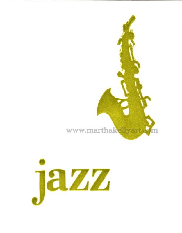
Musicians
Tea
Dutch travelogue
Shakertown travelogue
Sketching tools
OILS
LITURGICAL
BLOG
ABOUT
SHOP
HOME
PRINTS
BOOKS
WATERCOLORS
Memphis
Paris
England
France
Greece and Turkey
St. Louis
My Palette
SKETCHES
Quarantine Journal
Memphis
Overton Park
Mr. Darcy
Musicians
Tea
Dutch travelogue
Shakertown travelogue
Sketching tools
OILS
LITURGICAL
BLOG
ABOUT
SHOP