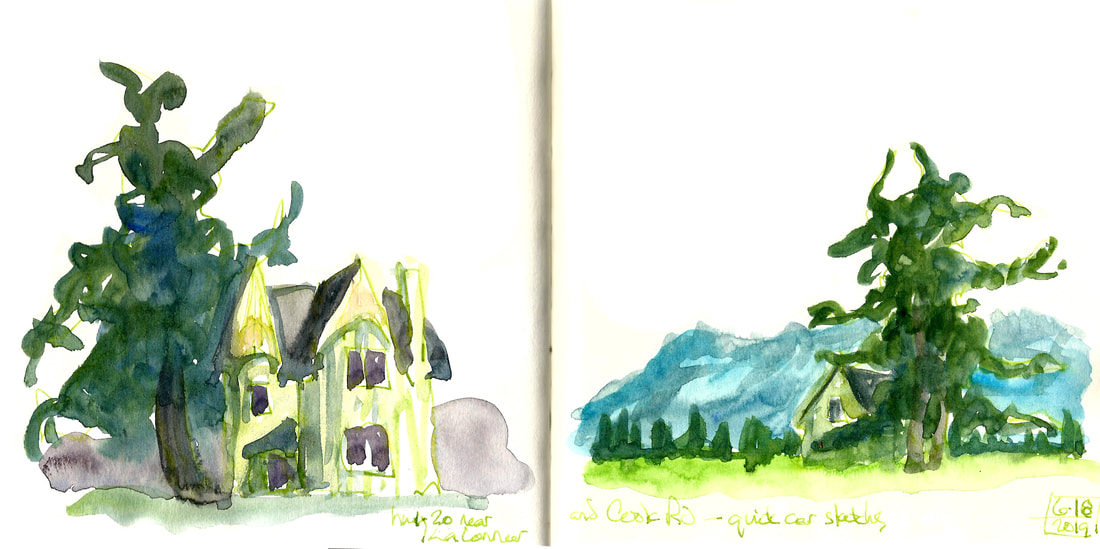
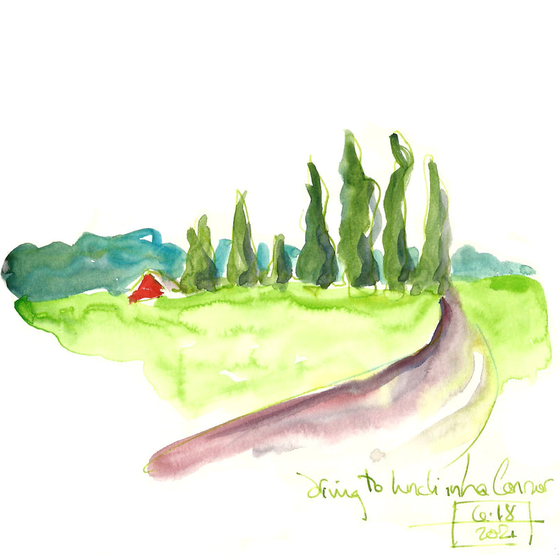
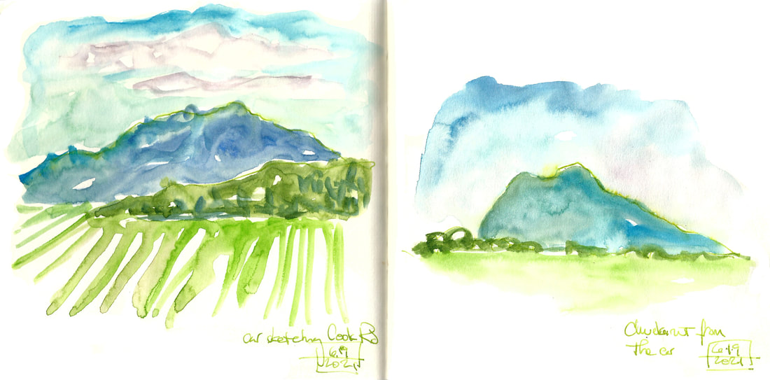
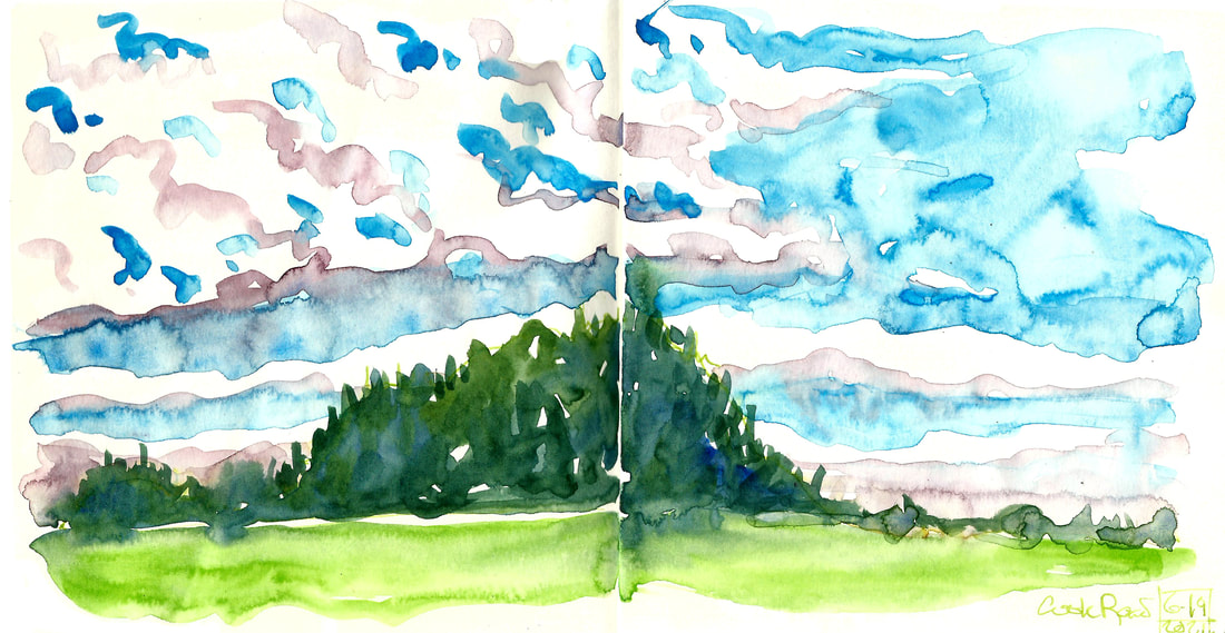
The Sennelier sap green is lush and gorgeous, a little cooler and more opaque than the Windsor and Newton sap green that I've been used to. In fact, all of the colors are more opaque. This set feels like a step towards gouache. I've had fun playing with it, and I've enjoyed having a Paynes grey, which is a color I keep hearing about but have never used. I'm having trouble getting the dark richness that I can with my W&N set, though, and the light green in this one is more acidic than the warm green gold I have in my regular set. It's always good to try new things, and after feeling under the weather for several weeks, I wanted a new toy to jump start my sketching practice. I had real trouble getting up the energy to draw much of anything for a while there. This will be a neat set for keeping in a purse and being ready for on-the-go. I may try to get a tube of the green I like to add to my regular set, but at this point, I'm still a total fan of the professional grade Windsor and Newton watercolors.
I did finally get some depth in this last one, and I like how the colors bleed into each other. I also like that they dry faster than my W&N ones. I always thought that was more paper than paint, but these seem to dry more quickly instead of my having to carry an open book around for the next several minutes. But I'm still sticking with my main set for more formal work.
0 Comments
Leave a Reply. |
online store Martha Kelly is an artist and illustrator who lives and works in Memphis, Tennessee. Get occasional studio email updates. Categories
All
Archives
June 2024
|


